Collections · The Riviera & the sea
The Riviera & the sea, restored for the way you live
The PLM railway sold the Côte d'Azur the way the great shipping lines sold the Mediterranean: as a promise in five flat colours. This room collects the coast at its most confident — casinos, palm walks, white hulls. Each listed sheet is dated and attributed; any rights conclusion is limited to the named poster, intended sales territory and documented provider file. Sixteen are below; 60+ are in the catalogue.
Explore the edit on GeMarkt, then compare the sizes and print formats currently offered by our frofyprint Etsy shop.
A considered place to start
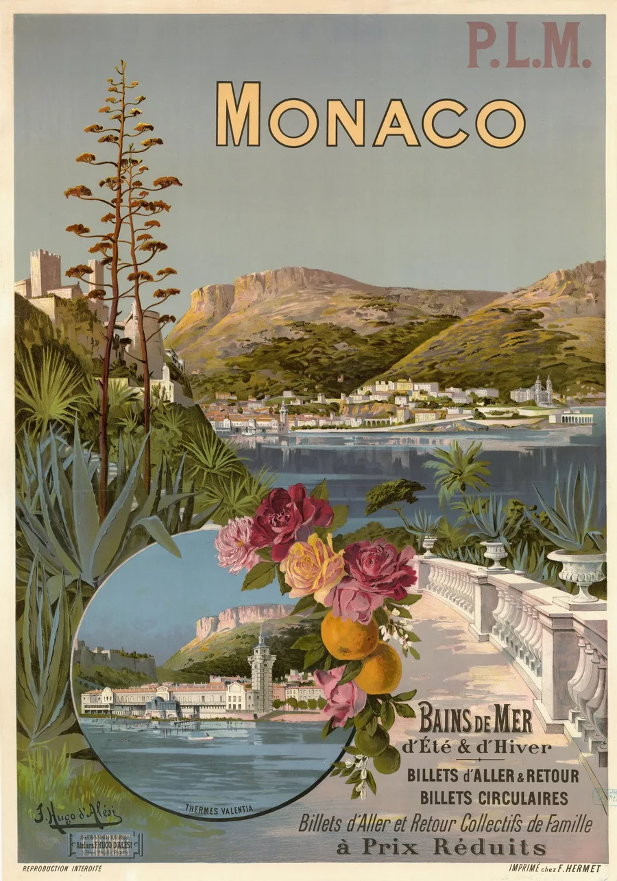
Monaco — Bains de Mer d'Été & d'Hiver, 1896
Hugo d'Alési painted the principality for the PLM in 1896 and slipped the Thermes Valentia — the marble bath-palace that would be gone by 1908 — into the round inset like a locket. The roses and oranges along the balustrade carry the whole foreground; if they dull, the terrace goes with them.
Bains de mer · current options on Etsy
See sizes and prices on Etsy ↗
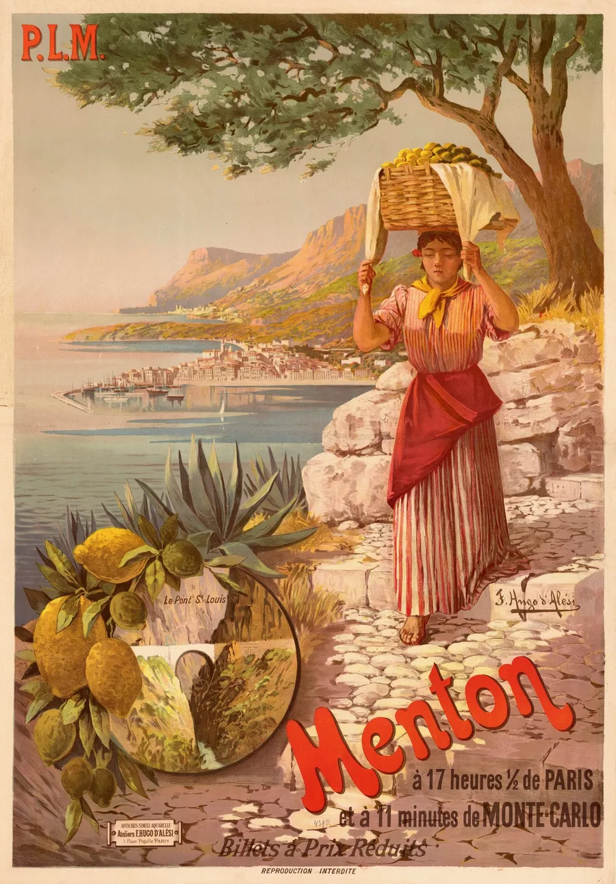
Menton, à 11 minutes de Monte-Carlo, 1898
Hugo d'Alési's 1898 design sells Menton by timetable — seventeen and a half hours from Paris, eleven minutes from Monte-Carlo — while a girl carries the town's lemon harvest down a cobbled path. The red script of the town's name has to stay loud against those pale stones.
PLM railways · current options on Etsy
See sizes and prices on Etsy ↗
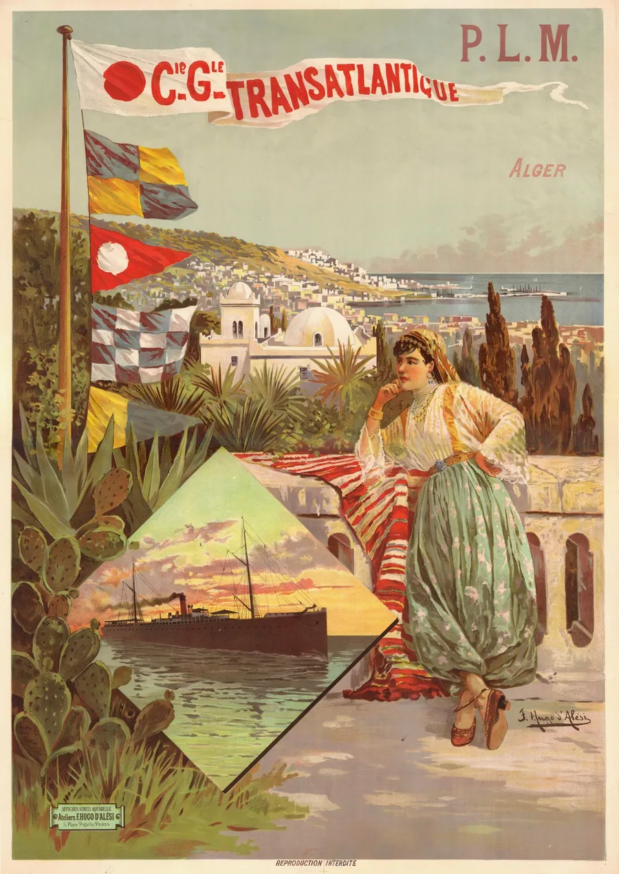
Alger, Cie Générale Transatlantique, 1898
One poster for two companies, painted by Hugo d'Alési in 1898: the PLM carried you to the quay at Marseille, and the Transatlantique's mail steamer took you on to Algiers. The signal flags running down the mast are the bright notes — each one a flat, crisp colour that must not bleed into the grey-green sky.
Ocean liners · current options on Etsy
See sizes and prices on Etsy ↗
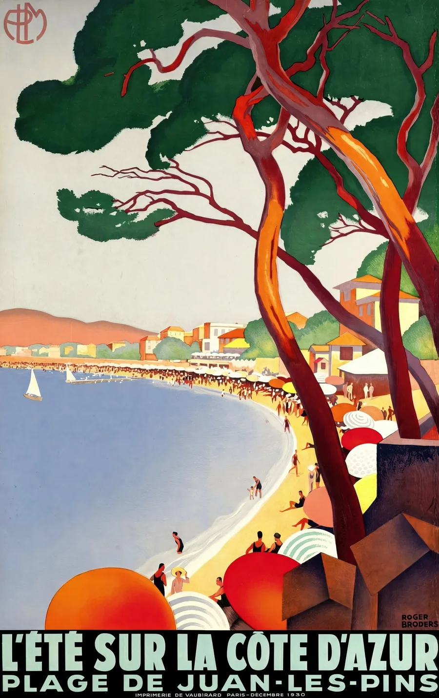
L'Été sur la Côte d'Azur — Plage de Juan-les-Pins, 1930
Roger Broders drew the beach at Juan-les-Pins in flat, hard-edged colour, and the stone is plate-dated December 1930 — the exact moment the painted Riviera turned modern. The red-barked pines are the whole architecture of the design; their edges have to hold against that empty sky.
Riviera turns modern · current options on Etsy
See sizes and prices on Etsy ↗
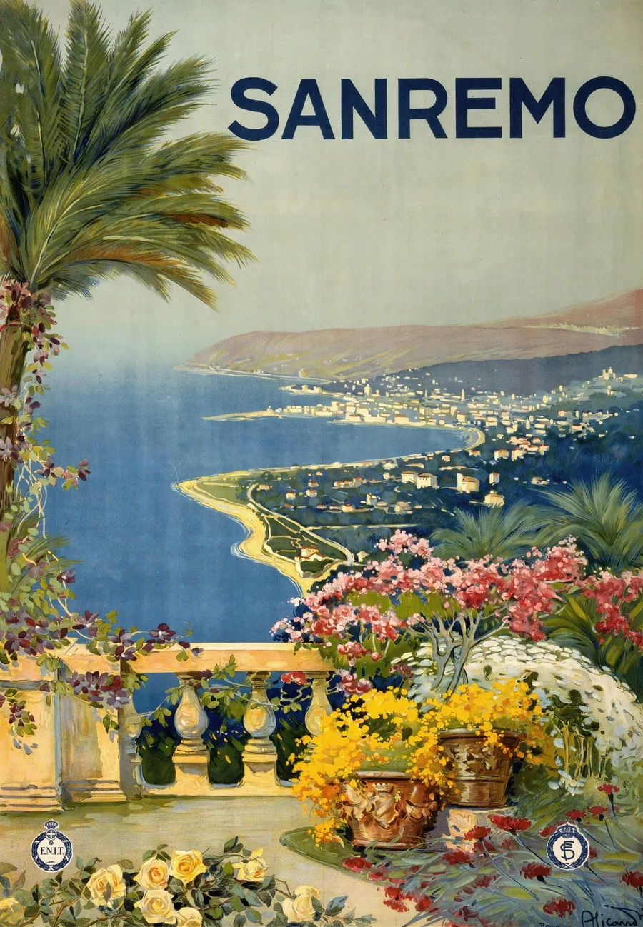
Sanremo, c. 1920
Vincenzo Alicandri painted the Italian Riviera for the state railways around 1920, printed in Genoa, the coast unwinding in one long S-curve below a terrace of mimosa and roses. The deep blue of that sea does all the work — every copy lives or dies by it.
Italian Riviera · current options on Etsy
See sizes and prices on Etsy ↗
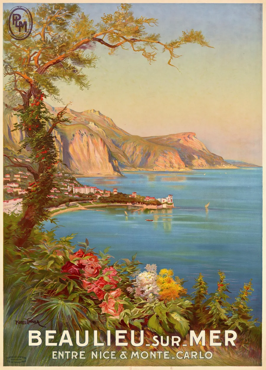
Beaulieu-sur-Mer, entre Nice & Monte-Carlo, 1920
Pierre Comba, Nice-born and best known for painting alpine soldiers, took the PLM's commission for Beaulieu in 1920 — the bay caught exactly where the subtitle puts it, between Nice and Monte-Carlo. The cliffs are laid in warm rose and ochre; lose that warmth and the sea's two blues go cold with it.
Côte d'Azur · current options on Etsy
See sizes and prices on Etsy ↗
Keep exploring
Past Monte-Carlo — working ports, quieter plages and the boats between.
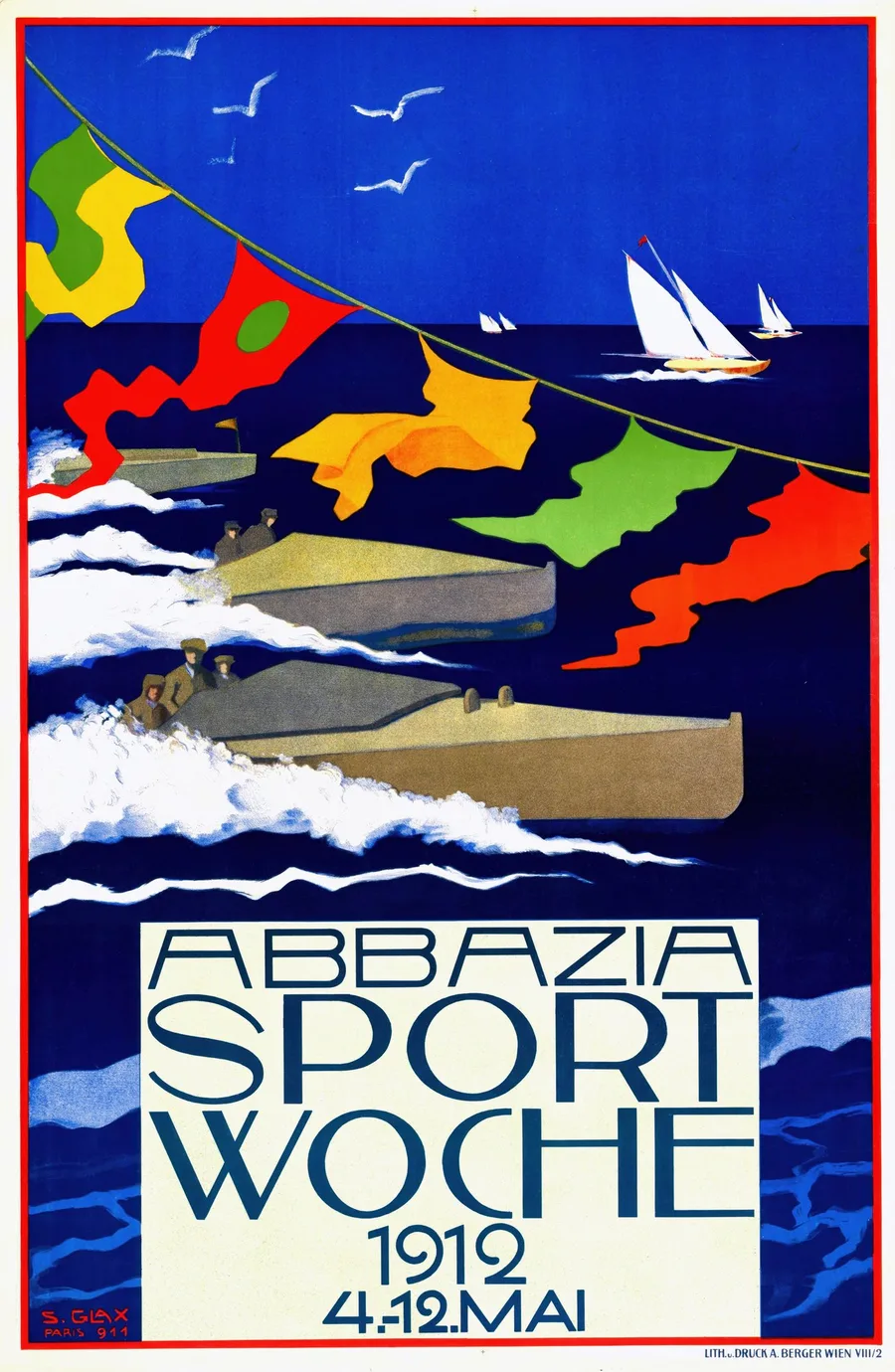
Abbazia Sport-Woche, 1912
Stephanie Glax was one of Austria's first women poster designers, and for Abbazia's 1912 sport week she strung carnival bunting clean across a race of motorboats. The sea is one flat mass of dark blue — the white wakes cut into it must stay paper-crisp.
Adriatic regattas · current options on Etsy
See sizes and prices on Etsy ↗
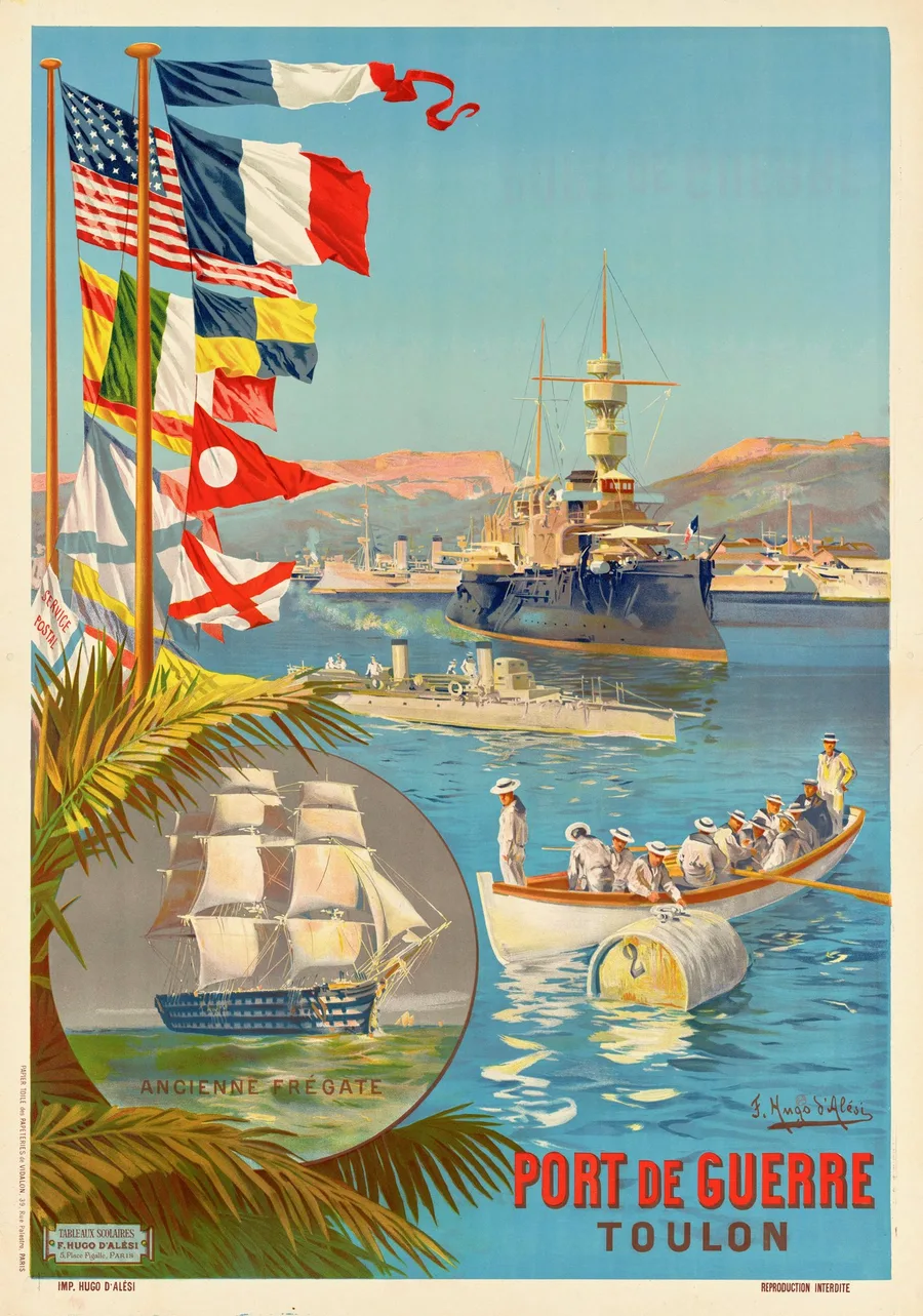
Port de Guerre — Toulon, 1901
Not a travel poster at all but a school wall-picture, issued from Hugo d'Alési's own Place Pigalle studio in 1901 to show children what a naval port looked like. The sailors' whites in the rowing launch are the picture's light — they must not grey.
Port de guerre · current options on Etsy
See sizes and prices on Etsy ↗
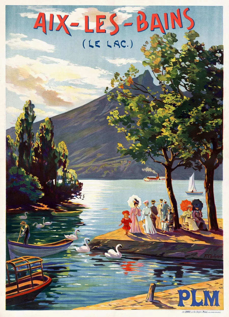
Aix-les-Bains, le Lac, 1906
François Cachoud, a Savoyard who made his name painting nightfall, gave the PLM this 1906 view of the lac du Bourget with the parasol crowd out on the jetty. The swans hold the middle of the picture — small, but they anchor all that shimmer.
Belle Époque spas · current options on Etsy
See sizes and prices on Etsy ↗
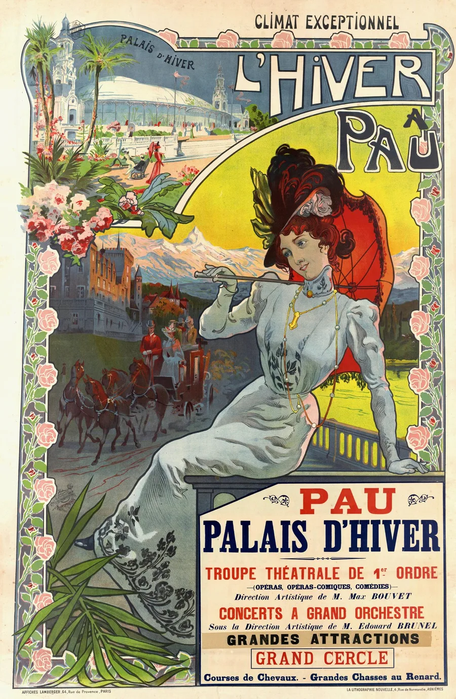
L'Hiver à Pau, c. 1900
Vincent Lorant-Heilbronn's playbill for Pau's winter season, around 1900 — opera troupe, grand orchestra and fox hunts, all promised under one 'climat exceptionnel'. The yellow fan of sky behind the woman in white is the poster's sun; it has to glow, not sour.
Winter seasons · current options on Etsy
See sizes and prices on Etsy ↗
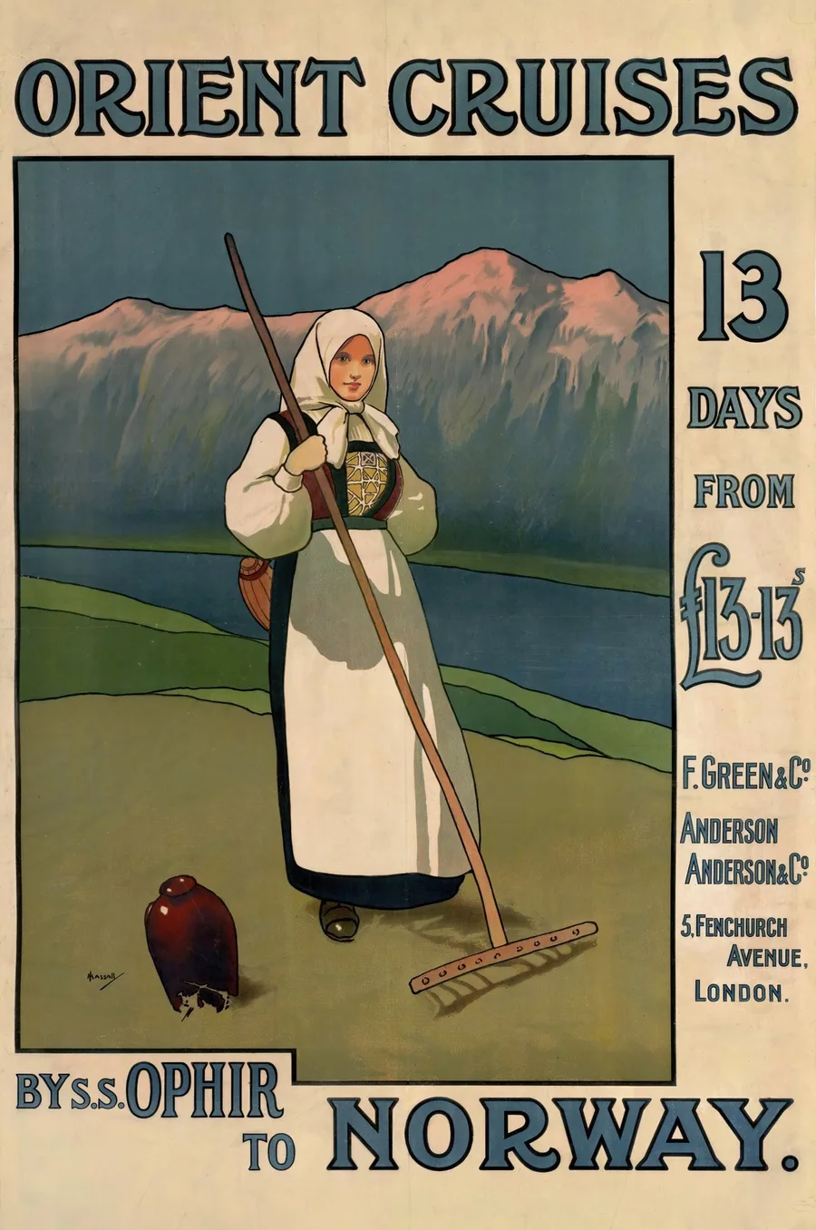
Orient Cruises by S.S. Ophir to Norway, c. 1901
John Hassall sold the Orient Line's thirteen-day cruises of about 1901 with a haymaker in a white headscarf rather than a ship — the Ophir herself was requisitioned in 1915 and never carried tourists again. Most of the sheet is bare cream paper, and it should read as paper, not as age.
Steamship cruises · current options on Etsy
See sizes and prices on Etsy ↗
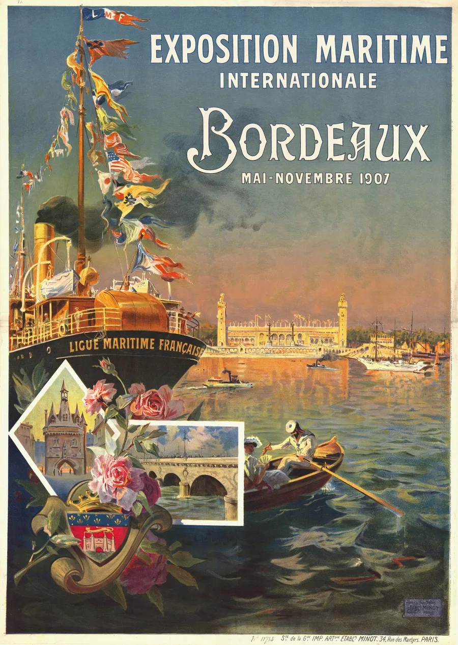
Exposition Maritime Internationale, Bordeaux, 1907
Antoine Ponchin dressed a Ligue Maritime steamer stem to masthead in signal flags for Bordeaux's 1907 maritime exposition on the Garonne. The sunset orange lying on the water is the fragile colour — most surviving copies have let it fade to tan.
Maritime expositions · current options on Etsy
See sizes and prices on Etsy ↗
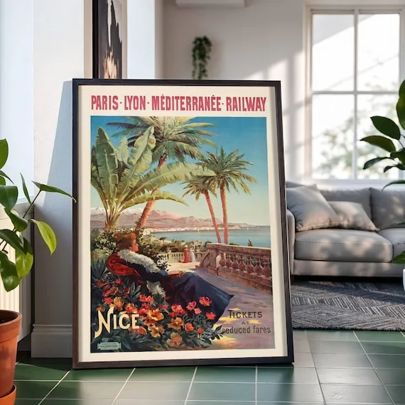
Nice — Tickets at Reduced Fares, c. 1904
D'Alési wrote this one in English — 'Tickets at reduced fares' — because Nice's winter colony was still largely British when the PLM issued it around 1904. The fur-wrapped woman under the palms is the whole sales pitch, winter with palms; her dark wrap has to keep its warmth against all that bay blue.
The English season · current options on Etsy
See sizes and prices on Etsy ↗
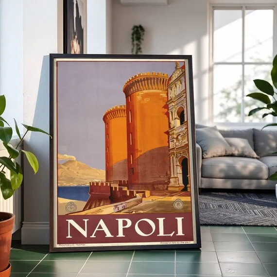
Napoli, c. 1920
Printed in Naples by Richter for the state tourist office founded only the year before, with Vesuvius trailing smoke at the castle's shoulder. The sheet lives in one late-afternoon ochre — Castel Nuovo's two round towers must stay two distinct oranges, or the fortress flattens into a wall.
ENIT campaigns · current options on Etsy
See sizes and prices on Etsy ↗
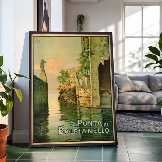
Punta di Balbianello — Lago di Como, c. 1925
The state railways and the young tourist office shared this mid-1920s sheet, which the Salce collection files under Fabio Cipolla's name. Lake, garden and sky are all one family of green — the sunset gold lying on the water is the lone intruder, and it has to arrive gently.
Italian lakes · current options on Etsy
See sizes and prices on Etsy ↗
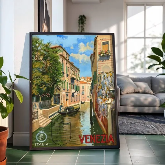
Venezia, c. 1920
Nobody signed the tourist office's Venice of about 1920, and this impression carries a New York agency's shield — an ocean crossing sold from a side canal. The canal green is the binding colour; it has to hold the gondola's black and the walls' faded pink together without going to soup.
Grand Tour revived · current options on Etsy
See sizes and prices on Etsy ↗
Follow what catches your eye
These works are only the beginning. The GeMarkt archive contains 60+ The Riviera & the sea records; current Etsy availability may change. Continue by subject:
Choosing a format
Rolled poster
The cheapest way in — pick it if you already own a frame or want one chosen for the room, not the shipment.
Framed paper
Arrives ready to hang, glass over paper — the classic museum-print look, and the safest default for most rooms.
Stretched canvas
No glass, no glare — texture close to a painting's, and a natural fit for painterly surfaces.
Framed canvas
The canvas texture with a finished edge — the most furniture-like of the four, and the largest sizes live here.
Prices and available formats vary by listing; Etsy shows the current options and currency for that work. Undecided? Our print format guide compares the four honestly.
From the journal
Why is this work free to print in the first place? The Riviera & the sea and the public domain — the full guide →