GeMarkt Blog · Essay
Post-Impressionism: Van Gogh, Cézanne, Gauguin
See how Van Gogh, Cézanne, Gauguin and their contemporaries took painting in different directions, with eight works and clear visual comparisons.


Post-Impressionism is a broad name for artists who took the possibilities of Impressionism in different directions. Van Gogh made strokes of colour feel active and expressive. Cézanne explored how a picture could hold forms together. Gauguin used larger areas of colour and strong boundaries. Seurat pursued an ordered arrangement of separate colour marks. They did not all belong to one club or paint in one style.
The eight works below make those differences visible. Begin with a simple question: what is the paint doing besides showing us a recognisable subject? It might build a solid apple, make a field pulse, hold a figure flat against a background or turn a dancer into an instantly memorable silhouette. These are our visual readings, not claims that we know every artist’s private intention.
One name, several directions
The label came later than many of the pictures it describes. In his 1910 London exhibition Manet and the Post-Impressionists, critic Roger Fry brought different approaches under a common heading. The Metropolitan Museum’s introduction explains both the label and the artists’ independence. It is more useful to think of connected experiments than a single agreed programme.
Nor did one movement switch off when another switched on. Seurat showed his great riverside picture at the final Impressionist exhibition in 1886. The categories overlap. This guide follows eight revealing works, not a claim that every important artist or every part of a long career fits neatly inside the term. For the starting point, see our introduction to Impressionism.
What to look for
Compare the same three things in each image: marks, edges and space. Are marks short dashes, separate dots or broad areas? Do the edges of objects stay firm? Does the picture invite you to imagine walking into a deep room, or keep you aware of its flat surface?
These questions work better than “Is it realistic?” A painting can contain carefully observed objects and still change their relationships. Also, bright colour alone tells you very little. Cézanne’s muted greens can be as structurally adventurous as Van Gogh’s strong yellows. Composition simply means the arrangement of shapes across the picture; it is something you can examine without specialist vocabulary.
Cézanne: a mountain made of relationships
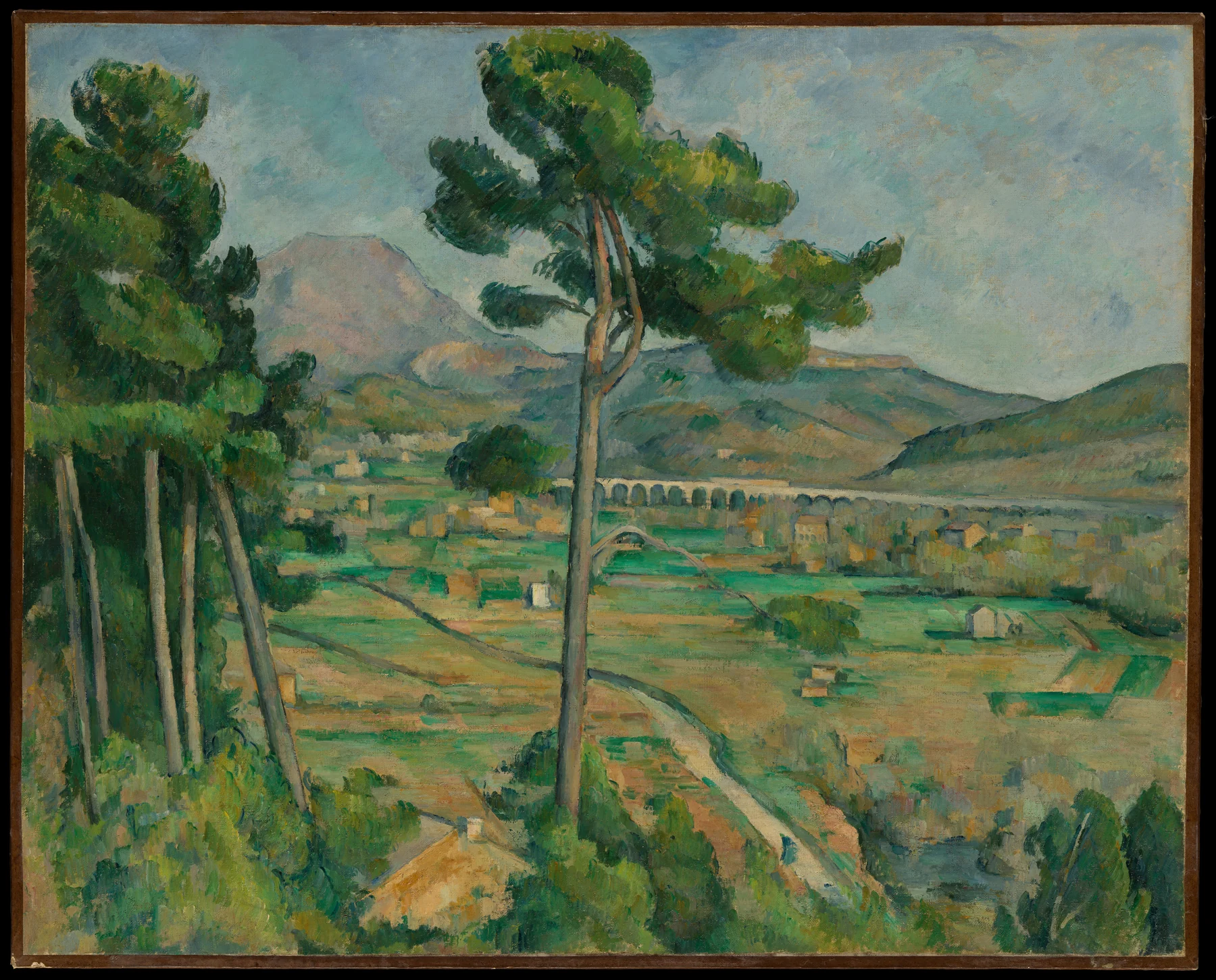
The mountain is not the only organising shape. Upright trees, the low band of the viaduct and the sweep of the valley divide the view. Patches of green and ochre make neighbouring areas connect even as they describe different distances. The painting can be read as landscape and as a structure of colour at the same time.
Try this: follow the strongest horizontal line, then the strongest vertical. Notice how they stop the distant mountain from floating away on its own. This is one particular view in a much larger sequence of paintings of the mountain, not a title identifying one universal version.
Cézanne: a table that will not sit still
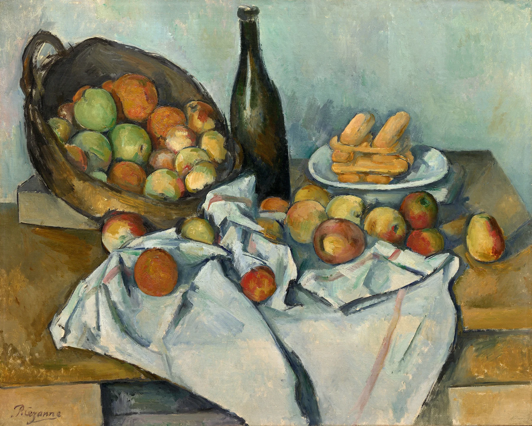

A bottle stands like a dark support while the basket tips and the cloth makes its own little landscape. The table edges do not resolve into one easy perspective. Nevertheless, the apples feel weighty. That tension is the point of looking: convincing objects do not require every surrounding line to behave like a photograph.
Try this: trace the table edge from left to right. Where it disappears under the cloth, imagine continuing it. The difficulty helps you notice how Cézanne balances the arrangement rather than simply recording a fixed tabletop.
Van Gogh: a face built from brushstrokes
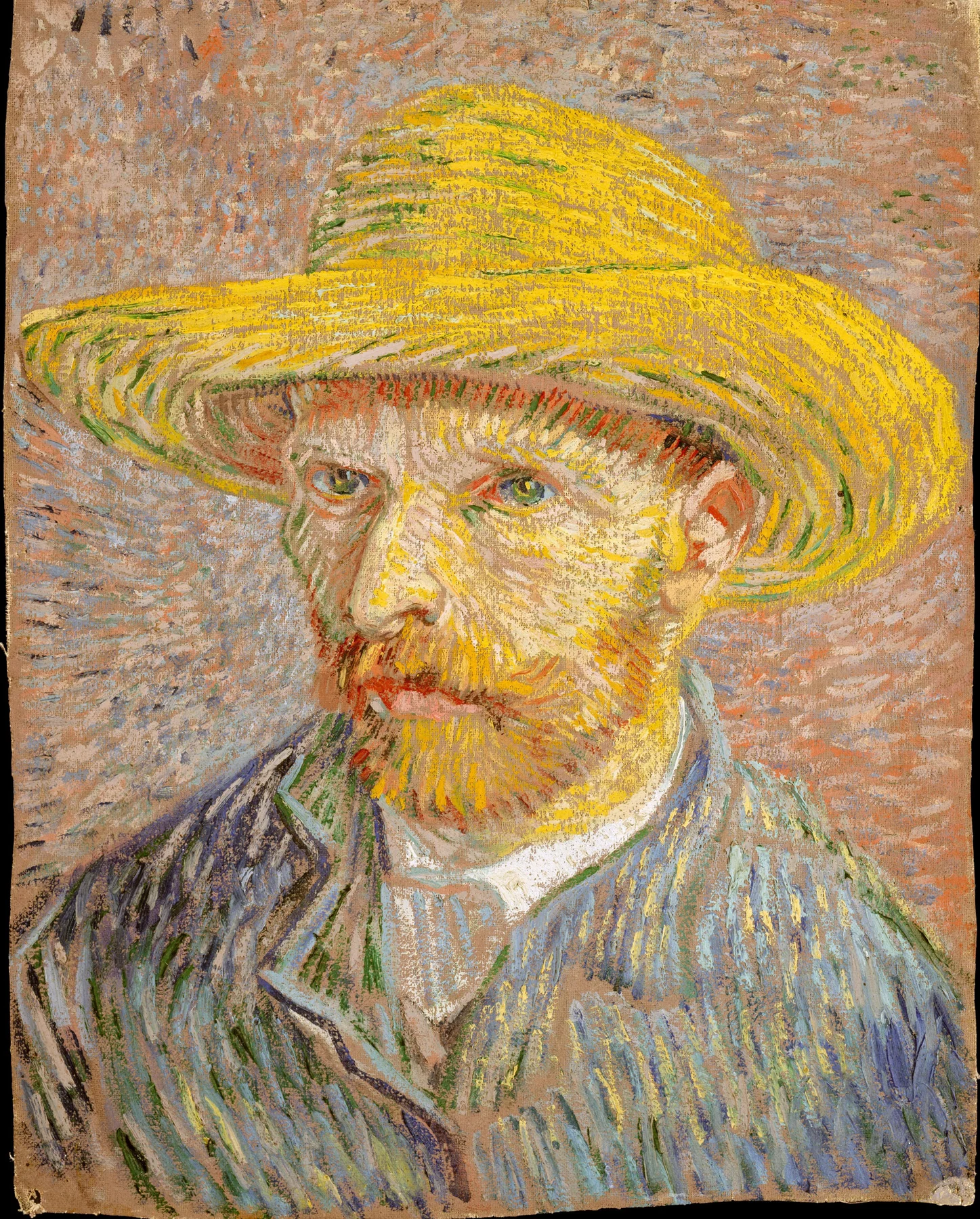
The direction of a mark matters here. Strokes turn around the face, spread across the hat and gather into a different rhythm in the jacket. Colour does not merely fill the spaces inside an outline; the marks help create the head itself. The museum identifies another painting on the reverse, a reminder that an image on screen shows only one face of a physical object.
Try this: compare the marks in the background with those on the cheek. They belong to the same painted surface but do different jobs. There is no need to diagnose the artist’s state of mind from them.
Van Gogh: a landscape with rhythm
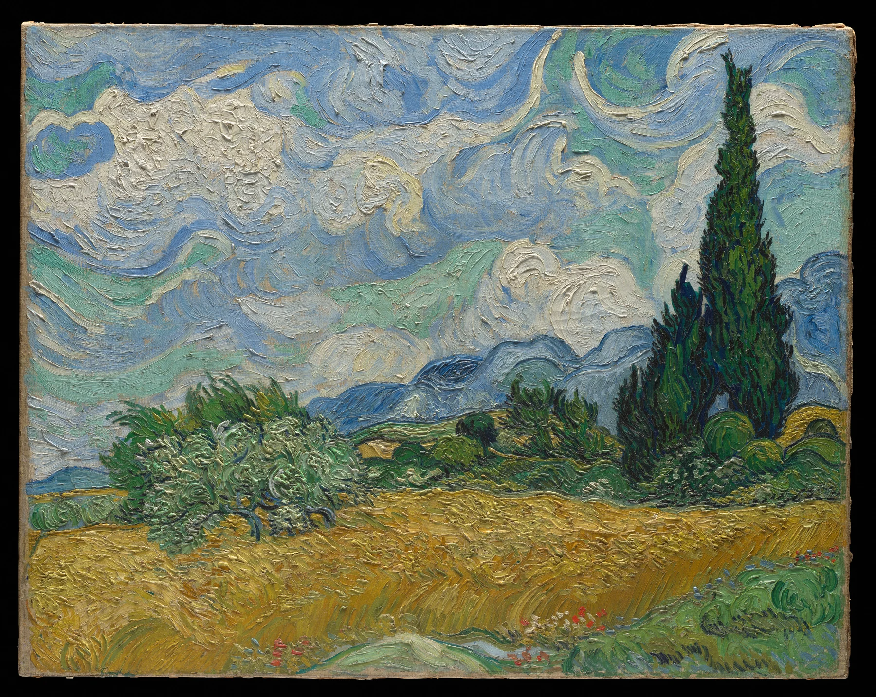
The cypress makes a strong upward movement; the wheat and hills pull across the canvas. Curving marks recur in clouds, vegetation and distant slopes. We still recognise different materials, yet they seem to share a rhythm. Compare this with the Cézanne mountain: one useful distinction is between marks that make the scene feel animated and relationships that make it feel held together. It is a comparison, not a permanent rule for either painter.
Try this: follow the clouds without reading them as weather for a moment. Their repeated curves become a pattern across the sky. The caption identifies the Met version because Van Gogh made more than one related composition.
Seurat: order on a Sunday afternoon
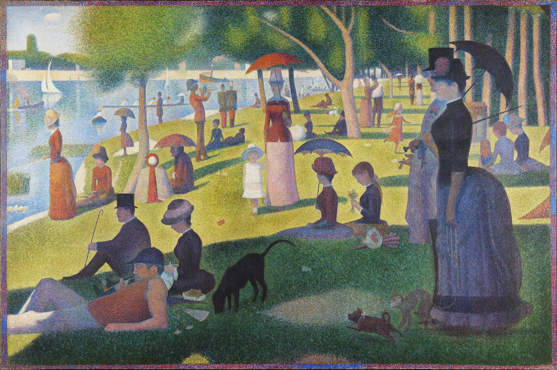
The park contains people at leisure, a subject familiar from Impressionism. But the upright figures and carefully spaced silhouettes give it an unusually still feeling. Many separate touches of colour coexist with that large-scale order. Pointillism names the use of small dots; Neo-Impressionism is the wider movement associated with Seurat and artists such as Signac. The Met’s account of that circle distinguishes the colour theories from the application of dots.
Try this: compare the smallest marks with the largest silhouette. Both scales matter. Reducing the painting to “lots of dots” misses its organisation.
Gauguin: figures held inside colour
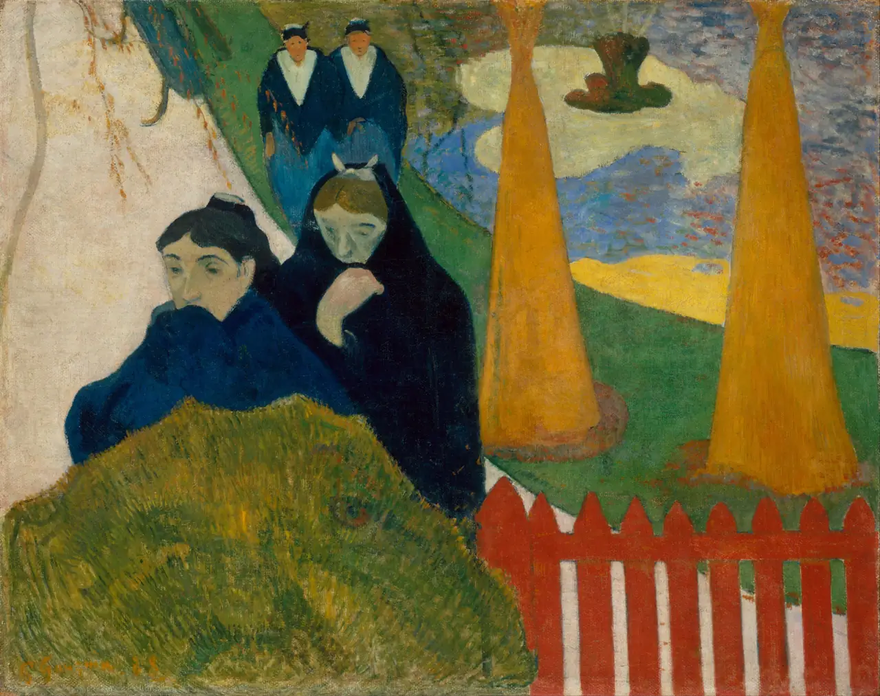

In Arlésiennes (Mistral), Gauguin’s women occupy a scene of paths, trees and strong areas of colour. The Art Institute’s record dates it to 1888. Look at the contours around the figures: they hold their shapes apart from the ground more firmly than the changing strokes around Monet’s parasol figure. Instead of trying to make every colour patch dissolve into observed light, this picture makes the boundaries part of its expressive effect.
Try this: compare a dress shape with the shape of the path beside it. Both contribute to the arrangement. Gauguin’s later work and colonial context need their own discussion; this French scene is not evidence that all his subjects or relationships can be described in the same way. Our Van Gogh and Gauguin comparison follows their specific period in Arles.
Toulouse-Lautrec: a picture for the street
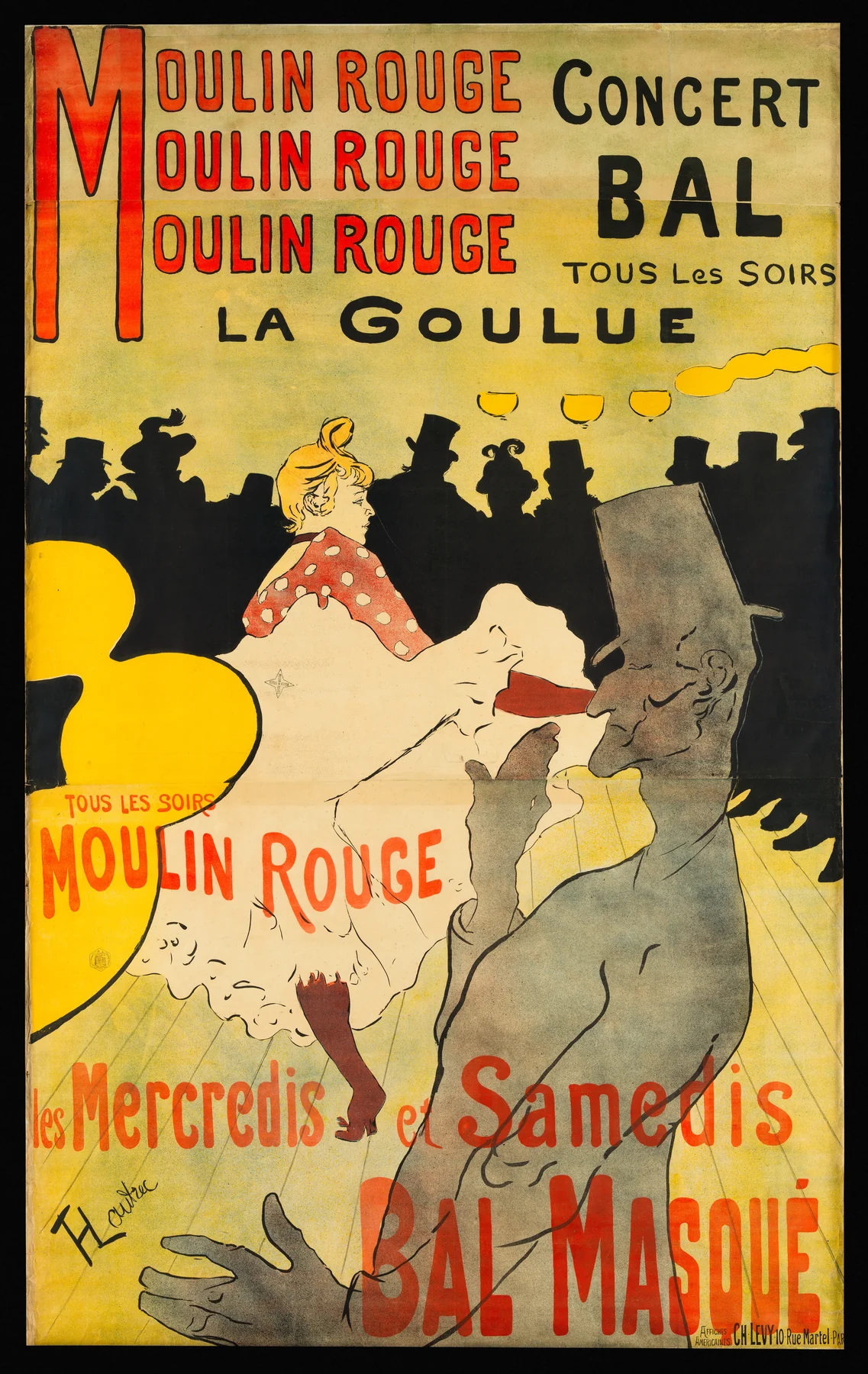
This is a printed advertisement, not an oil painting. Lettering, silhouettes and the dancer’s bright skirt work together at a glance. The crowd becomes a dark band rather than a collection of individually modelled faces. Seen alongside the paintings, the poster shows how simplification can serve a different purpose: a striking public image designed to announce a performance.
Try this: imagine the lettering removed. The balance changes. Words are not an afterthought here; they occupy the picture just as the figures do.
Rousseau: a jungle that feels invented
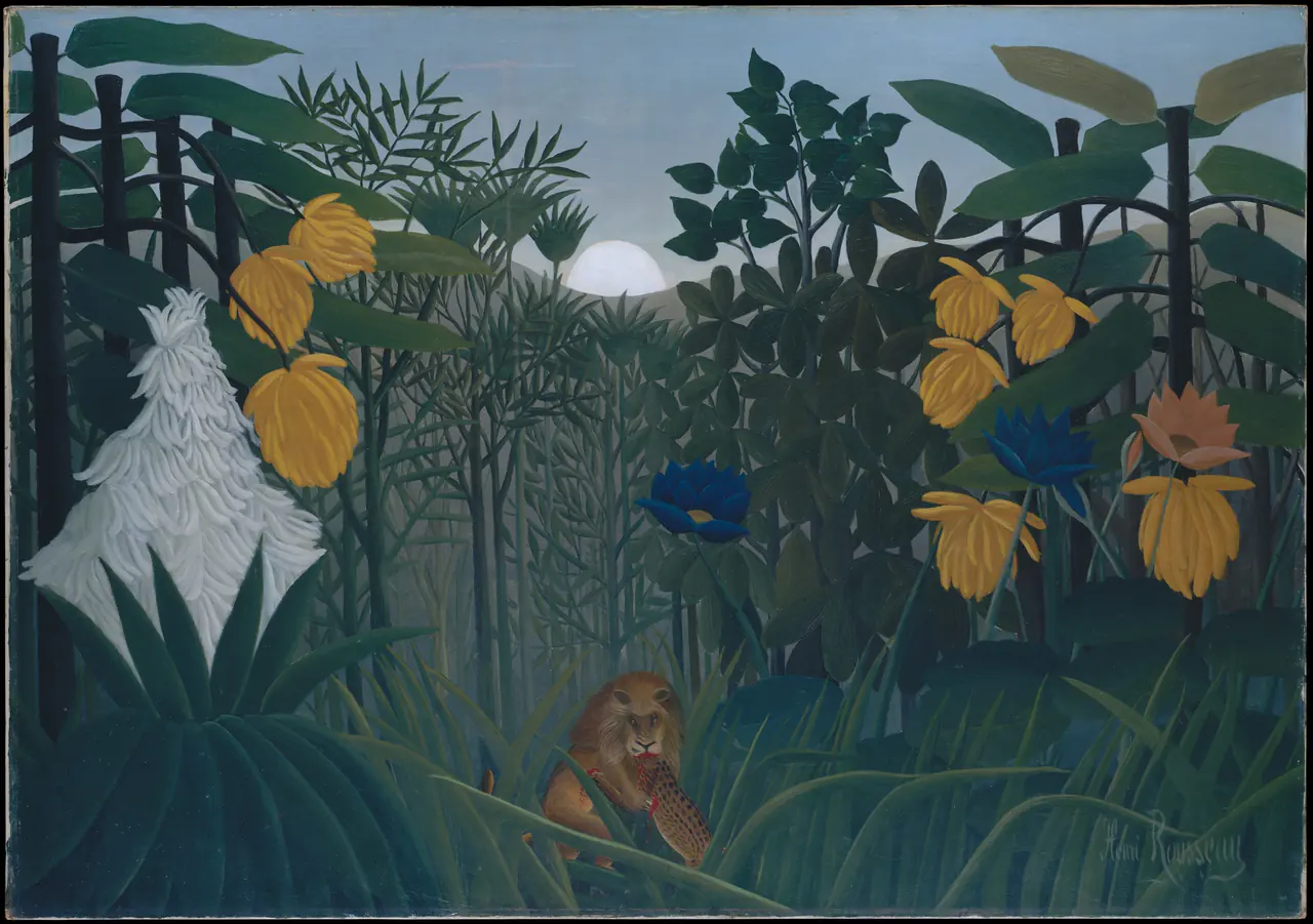
The repeated leaves are unusually distinct, and the vegetation feels assembled in layers. The Met explains that Rousseau’s jungle imagery drew on sources such as Parisian botanical gardens rather than travel to the tropics. Do not treat the scene as a field report. It belongs in this wider comparison because its deliberate, constructed world differs so clearly from a fleeting optical impression. It is not proof that Rousseau belonged to one organised Post-Impressionist group.
Try this: count how many overlapping layers separate you from the lion. Flat-looking shapes can still create an absorbing space.
Six artists without one formula
Explore the individual guides for Cézanne, Van Gogh, Seurat, Gauguin, Toulouse-Lautrec and Rousseau. The label connects questions they explored; it does not erase their differences or establish rights for every reproduction.
For a home, choose the visual quality you actually enjoy: active strokes, an ordered still life, a flat silhouette or a dense invented landscape. The Van Gogh collection offers one route into that choice. A movement name can help you find neighbours, but it should not substitute for looking at the particular image.
Editorial record
About this article
- Author
- Publisher
- GeMarkt
- Published
- Reviewed
- Internal source & rights check. Conducted by GeMarkt Research Review. This is an internal editorial check—not independent peer review.
- Source standard
- Art history source standardPrioritises object records and research sources, distinguishes evidence from interpretation, and states material uncertainty.
Found a claim that needs checking? Report a factual error.