GeMarkt Blog · Essay
Japonisme: How Japanese Prints Changed Western Art
Eight works reveal different kinds of Japonisme, from Van Gogh’s painted Hiroshige to Cassatt’s intimate scenes, Bonnard’s screen and Lautrec’s posters.

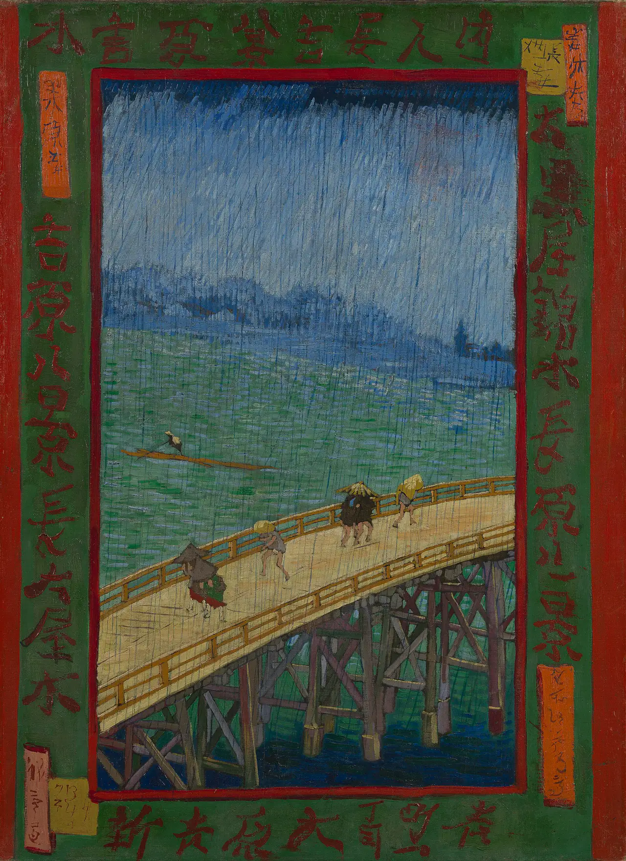
Put Hiroshige’s rain-covered bridge beside Van Gogh’s painted version and the family resemblance is immediate. The bridge cuts across the same stretch of water; people hurry beneath the same downpour. Then differences emerge: heavier strokes, stronger colour, and a painted border that was not part of Hiroshige’s scene.
This is one particularly visible form of Japonisme: Western artists engaging with Japanese art and design, especially during the later nineteenth century. But copying a print was only one possibility. Japanese works also offered ways to organise a picture, give importance to ordinary activity, or make a folding screen instead of a conventional framed view. These eight works by seven artists show those different approaches without treating every resemblance as proof of a direct borrowing.
An encounter, not a single style
Japonisme is not the name of a Japanese art movement. It describes a reception and reinterpretation of Japanese art elsewhere. Japanese prints had their own subjects, audiences, artists, publishers and histories before European and American collectors became enthusiastic about them.
Trade and international exhibitions helped Japanese objects circulate more widely in the second half of the nineteenth century. The Met’s account of Japonisme explains that artists responded not only to recognisable objects such as fans and screens, but also to unusual viewpoints, strong outlines and asymmetrical arrangements.
That distinction is useful. A painting can contain a Japanese object without substantially changing its composition. Another can show a Parisian room yet reveal close attention to Japanese prints. Neither a diagonal nor a flat patch of colour is, by itself, a reliable certificate of influence. For each example, ask what was available to the artist and what actually changed in the resulting work.
Hiroshige and Van Gogh: a copy that transforms
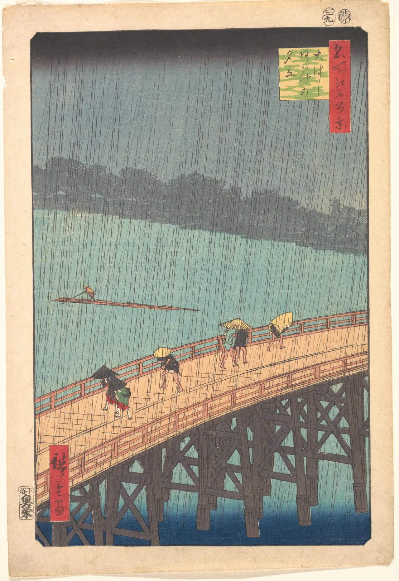
Hiroshige’s bridge is both a route across the river and a bold division of the sheet. Fine rain lines cross the people, water and distant shore, joining those different depths under one change of weather. The Met’s sheet is a particular impression of the 1857 design, not a photograph of the later painting’s exact source sheet.
Van Gogh’s 1887 painting preserves the arrangement while changing its material effect. His rain becomes visibly brushed; the river is made from worked bands of colour rather than a comparatively even printed field. The Van Gogh Museum’s object account explains that he intensified the colours and added a border to accommodate the design’s proportions on his canvas. Its characters were copied from other Japanese prints.
This is documented adaptation, not simply a critic spotting a similarity. The added frame also shows how selected Japanese elements could be recombined outside their original setting. For the second major example from the same experiment, see our closer comparison of Van Gogh’s copies of Hiroshige.
Utamaro and Cassatt: looking closely at ordinary care
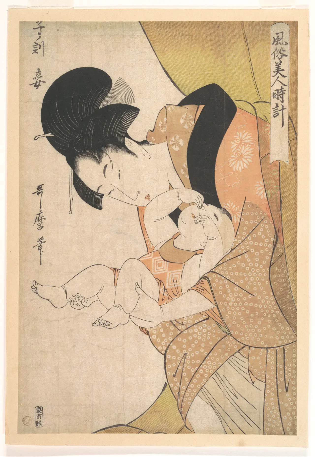
Utamaro’s woman bends through the picture towards a child. Patterned fabric takes up far more space than the small faces, yet the bend of her body makes the intimate action clear. The Met identifies the setting as the midnight hour, with the woman emerging from a mosquito net to attend to the child.
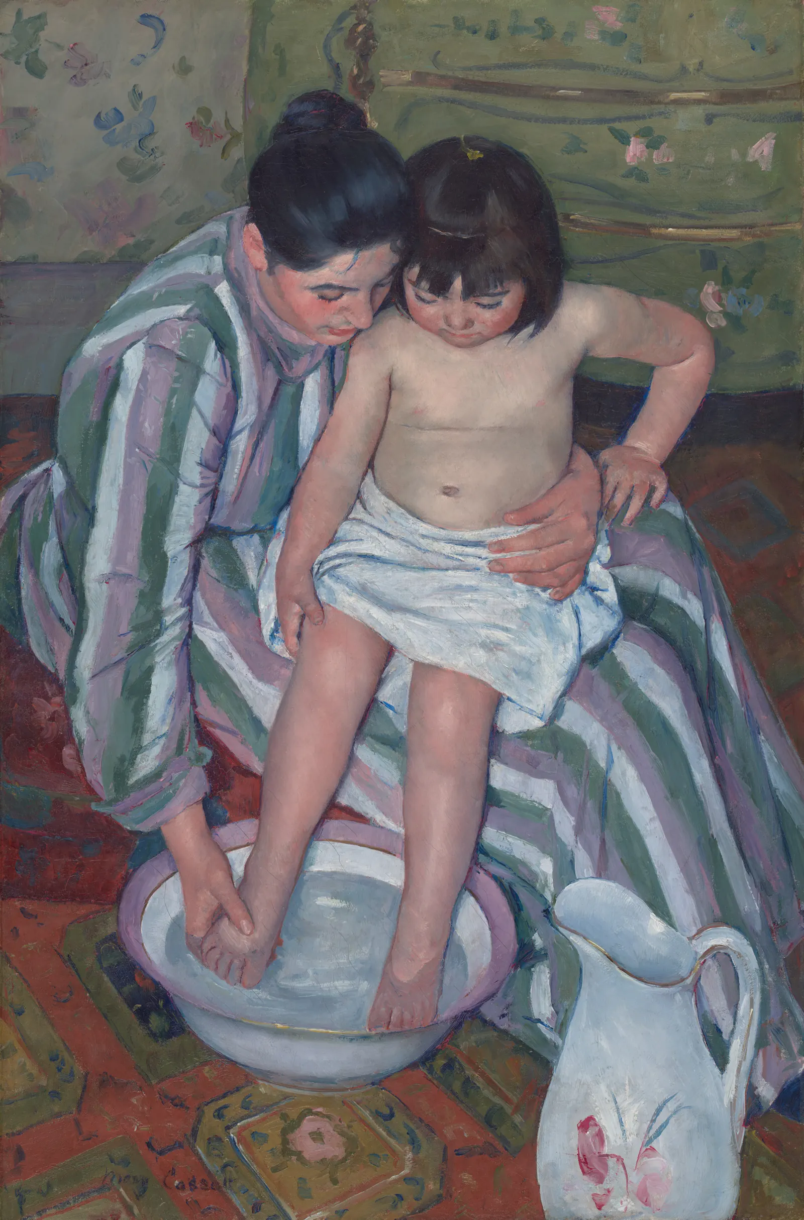
Cassatt’s painting places us above another act of care. A striped dress, patterned floor and painted furniture surround the bodies, while the basin’s oval gives the lower part of the picture a firm shape. The perspective is close and steep: we are looking into a shared activity rather than watching a distant scene through an imaginary window.
This pair is an invitation to compare, not a claim that the displayed Utamaro sheet was the direct model for The Child’s Bath. Cassatt’s engagement with Japanese prints is documented; the Art Institute’s discussion of this painting connects its viewpoint, shallow space and patterns with that interest. The distinction keeps a useful visual comparison from turning into an invented chain of copying.
Cassatt’s The Letter: the print as a coloured surface
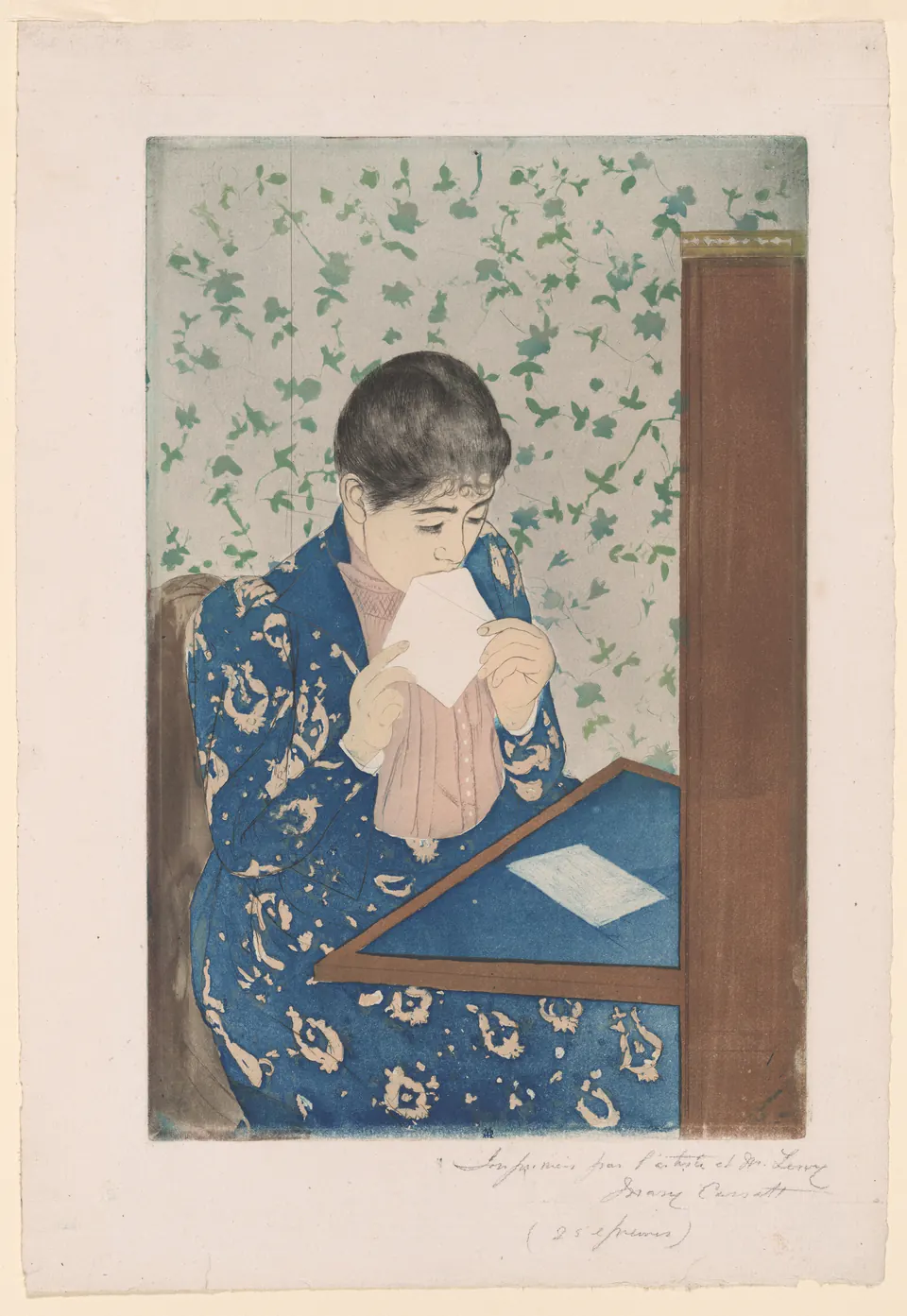
The dress and wallpaper carry different patterns, but neither is treated as mere background noise. Cassatt places their coloured surfaces against the pale envelope and the sharper geometry of the desk. The small action of sealing a letter becomes the meeting point of these larger shapes.
After seeing a major Japanese print exhibition in Paris in 1890, Cassatt made a series of colour prints; the Met discusses that response. The Letter also reminds us that influence did not require identical technique. Chicago identifies it as aquatint and drypoint, not a woodblock print. Cassatt translated possibilities she admired into a different printmaking process.
Bonnard’s screen: changing the shape of a picture
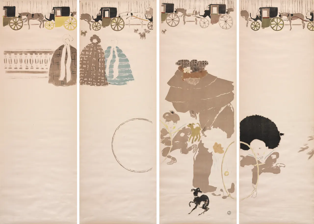
Bonnard distributes the scene across four panels. Carriages form a narrow band near the top; people, a dog and a large hoop occupy widely separated positions below. Broad pale areas remain between them. Our eyes have to travel across gaps rather than follow one central group.
Cleveland connects the work’s flat colours with the Japanese woodcuts Bonnard collected. The folding screen also changes the picture’s physical role: it can divide or occupy a room, rather than merely hang on its wall. Its panel joins are part of that object. This is Japonisme operating through format and decorative arrangement, not only through a borrowed subject. Our Nabis guide places the screen alongside Bonnard’s fellow artists.
Monet’s footbridge: making a place to paint
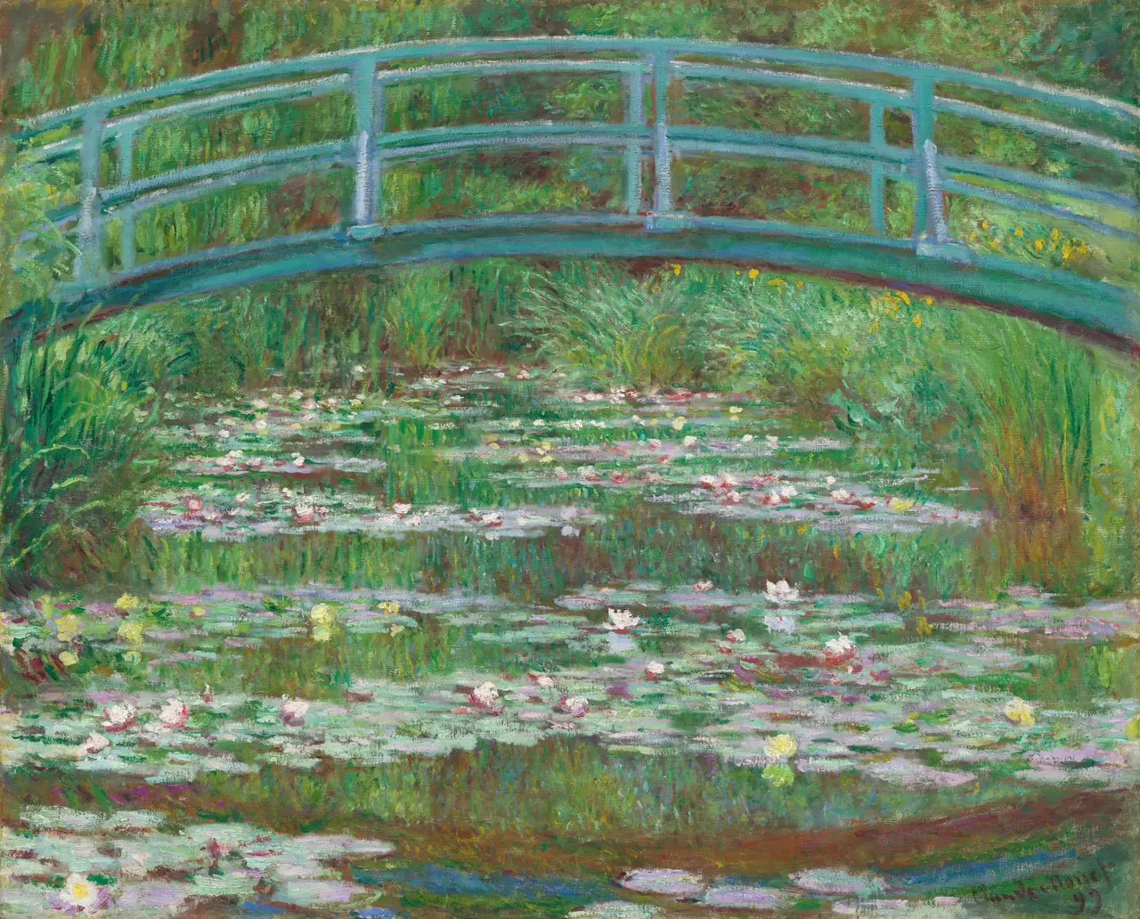
The Japanese connection here includes a place Monet helped create, not just an arrangement borrowed from a sheet of paper. The NGA describes the water garden at Giverny and identifies this canvas as one of twelve paintings of the view made in 1899.
The bridge’s arch is legible, but much of the scene is tangled: plants meet their reflections, and small touches of colour break up the water. Compare that surface with Hiroshige’s rain bridge. A related architectural motif does not produce the same kind of picture. Monet’s dense oil paint and surrounding garden keep their own character; this is not evidence that he copied the particular Hiroshige design shown above.
Toulouse-Lautrec: from close looking to the street
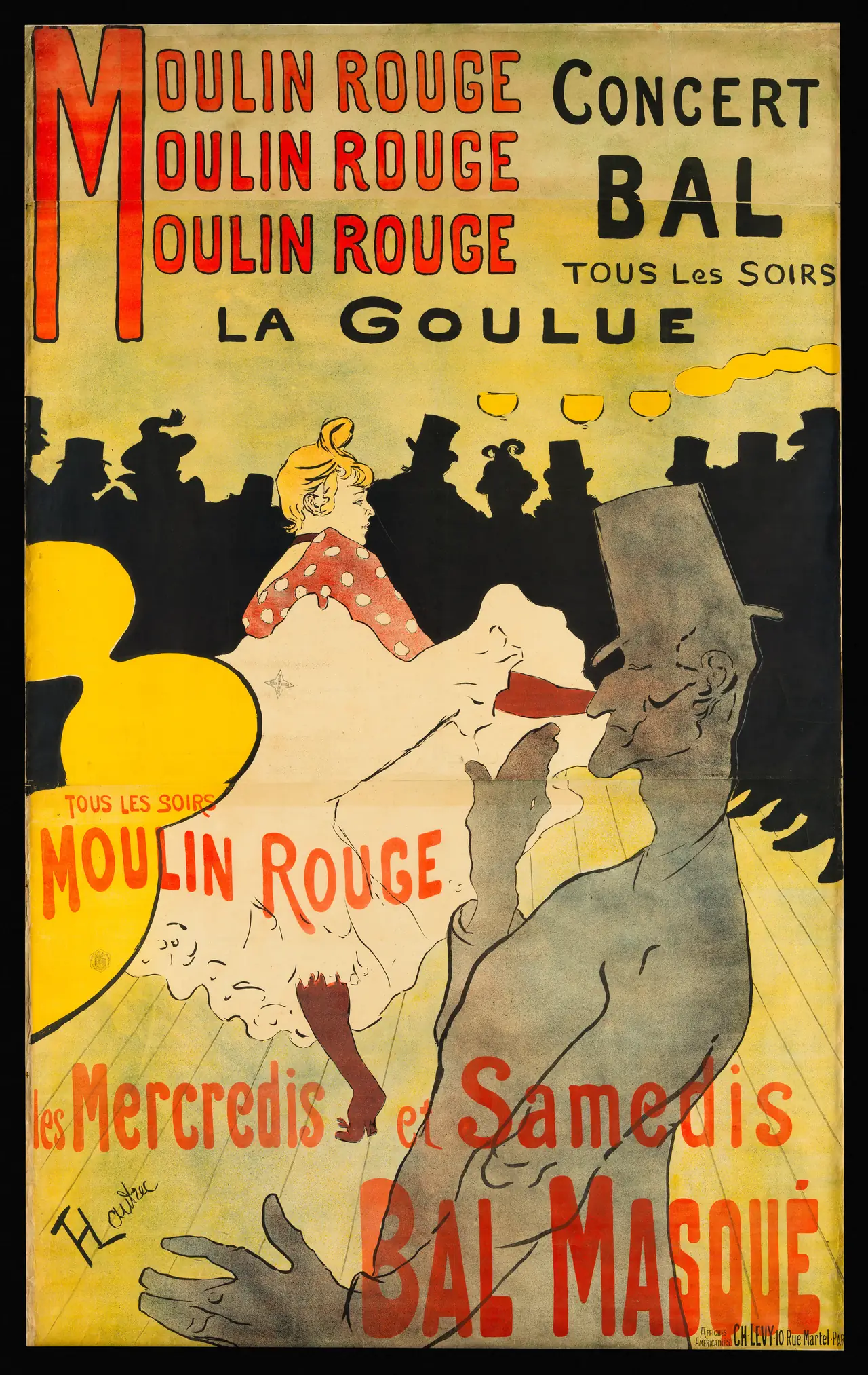
A large foreground figure is cut by the edges. Behind him, the dancer’s pale skirt stands out against the audience’s black silhouettes. Strong outlines and broad colour areas make the action readable beside oversized lettering.
The Met’s Japonisme essay relates Toulouse-Lautrec’s simplified contours and emphatic colour to Japanese theatrical prints. That is a broader artistic relationship, not an identification of one source print for every shape here. The work is also a Parisian advertisement, made by colour lithography and designed to announce a performer and venue. The Japanese connection helps explain a visual vocabulary without explaining away the poster’s own purpose.
How to recognise Japonisme without seeing it everywhere
Look for a combination of evidence and visible choices. A documented copy is the clearest case. Elsewhere, compare viewpoint, cropping, pattern, colour areas and the object’s format, then check whether the artist’s engagement with Japanese art is supported by a museum record or research account.
Avoid the shortcut that Japanese art is always flat and Western art was always deeply perspectival. Hiroshige’s bridge recedes convincingly; Cassatt’s figures retain weight. The interesting changes lie in how artists combine depth with surface, not in replacing one simple formula with another.
Seven artists and further looking
Follow the individual practices through our guides to Hiroshige, Van Gogh, Cassatt, Monet and Toulouse-Lautrec, alongside the museum records for Utamaro and Bonnard above. The existing Van Gogh and Monet collections are separate browsing routes, not inventories of all eight illustrated works.
The strongest comparison does not finish with “they look alike”. It tells us what travelled, what changed, and what each artist chose to keep different.
Editorial record
About this article
- Author
- Publisher
- GeMarkt
- Published
- Reviewed
- Internal source & rights check. Conducted by GeMarkt Research Review. This is an internal editorial check—not independent peer review.
- Source standard
- Art history source standardPrioritises object records and research sources, distinguishes evidence from interpretation, and states material uncertainty.
Found a claim that needs checking? Report a factual error.