GeMarkt Blog · Essay
Van Gogh’s Copies of Hiroshige: Originals and Versions
Put Hiroshige’s rain bridge and plum garden beside Van Gogh’s painted versions. Follow the changed colours, borrowed compositions and added borders.

Start with the bridge. The angle is familiar, the travellers are hurrying in the same direction, and rain still crosses the whole picture. Then look at the edges: Van Gogh has surrounded Hiroshige’s scene with a broad green border. Inside it, the river has become a field of visible brushstrokes. The subject survives, but the way it reaches you has changed.
Van Gogh’s paintings after Hiroshige are deliberate translations, not attempts to pass off his work as Japanese prints. Comparing them makes an unusually direct art lesson: you can see what he kept, what he altered and how those choices affect a picture.
What after Hiroshige means
In 1887, in Paris, Van Gogh painted versions of two Hiroshige designs issued in 1857: a sudden shower at the Shin-Ōhashi bridge and a flowering plum garden at Kameido. The Van Gogh Museum’s account of Hiroshige connects the paintings to the Japanese prints he collected. “After” in their titles acknowledges another artist’s composition.
The objects are different kinds of things. Hiroshige’s images were colour woodblock prints, made as impressions on paper. Van Gogh worked in oil paint on canvas. His paintings are not later impressions of Hiroshige’s blocks, and Hiroshige’s prints are not preparatory drawings for Van Gogh.
The pairs below preserve the complete compositions. They are not displayed at their physical museum sizes. The Hiroshige sheets shown belong to the Met and Tokyo Fuji Art Museum: they illustrate the source designs, but are not presented as the particular sheets Van Gogh owned.
The rain bridge side by side
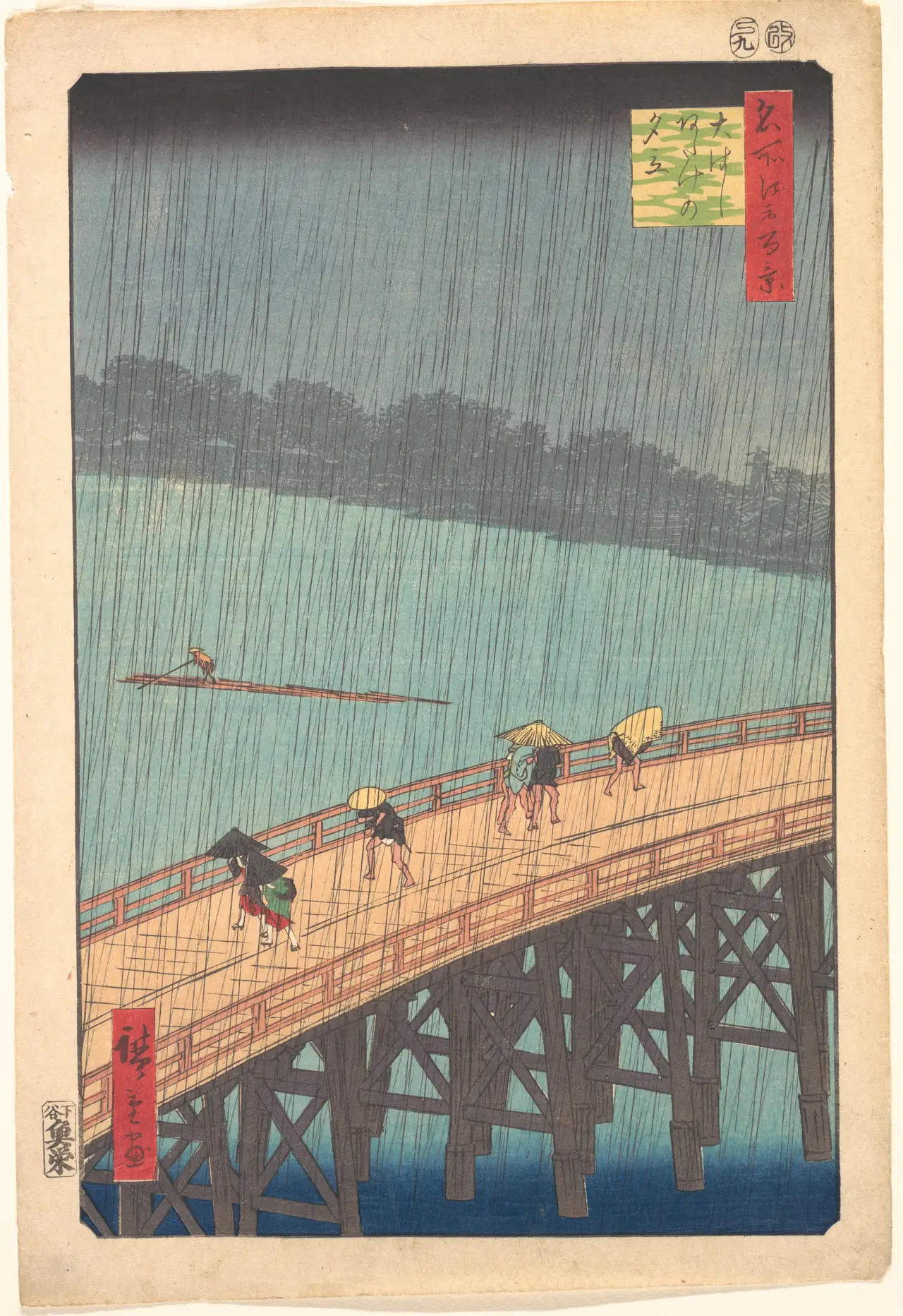
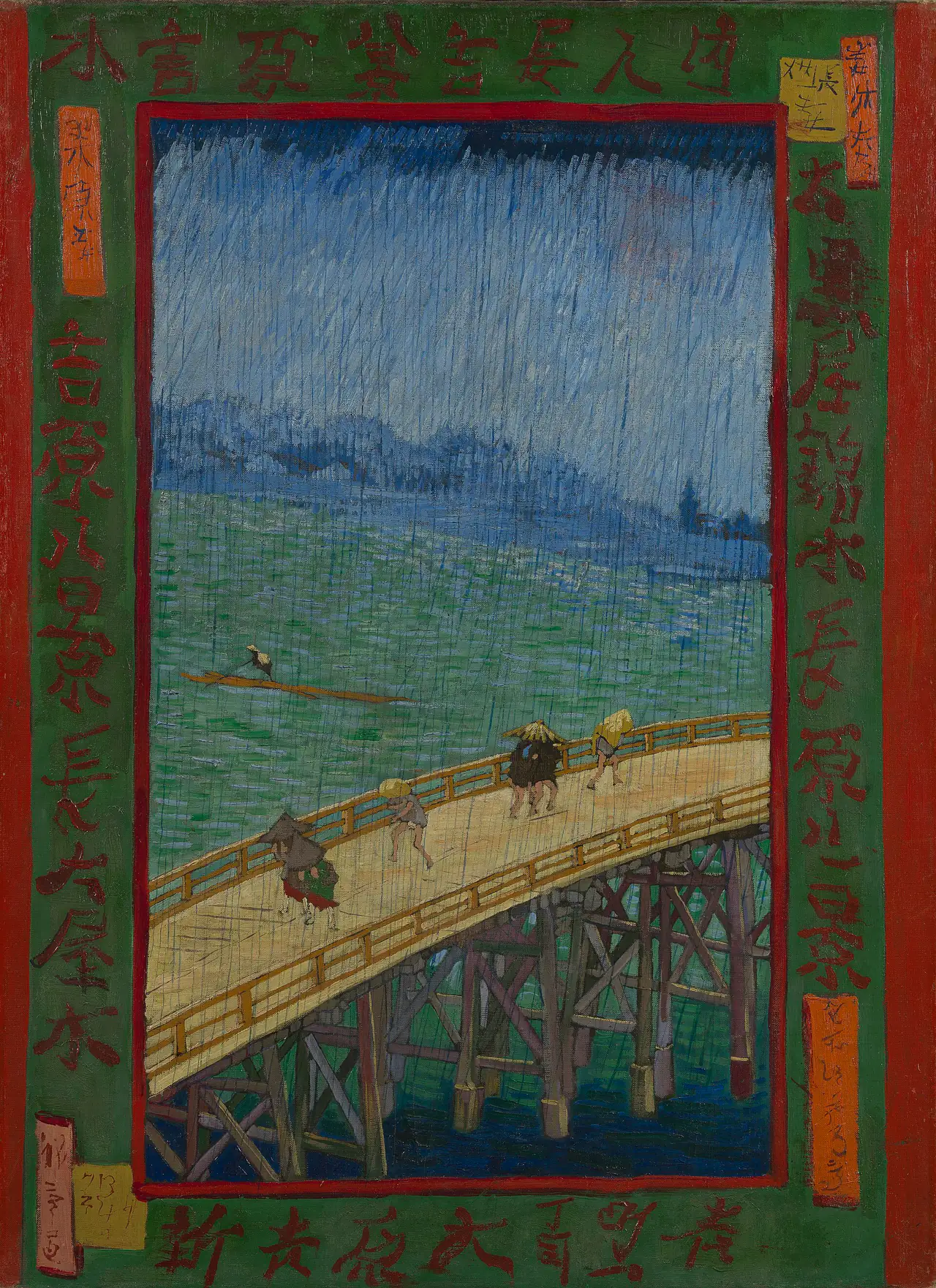

Both views put the bridge close to us, crossing the bottom of the image at an angle. The far bank is a low strip beyond the river. That leaves a large area in which the weather can happen. You do not need a dramatic figure at the centre: the figures’ smallness is part of the experience of being caught outside.
Try following the river before looking at the people. In the print, its relatively even colour lets the dark lines of rain remain distinct. In the painting, horizontal marks in the water meet the downward rain strokes. You can read the same stretch of river both as a place and as the movement of a brush.
The same storm in a different material
Hiroshige’s rain is not a soft grey veil. It is drawn as many separate lines, some crossing the bridge’s rails. The repeated marks connect sky, water and foreground. Van Gogh keeps that device but adds conspicuous strokes to the sky as well. There are now competing rhythms: rain descending, river moving sideways, bridge climbing across the view.
Look underneath the bridge, too. Its supports make a framework of triangles. Van Gogh preserves that framework while using stronger patches of violet, blue and yellow. The museum’s painting record identifies his intensified colour and explains the added border as a response to the proportions of a standard canvas.
This is not a controlled colour test of two pristine originals. Different impressions, paint ageing, photography and screens affect what we see. The more dependable comparison is structural: the bridge, shore, rain and border can be followed without pretending that a digital swatch tells us exactly what either artist saw.
Why the border matters
The green surround is painted on the canvas; it is not simply the wooden frame chosen by a later owner. Van Gogh keeps the central bridge scene inside a red outline and places large characters around it. Your eye alternates between looking through the picture and reading its outer surface as decoration.
According to the Van Gogh Museum, the characters were copied from other prints. They should not be treated as a faithful translation of the bridge print’s title. Their scale and placement make another visual rhythm around the scene, almost a second set of figures.
For that reason, cropping the border away loses part of Van Gogh’s decision. It would make the two images look more alike while concealing one of their most important differences. Here, leaving the edges visible is more informative than making the central scenes match perfectly.
The plum garden side by side
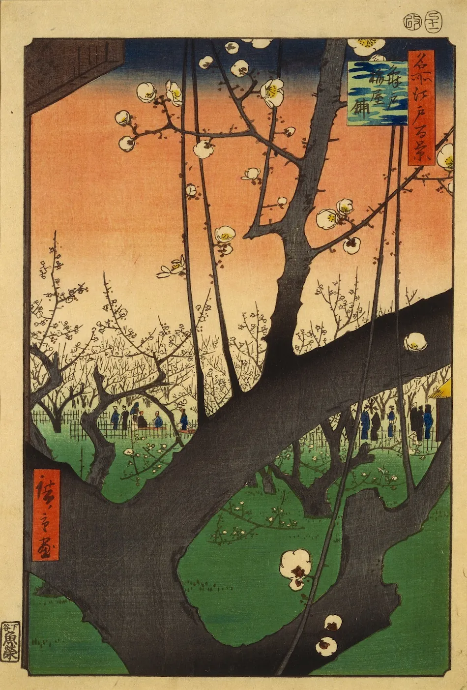
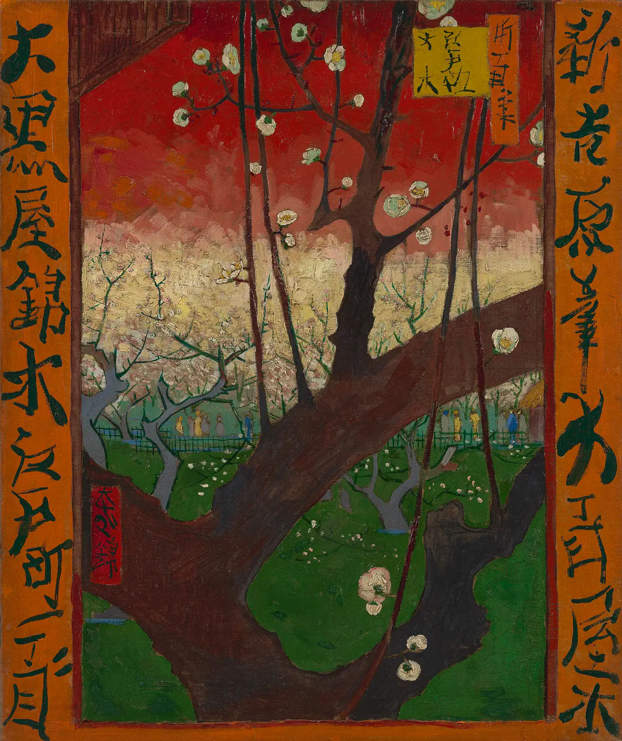

The bridge carries your eye across a scene. The plum tree interrupts your view of one. A large trunk cuts diagonally through the foreground; smaller trees and visitors appear through its openings. The Tokyo Fuji Art Museum’s record identifies this 1857 design within Hiroshige’s series of famous Edo views.
Van Gogh retains the obstruction. He does not move the tree politely to the edge or enlarge the visitors into leading characters. That is a substantial borrowing: the foreground becomes a shaped opening through which a much smaller world can be seen.
A tree that changes the distance
Follow the large branch across each image, then find the fence beyond it. The jump in scale is abrupt. There is no comfortable sequence of equally spaced trees leading you gradually into the distance. The design asks you to hold near and far in mind at once.
The painted version gives that branch red and blue tones instead of simply repeating a dark silhouette, a change noted in the museum’s account of the painting. Individual white blossoms also become conspicuous touches of paint. They sit on the surface while describing flowers in space.
At either side, orange borders pull the image outward. The museum’s interpretation on Google Arts & Culture explains that the assembled characters do not form a coherent text. Treating them as decorative borrowings is more accurate than inventing a hidden Japanese message.
Copying was a way to learn
The Van Gogh Museum’s account of Japanese influence describes his collecting in Antwerp and Paris, followed by experiments with unusual viewpoints, strong contours and expanses of colour. The prints offered practical alternatives to building every scene around gradual, centrally organised depth.
These two paintings let us watch that learning at close range. Van Gogh could keep a composition stable while changing its material, colour relationships and edges. He did not need to invent a completely new subject to test a different kind of painting.
Nor did “Japanese influence” belong to a single anonymous tradition. Here the designs are specifically Hiroshige’s. Naming him, the series and the surviving impressions keeps the exchange from becoming a vague story in which Japan merely supplies atmosphere for a European artist.
Originals does not mean one identical sheet
A woodblock design can survive in multiple historical impressions. Different sheets may have different margins, colours or wear. That is why the museum credits matter: a comparison using the Met’s JP2522 must not silently call it Van Gogh’s own print.
Likewise, the broad label “Van Gogh’s Japanese paintings” covers more than these two canvases. His Courtesan (after Eisen) is another painted response, but its named source is Keisai Eisen, not Hiroshige. The museum’s Japanese-influence account distinguishes it. Two Hiroshige comparisons do not become three simply because the paintings are discussed together.
Compare without ranking
Ask what each version makes easier to notice. Hiroshige’s fine rain lines stay legible against relatively quiet areas of colour; Van Gogh’s strokes make the weather and water feel physically worked. The plum print’s dark branch reads crisply across the garden; its painted counterpart adds colour and texture inside that same shape.
Neither observation requires declaring a winner. The rewarding question is how one design can sustain two different experiences. For another look at the Japanese prints themselves, continue with Hokusai vs Hiroshige; for the difference between an impression and a painted version, see Original vs Reproduction vs Print.
Editorial record
About this article
- Author
- Publisher
- GeMarkt
- Published
- Reviewed
- Internal source & rights check. Conducted by GeMarkt Research Review. This is an internal editorial check—not independent peer review.
- Source standard
- Art history source standardPrioritises object records and research sources, distinguishes evidence from interpretation, and states material uncertainty.
Found a claim that needs checking? Report a factual error.