GeMarkt Blog · Essay
Ukiyo-e: A Guide to Japanese Woodblock Prints
Explore ukiyo-e through eight real works: illustrated books, actors, intimate scenes, birds, landscapes and ghosts, with a guide to how prints were made.

A towering wave is one entrance into ukiyo-e, but it can give a misleading first impression of the whole field. Turn a few more pages and you find a performer adjusting a hat, a mother attending to her child, birds beside poems, and an enormous cat looming behind human figures. These pictures belonged to a culture of printed images, books and stories, not a single school of landscape painting.
The eight works below offer a way in without requiring you to recognise every signature. Start with what the picture asks you to notice. Is the subject a particular person, a place, a performance or a familiar tale? Then look at how line, colour and the shape of the sheet deliver that subject.
What ukiyo-e means and what it does not
Ukiyo-e is commonly translated as “pictures of the floating world”. It is closely associated with the urban culture of Edo-period Japan, especially Edo, the city now called Tokyo. The Library of Congress introduction traces a broad field of popular imagery, from entertainment and illustrated literature to the landscapes familiar today.
The term does not mean every Japanese woodblock print. Nor does it exclude paintings: ukiyo-e artists worked in more than one medium. Here the focus is printed sheets and books, with six artists spanning different generations. A seventeenth-century book and a nineteenth-century colour landscape need not resemble each other closely to belong in this history.
Recognisable features often include expressive outlines, patterned clothing, carefully placed areas of colour and viewpoints that bring something surprisingly close. Treat these as prompts for looking, not a checklist that can identify any Japanese image on sight.
How a print was made
An artist’s name usually receives the attention, but producing a print required several kinds of work. In the Met’s account of the process, the designer, block carver, printer and publisher contribute different skills. A drawing guided the carved block; the printer transferred ink to paper by rubbing its back. Colour printing required carefully aligned impressions from additional blocks. The publisher financed and organised the project.
Earlier prints could receive colour by hand. Multi-colour printing developed further, with the elaborate nishiki-e, or brocade prints, emerging in the eighteenth century. A bold outline therefore does not tell you whether the colours were painted or printed: check the particular object record.
It also helps to separate a design from an impression. The same design can survive in multiple printed examples. The museum and accession number beneath each image identify the example shown here, rather than an imaginary single, definitive copy.
When browsing a museum catalogue, keep that object number with your notes. Two pages with similar titles might show different impressions, different sheets from a larger composition, or different openings of a book. Before comparing colour or deciding that a detail has disappeared, check that you are comparing the same part of the same design. The visible sheet edges and book folds can be useful evidence rather than distractions to remove.
Moronobu: a world between book covers
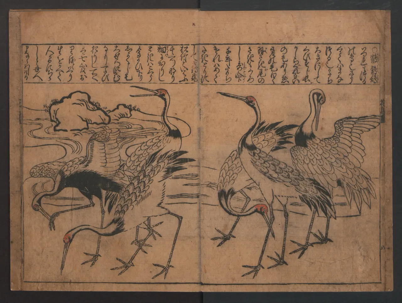
Moronobu’s cranes occupy a book, not a standalone poster. Their bodies turn in different directions, while their long necks carry the eye across the central fold. Writing remains part of the page rather than something outside the picture.
This is a useful corrective to thinking of ukiyo-e solely as framed sheets. A book offers a sequence; a reader turns pages and encounters new combinations. Here, the repeated birds let you compare posture and line within one opening. The dark printed contours do much of the descriptive work, with small touches of colour drawing attention to the heads.
Kiyonobu: a performer made of bold lines
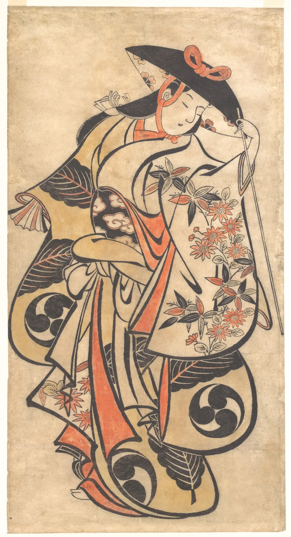
The actor’s costume seems to take up almost the entire sheet. Heavy curves sweep around the body, while the tilted hat makes the small face an unusually delicate centre of attention. You can follow the pose even before deciphering the clothing.
The Met relates this bold drawing to the Torii artists’ work for the theatre and identifies the colour as hand-applied. That matters: this is not the same printing arrangement as a later many-coloured landscape. Notice the attribution too. “Attributed to” preserves a degree of uncertainty; removing those words would make the museum’s identification sound firmer than it is.
Utamaro: intimacy and the illustrated page
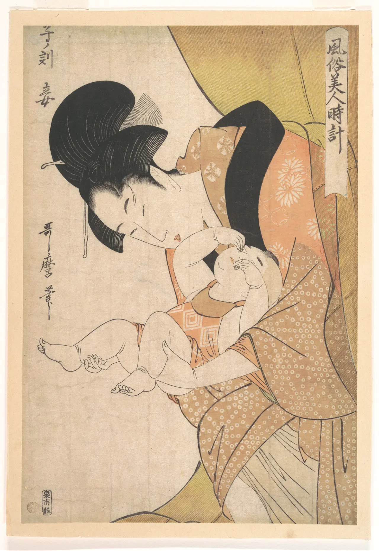
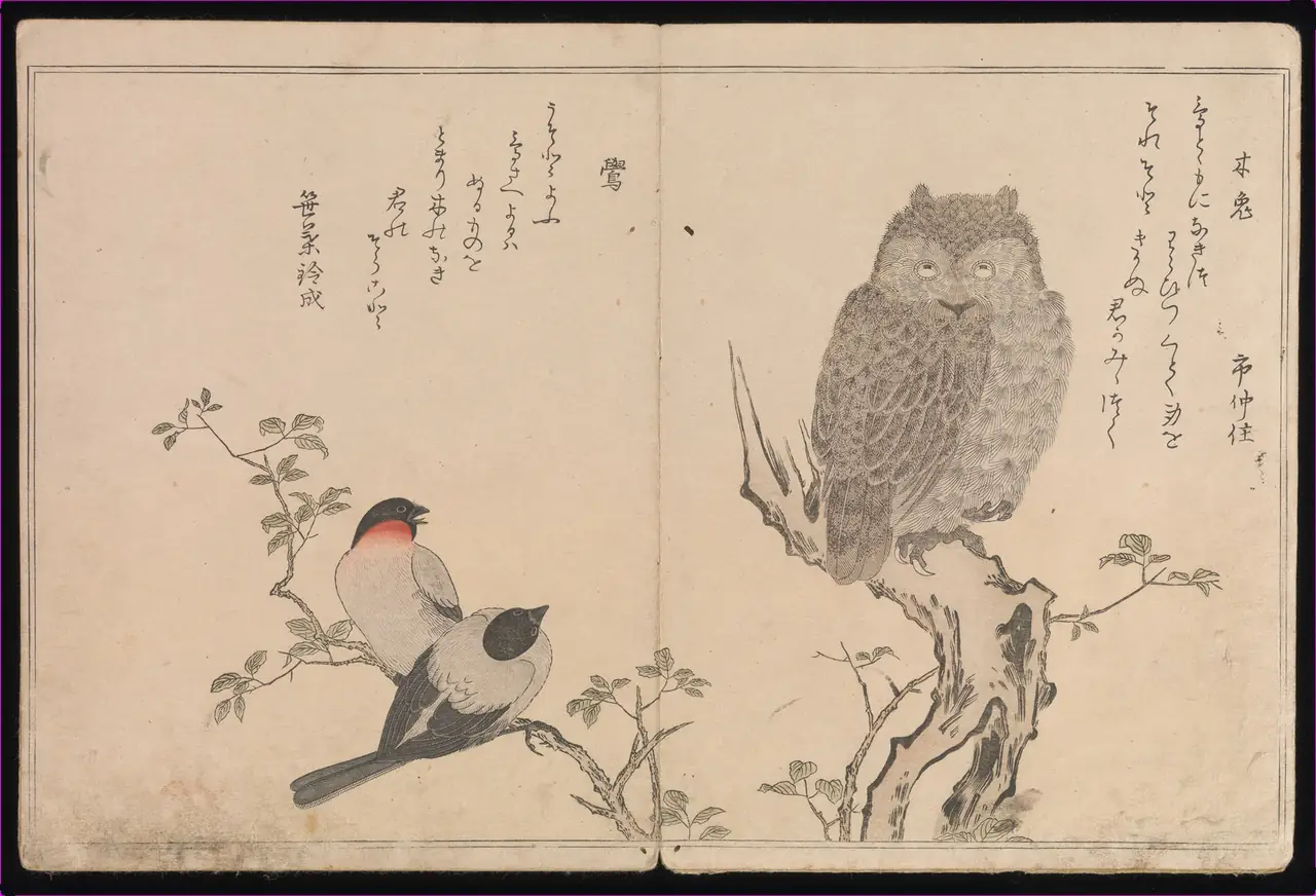
Two works from the same year show why assigning an artist a single subject is limiting. In Hour of the Rat, the mother’s bent head and the child’s lifted limbs make a compact, irregular shape. The mosquito net and clothing fill the surrounding space without breaking that intimate focus. The Met identifies an episode of night-time care, not a formal portrait.
In Myriad Birds, blank paper gives the owl and the smaller birds room to remain separate. The publication brings birds together with playful poetry; this opening is one part of a book, not its cover. The finely described feathers invite a different pace from the sweeping outlines of Kiyonobu’s actor. Both are printed images, but their pleasures are quite different.
Hokusai and Hiroshige: landscape as an event
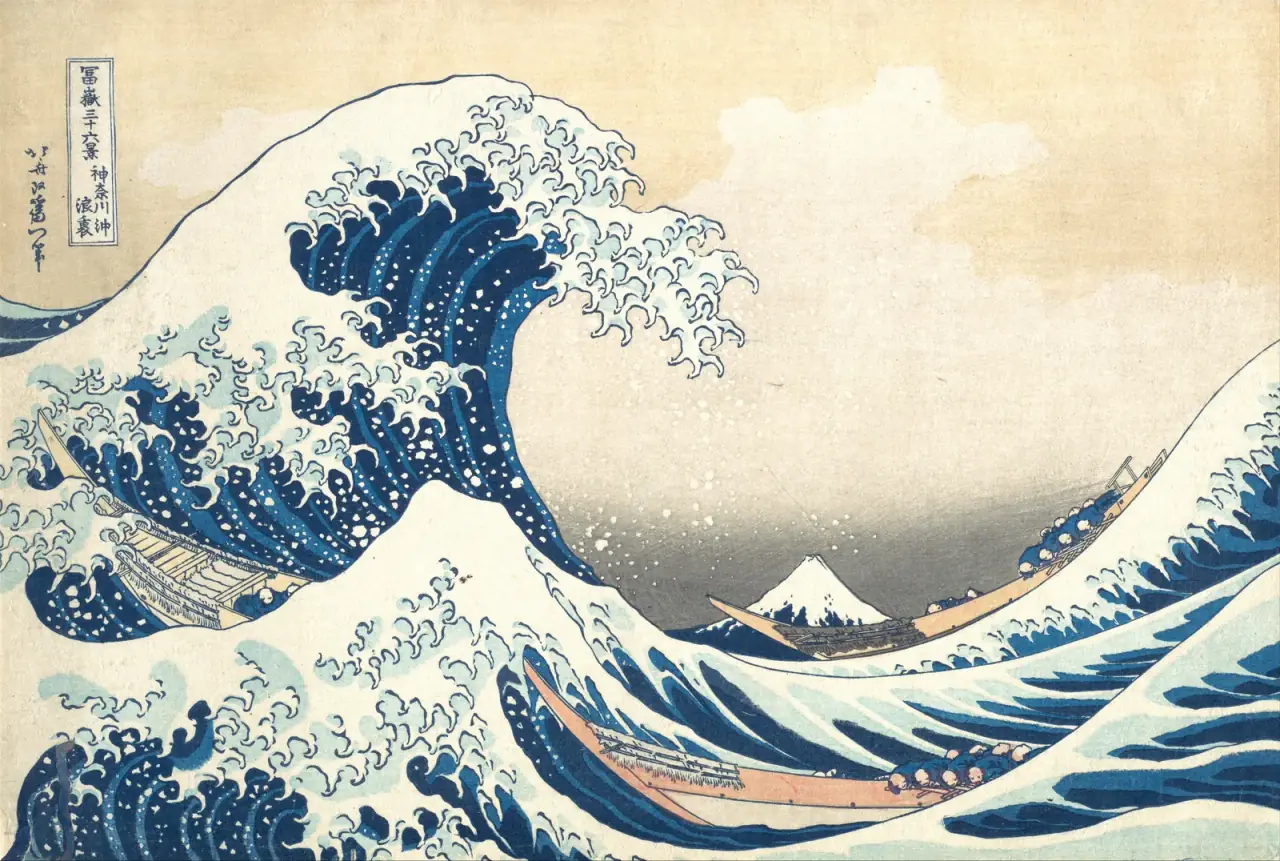
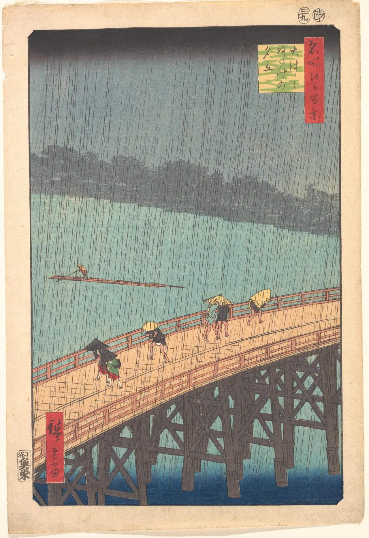
The human figures in these landscapes are small but essential. Remove Hokusai’s boats and you lose a powerful measure of the wave’s scale. Remove Hiroshige’s hurrying pedestrians and the shower becomes less immediately bodily: their covered heads and bent poses tell you how it feels to be there.
The two designs also belong to series: Hokusai’s Thirty-six Views of Mount Fuji and Hiroshige’s One Hundred Famous Views of Edo. The series title changes the question. A wave becomes one way of looking towards Fuji; a wet bridge becomes one way of experiencing a city. These are composed views, not neutral records of everything a visitor would see.
Kuniyoshi and Hokusai: the supernatural comes close
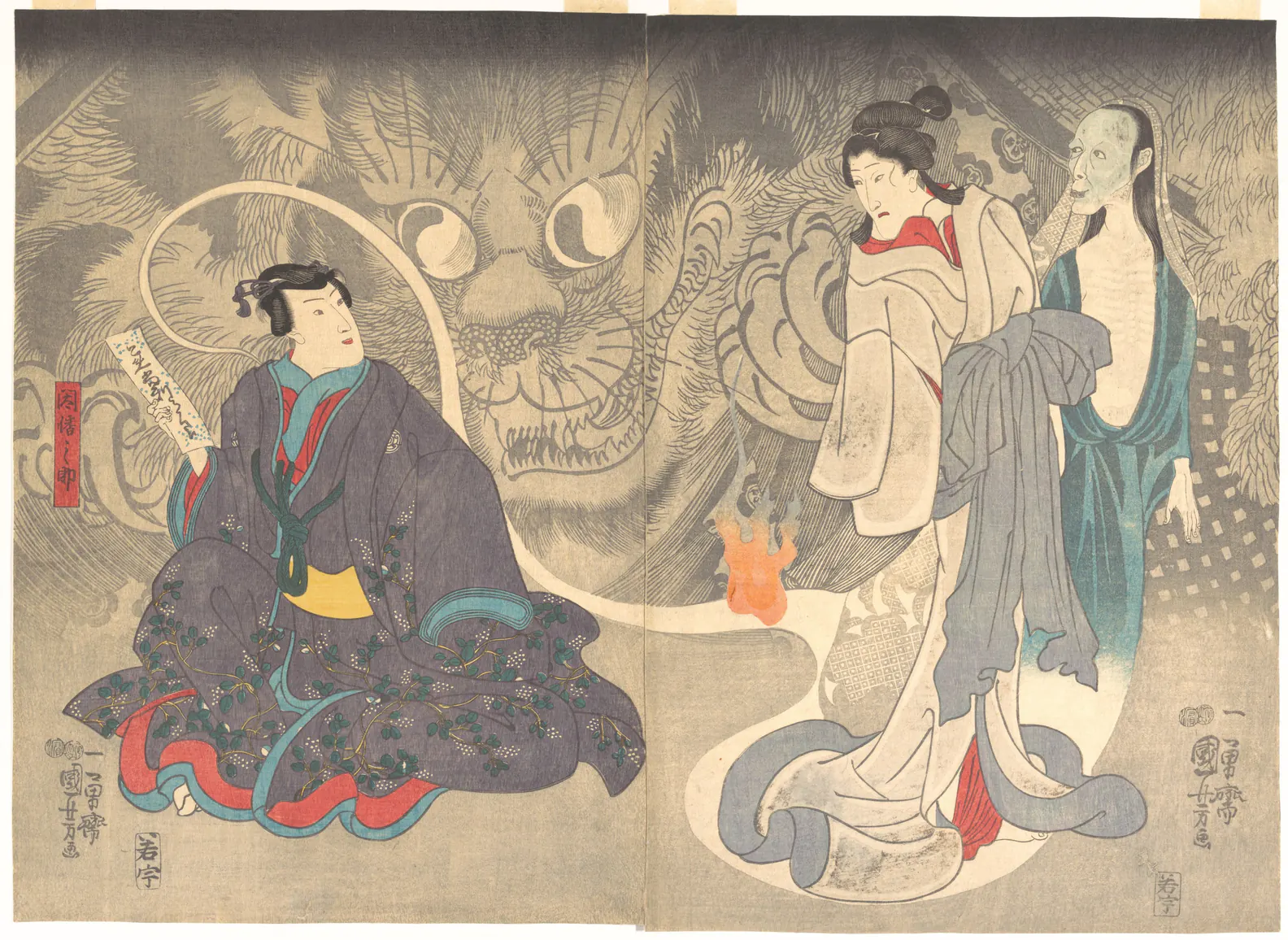
Kuniyoshi gives a monstrous face the space usually occupied by scenery. Its eyes loom behind the much smaller figures; the join between two sheets becomes part of a broad theatrical presentation. The picture makes you look twice at what is background and what is a living presence.
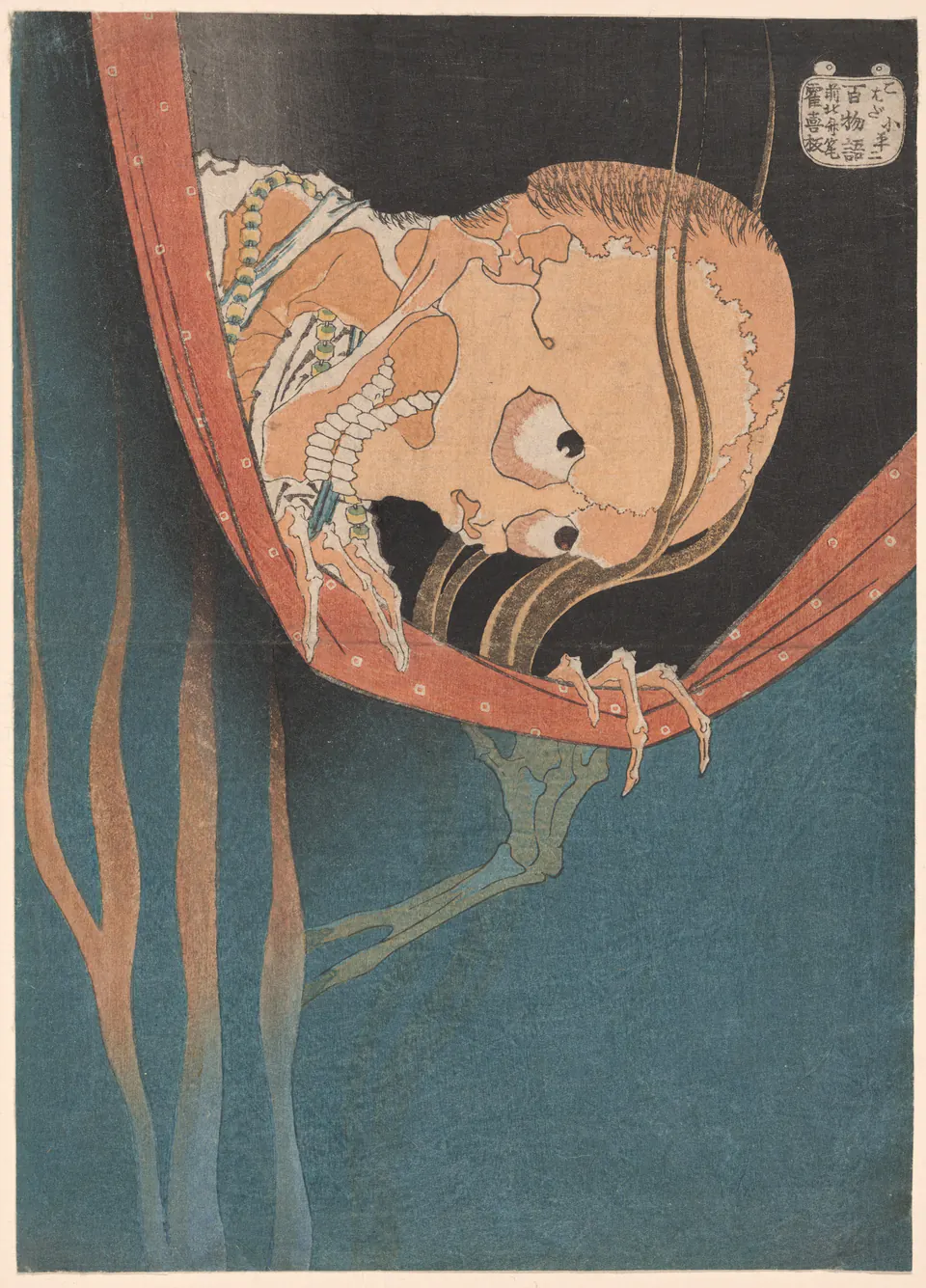
Hokusai works in the opposite direction, bringing one dreadful face close to the edge of a net. The Art Institute’s record connects the ghost to a revenge story about an actor murdered by his wife’s lover. The image does not narrate every event: its grip, stare and concealment carry the immediate shock. Ukiyo-e could invite recognition of a story as readily as recognition of a landmark.
How to look at an unfamiliar print
First check the format: a book opening, a single sheet and a multi-sheet composition organise attention differently. Next follow the largest lines before trying to interpret every detail. Finally read the catalogue title, series and date, then return to the image. The words may explain a subject you could not identify visually, but they should not replace looking.
Avoid treating every empty area as “minimalism”, every woman as a courtesan or every old-looking Japanese print as ukiyo-e. Ask a narrower question: what does this particular composition emphasise, and what does its museum record actually establish?
Six artists and where to go next
Moronobu, the artist attributed as Kiyonobu, Utamaro, Hokusai, Hiroshige and Kuniyoshi offer six starting points rather than a complete canon. Continue with our artist guides to Hokusai, Hiroshige and Kuniyoshi, or follow the more focused bird-and-flower print guide.
For screen downloads, the existing Hokusai and Hiroshige wallpaper collections offer a separate selection, not all the works illustrated here. If you are considering a purchase, our woodblock-print buyer’s guide distinguishes historical impressions from modern reproductions.
Editorial record
About this article
- Author
- Publisher
- GeMarkt
- Published
- Reviewed
- Internal source & rights check. Conducted by GeMarkt Research Review. This is an internal editorial check—not independent peer review.
- Source standard
- Art history source standardPrioritises object records and research sources, distinguishes evidence from interpretation, and states material uncertainty.
Found a claim that needs checking? Report a factual error.