GeMarkt Blog · Essay
Kachō-e: Japanese Bird and Flower Prints, from Hiroshige to Koson
Look closely at eight Japanese nature prints and book illustrations, from Moronobu and Utamaro to Hokusai, Hiroshige and Koson’s birds in rain.

A crow curls over a persimmon. Its body makes a dark arch; its beak, claw and orange fruit draw your attention into one small encounter. There is no panoramic landscape to explore. The branch and the largely unprinted space give this ordinary action the whole picture.
That is one pleasure of Japanese bird-and-flower pictures: a slight movement can become the main event. Yet these images are not all quiet, and they are not all solitary birds on pale paper. The eight examples here include a crowded book opening, wind-tossed flowers, swimming birds, a tropical macaw and a decidedly unscientific dancing fox. Five artists show how much can happen within a seemingly modest subject.
What kachō-e means
Kachō-e means bird-and-flower pictures. It names a subject tradition rather than a single artist group, period or printing style. Its wider nature imagery can include insects, fish and mammals as well as birds and plants. The Cleveland Museum of Art’s account of Koson places his prints within that broader tradition.
The term also does not mean that every picture must contain both a bird and a flower. Hokusai’s poppies can occupy the page without a bird; Hiroshige’s swimming birds need water more than blossom. Look for the attention given to a living thing, its setting and the relationship between them.
These are designed pictures, not substitutes for identification guides. Accurate-looking feathers may sit beside a poetic inscription, an expressive gesture or a carefully staged branch. The book, print format and particular impression matter as much as the species depicted.
Moronobu: cranes across an open book
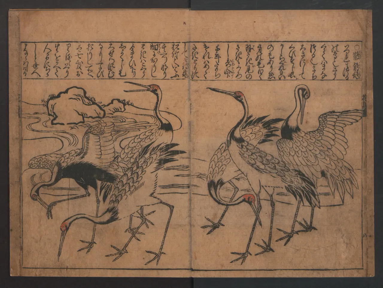
Moronobu’s cranes make the book’s width useful. Necks rise, bend and turn across the two pages, while dark feathers punctuate the lighter bodies. The vertical writing occupies another part of the same space rather than sitting outside the image as a modern caption would.
The Met dates this woodblock-printed book to the fifth month of 1683. Remembering the object’s format changes how we look: the central gutter is not an unfortunate interruption of a poster. It belongs to an image encountered while turning pages. Follow one neck before moving to the next, and the opening becomes a sequence of postures rather than a diagram of one ideal crane.
Utamaro: birds with voices
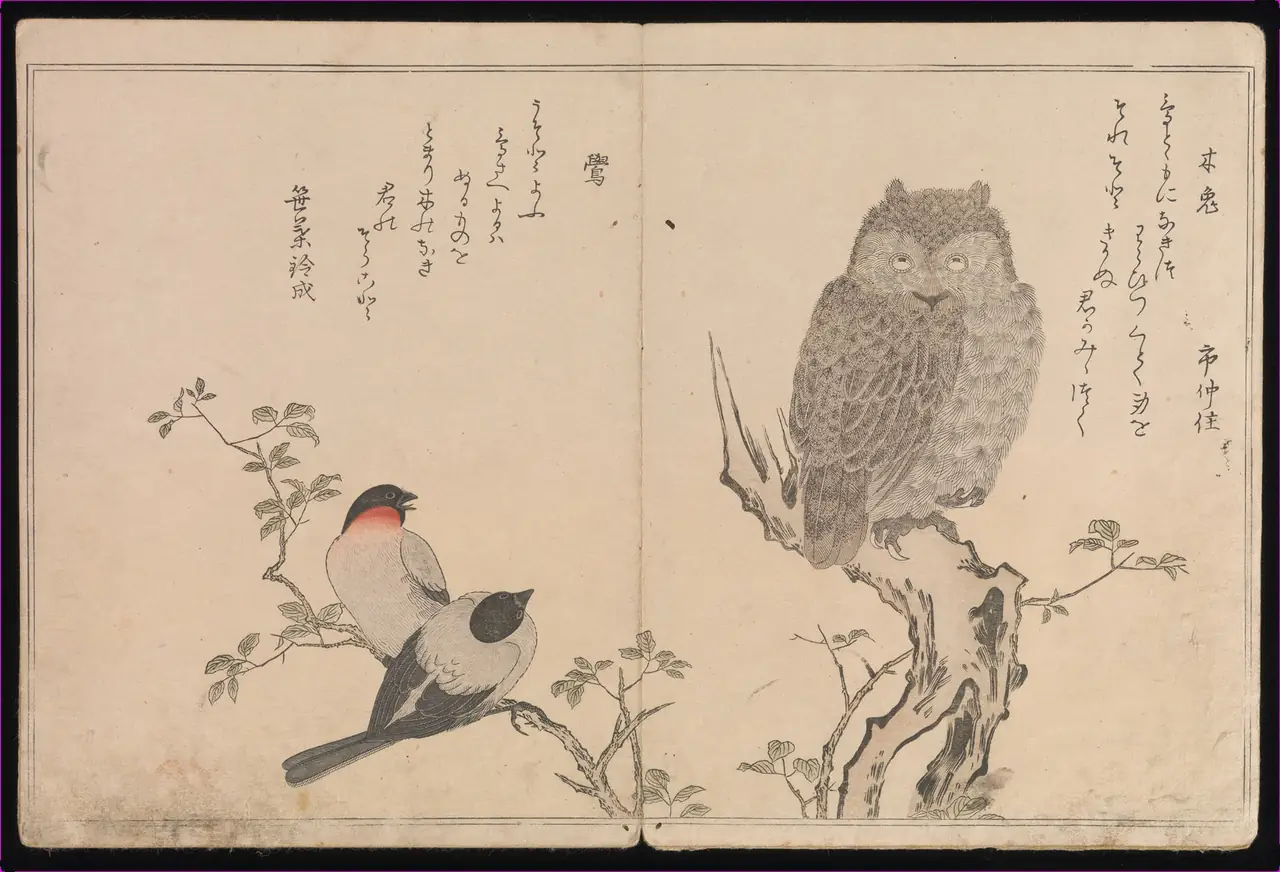
Utamaro puts a round, forward-facing owl opposite two smaller birds. The differences are tangible: the owl’s layered feathers seem almost woolly beside the smoother wings on the other page. Thin branches and generous gaps keep the birds from becoming one decorative mass.
The book also gives birds imagined voices. According to the Met’s record, its double-page illustrations accompany playful love poems spoken in the voices of different species. Natural observation and human invention coexist here. Without reading the poems, we can still compare poses and textures; understanding the book’s literary purpose tells us why treating it only as a bird catalogue would miss half the encounter.
Hokusai: Poppies in the Wind
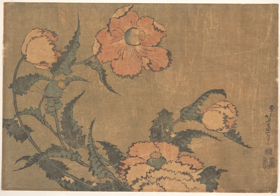
The bowed stems make the wind visible without a drawn gust. Some flower heads turn away, while a large bloom faces us near the top. Their irregular edges keep the arrangement from looking like a set of identical ornaments.
Notice how much open space remains to the right. Hokusai does not need to fill it with a garden or horizon; the bending plants already suggest forces beyond the picture. This particular museum impression has subdued colour and visible paper texture. It is the object reproduced here, not a claim that every impression of the design originally looked exactly this way.
Hiroshige: Oystercatchers
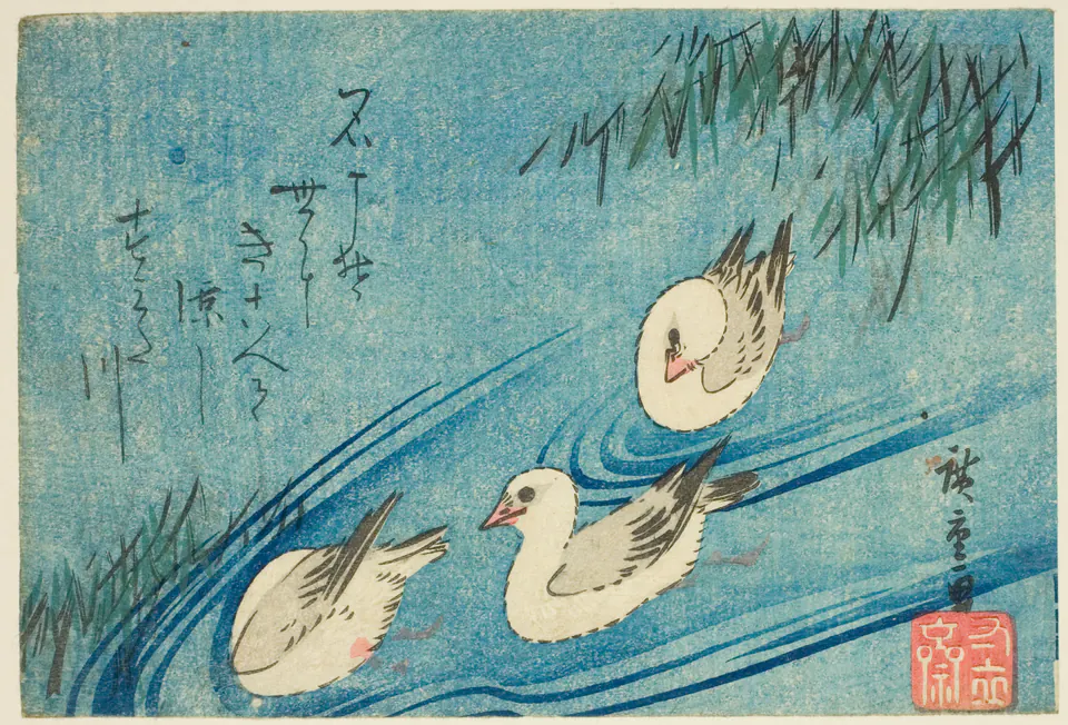
Chicago catalogues this compact print as Oystercatchers. Its birds turn in different directions, but the sweeping blue lines bind them into a shared stretch of water. Reeds enter from the corners; the writing leaves the swimming group room to move.
Compare those wakes with the curved stems in Hokusai’s flowers. Both artists make an unseen or fleeting force legible through line. Here the water is not a uniformly blue background. Its changing marks describe disturbance, direction and the interval between one bird and another. The small format concentrates the event rather than making it less ambitious.
Hiroshige: Macaw on a Pine Branch
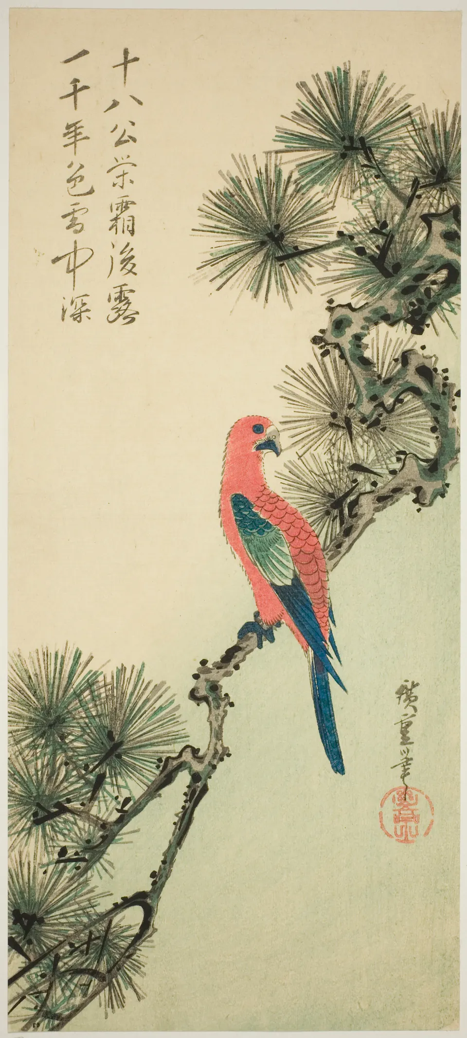
This tall design asks for a different kind of looking. The pine runs diagonally, while the macaw’s long tail drops through the picture. Its red body and blue feathers stand out against restrained greens and pale paper.
The bird is neither centred in an empty rectangle nor buried in foliage. The branch supports it physically and organises the composition. Cover the top of the image and the whole balance changes: the lettering and pine needles above are part of what makes the lower bird feel suspended. A nature print can be as much about proportion as detailed description.
Koson: Crow with a Persimmon
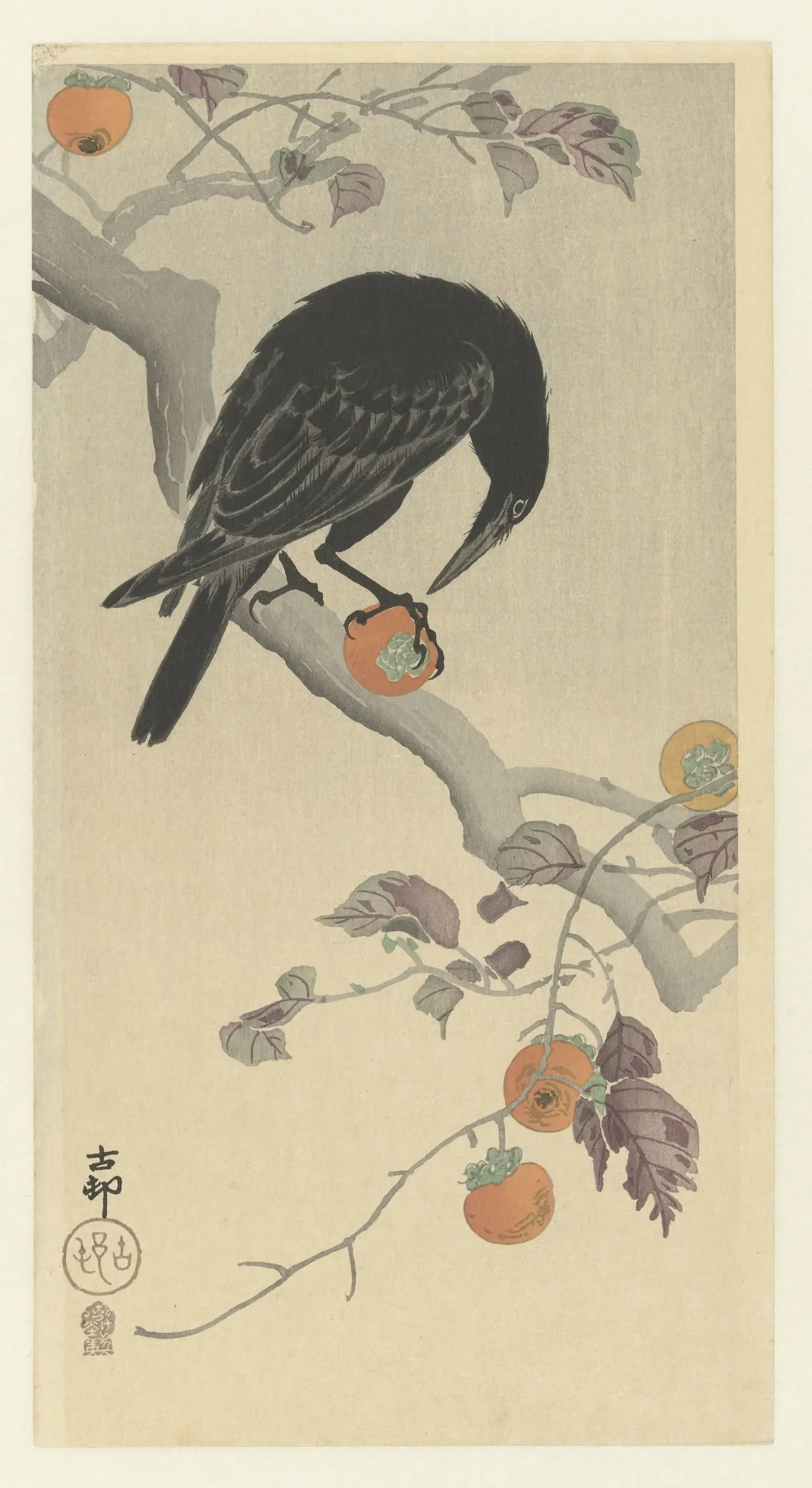
Koson’s crow is more than a dark silhouette. Pale marks separate feathers across its wing, while the eye and beak guide us towards the fruit. The claw makes the contact unusually specific: this is a bird doing something, not simply decorating a branch.
The Rijksmuseum dates the print to 1900–1910 and names Akiyama Buemon as publisher. Those details place this sheet in a production history, rather than treating “Koson” as a timeless style. In the picture itself, muted branches lead down towards more persimmons, repeating the orange without competing with the crow’s concentrated action.
Koson: Songbirds in Rain
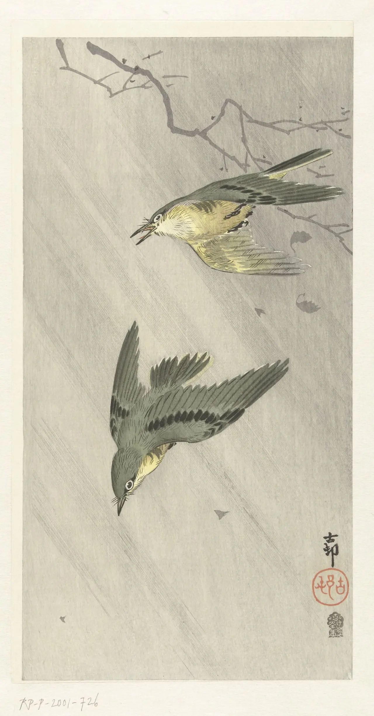
The birds do not share an identical pose. One spreads its wing while the other tilts more steeply downwards. Fine diagonal rain fills the air between them, making the blank-looking space active.
Set this beside the crow. Both are tall Koson prints, but one gathers attention around a firm contact point and the other stretches it between moving bodies. “Calm Japanese nature print” is too blunt a description for both. The rain introduces exposure and effort; the small flying shapes have to negotiate an environment rather than simply inhabit a decorative background.
Koson: Dancing Fox at the genre’s edge
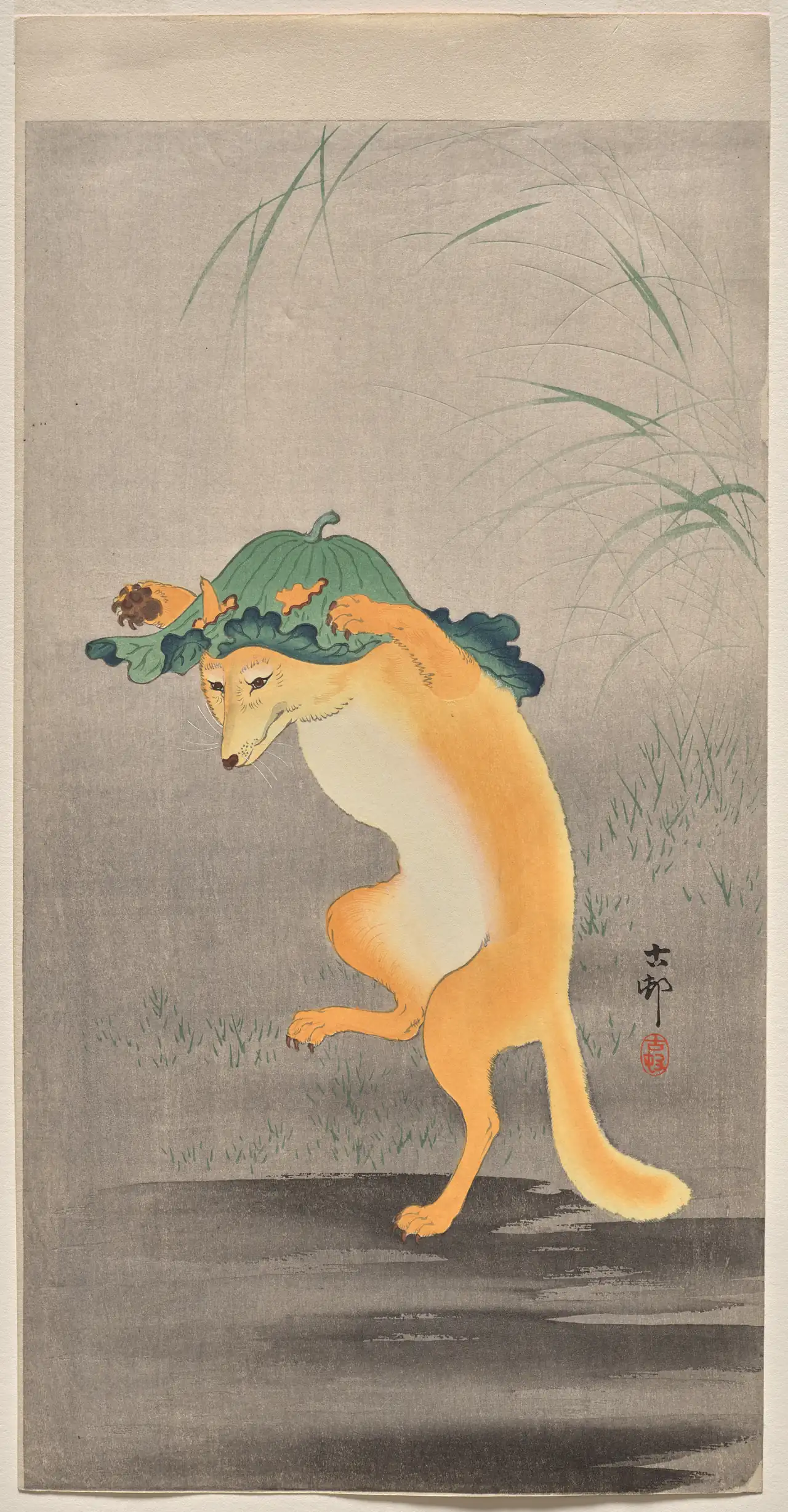
A fox is not a bird, and this is not presented as a literal bird-and-flower scene. It shows the wider nature imagery surrounding Koson’s work. The raised leg, upright body and leaf held over its head introduce humour rather than zoological neutrality.
Cleveland identifies this as the edition with grasses. Their fine arcs help soften the large empty area above the fox, while the darker ground anchors its remaining foot. The distinction matters: a different edition can alter the setting of an apparently familiar design. Subject, composition and printed version need to be looked at together.
What to look for next
Start with three questions: what is moving, what makes that movement visible, and what has the artist left out? Then check whether you are looking at a book opening, a compact sheet or an unusually narrow format. These choices explain more than the generic label “Japanese bird print”.
Our artist guides introduce Hokusai, Hiroshige and Koson. The existing Koson collection is a separate place to browse reproductions; this selection of museum examples does not imply that every illustrated work is stocked there. For further looking, return to the two book openings and notice how their words share the page with living things. The tradition has room for reading, observation and invention at once.
Editorial record
About this article
- Author
- Publisher
- GeMarkt
- Published
- Reviewed
- Internal source & rights check. Conducted by GeMarkt Research Review. This is an internal editorial check—not independent peer review.
- Source standard
- Art history source standardPrioritises object records and research sources, distinguishes evidence from interpretation, and states material uncertainty.
Found a claim that needs checking? Report a factual error.