GeMarkt Blog · Essay
Pointillism: Seurat, Signac and the Science of Colour
Eight works explain Pointillism and Divisionism, from Seurat’s measured parks to Cross’s open watercolours—and why the movement was more than dots.


From a distance, Seurat’s park is full of people, trees and long afternoon shadows. Move closer and the apparently continuous grass breaks into small coloured marks. That change between looking at a scene and looking at its construction is one of Pointillism’s pleasures.
The dots are easy to recognise. The larger ambition is more interesting: could artists organise colour deliberately enough to make a painting seem luminous without smoothly blending all its pigments? Seurat and Signac pursued that question in different ways. Their circle also made watercolours, drawings and prints that resist the familiar dotted stereotype.
These eight works follow the idea across five artists. Seven examine colour and separated marks; a final monochrome etching shows why membership of the circle should not be confused with a single technique.
Three names that do different jobs
Pointillism describes painting with small, dot-like touches. Divisionism describes separating colour into neighbouring marks; those marks need not be round. Neo-Impressionism names the broader movement associated with Seurat, Signac and their circle. The critic Félix Fénéon introduced that movement label in 1886. These distinctions are outlined in the Met’s history of Neo-Impressionism.
The artists drew on nineteenth-century writings about colour and perception, including Chevreul, Rood and Charles Henry. They hoped that separate touches would produce a more vibrant effect in the viewer’s eye. That is a historical ambition, not a promise that every arrangement of dots produces the same result—or proof that every theory they adopted was scientifically correct.
A useful first distinction is between recognising a mark and understanding what it does. Does it make a shadow restless, hold a figure still, or lead your eye across water? A dotted surface alone cannot answer those questions. The spacing, surrounding colours and organisation of the whole picture matter too.
Seurat: A Sunday on La Grande Jatte
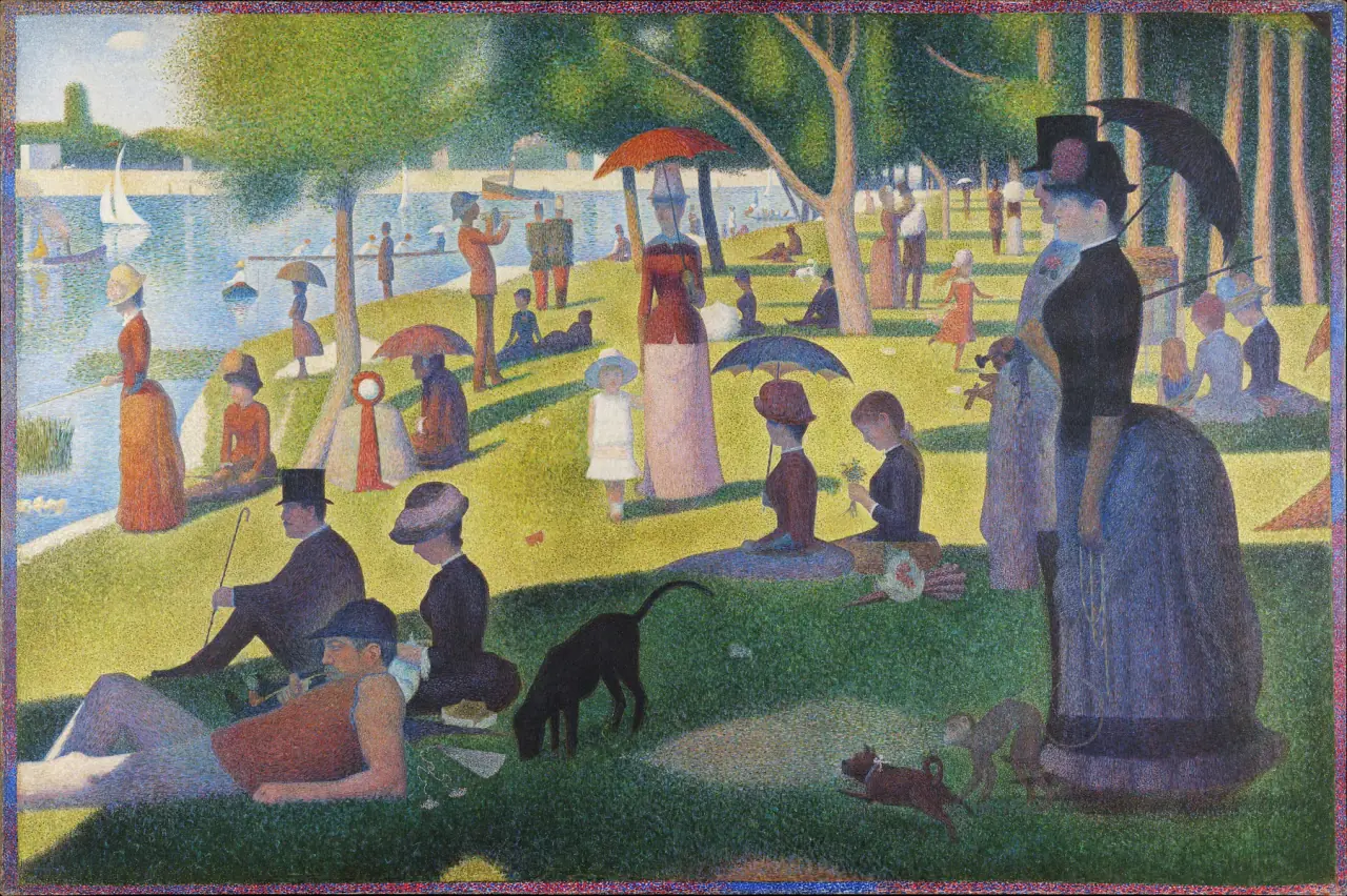
Start with the large shapes rather than the surface. The standing couple on the right, the reclining people below, the tree trunks and the parasols establish a slow rhythm. So much is happening, yet the scene feels unusually held in place. The small marks do not produce a casual composition.
The Art Institute’s record dates the main painting to 1884–86 and the painted border to 1888–89. Even the edge belongs to the colour construction. It is not simply an ornamental frame added by the photographer.
Try following the boundary between sunlight and shade across the lawn. It connects people who face different directions and scarcely seem to acknowledge one another. The painting’s discipline is as much about these intervals and relationships as about dots. At small screen size you can read the arrangement; a closer view offers a different, more granular experience.
Seurat: the study before the monument
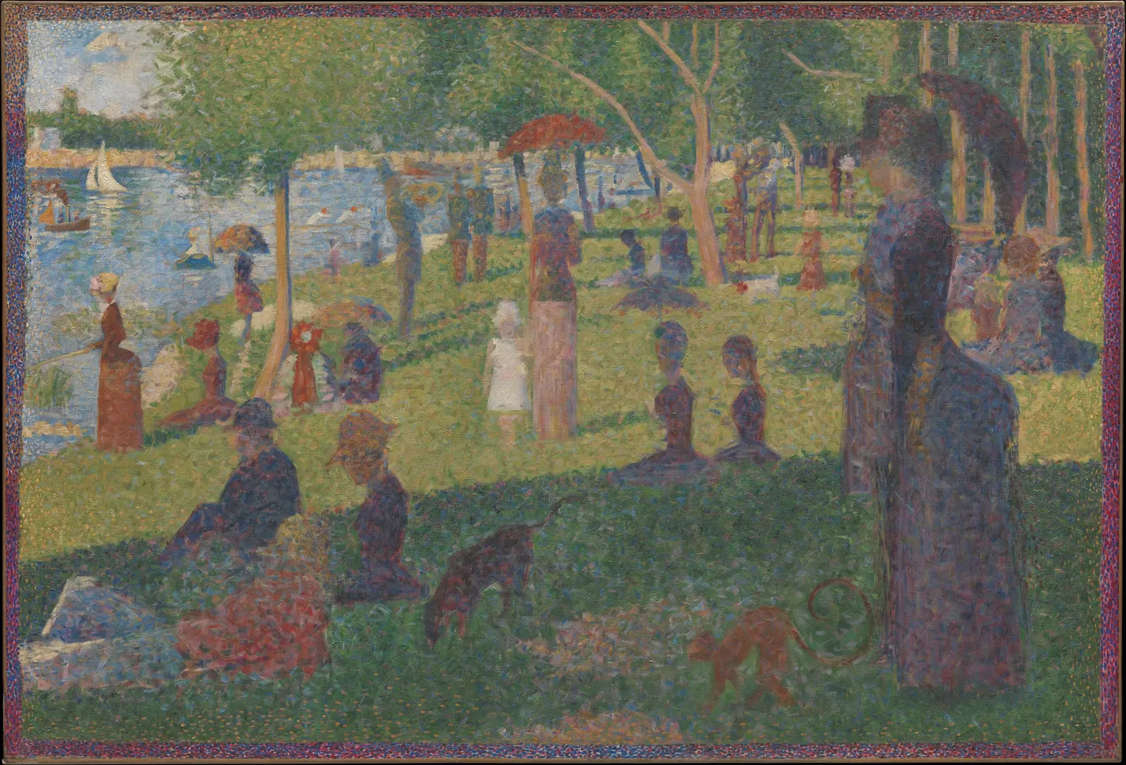
This is a separate preparatory canvas, not a blurred reproduction of the finished painting. The Met identifies it as Seurat’s final study. Its patchier, often diagonal strokes make a productive comparison with the more controlled surface of the large picture.
Look at the trees and the skirts. Their edges seem to gather from overlapping touches rather than arrive as fully closed silhouettes. The scene has not abandoned order, but the act of assembling it remains unusually visible. That makes the study a useful antidote to the idea that Seurat began with a ready-made formula and merely filled every area with dots.
Seeing both works together also changes the meaning of “finished.” A lively study and a monumental exhibition painting solve different problems. The study is not valuable only because it leads to the more famous object.
Seurat: Circus Sideshow
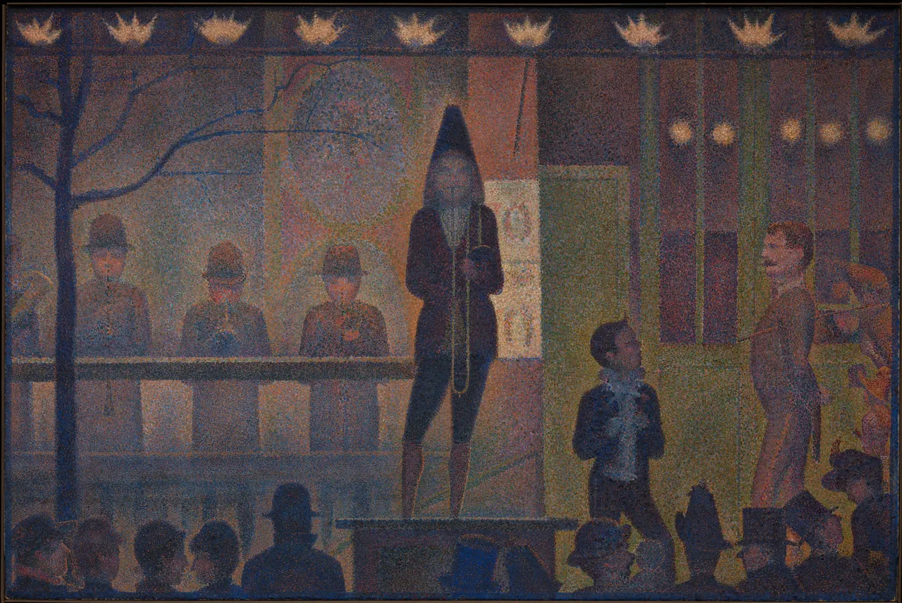
Not every Pointillist picture promises a sunny afternoon. Here a line of lights hangs above performers while spectators form a dark, uneven band at the bottom. The central musician is sharply outlined, but the surrounding colour makes the air feel dense.
The Met identifies the subject as the free outdoor sideshow used to attract customers to the Circus Corvi, rather than the performance inside its tent. That distinction helps explain why performers face outward as if addressing a passing public.
Compare the many small colour changes with the strong horizontal rails and upright bodies. Tiny variations coexist with a rigid stage-like structure. The effect is not simply “bright colours blending”; dark restraint is doing much of the work. A method associated with sunshine can also make artificial light seem strange.
Signac: Chromatic Circle
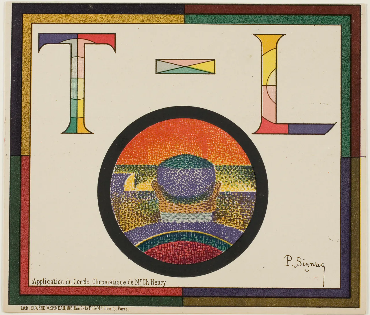
This lithograph brings theoretical language directly onto the sheet. Its inscription refers to Charles Henry’s chromatic circle, but the design does not look like a neutral laboratory chart. Oversized letters, a circular image and a multicoloured border compete for attention.
Within the circle, tiny touches make the figure and background; outside it, broad strips offer a quite different kind of colour encounter. The eye moves between a represented scene and a decorative arrangement.
It is useful evidence of an artist making colour theory public and visually engaging. It is not, by itself, an experiment proving the theory. Keep those two kinds of evidence separate: a historical print can show what an artist wanted to explore without settling how human vision works.
Signac: The Port of St. Tropez II
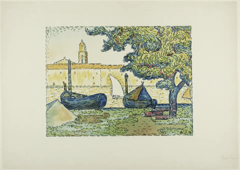
The title matters: this is the colour lithograph catalogued as II, not one of Signac’s similarly named harbour paintings. It carries the exploration of separated colour into a different medium.
Follow the tree canopy. Its curling marks are not tidy points; they form looping clusters. The boats below are heavier and darker, while the distant waterfront remains pale. A limited arrangement of coloured inks creates those differences without imitating the surface of an oil painting.
Seen after Chromatic Circle, the print makes Signac look less like a keeper of a rigid rulebook. Repetition can be flexible. In one part it describes foliage, in another water, while blank paper helps keep the small scene open.
Pissarro: Two Women in a Garden
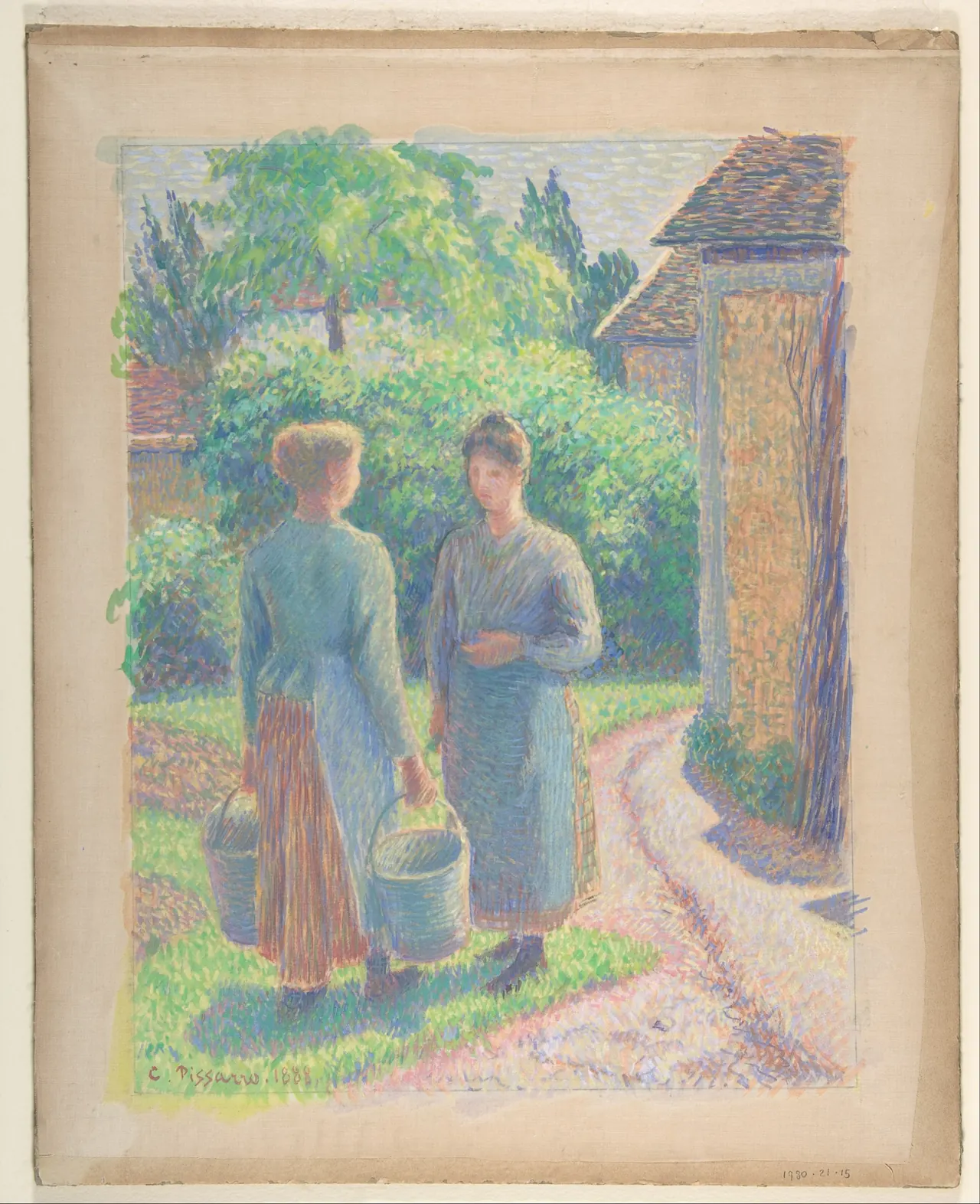
Pissarro’s figures are close enough to suggest a pause in conversation. The buckets, path and doorway place them in an ordinary working environment. Their bodies remain legible while short strokes animate nearly everything around them.
Notice how the touch changes direction: it crosses the path, follows clothing and accumulates in foliage. Describing all of it as dots would hide the differences. The support is silk, not canvas, and the surviving mount remains visible in this image.
Pissarro participated in the Neo-Impressionist circle but did not remain committed to its system indefinitely, as the Met’s exhibition account explains. One work belongs to a particular experiment within a long career; it should not turn its maker into a single permanent category.
Cross: The Artist’s Garden at Saint-Clair
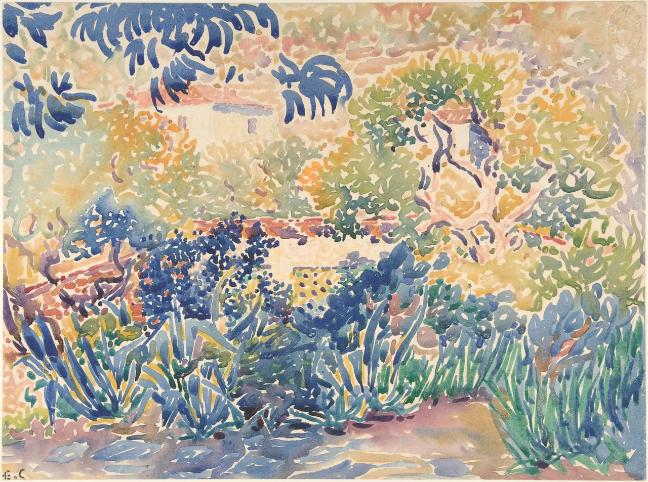
Cross gives the marks room to breathe. Dark blue leaves stretch across the upper left; paler colours and untouched-looking intervals open the middle distance. The page feels full without every space being filled.
The Met describes his later handling as larger and more mosaic-like. Here you can see why “Divisionism” is often more useful than “Pointillism.” Separate patches remain important, but insisting on uniform dots would misdescribe the image.
Compare it with Seurat’s night scene. One feels compressed and enclosed; the other expansive and porous. Shared interest in colour relationships did not require a shared atmosphere. Cross also makes the paper participate: the light spaces between strokes are not merely missing paint waiting to be completed.
Luce: an etching from the wider circle, not a Pointillist painting
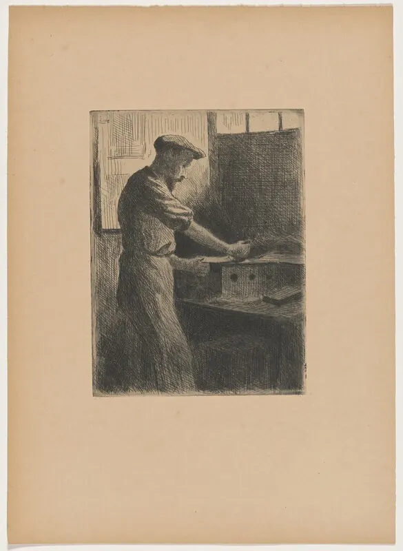
Luce belonged to Signac’s wider circle, but this print works through lines and tonal density rather than divided colour. It earns its place here precisely because it prevents a misleading conclusion: artists associated with Neo-Impressionism did not make every object in the same way.
Light catches the worker’s sleeve and the edge of the bench. Dense hatching makes the room beyond feel darker. This is an image of concentrated labour, with a modest, intimate scale rather than the public stillness of La Grande Jatte.
The NGA record identifies this particular impression as blue-black on wove paper. Other impressions need their own descriptions. A movement label does not replace attention to the physical object in front of us.
How to look beyond the dots
Begin with the whole composition, then examine a shadow, an edge and a patch of open background. Ask how the marks change between them. Finally return to the whole: has the scene become calmer, stranger or more energetic now that you can see how it is built?
Continue with our guides to Seurat, Signac and Pissarro, or the narrower Pointillism versus Impressionism comparison. The Seurat collection is a separate browsing route, not a claim that all eight illustrated works are available as products.
The lasting lesson is not that a dot guarantees luminosity. It is that the smallest mark can participate in the largest decision: how a picture holds together, and how long it rewards looking.
Editorial record
About this article
- Author
- Publisher
- GeMarkt
- Published
- Reviewed
- Internal source & rights check. Conducted by GeMarkt Research Review. This is an internal editorial check—not independent peer review.
- Source standard
- Art history source standardPrioritises object records and research sources, distinguishes evidence from interpretation, and states material uncertainty.
Found a claim that needs checking? Report a factual error.