GeMarkt Blog · Essay
Art Nouveau: Mucha, Morris and the Curving Line
Explore Art Nouveau through eight real designs and visual sources: Morris textiles, Mucha’s posters, Gallé’s furniture, Tiffany glass and Haeckel’s marine forms.

A lock of hair becomes a ribbon. A cabinet edge bends like a stem. A glass vase seems halfway between a flower and a feather. Art Nouveau is often recognised through these flowing lines, but its ambition reached beyond putting attractive curves on otherwise conventional objects.
It asked what might happen if an advertisement, a chair, a window and the room around them were designed as parts of the same visual world. Ordinary surroundings could become occasions for art. That did not produce one uniform style, nor did every designer agree about materials, machinery or ornament.
The eight examples below trace both the movement and some of its sources. William Morris belongs to the Arts and Crafts background; Haeckel contributes natural-history imagery; Toulouse-Lautrec occupies neighbouring graphic territory. Keeping those relationships visible makes the story more useful than labelling every late nineteenth-century curve “Art Nouveau.”
What Art Nouveau was trying to change
Art Nouveau developed internationally around the late nineteenth and early twentieth centuries, with different local names and emphases. Flowing lines, natural forms and the relationship between decoration and structure are useful clues. So are asymmetry and, in some branches, geometric restraint. The V&A’s international overview shows why a French poster cannot stand for the whole movement.
A central ambition was to connect the fine and applied arts rather than treating a useful object as artistically secondary. The Met’s account places that ambition within a wider history of design reform and coordinated interiors.
When looking at an object, ask where its ornament begins. Is a plant painted onto a plain surface, or does its growth shape the object itself? Does the lettering sit above an illustration, or participate in its rhythm? Those questions reveal more than a checklist of flowers and long-haired women.
Morris: Strawberry Thief, an Arts and Crafts precursor
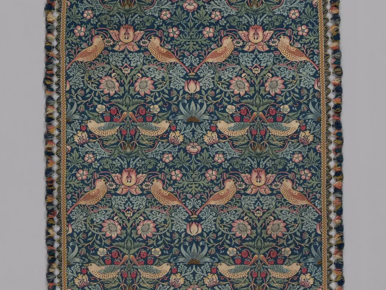
The birds appear lively, yet the design holds them inside a strong repeated order. Mirrored groupings, alternating flowers and connecting stems turn a small incident in nature into a pattern capable of continuing beyond the visible fragment.
The AIC identifies this object as a printed cotton textile with wool trim, not wallpaper. It also notes the importance of Islamic textiles to the design. The distinction matters: Morris was not simply copying an English garden without other visual influences.
His place here is as an influential Arts and Crafts figure. That movement concerned the value of making and the relationship between work, materials and everyday life, not merely a shared decorative look. The V&A’s Arts and Crafts introduction provides that context. Art Nouveau drew on this background without becoming identical to it.
Morris: Willow, a pattern without a centre
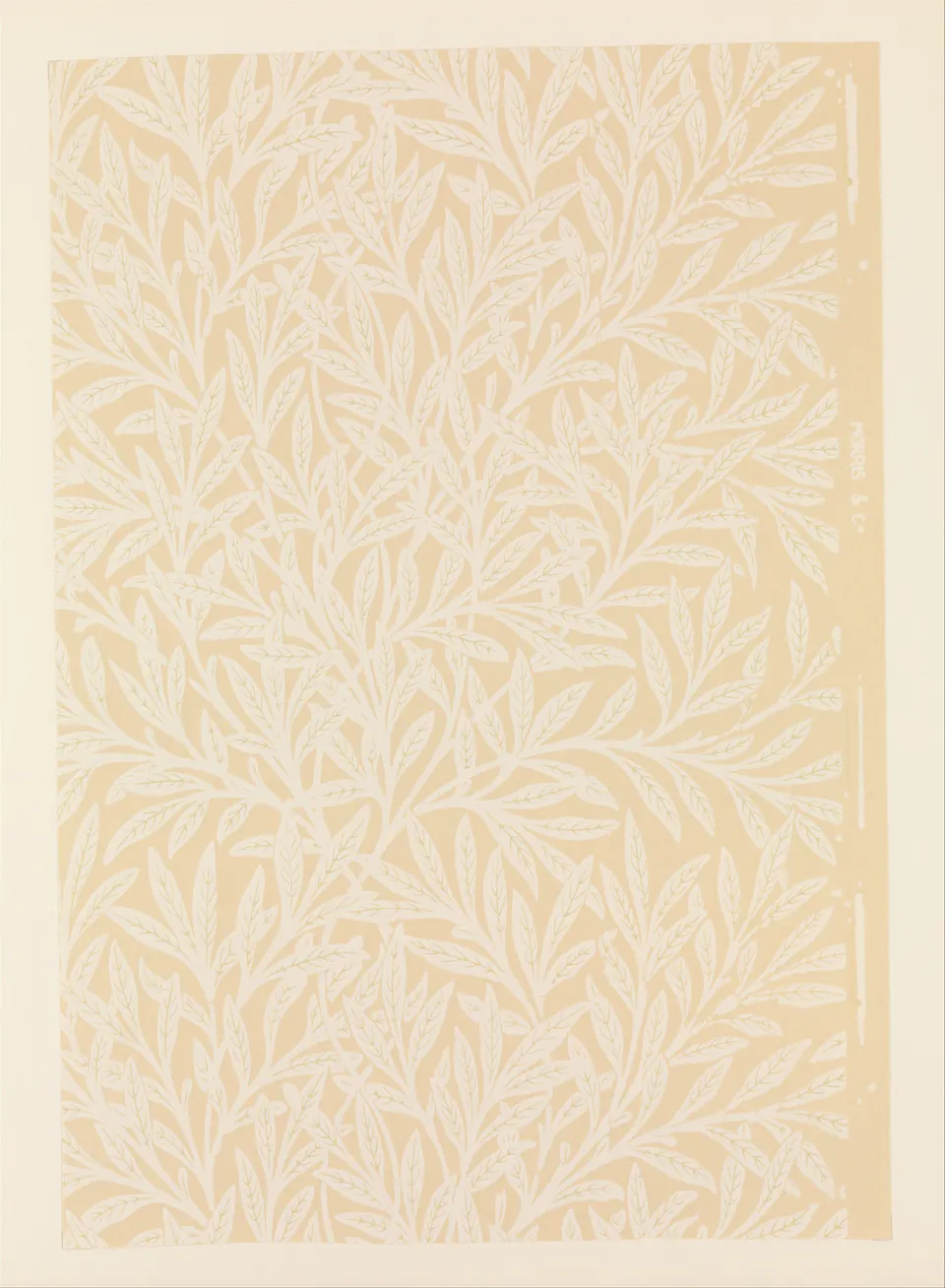
Without the birds, the line becomes easier to follow. Stems divide and bend; leaves fill the intervals without turning the sheet into a view through a window. There is no privileged central flower waiting to be framed like a portrait.
This is Willow, not the later and denser Willow Bough. The Met record distinguishes the two, although its catalogue date and narrative production date differ. Using the recorded title and object number is safer than collapsing similarly named patterns into a single design.
Compare its repeated branches with Mucha’s hair in the next image. Both make the eye travel, but one must continue across a surface while the other has to organise a bounded advertisement. Similar lines answer different practical questions.
Mucha: JOB, 1898
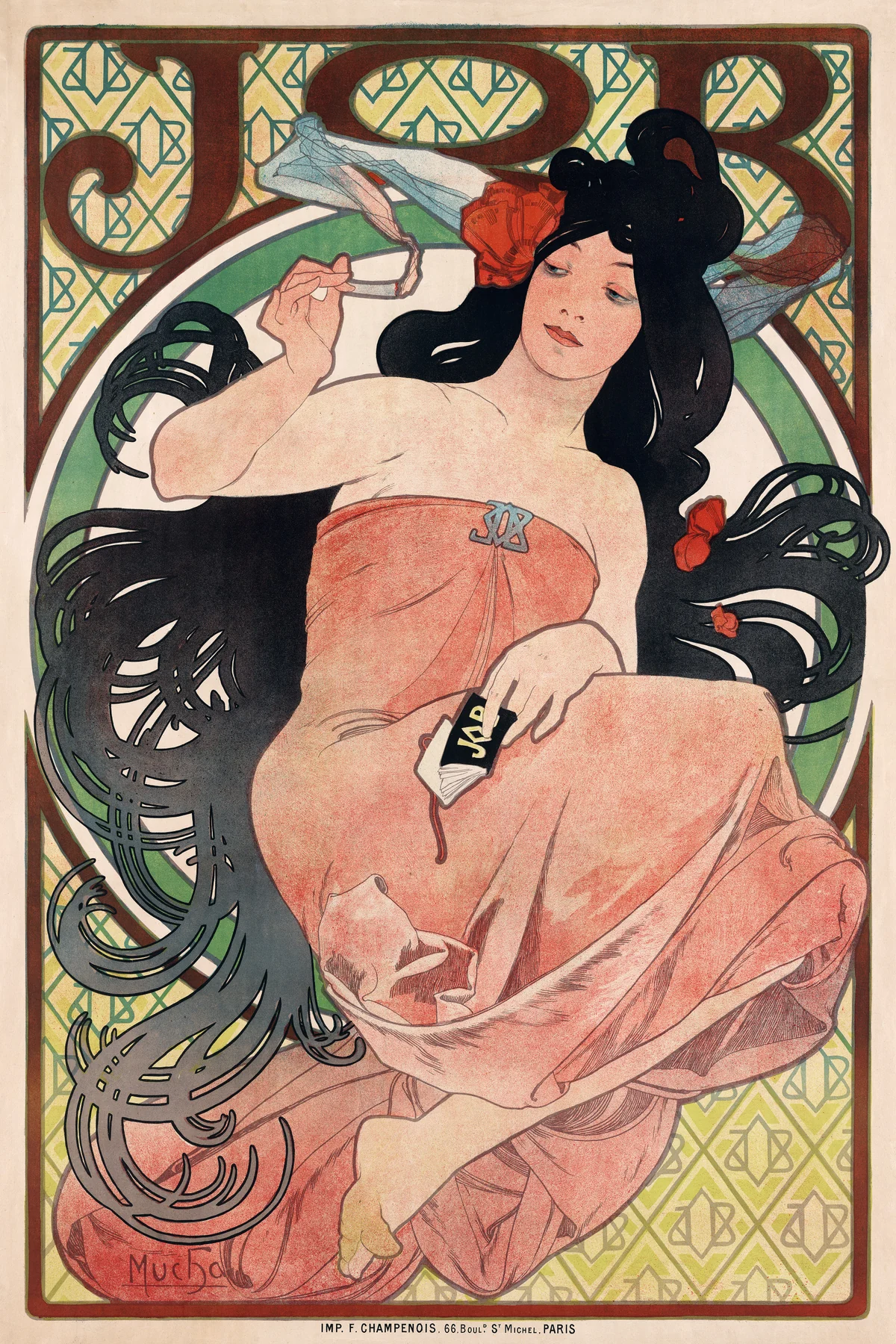

The hair is not a collection of individually modelled strands. It becomes thick, looping shapes that cross the circular boundary and echo the rounded lettering. The woman, the patterned background and the product name belong to one coordinated surface.
Notice the repeated JOB motif in the background and on the small objects within the image. The design does not hide its commercial purpose. It makes that purpose inseparable from the figure’s pose and the pleasure of following the ornament.
This is Mucha’s 1898 design, not his other well-known JOB poster of 1896. That small distinction prevents a surprisingly common kind of loose looking: recognising a brand and an artist, then assuming every version is the same image. Here the sweeping black hair and the large seated figure provide a particular balance, not a generic “Mucha woman.”
Toulouse-Lautrec: a neighbour, not an identical style
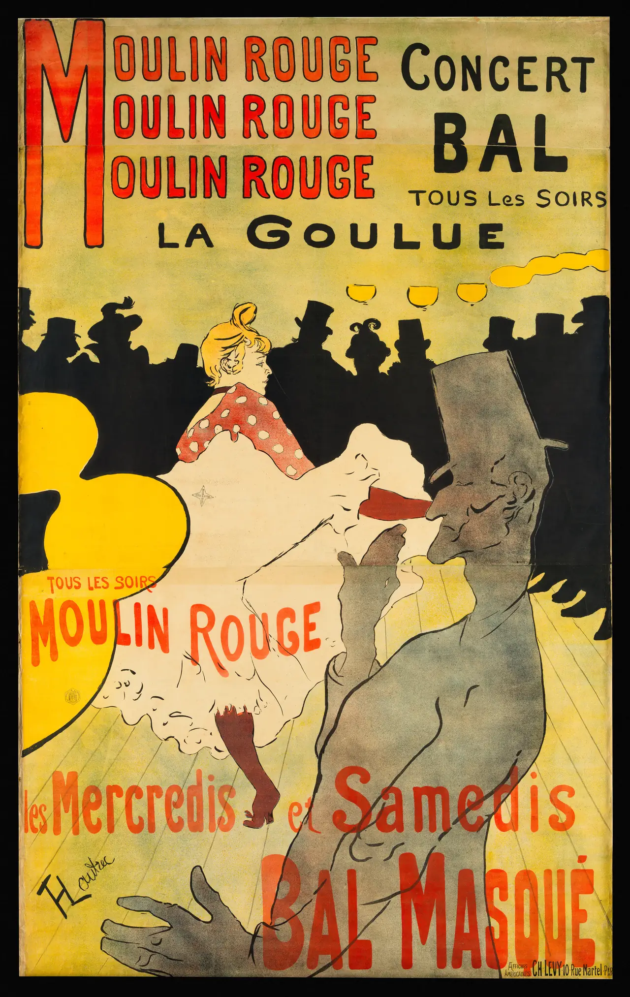
Lautrec shares the world of modern Parisian posters, but this image does not behave like Mucha’s. Heavy silhouettes, abruptly cropped forms and a large area of pale yellow do much of its work. Ornament does not flow evenly around every edge.
The dancer’s light skirt interrupts the dark band of spectators. The foreground figure makes the viewer feel close to the action while also blocking part of it. That obstruction is an active design choice, not a failure to give everyone a clear view.
The V&A includes Lautrec in its account of Art Nouveau’s graphic environment. “Neighbour” remains a helpful description here: common streets, media and audiences do not erase differences in artistic purpose. Calling both posters Art Nouveau should begin a comparison, not end it.
Gallé: a vase that does not flatten nature
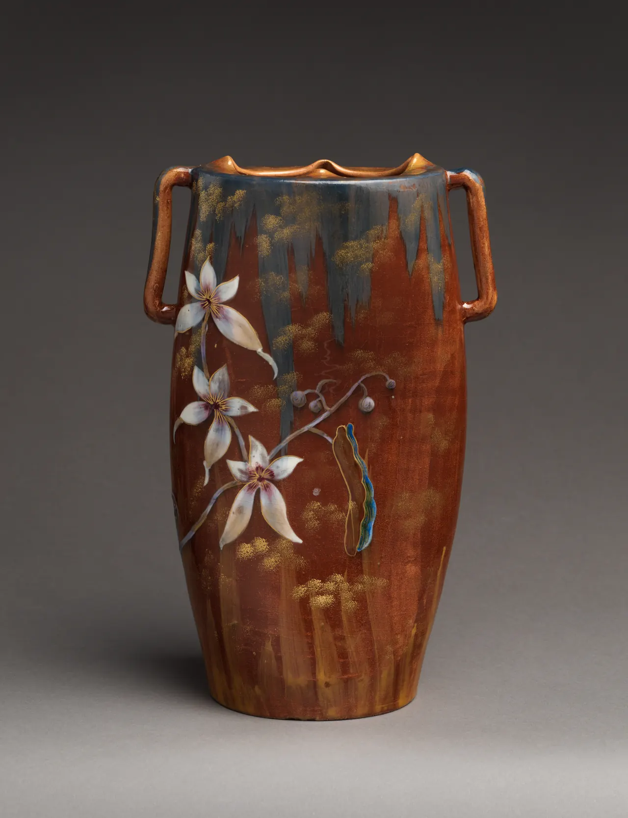
This object looks quite different from a flat poster. Pale flowers cross a brown ground, while a darker glaze descends from the mouth. The two handles establish a relatively firm outline; the irregular surface effects soften it.
The Met connects Gallé’s floral decoration with botanical observation and Japonisme. Looking closely, the flowers do not merely fill available space at regular intervals. A branch travels across the vessel, leaving quieter areas around it. The result feels arranged rather than mechanically repeated.
Do not call it a glass vase because Gallé is famous for glass. This particular object is glazed earthenware. Art Nouveau’s relationship with nature worked through different substances, each with its own possibilities. A photograph can suggest sheen and shape, but it cannot give us the object’s weight or texture in the hand.
Gallé: the cow-parsley cabinet
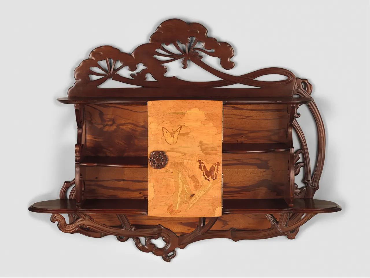
Here the plant does more than decorate a surface. Flower heads rise above the upper shelf, and long carved stems bend around the cabinet’s sides and lower edge. The silhouette participates in the design before we inspect the central door.
Yet shelves remain shelves, and the door still has a handle. The tension between a useful rectilinear object and growth that appears to escape its limits is part of the interest. This is not simply furniture disguised as a literal plant.
Look at the different woods rather than assuming the brown colour is uniform. The Met identifies a beech case and carved elements alongside multiple veneers. Colour here comes partly from the selection and arrangement of materials. That is a different operation from printing coloured ink onto paper, even when both produce flowing lines.
Tiffany: colour and form in glass
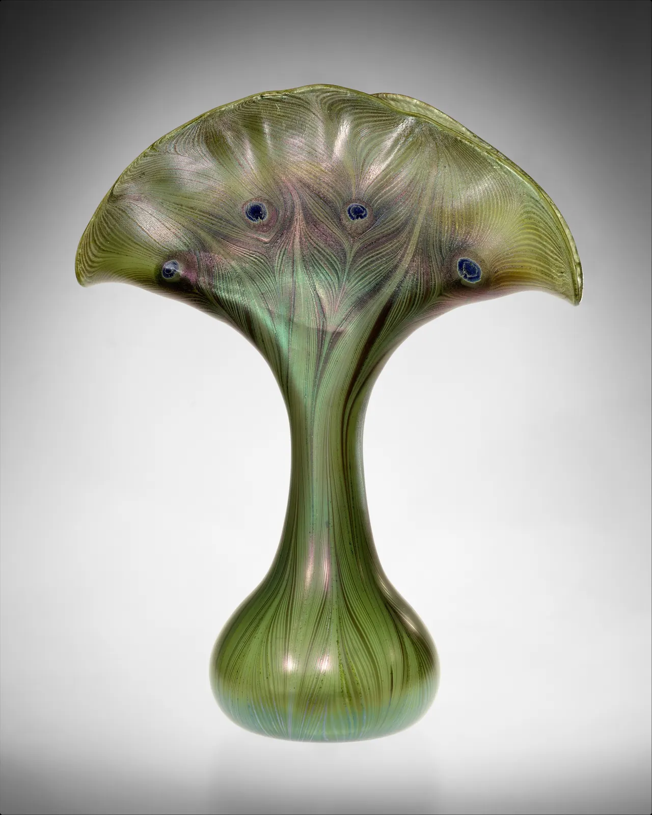
The narrow neck expands into a fan-like opening, with fine lines and dark spots suggesting feathers. It is not necessary to identify a single plant or animal before noticing how those features work together. The outline and the surface seem to grow in the same direction.
The Met records inspiration from both nature and ancient glass in Tiffany’s decorative vessels. This example entered its collection in 1896 as part of a Havemeyer gift. Its iridescence is an effect of the material, not a green pattern simply printed on a neutral container.
The photograph fixes one view and one lighting arrangement. Remembering that limitation is especially important with glass: the image explains the design, but it does not demonstrate every appearance the object could have as we move around it.
Haeckel: a visual source, not an Art Nouveau membership card
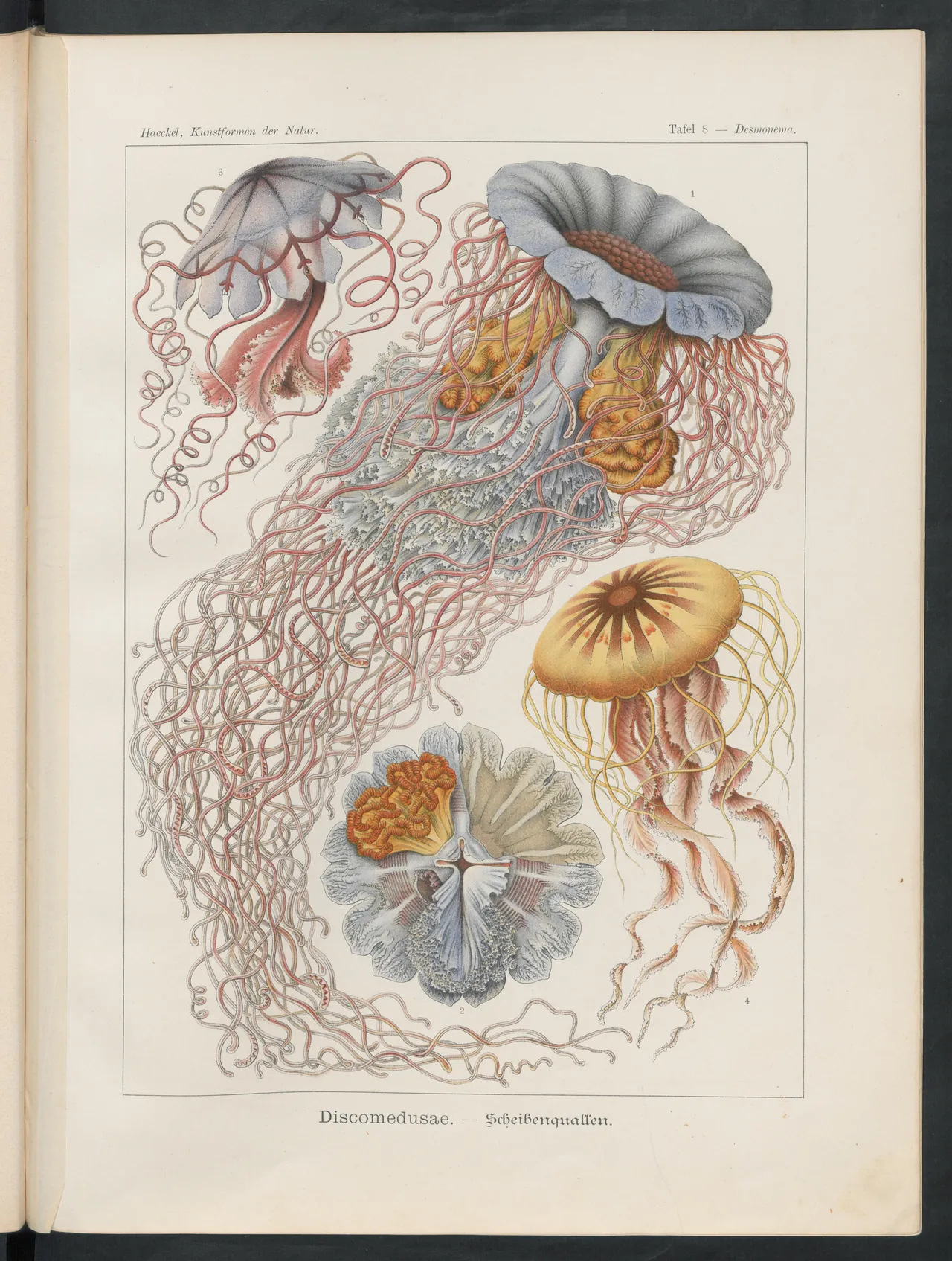
Haeckel’s illustrated natural history offered another vocabulary of curves: branching, curling, radiating and folding forms that did not come from a conventional garden flower. The Met identifies his marine illustrations among Art Nouveau’s visual inspirations.
This plate remains a natural-history illustration, not a furniture design. Numbers distinguish specimens or views, and the composition arranges several forms for attention. We should not claim that a particular curl directly caused a particular cabinet unless evidence establishes that connection.
What comparison can show is more modest and more interesting: nature offered designers structures as well as motifs. A tentacle, a leaf and a feather could suggest different ways for a line to move. Haeckel’s page helps us see that shared visual curiosity without inventing a direct commission or influence for every object above.
Recognising the movement without making everything fit
Look for relationships: between lettering and figure, surface and outline, ornament and use. Curves are one clue, not a complete definition. Equally, nature-inspired decoration existed long before Art Nouveau and continued long after it.
For closer artist context, follow Morris, Mucha, Toulouse-Lautrec and Haeckel. The existing Mucha collection is a separate browsing route; these eight illustrations are not a product catalogue.
Once you stop asking whether an object has enough curls to qualify, the movement becomes easier to explore. Ask instead how a designer made its parts belong together—and where an inherited idea became something newly possible in paper, wood, clay or glass.
Editorial record
About this article
- Author
- Publisher
- GeMarkt
- Published
- Reviewed
- Internal source & rights check. Conducted by GeMarkt Research Review. This is an internal editorial check—not independent peer review.
- Source standard
- Art history source standardPrioritises object records and research sources, distinguishes evidence from interpretation, and states material uncertainty.
Found a claim that needs checking? Report a factual error.