GeMarkt Blog · Essay
The Northern Renaissance: Dürer and the Art of Precision
Eight works by six artists introduce Northern Renaissance art, from Dürer’s prints and a painted hare to portraits, carved saints and Bruegel’s harvest.


A hare’s whiskers, a bead catching light, a curl cut into wood: Northern Renaissance art rewards the person who moves closer. Yet its precision is not simply a contest to squeeze the most detail into a picture. A sharply drawn line can describe fur, announce someone’s status or make an imaginary disaster feel terrifyingly immediate.
The eight works below offer different ways into that achievement. Dürer supplies the central comparison because he could turn from a quiet animal study to a charging crowd without losing control of a mark. Around him, five other artists show what changes when the subject, material and audience change. Look first at the whole composition, then at one small passage: the relationship between the two is where much of the pleasure lies.
A period of art, not a detail setting
Northern Renaissance is a broad historical label, not the name of a club. Here it covers selected fifteenth- and sixteenth-century art from the Netherlands and German-speaking regions. Van Eyck’s early Netherlandish painting and Bruegel’s later landscapes belong to different generations; neither is simply a variation on Dürer.
Nor was northern Europe sealed off from Italy. The Met’s account of Dürer follows his Italian journeys, interest in the human body and work across painting, drawing and print. Observation and learned construction could reinforce one another. The useful question is not whether a work is “realistic,” but how its particular kind of realism persuades us.
Dürer: Young Hare
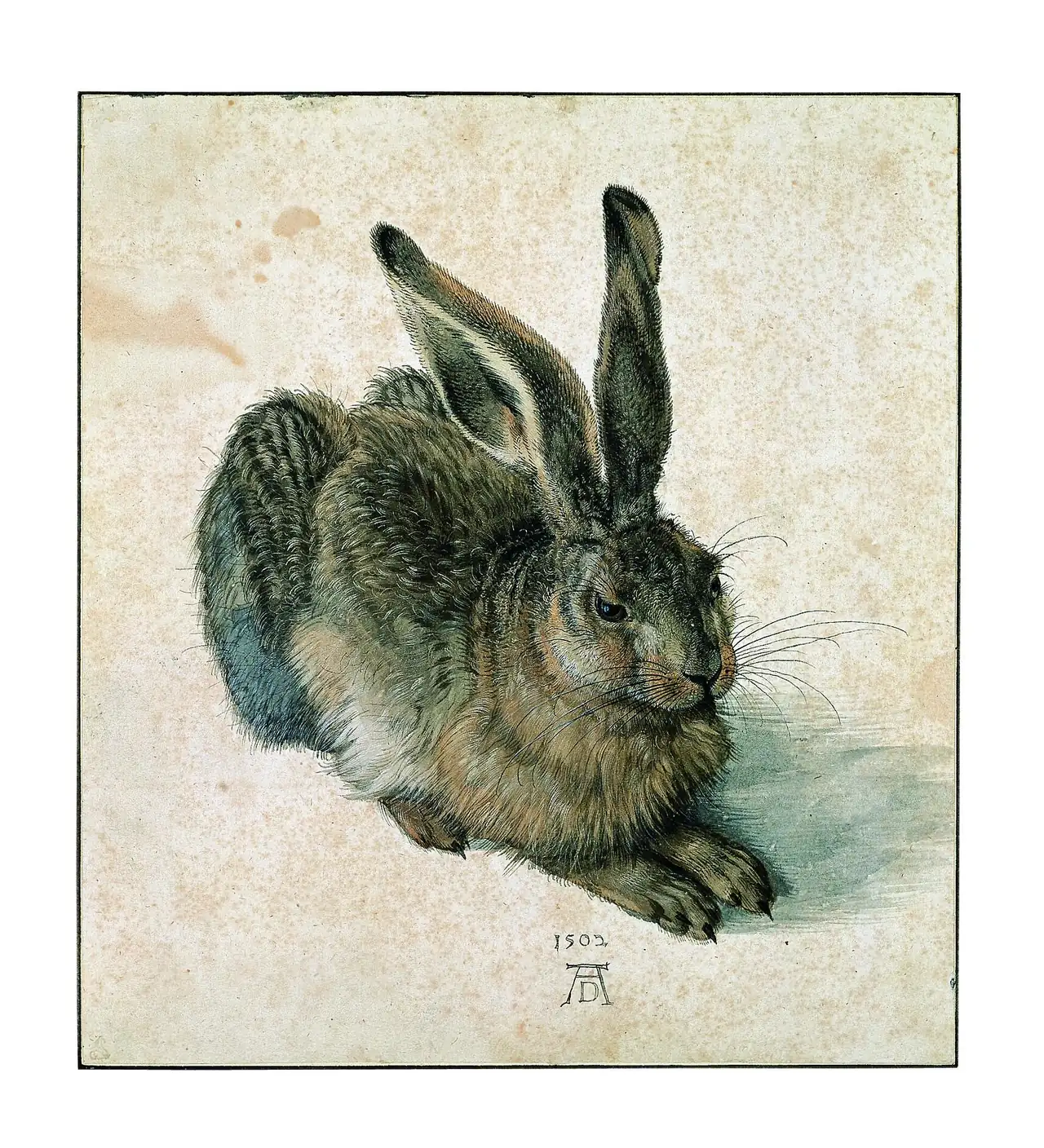
Start with the change from the hare’s back to its face. The longer, broken tufts across the body become shorter marks around the muzzle; the whiskers stretch beyond both. These differences keep the animal from looking like one uniformly textured shape. The pale ground gives every small projection room to register.
The ALBERTINA identifies the 1502 sheet as a work in watercolour and bodycolour with white heightening. It is a drawing in a museum collection, not an illustration cut out of a wildlife photograph. Its shadow anchors the body while the dated monogram makes the artist’s presence explicit. You can admire the looking without needing a story about how long a live hare supposedly sat still: the finished surface does not tell us that.
Van Eyck: The Arnolfini Portrait
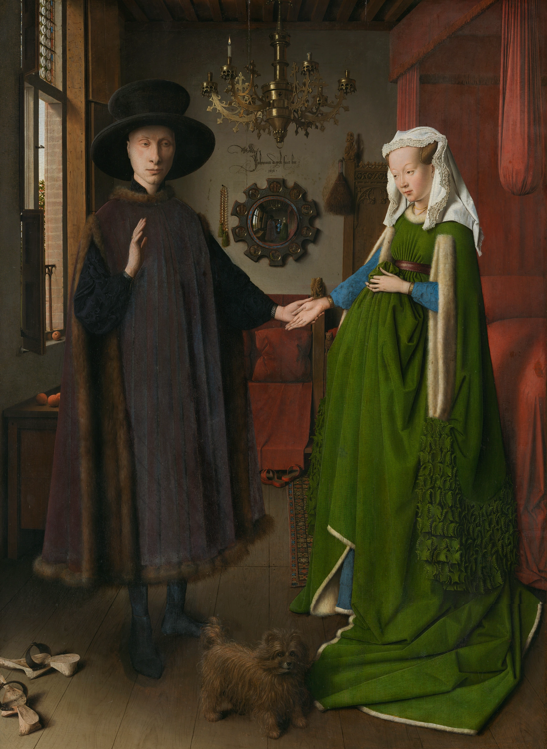

The convex mirror makes a tiny room inside the room. Elsewhere, brass, fur, wood and cloth catch the light differently. That variety helps persuade us that this is a space we could enter, with possessions we could touch.
But precision does not guarantee a literal record. The National Gallery explains that the room has spatial inconsistencies, and that its carefully selected belongings advertise wealth. It identifies the sitters as probably Giovanni di Nicolao di Arnolfini and his wife, rather than treating every detail as settled. Follow the window light through the picture, then notice how much of the composition is organised around the joined hands. Description serves a carefully staged encounter; it is not a neutral inventory of furniture.
Dürer: Adam and Eve
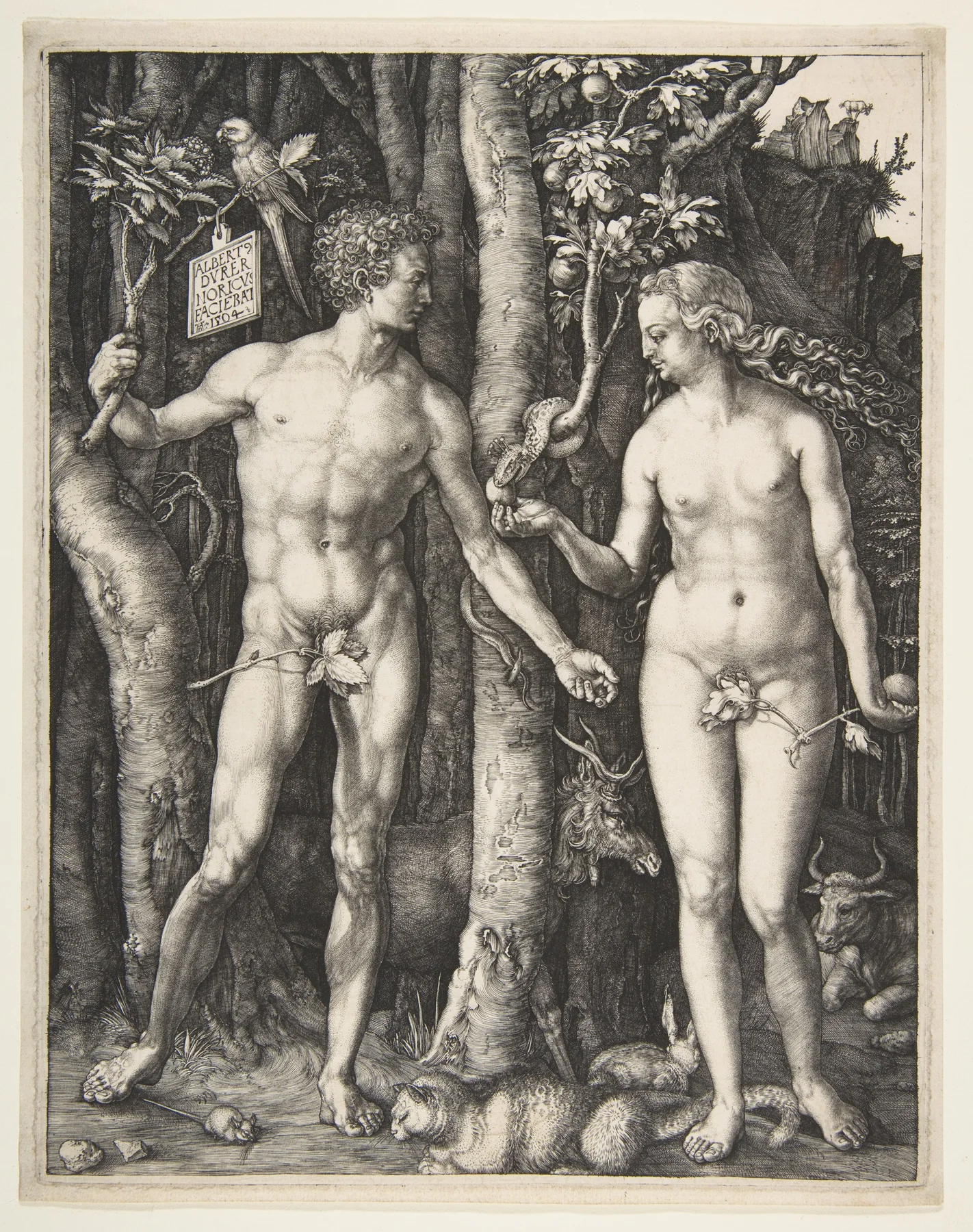
Look at how the pale bodies separate from the dark forest. Flesh appears rounded, yet no coloured pigment supplies that effect: changing densities of engraved lines do the work. Bark, hair and leaves receive different patterns, so the picture remains legible despite its crowded surface.
This is also a constructed ideal. The Met relates Adam’s pose to classical sculpture and Dürer’s interest in measured human proportion. The bodies are not simply two people encountered in the woods. Place the engraving beside the hare and the title’s “precision” becomes more useful: one work persuades through a particular creature, the other joins observation to an idealised body and a biblical story. Close looking need not exclude imagination or theory.
Dürer: The Four Horsemen
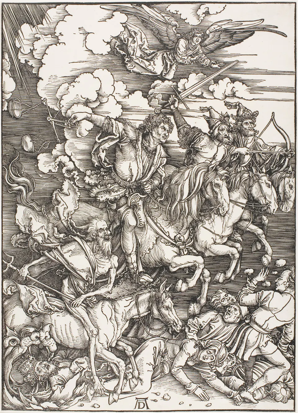
Here precision produces speed, not stillness. The horses overlap, weapons cut diagonally across the sky, and the bodies below have almost nowhere to escape. Black lines organise the apparent chaos. Try following one horse’s head before moving to its legs: the overlap makes the charge feel collective rather than a row of separate riders.
This is a woodcut, unlike the engraving above. The Chicago sheet is dated c. 1497/98, while the Apocalypse series appeared in 1498. Dates attached to a design, an edition and an individual surviving impression are not automatically interchangeable. The image also challenges the idea that Northern Renaissance art was always patiently descriptive. Its frightening compression is as deliberate as the hare’s isolated stillness.
Riemenschneider: Three Helper Saints
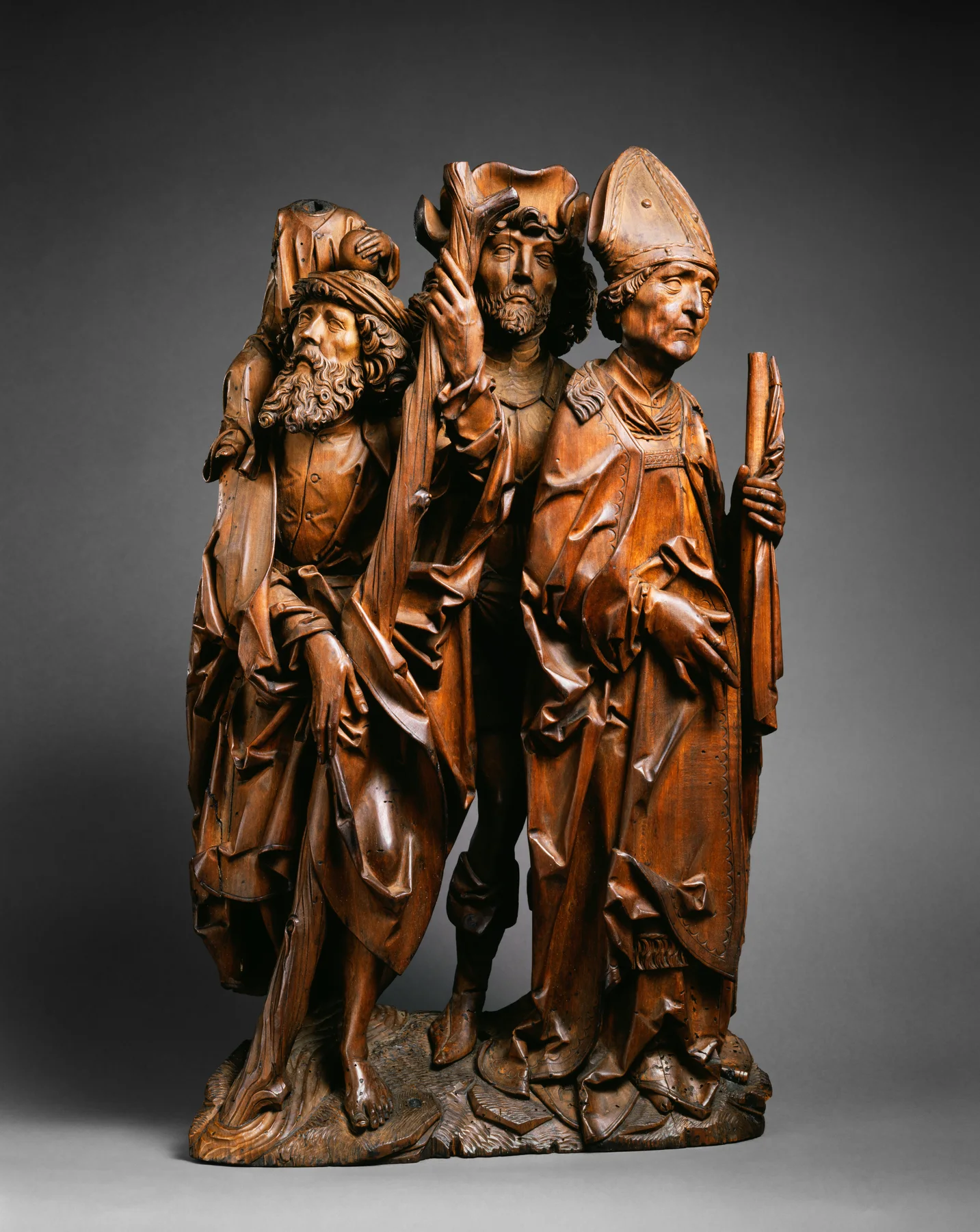
Precision is not confined to flat pictures. Deep folds create dark channels between these carved figures; small cuts give their hands and faces a very different character from the heavy robes. Light striking the relief completes effects that an engraving must make with ink.
The Met identifies three Helper Saints and places the carving in Würzburg around 1500–1505. Its overlapping arrangement suggests that it once belonged to a larger relief. The museum also argues that fine carving and decorative punch work indicate an intended unpainted surface. That is a conclusion about this object, not a rule that medieval or Renaissance wooden sculpture was always bare. What survives as a museum object may be only part of its original setting.
Cranach: Luther as Junker Jorg
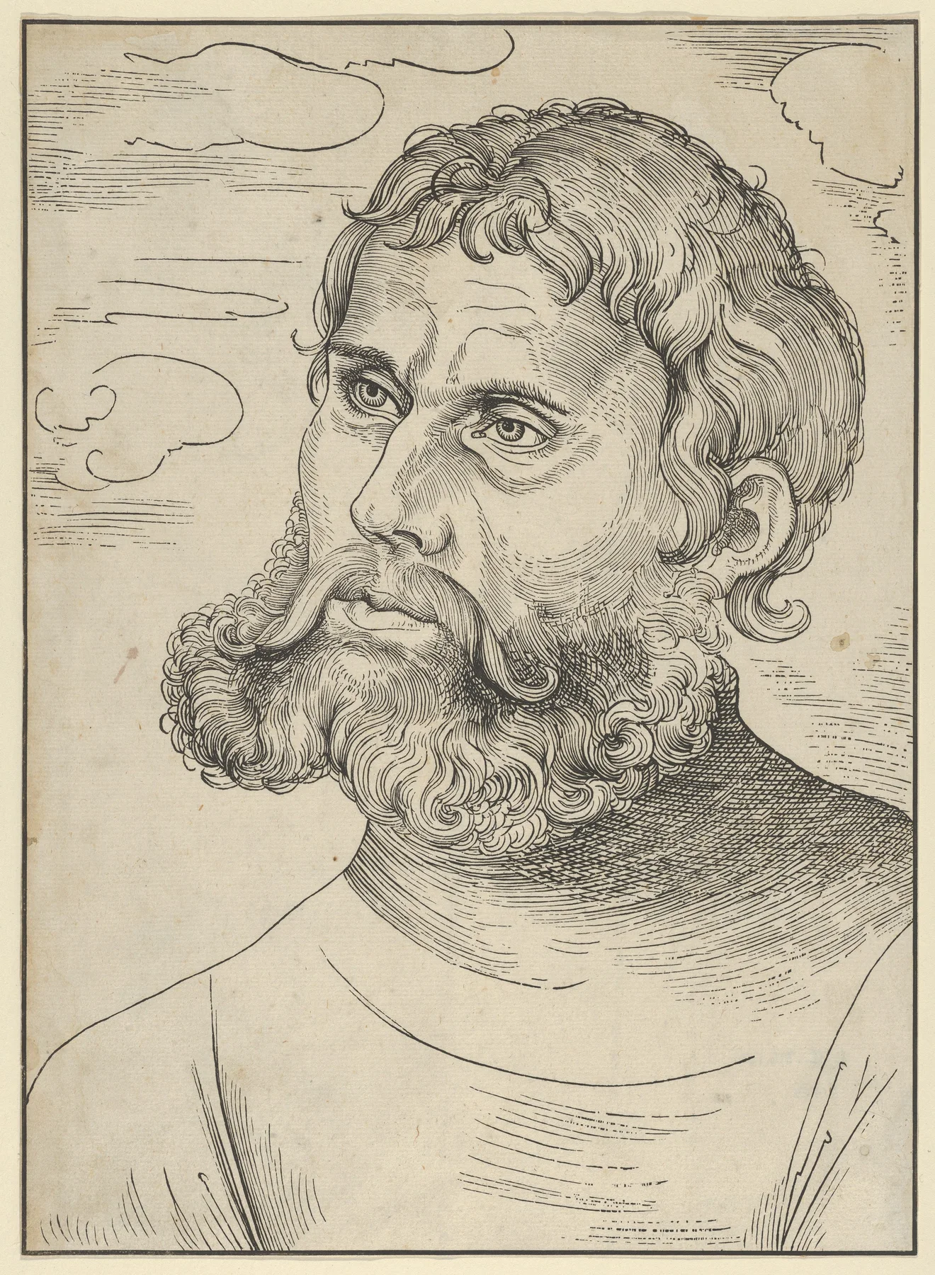
The curls of the beard are conspicuous, but the concentrated eyes hold the portrait together. There is little setting to distract us. The 1522 woodcut identifies its subject through the title, while its repeated lines give a recognisable face a portable form.
This belongs to a period when images could participate in religious controversy as well as devotion. The Met’s Reformation overview describes their role in spreading ideas and attacks on religious authority. It would be misleading to imagine that the Reformation simply stopped image-making. Compare Cranach’s pared-back head with Riemenschneider’s clustered saints: two kinds of public and religious presence, made for different circumstances, can exist within the same broad historical label.
Holbein: Hermann von Wedigh III
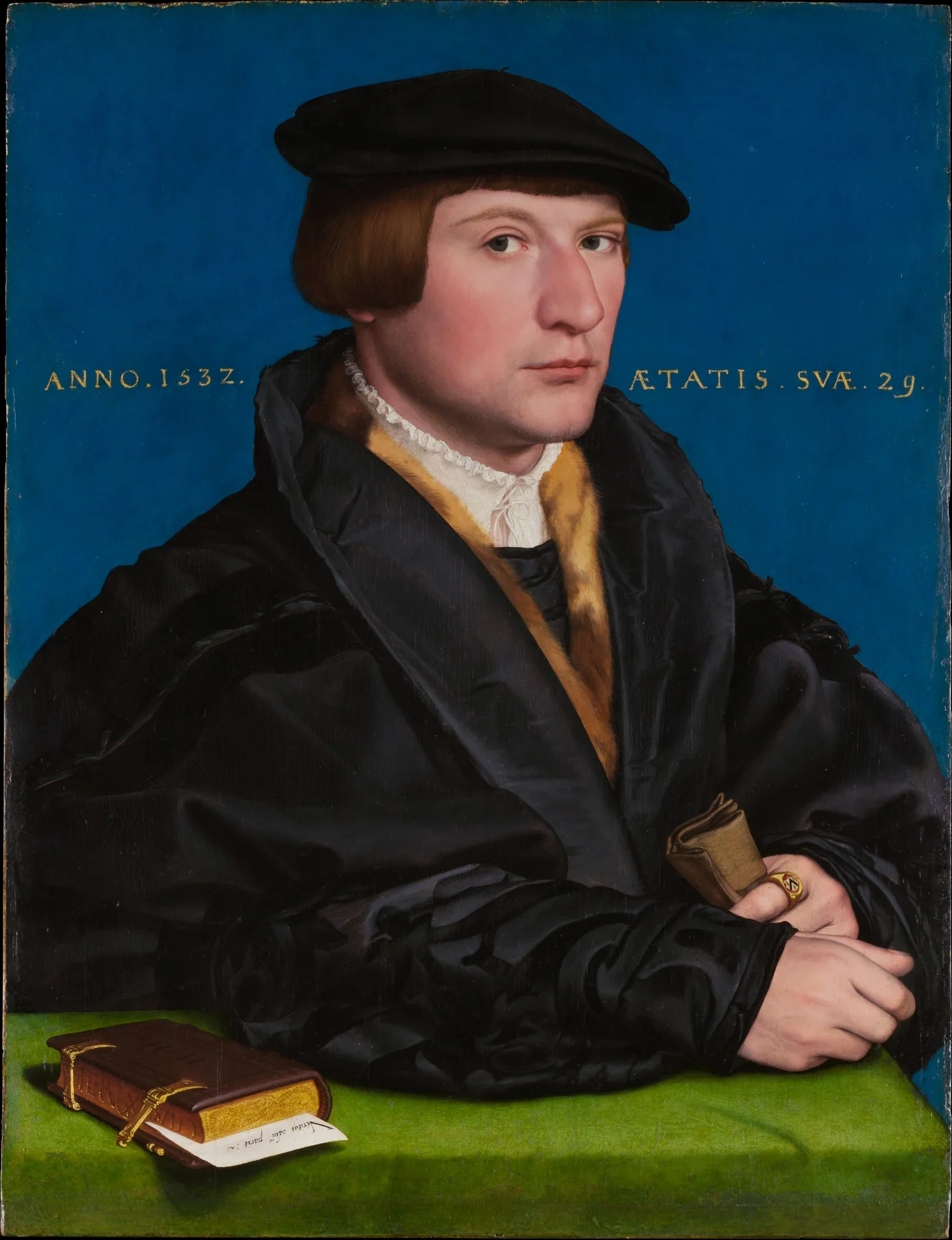
Holbein gives the face ample space against blue. The dark clothing is not an undifferentiated block: folds, fur and the fine white collar describe a person dressed with care. Below, the green table makes the small book unusually easy to notice.
The Met draws attention to the portrait’s different inscriptions, including the inserted paper’s quotation from the Roman writer Terence. Here words are part of the visual arrangement, not merely information outside the painting. First the sitter meets our gaze; then the hands, ring and book offer more to read. Compared with Cranach’s woodcut, this portrait builds identity through colour, possessions and text as well as a face. Its selective quiet is as important as its fine detail.
Bruegel: The Harvesters
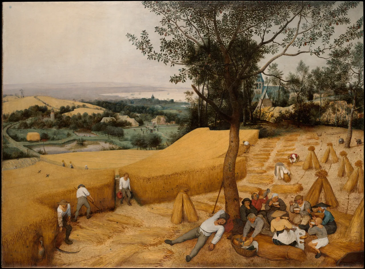
Bruegel changes the scale of attention. Start with the resting group, then follow the cut path into the standing grain and beyond it towards the water. Large colour areas guide the journey before you begin noticing distant activities. The painting is not held together by equally sharp detail everywhere.
According to the Met’s interpretation, this was part of a seasonal cycle commissioned for an Antwerp merchant’s dining room. Its attractive harvest landscape gives an idealised account of labour, shaped for a wealthy patron. The figures are neither incidental decoration nor a transparent social document. Their work and rest make the season visible, while the composition turns that season into a scene another person could possess and contemplate.
Six artists and three ways to look
Keep three questions in mind: what receives the sharpest attention, how does the medium achieve it, and what does that attention ask you to believe? These connect Dürer, Van Eyck, Cranach, Holbein, Riemenschneider and Bruegel more usefully than a claim that they all painted the same way.
Continue with the artist guides to Dürer, Van Eyck and Bruegel. The longer Northern Renaissance Atlas chapter follows workshops, devotional practices and the circulation of images. For browsing beyond the reading, the collection directory is the existing route; it is not a dedicated Northern Renaissance collection or a promise that these eight works are stocked.
Editorial record
About this article
- Author
- Publisher
- GeMarkt
- Published
- Reviewed
- Internal source & rights check. Conducted by GeMarkt Research Review. This is an internal editorial check—not independent peer review.
- Source standard
- Art history source standardPrioritises object records and research sources, distinguishes evidence from interpretation, and states material uncertainty.
Found a claim that needs checking? Report a factual error.