GeMarkt Blog · Essay
Book Illustration from Blake and Doré to the Golden Age
Explore eight examples of book art, from Blake's illuminated poems and Doré's dramatic plates to Walter Crane and the page design of the Kelmscott Chaucer.


Before a reader reaches the first sentence, an illustration has already made decisions: how large the world will feel, where danger lies, and whether the story welcomes us or keeps us at a distance. A book’s pictures can lead the text, interrupt it or grow around it. They are not merely decoration added after the serious work is finished.
These eight examples follow those choices from William Blake’s intimate poem-pages to Gustave Doré’s enormous imagined spaces, then to Walter Crane and the collaboration of William Morris and Edward Burne-Jones. It is a selective route through the art of the illustrated page—not a complete history of publishing, nor a claim that all five makers belonged to one movement.
A golden age with more than one boundary
“Golden Age of Illustration” is a flexible historical label. The Library of Congress uses approximately 1880–1930 for its American context. That does not relocate Blake, who died in 1827, into the same generation. Here his work is an earlier, unusually revealing starting point; Doré’s nineteenth-century illustrated editions provide another route towards the later flourishing of book design.
Keep three objects separate as you look: an artist’s original drawing, the printing surface made to reproduce it, and a particular printed copy. They can have different makers and dates. A modern photograph or scan adds another layer. Our examples identify the object actually shown, rather than using an illustrator’s name as if it described every edition equally well.
Blake: the Tyger is part of the page
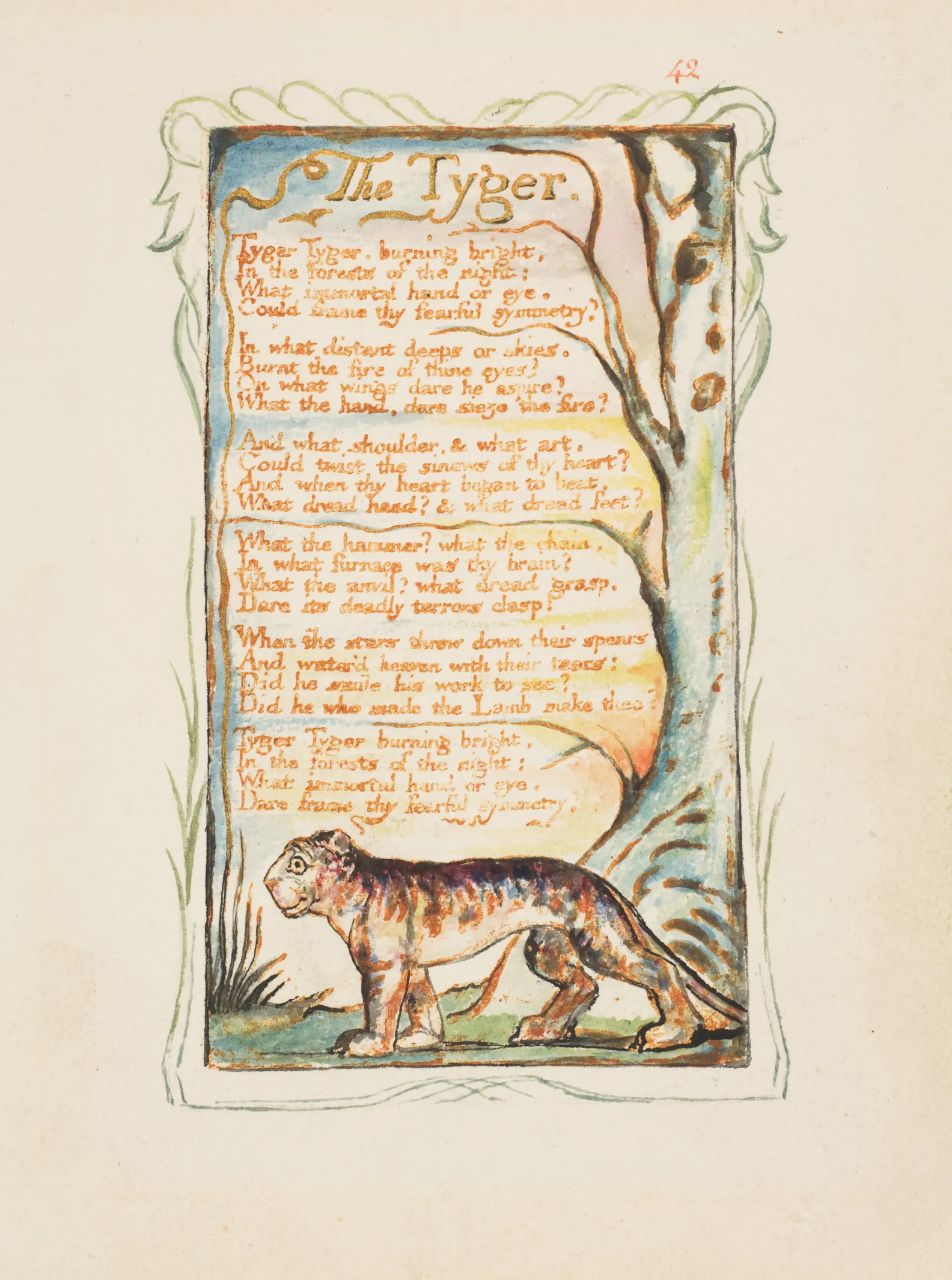
In this Met impression of The Tyger, the animal occupies only a small area below the verses. A curving trunk rises beside them, and fine green lines continue around the outside. Words, coloured marks and figures share one designed surface.
The animal is not an independent zoological picture dropped beneath a poem. Its compact body sits against questions whose scale feels much larger. The contrast is something a reader can experience without deciding on one final interpretation of the tiger’s expression.
The date needs both halves: the plate was made in 1794, while this impression belongs to around 1825. That difference is visible evidence of a work returning to the press, not a catalogue inconsistency. Our Blake guide follows the particular copies and their sources in more detail.
London and The Sick Rose: two ways to surround a poem
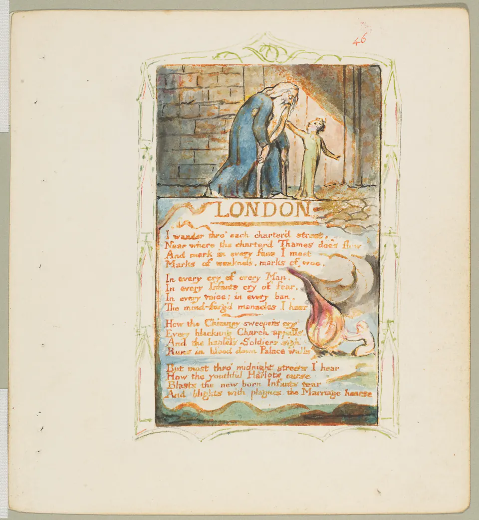
The London page places a hunched older figure and a child above the title. They establish a human encounter before the eye enters the verses. Below, a curling flame-like shape occupies the text’s edge. The block of writing remains readable as a block, yet the image refuses to stay in a separate compartment.
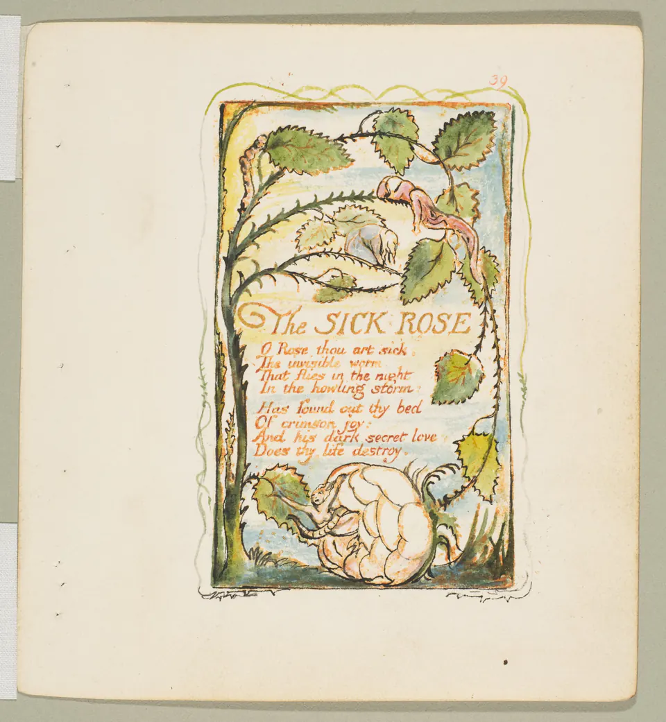
The Sick Rose encloses its shorter poem with a more continuous growth of stems, leaves and small figures. Following the border becomes a second reading route. Neither page needs to behave like a literal diagram of every line.
These are two leaves from Copy Y, not generic templates representing every surviving Blake book. The Met describes printing and hand-colouring across successive copies. Differences between impressions are therefore part of the history, not necessarily evidence that one scan has the “wrong” colours. Compare the page relationships before comparing reproduction settings.
Blake’s shepherd: a small black-and-white world
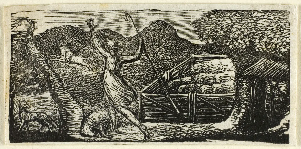
This 1821 wood engraving changes both scale and means. The landscape is built from black masses and narrow pale cuts rather than transparent washes. A raised arm, the slanting staff and the retreating animal make the action legible inside a shallow horizontal strip.
Look at how much atmosphere survives without colour. Repeated marks give the hills weight; the bright gaps surrounding the figure prevent the body from disappearing into them. This is a different sort of book image from the illuminated poems, even though Blake made both.
It also reminds us that an illustrator need not always illustrate their own words. Here the named literary source is Virgil. The relation between an artist and a text can change across a career, as can the relation between that artist and the printing process.
Doré: the descent on Geryon
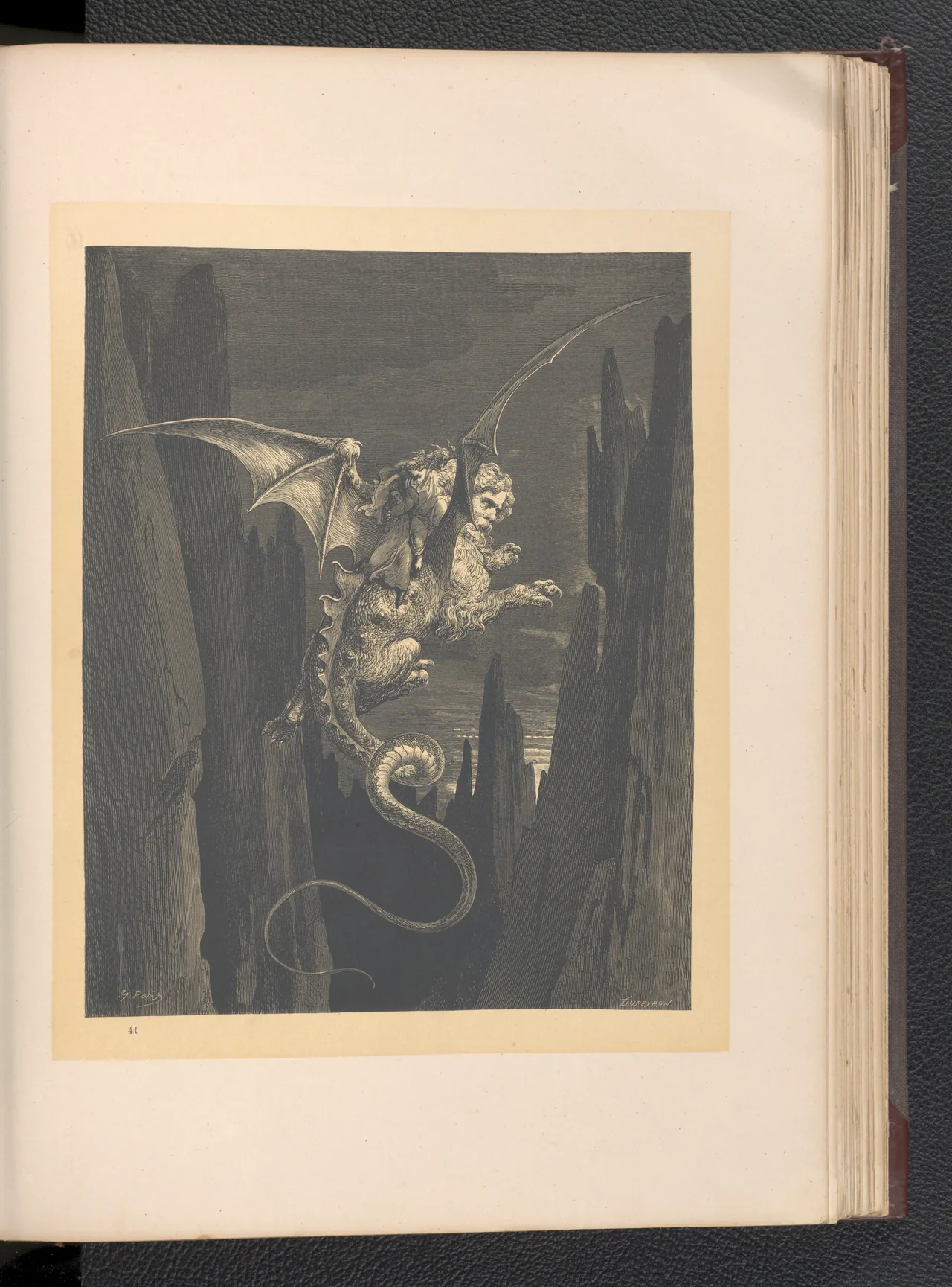
Doré opens a different kind of space. The selected 1870 German page shows Dante and Virgil riding Geryon between vertical rocks. The coiling tail and stretched wings make the surrounding emptiness feel perilous. The figures’ smallness matters as much as the creature’s detail.
The dark field is not one flat black. Dense marks produce different depths of shadow, allowing the lit bodies to emerge. The design is credited to Doré, and Dupeyron’s name is also visible below the image. That second name is a reason to investigate the production history, not to assume that Doré personally cut every line.
The BnF records the French Inferno edition in 1861; the leaf shown here is not a page from that particular copy. Editions carry images across languages and decades. Our Doré guide and Divine Comedy file check explain why the distinction is useful.
Creation of Eve: light made from lines
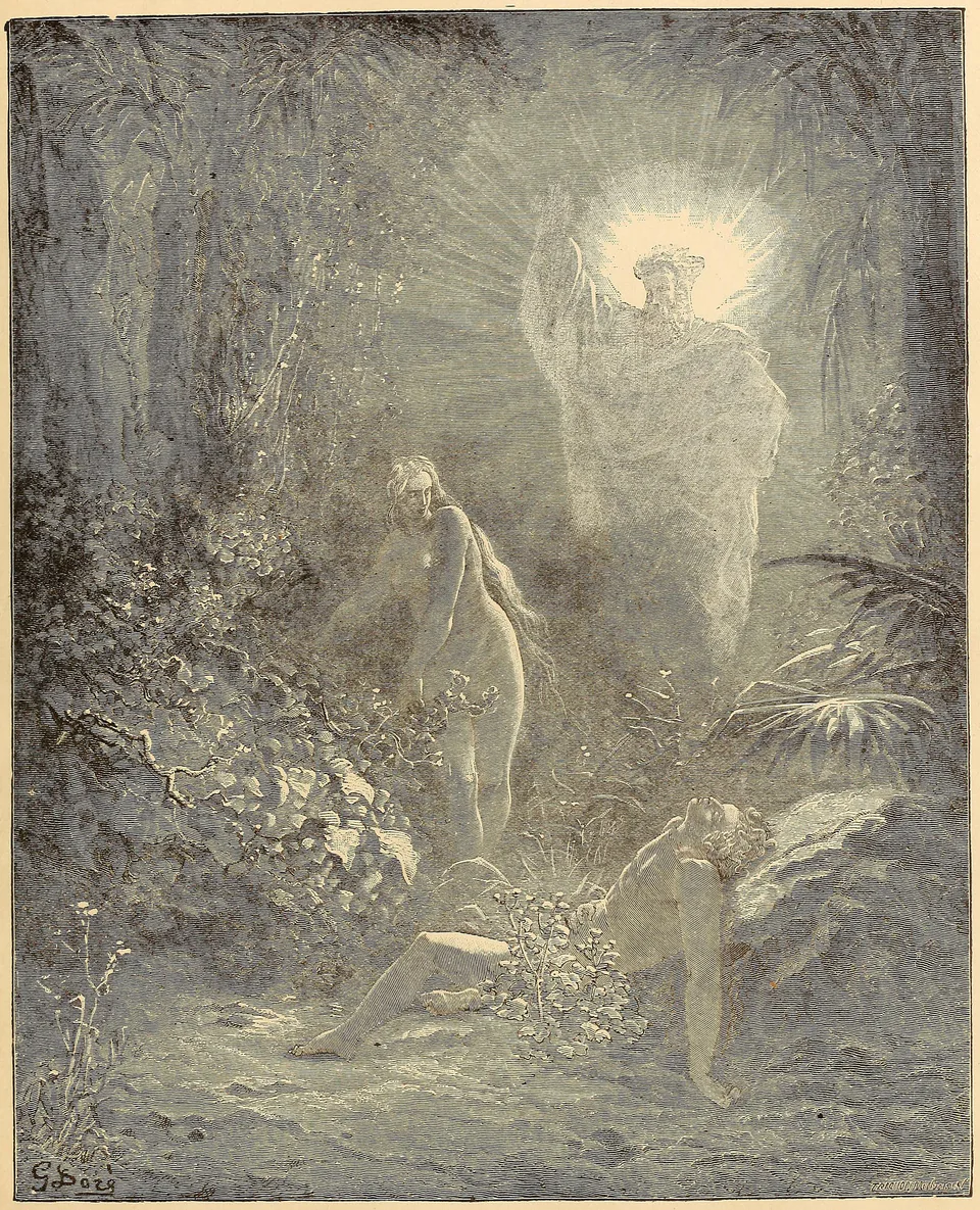
In the Bible Gallery illustration, light appears to expand from the standing divine figure into the surrounding trees. Eve’s upright body bridges that brightness and the reclining Adam below. The forest does not merely locate the scene; its enclosing darkness makes the emergence of light the image’s main event.
Compare this with Geryon’s descent. Both turn light against a large dark environment, but one draws the eye towards an opening while the other suspends its figures over an abyss. The technique serves a different narrative movement.
This is a plate reproduced in a later American volume, not an original drawing by Doré. The displayed file also omits the page margins. That crop is disclosed because a picture seen alone cannot tell us how much surrounding space a book originally gave it.
Crane: an endpaper can begin the story
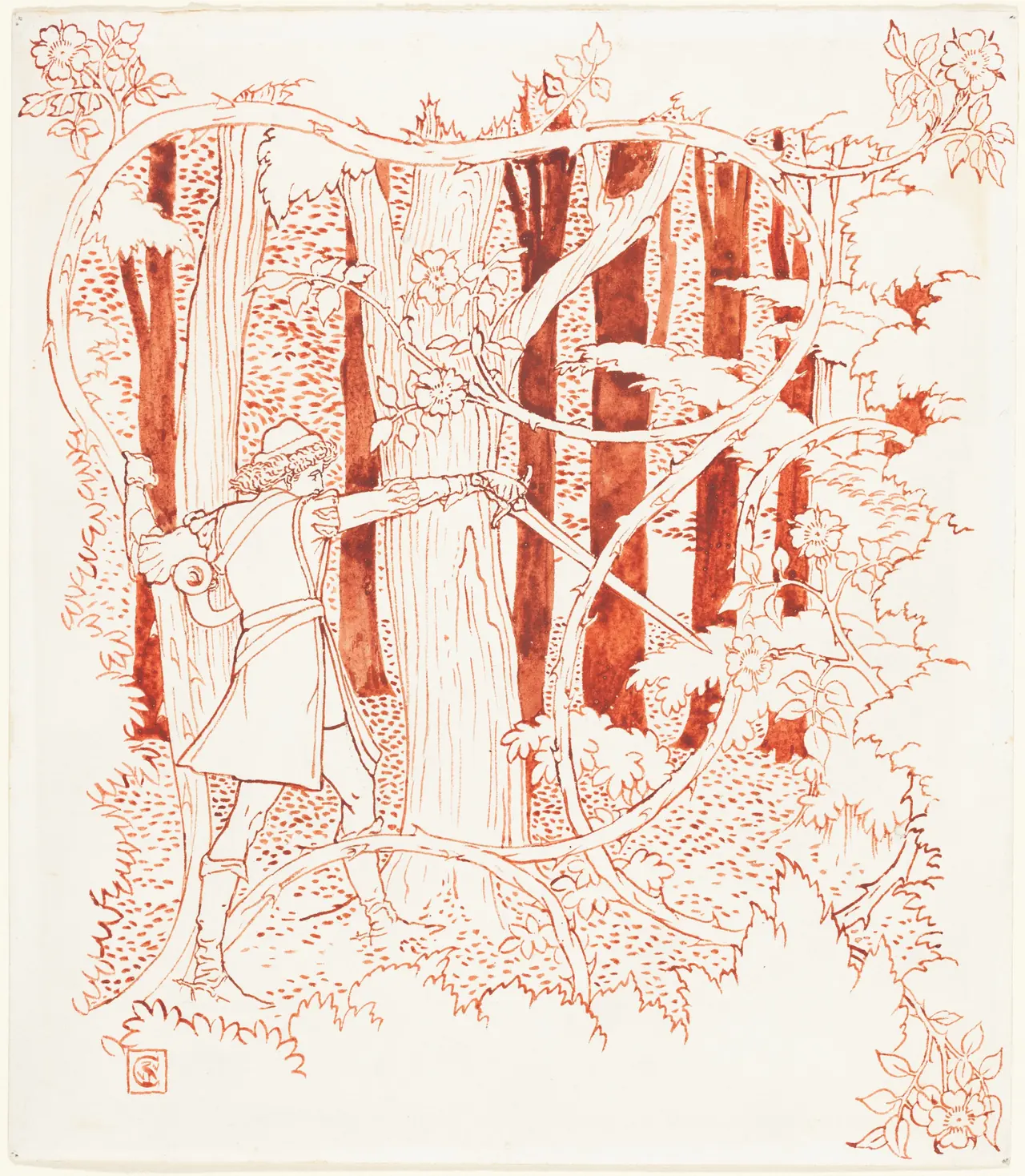
Crane’s red-ink drawing brings us back towards the surface. Tree trunks rise in close ranks while the flowering thicket curls across them. The prince’s sword creates a sharp diagonal among these repeated shapes. Story and ornament occupy the same patch of paper.
The NGA transcribes inscriptions on the reverse associating the design with an endpaper for The Sleeping Beauty. An endpaper belongs near the book’s binding, before or after its main sequence of pages. It can set an atmosphere even before narrative reading begins.
What we see here is a drawing, not proof of precisely how a published edition printed it. Keep that distinction, then enjoy the practical invention: a threshold to a book imagined as a literal thicket to be entered.
Morris and Burne-Jones: the whole opening matters
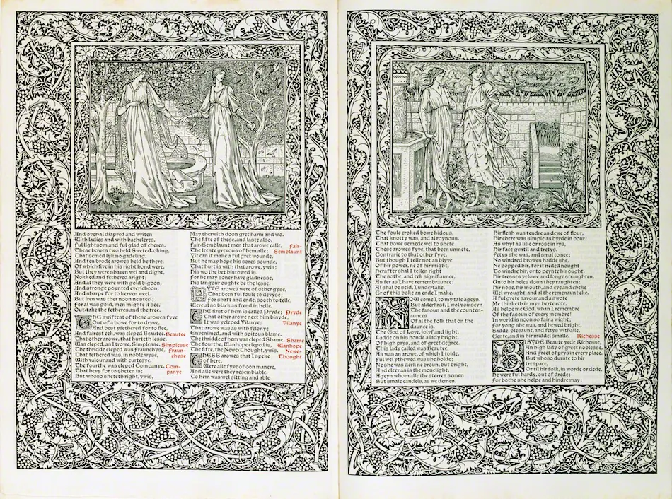
The Tokyo Fuji Art Museum’s 1896 Chaucer lets us examine an opening rather than an isolated illustration. Each page gives space to an image, two columns of text, large initials and an elaborate border. The two sides answer one another across the central fold.
Morris and Burne-Jones did not perform interchangeable tasks. The museum credits Morris for the book’s binding and Burne-Jones for its illustration; the opening makes their wider collaboration in book design tangible. Morris belongs in this discussion as a maker of the book, not as the draughtsman of every figure.
At this displayed size, the fine text is not intended as a reading edition. What remains clear is the balance between dark ornament, patterned lettering and figures. The page is both something to read and something to contemplate as a whole. Our Morris guide provides another way into that relationship between image and designed object.
Read the object as well as the picture
Try three passes when you encounter an illustrated book. First, follow the story’s action. Next, look at how the picture meets the words and margins. Finally, read the catalogue: which copy, which date, which medium, and which collaborators?
That last pass need not turn pleasure into paperwork. It explains why a small Blake page, a Doré plate and a Crane drawing feel different before we have read a line. For related available art, browse the collection directory, without assuming every historical example appears there. The richest discovery is often not another famous image, but a familiar one restored to the particular page that gave it its voice.
Editorial record
About this article
- Author
- Publisher
- GeMarkt
- Published
- Reviewed
- Internal source & rights check. Conducted by GeMarkt Research Review. This is an internal editorial check—not independent peer review.
- Source standard
- Art history source standardPrioritises object records and research sources, distinguishes evidence from interpretation, and states material uncertainty.
Found a claim that needs checking? Report a factual error.