GeMarkt Blog · Essay
The Birth of Abstraction: Kandinsky, Klee, Mondrian, af Klint
Follow several routes into abstract art through eight pictured works, from Mondrian’s trees to Malevich’s square, with Hilma af Klint’s distinct early history.

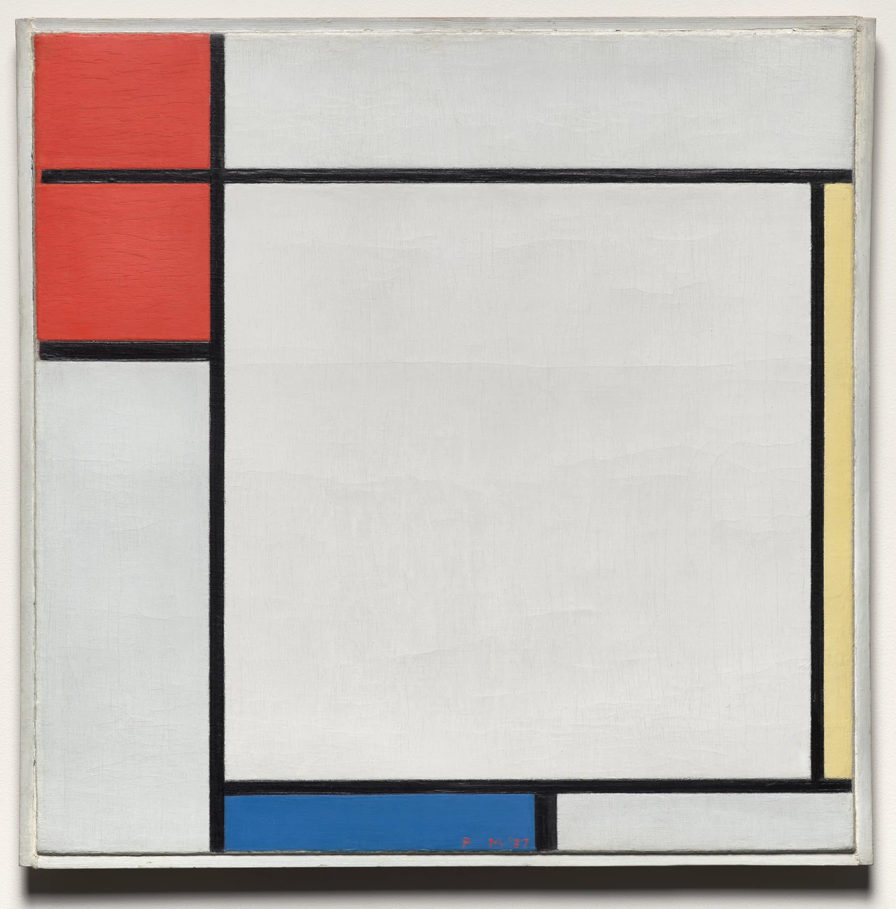
Put Mondrian’s dark trees beside his later red, yellow and blue composition. It is tempting to imagine a tidy journey: the painter studies nature, removes its details, and finally discovers pure geometry. The two pictures make that story attractive. They do not make it complete.
Early abstract art developed through several overlapping projects. Some artists reworked observed places. Some tested colour relationships, pursued spiritual ideas, or made shapes independent of recognisable objects. Others moved back and forth between those possibilities. Eight illustrated works below make the differences visible; Hilma af Klint’s separate history explains why public exhibitions alone cannot tell the whole story.
What does “abstract” mean here?
In ordinary language, abstract can mean difficult or theoretical. In painting, it concerns the relationship between the marks and the things they might represent. A highly simplified landscape still refers to a landscape. A composition of shapes may not ask us to identify any external object at all.
The distinction is a spectrum, not a reliable division between pictures with titles and pictures without them. A title can preserve a subject that has become hard to recognise. Conversely, an apparently geometric image can carry a specific story. Nor did early twentieth-century European painters invent pattern, geometry or non-figurative visual culture for the world. This guide concerns particular modern artistic projects, not the first abstract mark ever made.
Begin by asking what each image lets you recognise, and what keeps working after recognition stops. Shape, spacing and rhythm are visible matters; they need not be treated as a secret language whose correct translation is available only to experts.
Hilma af Klint: a different starting point
The Guggenheim Bilbao’s af Klint exhibition documents the Paintings for the Temple, begun in 1906 and eventually comprising 193 paintings and drawings. Her practice brought spiritual investigation into contact with an interest in contemporary scientific ideas. That describes her intellectual setting; it does not require us to accept the beliefs as scientific findings.
These ambitious works were not circulating through the same public exhibition network as Kandinsky’s or Malevich’s. Af Klint rarely displayed her radical paintings publicly and directed that they remain unseen for a period after her death. Early production and public influence are consequently different questions.
Her place here is historical, not a claim that every modern abstraction descends from her. The museum’s examples can be examined through its exhibition page. No af Klint image is reproduced in this guide, and her inclusion does not clear any artwork or photograph for reuse.
Mondrian: a landscape and a constructed balance
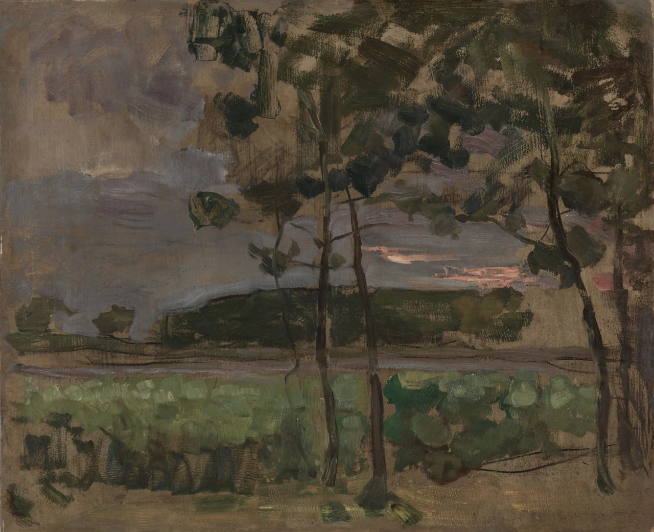
The early landscape offers unmistakable trees, but it also distributes dark uprights across a broad field of colour. Their spacing matters: a trunk near the centre is not balanced by an identical one on the other side. Looking for that arrangement does not mean the trees were secretly a plan for a future grid. The landscape is worth seeing on its own terms.
In the 1927 composition, unequal rectangles replace the recognisable view. Red occupies the upper left; a blue strip anchors the lower edge; yellow survives as a narrow passage at the right. The large pale region is not empty in the sense of being irrelevant. Its size determines the pressure exerted by those smaller coloured areas.
This is Cleveland’s 1927 painting, not one of the similarly titled compositions dated 1930. Its visible brushwork and retained original frame also remind us that a famous “grid” is a made object, not a frictionless digital diagram. The Mondrian guide keeps those work-specific distinctions in view.
Kandinsky: recognition can fade without disappearing
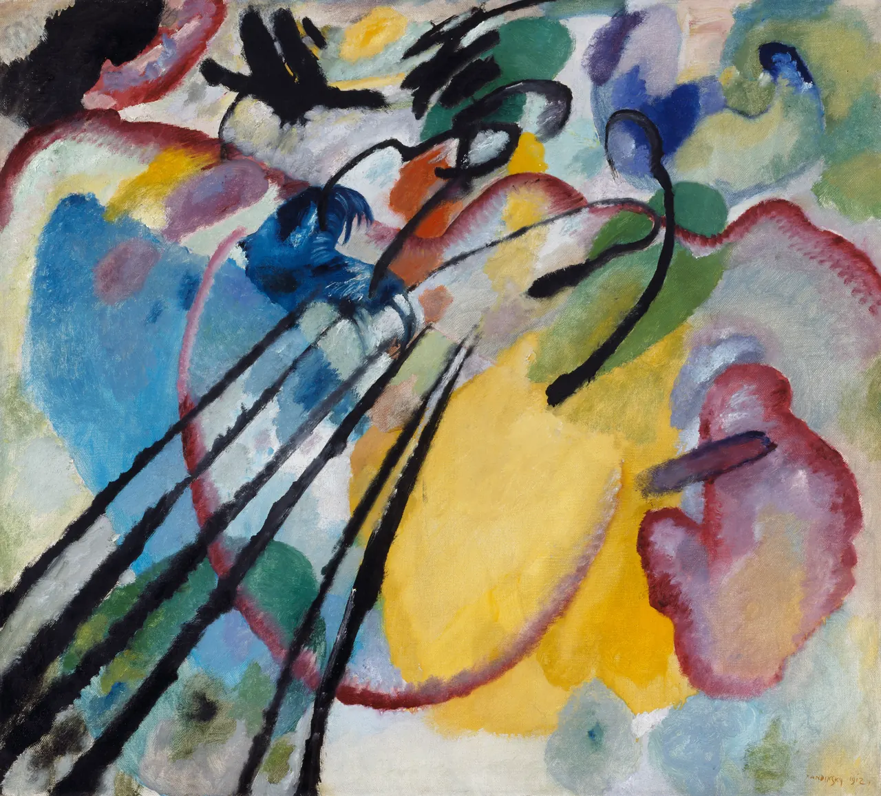
Give yourself a few seconds with Rowing before following its title. The diagonal strokes provide direction even when they do not yet seem to describe oars. Once you recognise a possible boat, the painting does not suddenly become an ordinary view of a river. Line and colour continue to pull your attention separately.
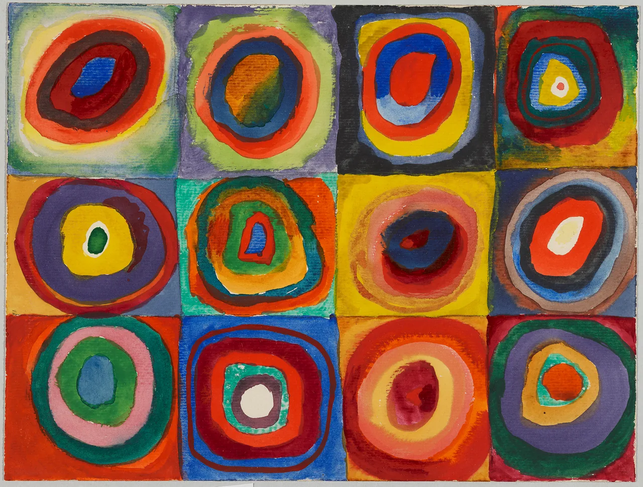
The Colour Study reduces the task differently. Twelve related arrangements allow comparisons without a landscape or body to identify. Some rings appear to advance; others seem hemmed in by their neighbours. Those are effects to test with your own eyes, not instructions that blue must always mean one emotion and yellow another.
Neither image needs a single “first abstract painting” trophy to be important. Together they demonstrate that loosening depiction and investigating colour can happen through different kinds of work. Our Kandinsky guide supplies a wider context for the individual objects.
Delaunay: colour does not erase a story
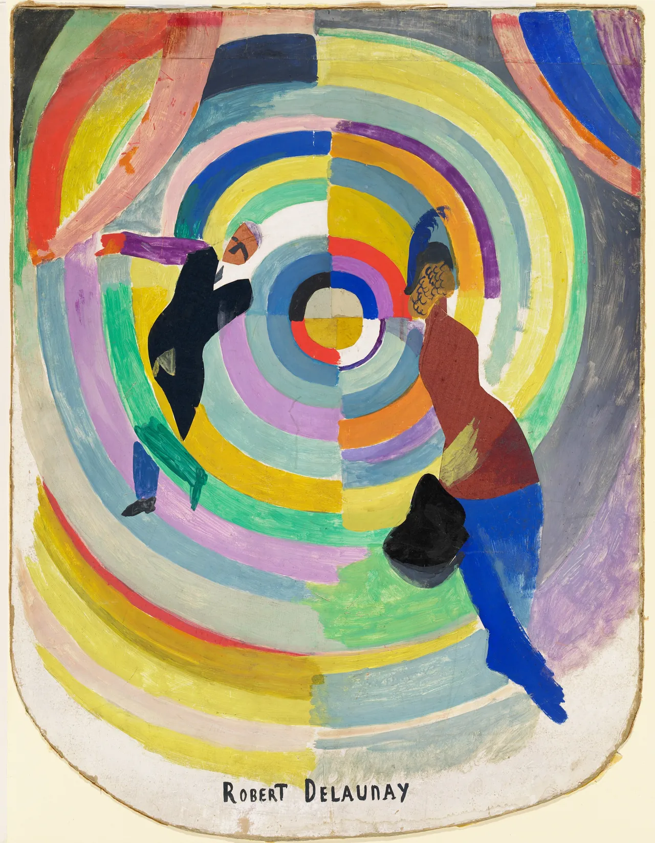
At a glance, Delaunay’s Political Drama might seem to offer an expanded version of Kandinsky’s circles. Look again at the figures. The National Gallery of Art connects the subject to a newspaper illustration of Henriette Caillaux shooting Gaston Calmette, the editor of Le Figaro, in 1914.
That context changes the stakes of the colour. The circles do not replace the event; the fragmented bodies remain entangled with them. A raised arm and a falling figure are still readable inside the repeated bands. The work is oil and collage on cardboard, another reminder that an image’s apparent unity can contain different materials.
This is not evidence that all coloured circles tell violent stories. It shows why a familiar-looking abstract device cannot identify a picture’s meaning by itself. Here, modern visual experiment and a reported event occupy the same surface.
Malevich: a square with a history
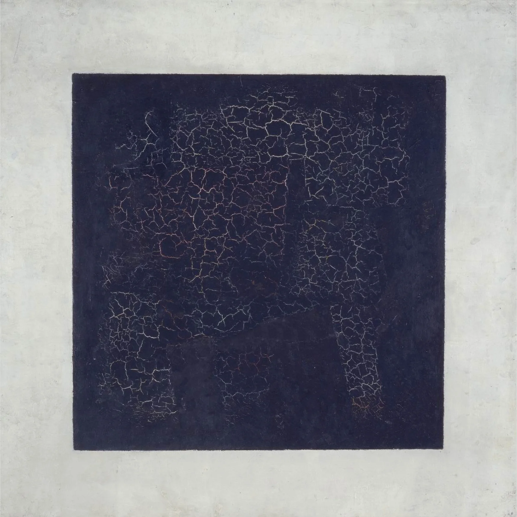
The image here is the Tretyakov’s 1915 Black Square, not a later version or a clean graphic reconstruction. Its imperfect edge and extensive cracking belong to the object we can see today. Removing them would make it easier to read as a logo and harder to encounter as a historical painting.
Malevich’s Suprematism proposed a much more decisive independence from depicted objects. MoMA’s account of his early Suprematist work places its public introduction at the December 1915 exhibition in Petrograd. The useful comparison with Delaunay is not “simple versus complex.” It is whether the arrangement still asks us to recover an external scene.
The pale margin matters as much as the dark centre. It establishes the square as a shape within a field, not simply a blackened canvas. You can observe that relationship without inventing a hidden landscape underneath it.
Klee: figures at the edge of abstraction
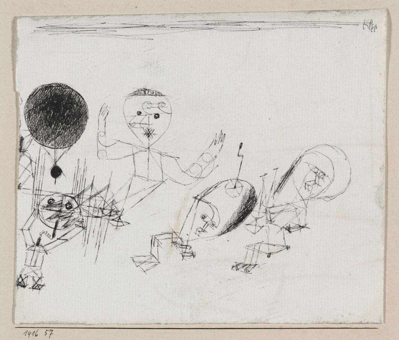
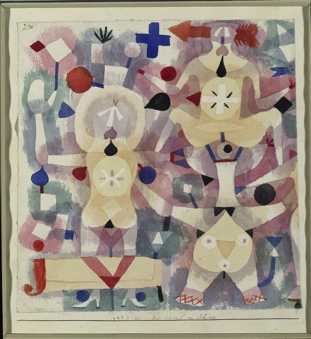
Klee prevents this sequence from ending with the disappearance of figures. In With the Dot, extremely slight lines can still suggest bodies and a threatening encounter. In Carnival in the Snow, patches of colour become performers without surrendering their geometric character.
Try following one outline through the carnival. The same boundary may separate coloured areas and help build a face or limb. The picture stays alive between those readings. It does not need to cross permanently into either a world of identifiable people or a world of shapes alone.
The Klee guide and Kandinsky–Klee comparison explore that instability further. Klee is not simply a later checkpoint on someone else’s march towards purer abstraction.
Several beginnings, and better questions
These works do not form one team. Af Klint’s largely private project, Malevich’s public Suprematism, Mondrian’s constructed balance and Delaunay’s fractured narrative have different aims and histories. Recognising their differences is more rewarding than deciding which artist makes everyone else secondary.
Ask what remains of the visible world, what a title contributes, and what the material surface prevents you from forgetting. Abstraction can reduce information, but it can also create new kinds of attention. For a separate route into art for a room, browse the collections directory; the historical selection here is not a stock list or a movement-wide copyright clearance.
Editorial record
About this article
- Author
- Publisher
- GeMarkt
- Published
- Reviewed
- Internal source & rights check. Conducted by GeMarkt Research Review. This is an internal editorial check—not independent peer review.
- Source standard
- Art history source standardPrioritises object records and research sources, distinguishes evidence from interpretation, and states material uncertainty.
Found a claim that needs checking? Report a factual error.