GeMarkt Blog · Essay
Kandinsky vs Klee
Compare four works by Kandinsky and Klee to see how colour, repeated shapes and drawn signs can move between abstraction and recognisable subjects.

Wassily Kandinsky and Paul Klee can both make a few coloured shapes feel surprisingly alive. That similarity is a good reason to compare them, not a reason to file both under “abstract art” and move on. A ring, an arrow and a face can behave very differently within a picture.
In the four works here, Kandinsky makes colour relationships and forceful directional marks especially conspicuous; Klee makes simple forms hover between signs and recognisable figures. These are observations about selected works, not permanent rules. Kandinsky does not always remove subjects, and Klee’s apparently playful language can carry disturbing content.
Friends with shared questions
They were connected in life as well as in later art-history surveys. The Zentrum Paul Klee’s account of Klee’s friendships records their first personal meeting in Munich in October 1911, followed by Klee’s participation in the second exhibition associated with Der Blaue Reiter, or the Blue Rider.
After the First World War interrupted that Munich connection, they met again at the Bauhaus in 1922. The Bauhaus was a school bringing art, design and craft into conversation. Their shared setting matters, but it did not make them interchangeable teachers or artists.
It is more productive to follow a common question: how much can a picture communicate without describing a scene in the usual way? Neither colour nor a drawn line has to become a realistic object before it can direct attention. Yet an object can remain present even when its appearance has changed dramatically.
Colour rings and carnival figures
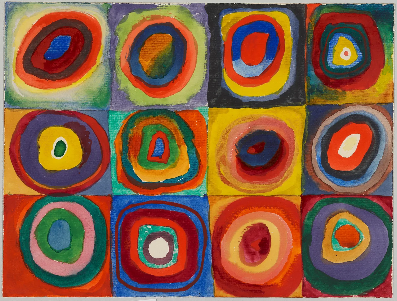
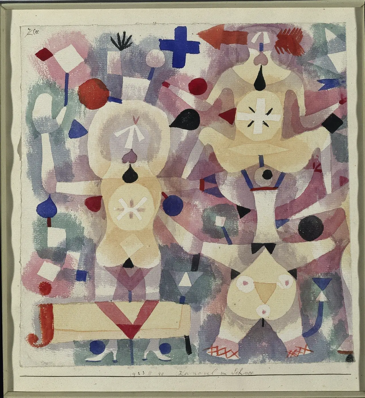
These small works on paper offer an unusually clear comparison. One gives you twelve related units. The other turns a field of shapes into an ambiguous group of performers. Neither needs a deep, realistically lit room to make looking eventful.
Kandinsky repeats a shape to change the colour
Choose one ring in the top row, then compare it with a ring beneath it. Reds border different neighbours; a blue centre can appear surrounded by warm bands or enclosed in darker ones. The format makes comparison almost unavoidable because the broad structure remains recognisable from cell to cell.
The circles are not machine-perfect. Some centres sit off balance; bands thicken, narrow and meet unevenly. That irregularity keeps the sheet from looking like a commercial colour chart. You can notice both the system and the hand at work within it.
The Lenbachhaus record identifies this as a colour study combining several materials. There is no need to turn it into a universal code in which one hue always means one emotion. Its visible invitation is more immediate: compare what happens when related forms contain different colour relationships.
Klee lets shapes become performers
Klee’s sheet initially looks busy with circles, crosses, arrowheads and pale curved shapes. Then a head and outstretched arms begin to assemble themselves. Once you recognise a performer, the same marks may switch back into a pattern. Recognition is something that happens while you look, rather than a task completed at the first glance.
The Cleveland Museum’s description identifies acrobats and jugglers, including two who share a face and torso. It connects their emergence with the artist’s layering of coloured forms. That account helps explain this image without requiring us to assume that every Klee began by exactly the same method.
Compare the blue cross near the top with Kandinsky’s rings. Both are simple shapes, but Klee’s cross joins a scene in which other signs are beginning to act like people. Its meaning is less settled. An arrow directs the eye even when it does not point to a clearly labelled destination.
A boat and an unsettling drawing
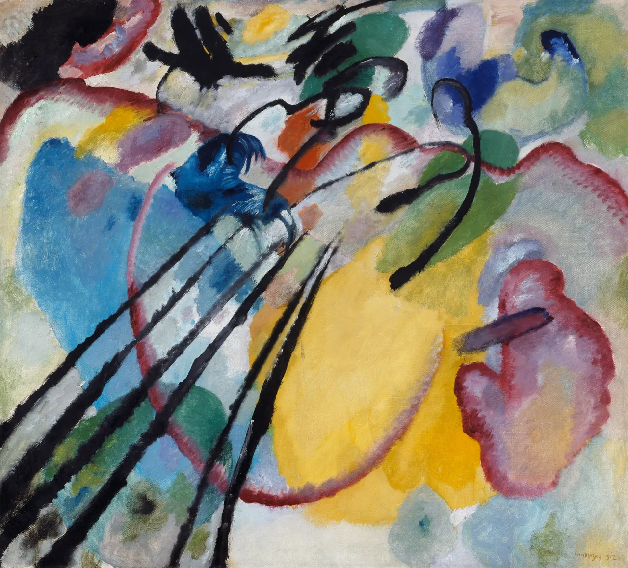
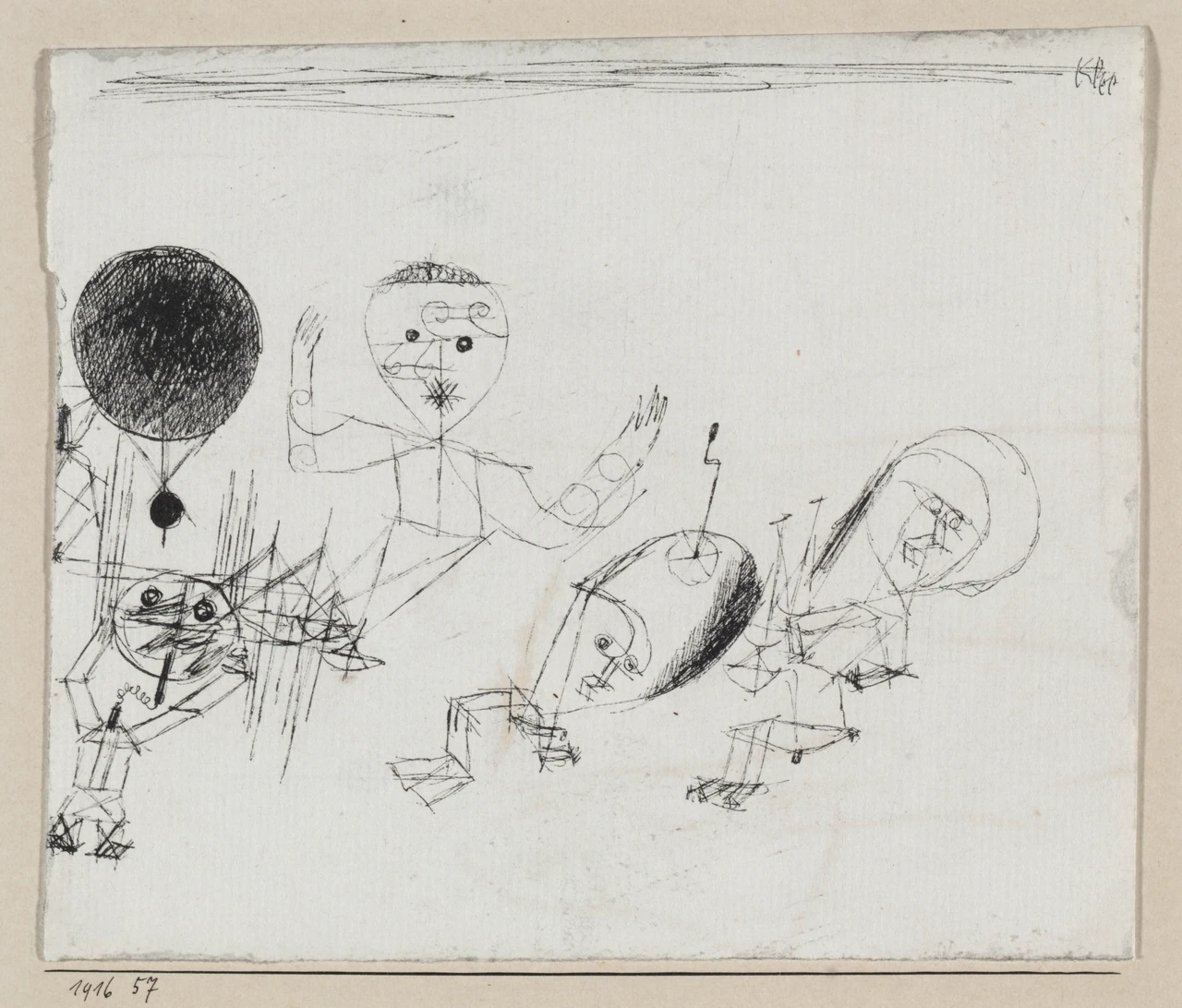
This pair complicates the first. Kandinsky’s title names a physical activity: rowing. Klee dispenses with bright colour, and his fragile-looking figures belong to a wartime image. Neither fits a simple opposition between serious abstraction and cheerful fantasy.
Follow the marks before naming the subject
In Rowing, the black diagonals rise strongly from the lower left. Curves gather around the centre, while yellow occupies a large area below and to the right. The marks suggest effort and direction before every part can be assigned a name. The title offers a way to connect them with bodies, a boat and oars; it does not turn the picture into a precise diagram of rowing technique.
Klee’s lines operate at another pressure. Thin, wandering contours build unstable figures, while the dense black circle pulls disproportionately hard on the left. The contrast between a heavily worked patch and barely supported bodies matters even before the scene’s historical interpretation is introduced.
The Cleveland record for With the Dot links the drawing to the First World War and identifies a zeppelin and a fallen soldier among its forms. It leaves the hovering figure’s character uncertain. That uncertainty belongs in the reading: strange shapes do not provide a simple dictionary in which every feature has one incontestable meaning.
Small paper is not less ambitious
The original colour study is only about 24 centimetres high, and Klee’s ink drawing is smaller still. Enlarging them on a screen can disguise the closeness of the encounter they invite. Rowing, by contrast, is roughly a metre across and painted in oil on canvas.
Those differences do not establish a ranking. They change the pace and physical character of looking. A tiny line drawing can ask for sustained attention; a large canvas can make a direction register before you have consciously followed it. Always check the dimensions before imagining how two works would confront you in a gallery.
What the titles do and do not tell you
Read the images once without their titles, then restore them. Colour Study confirms a comparative exercise; Carnival helps figures emerge from patterns; Rowing supplies a bodily action; With the Dot directs attention towards a small formal element within a troubling scene.
The titles guide rather than solve. They do not tell you exactly what to feel, and they cannot replace the evidence of the marks. This is one reason abstraction and representation are better treated as questions about particular pictures than as two permanently separate camps.
Compare decisions, not personalities
Kandinsky and Klee both explored how form could carry more than a straightforward likeness. Here, repeated colour relationships, directional energy, emerging figures and ambiguous signs offer four different answers. Saying one artist was rational and the other imaginative would overlook what the images actually share.
Continue through the Kandinsky and Klee guides, keeping one practical question: what changes when a mark stops being only a mark and starts becoming something you recognise? These four works make that moment visible without requiring it to happen in the same way every time.
Editorial record
About this article
- Author
- Publisher
- GeMarkt
- Published
- Reviewed
- Internal source & rights check. Conducted by GeMarkt Research Review. This is an internal editorial check—not independent peer review.
- Source standard
- Art history source standardPrioritises object records and research sources, distinguishes evidence from interpretation, and states material uncertainty.
Found a claim that needs checking? Report a factual error.