GeMarkt Blog · Essay
Hokusai vs Hiroshige
Compare Hokusai's Great Wave with Hiroshige's Sudden Shower: how their lines, viewpoints, weather and small human figures make a landscape move.

Hokusai gives you a wave that seems about to close over the picture. Hiroshige gives you a bridge you might hurry across before the rain gets worse. Both scenes contain tiny people, strong shapes and unsettling outdoor conditions. Their different effects become clear when you follow where each picture lets your eye move.
In this pair, Hokusai builds a concentrated encounter between a huge moving wave and a small distant mountain; Hiroshige spreads a passing shower across an everyday route through the city. That is a useful comparison of these prints, not a rule that Hokusai always painted drama and Hiroshige always painted peace.
The difference in one look
Katsushika Hokusai (1760–1849) and Utagawa Hiroshige (1797–1858) were Japanese artists whose lives overlapped. The works below are colour woodblock prints: images printed from carved blocks, rather than unique oil paintings. Their dates, titles and series are recorded by the Met for Hokusai’s sheet and Hiroshige’s sheet.
| Look at | Hokusai: The Great Wave | Hiroshige: Sudden Shower |
|---|---|---|
| The sheet | Wide and horizontal | Tall and vertical |
| The main movement | Curves fold inward and upward | Bridge and rain run on different diagonals |
| People | Crews bent low in narrow boats | Travellers sheltering as they cross |
| Distant anchor | The small white peak of Mount Fuji | The far riverbank beyond the rain |
| Series | Thirty-six Views of Mount Fuji | One Hundred Famous Views of Edo |
Two prints side by side
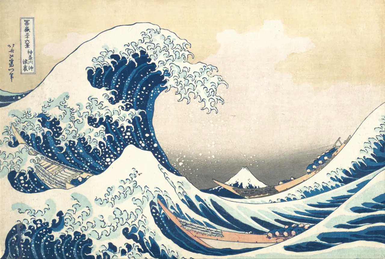
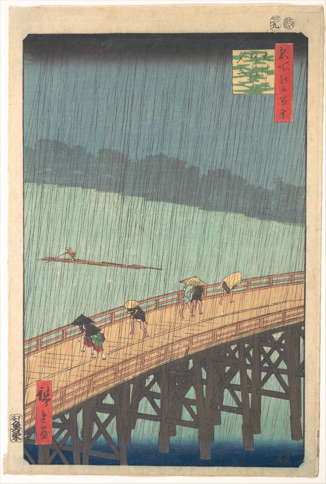
The sheets are not reproduced at their original physical sizes here. Their proportions are preserved so that the horizontal wave and vertical bridge can be compared without stretching either composition.
Hokusai builds a wave around a mountain
Begin with the largest shape, then search for the smallest white triangle. The wave curls down from the upper left; Fuji sits low near the middle, beyond the boats. The mountain is easy to overlook because the foreground water claims so much attention.
Now compare the wave in front with the mountain behind. One rises in a sharp, pale peak; the other has a snow-covered summit. The similarity makes the enormous difference in distance easier to feel. The mountain looks steady while the water is about to change shape.
The empty area beneath the crest is doing useful work. It separates the wave’s branching foam from Fuji and leaves room for the eye to find the mountain. Fill that space with more boats or more foam and the encounter would be much harder to read.
This is why the print remains readable even at a small size. Its immediate impact comes from the relationship between a few large shapes. The finer lines reward a second look, but they do not have to carry the whole composition.
Hiroshige makes rain cross the whole picture
In Sudden Shower, the wooden bridge rises diagonally across the lower part of the sheet. Above it is a wide stretch of water and a dark, distant bank. Fine rain lines cut through those different areas, joining near and far under the same weather.
Try following the bridge rail, then following a rain line. Your eye changes direction. That crossing of directions gives the picture energy without a single giant object like Hokusai’s wave.
The bridge also continues beyond the edges. You cannot see its complete length or watch each traveller reach safety. The view feels like a section of a larger journey rather than a whole scene neatly enclosed for inspection.
Notice the lone craft on the river. Its thin horizontal shape slows the eye between the sharply rising bridge and the darker strip of shore. The effect is not simply “busy foreground, empty background”: each area has a different pace.
Follow the people, not just the weather
Hokusai’s boat crews are easy to miss when the print is reduced to a wave logo. Their lowered bodies repeat along the hulls. Once you find them, the water becomes a force that particular people must negotiate, not an abstract decorative curve.
Hiroshige makes individual responses easier to separate. Travellers bend, share cover or hold protection above their heads. They are small, but their different postures make the interruption feel ordinary and recognisable.
Neither picture tells us precisely what every figure thinks, or what happens afterwards. We can describe their positions without inventing a rescue in one scene or a happy arrival in the other. The suspense belongs to the visible moment.
Two different ways to make depth
Both prints create distance without shading every form as though it were a European oil painting. Hokusai contrasts the huge foreground curve with the miniature mountain. Hiroshige overlaps the bridge, river and far bank, placing them at different heights on the sheet.
Colour helps separate those zones, but exact hues vary between surviving impressions and their photographs. The particular sheets reproduced here are two Met objects, not universal colour standards for every copy ever printed.
The composition is therefore a more dependable first comparison than saying one artist “uses more blue”. Ask how the near and distant forms are arranged. Then look at how this particular impression’s colour makes that arrangement visible.
These images were made by teams
The artist’s name is not the name of everyone involved. The Met’s explanation of ukiyo-e production describes distinct designer, carver, printer and publisher roles. Raised areas on carved blocks carried ink; successive impressions supplied the colours, aligned on the paper.
That matters when admiring Hiroshige’s rain. The fine lines had to survive translation into a printable surface. Hokusai’s foam likewise required more than an inspired drawing. The finished sheets depended on skilled physical production.
A museum impression is also not the same object as a modern poster made from its photograph. Our guide to paintings, prints and multiple copies explains that distinction.
Neither artist fits one mood
It is tempting to turn this comparison into a personality test: Hokusai the dramatic designer, Hiroshige the gentle traveller. Yet the shower is forceful, and the wave contains an exceptionally still mountain. Each picture holds opposing qualities.
Hiroshige’s range also includes travellers in the snow at Kanbara and the snow-covered temple at Asakusa. One rain scene cannot stand for all of it. Nor should Hokusai’s long career disappear behind his most reproduced wave.
What to look for next
On another print by either artist, start with three things: the route through the image, the relationship between people and setting, and the largest area left relatively open. These questions reveal more than memorising a favourite colour or a supposed national mood.
For a closer reading of the boats, foam and mountain, continue with the story behind Hokusai’s Great Wave. The Hokusai and Hiroshige guides identify further works and their source records. Keep comparing specific pictures: the exceptions are often where the artists become most interesting.
Editorial record
About this article
- Author
- Publisher
- GeMarkt
- Published
- Reviewed
- Internal source & rights check. Conducted by GeMarkt Research Review. This is an internal editorial check—not independent peer review.
- Source standard
- Art history source standardPrioritises object records and research sources, distinguishes evidence from interpretation, and states material uncertainty.
Found a claim that needs checking? Report a factual error.