GeMarkt Blog · Essay
The Story Behind Hokusai's Great Wave
Three boats, a tiny Mount Fuji and a wave about to break: discover the people, printing craft and remarkable blue behind Hokusai's famous image.

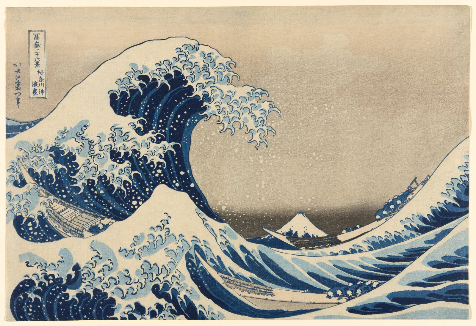
First you see the wave. Then the boats beneath it. Only after a moment do you notice the little white mountain in the distance.
That mountain is Mount Fuji, and it gives the picture its first surprise: this is an image from a series about a mountain, not a sea voyage.
Katsushika Hokusai created Under the Wave off Kanagawa, better known as The Great Wave, in Japan in the early 1830s. He was around seventy when he began Thirty-Six Views of Mount Fuji. And despite its enormous presence, the work is not a huge painting: the Art Institute of Chicago’s printed sheet shown above measures just 25.4 by 37.6 centimetres, about 10 by 15 inches. Its museum record dates it to 1830–33.
The drama fits on a sheet you could hold in your hands. Understanding what fills that small space makes the familiar image much less familiar.
The mountain you might miss
Fuji sits low in the picture, tucked into the gap beneath the wave. A much nearer peak of water rises on the left. Both have pale, pointed tops, so for a second the mountain can seem like another wave.
Then the difference becomes clear. The water bends and breaks; Fuji holds its shape. The empty sky between them makes the distance feel immense.
Fuji was already a mountain with deep religious and cultural significance. Hokusai’s series showed it from different places and in changing conditions, sometimes large, sometimes easy to overlook. Here, a view of that enduring landmark passes through a moment of danger. The British Museum’s account connects the composition with the mountain’s sacred importance.
That does not mean you need to decode every shape as a symbol. Start with the simplest contrast: something very close is about to change violently; something far away appears completely still.
The people under the wave
The thin brown forms running through the water are three boats. Their crews are bent low, their heads appearing as small pale shapes against the blue.
These are working boats, not pleasure craft. The British Museum identifies them as oshiokuri, fast boats used to carry fresh fish to market in Edo, the city now called Tokyo. That detail gives the scene an everyday purpose: people are trying to get their work done at sea. They are not merely decorative figures placed beneath an impressive wave. Source: British Museum.
Seen without the crews, the great curl might look almost ornamental. With them, it becomes frighteningly large. Follow the long curve of the foreground boat: water hides part of its hull, and the row of bodies seems perilously close to the surface.
The picture leaves their fate unresolved. We see the instant before the wave falls, not what happens afterward. It would be a different story if Hokusai showed an overturned boat or people safely reaching shore.
Nor should we turn it into a report of a particular tsunami. The museum describes a storm wave; the image alone cannot establish a specific historical disaster.
A print made by many hands
Hokusai designed the picture, but he did not produce every sheet by painting it again.
In Japanese colour woodblock printing, a carver cut the design into wood, leaving the areas that would carry ink raised above the rest. A printer applied colour, laid paper against the block and rubbed the back to transfer the image. Additional blocks supplied other colours, carefully aligned so that the shapes met in the right places.
A publisher organised the venture and brought the sheets to buyers. The finished print therefore depended on several people’s work: design, carving, printing and publishing. The Met’s explanation of woodblock printing describes those distinct roles.
Now look again at the small hooks of foam along the crest. They seem quick and effortless. Yet each curve had to survive that journey from a drawn line to carved wood to ink on paper. The apparent spontaneity rests on precise work.
The blue that gives the wave its depth
The blue is not just a memorable colour choice. It is part of the print’s technical story.
Prussian blue, a manufactured pigment newly available to Japan’s print market, offered a powerful new colour for sky and water. Research at the Met found that printers combined it with indigo in the dark outlines and layered blue over blue in the wave. Those overlapping areas create a deeper tone without flattening the brighter colour beside them. Source: Marco Leona, The Met.
These findings concern the impressions discussed in the Met’s study, including its early print; they are not a laboratory analysis of the Chicago sheet shown here.
You can still see why the colour matters. The pale foam stands out against the dark water, while bands of lighter blue draw the eye along the wave’s surface. The water seems to turn rather than lie flat.
Why there is more than one Great Wave
It is natural to ask which museum owns the original. With this work, there is no single answer in the way there would be for one painted canvas.
The design was made to be printed repeatedly. Each individual sheet is called an impression. Historic impressions survive in several collections, and they do not all look identical. Blocks wore down, printing choices changed and colours aged. British Museum scientist Capucine Korenberg explains how such differences help researchers place the sheets in sequence. These were also relatively inexpensive prints when first sold, rather than objects made only for museums. Source: The Great Wave: spot the difference.
The image on this page reproduces the Art Institute of Chicago’s impression numbered 1925.3245, from the Clarence Buckingham Collection. The museum identifies its three Great Wave sheets as later than the design’s first state. That does not make them modern copies; it tells us where they belong in the print’s production history. Source: Art Institute of Chicago.
So a paler sky or a different-looking line in another museum’s image need not mean someone has edited the picture. You may be looking at a different surviving sheet.
The moment that never ends
One way to understand the image’s pull is to notice how much it leaves unfinished.
The wave has risen but has not fallen. The boats are threatened but have not disappeared. Fuji remains visible, though the crest seems about to close around it. Your eye supplies the movement that the paper cannot show.
There is room for more than one response: fear for the crews, admiration for the curling shape, or relief in the small, steady mountain. Those are readings of the picture, not a claim that Hokusai left us one official explanation.
Once you have noticed the people and Fuji, it becomes harder to see only a beautiful blue wave. The picture holds a whole working world inside a single, suspended moment.
Keep exploring
The museum links throughout this story support its historical details. If your question is about downloading or reusing an image, our separate Hokusai public-domain guide explains the difference between the artwork, a particular printed sheet and its digital photograph.
Editorial record
About this article
- Author
- Publisher
- GeMarkt
- Published
- Reviewed
- Internal source & rights check. Conducted by GeMarkt Research Review. This is an internal editorial check—not independent peer review.
- Source standard
- Art history source standardPrioritises object records and research sources, distinguishes evidence from interpretation, and states material uncertainty.
Found a claim that needs checking? Report a factual error.