GeMarkt Blog · Essay
Hokusai, Hiroshige and Kuniyoshi: Three Masters Compared
Compare nine real prints by Hokusai, Hiroshige and Kuniyoshi, from wind and mist to workers, warriors and ghosts, without reducing each artist to one subject.

Hokusai is the wave, Hiroshige is the rain, Kuniyoshi is the warrior. That shorthand is memorable, but it breaks down as soon as you put more than one print by each artist on the table. Hokusai also made ghosts unsettlingly intimate. Hiroshige could fill a scene with violent water. Kuniyoshi could slow everything down to the quiet work of gathering seaweed.
These nine works—three by each artist—give a fairer comparison. Rather than awarding each a permanent mood, look at the choices within particular designs: what becomes large, what remains small, where the viewer seems to stand, and how much of a story the image expects you to know.
Three designers, not three sealed compartments
Katsushika Hokusai (1760–1849) was older than Utagawa Hiroshige (1797–1858) and Utagawa Kuniyoshi (1797–1861), but the works gathered here overlap within the nineteenth century. They are not successive stages in which one artist replaces another.
All three worked within a collaborative print culture. The finished sheets depended on publishers, carvers and printers as well as the named designer, as the Met’s explanation of woodblock production makes clear. They also produced far more than the small selection shown here. A comparison is most useful when its conclusions remain attached to actual pictures, rather than becoming claims about everything an artist ever made.
The first six works establish familiar strengths. The final three deliberately complicate them. Each caption identifies a particular museum impression; differences between surviving impressions should not be mistaken for a change of artist.
Hokusai: the wave and the force you cannot see
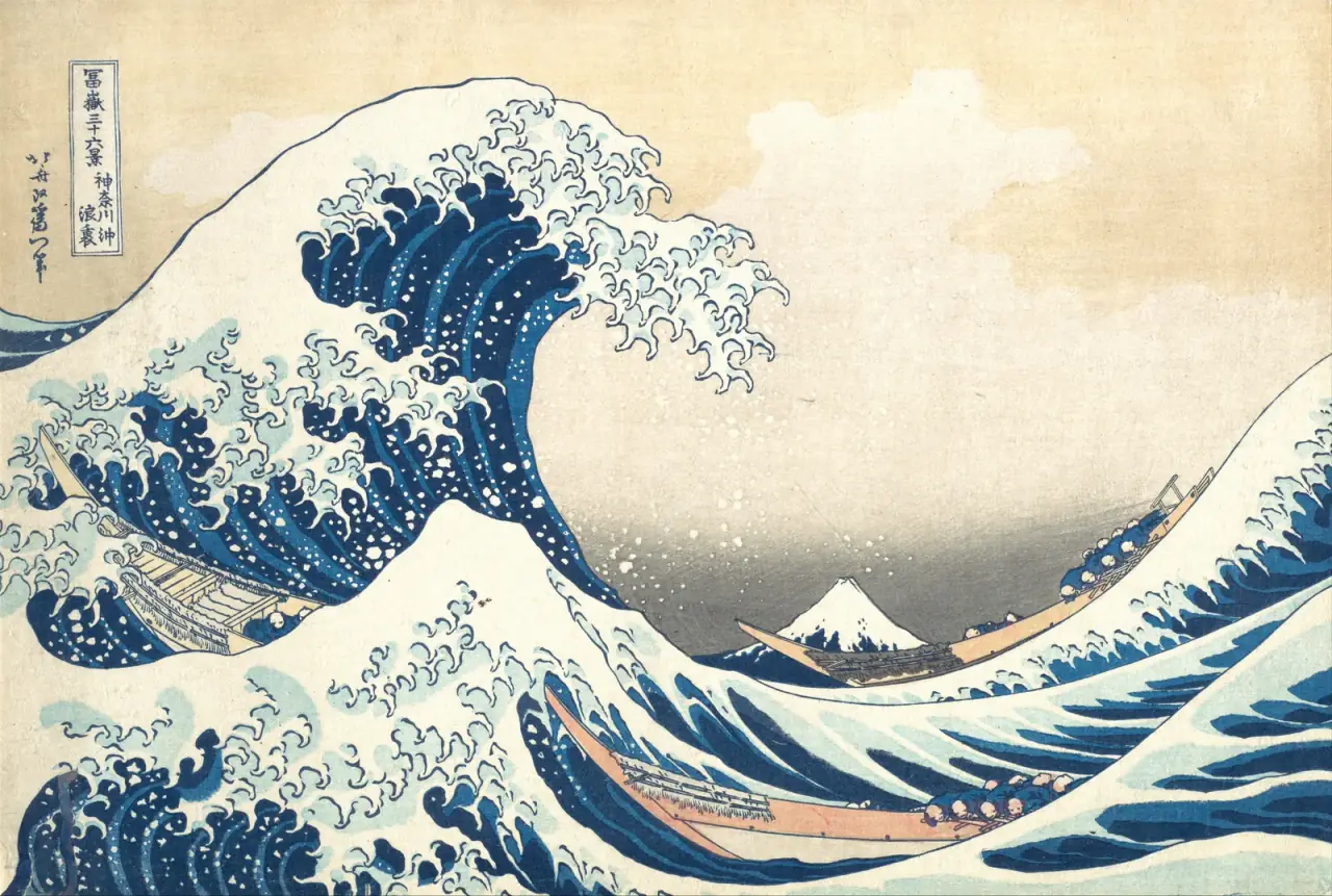
In Under the Wave off Kanagawa, the large curve is easy to remember. Less obvious is how many smaller shapes answer it. The boats bend through the water, the white foam breaks into hooked tips, and the people repeat low, rounded forms. Mount Fuji stays small and comparatively simple.
The image is therefore more than a large object beside a small one. Several rhythms compete within a tightly organised rectangle. Your eye can follow the boats under the wave, then stop at the mountain beyond them. The tension between moving foreground and apparently steady distance makes the design legible even at a small scale.
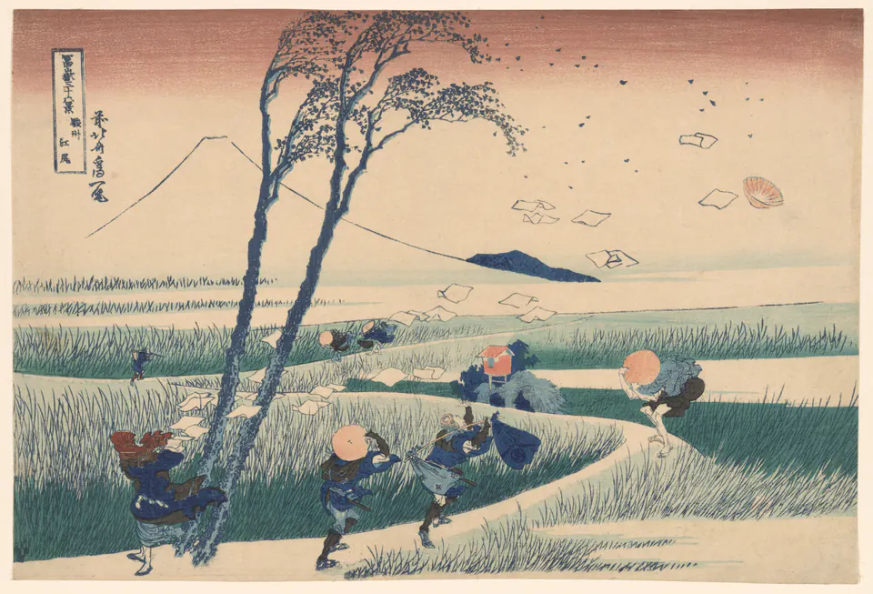
Ejiri gives wind a visible structure without painting wind itself. Papers scatter into the sky, a hat flies loose, trees lean and travellers brace themselves. The pale path twists through those disturbances. Fuji is again present, this time as an almost weightless outline behind the action.
Compare the two prints through the people rather than the weather. On the boats, repeated bodies seem caught in a shared movement. On the road, individuals react differently to one gust. In both, bodily effort helps you understand an otherwise immense or invisible force. Neither picture needs a detailed facial expression to make that effort readable.
Hiroshige: arriving at a place in particular conditions
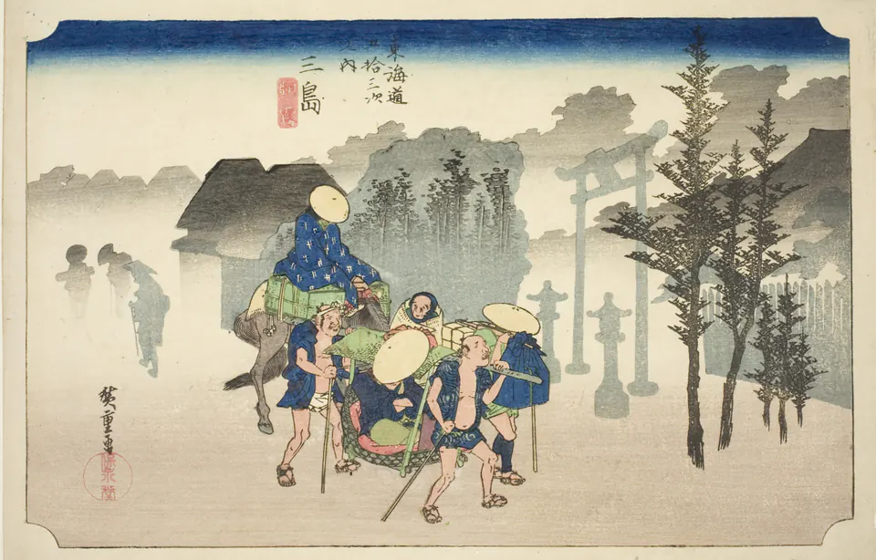
At Mishima, foreground travellers are relatively distinct while buildings, trees and people farther away fade into grey. Distance is made through differences in clarity. The picture asks you to experience an arrival in particular air, not simply identify a landmark.
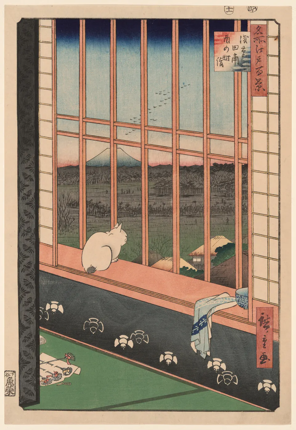
The vertical Asakusa Rice Fields changes the viewer’s position altogether. We look through an interior window, past a cat, towards the fields and mountain. The window grid interrupts the view rather than disappearing politely around it. Nearby cloth and small objects matter because they establish the space from which the landscape is being seen.
Place these beside Hokusai’s Ejiri. All three include ordinary activity or its traces, but the viewpoints distribute attention differently. Hokusai spreads a disturbance across the open road. Hiroshige can make the viewer pause behind a barrier, or watch forms gradually disappear into mist. “Atmospheric” is useful only if you can point to how that atmosphere is constructed.
Kuniyoshi: bodies, stories and ordinary work
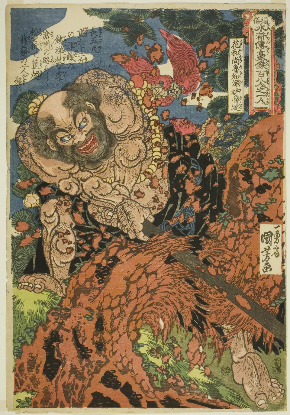
Kuniyoshi’s Lu Zhishen almost seems too large for the sheet. Bent limbs, tattoos, tree bark and flying fragments pack the surface. Unlike the small workers under Hokusai’s wave, this body occupies the centre of the action and appears capable of causing the surrounding upheaval.
The series title places the figure within the Water Margin stories. That literary identity matters, but the physical struggle is visible before you know the tale. Follow the feet, arms and diagonal trunk: the composition turns effort into a knot of opposing directions. The close viewpoint denies the comfortable distance available in a panoramic landscape.
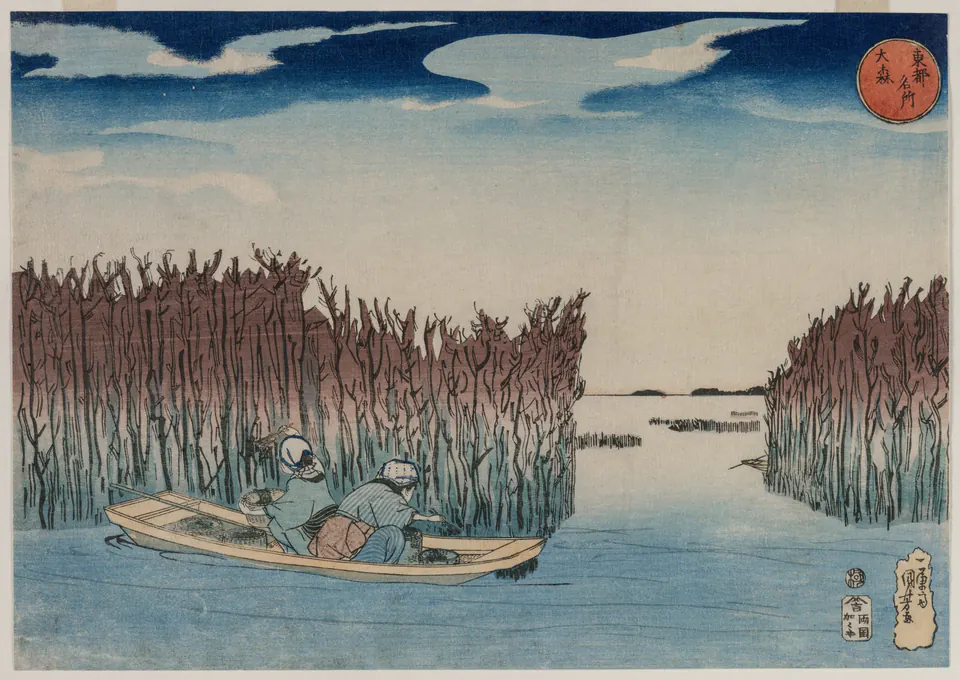
Then look at Ōmori. The Cleveland Museum of Art identifies two women gathering nori seaweed. Their low boat sits between dense beds and open water. Instead of an enormous hero, there are small working figures whose gestures belong to the place.
The comparison with Lu Zhishen is useful precisely because it frustrates the stereotype. Kuniyoshi can organise a quiet landscape as well as a crowded heroic scene. The branch-like shapes around the boat create a measured rhythm; the open channel gives the eye a route into the distance. His landscapes deserve to be seen rather than treated as exceptions to skip.
Where the easy labels break down
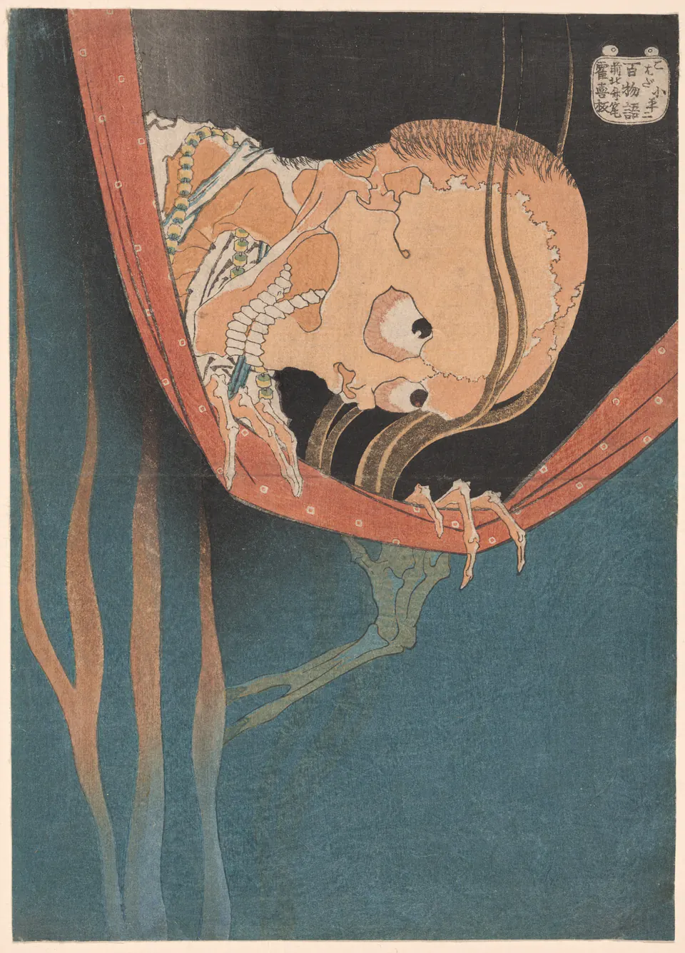
Hokusai’s ghost replaces the open horizon with an invasive face. The net’s curved edge and the fingers holding it make a boundary that feels insufficient. The Art Institute connects the subject to a murdered actor’s revenge. Knowing the story explains the identity; the composition supplies the uncomfortable proximity.
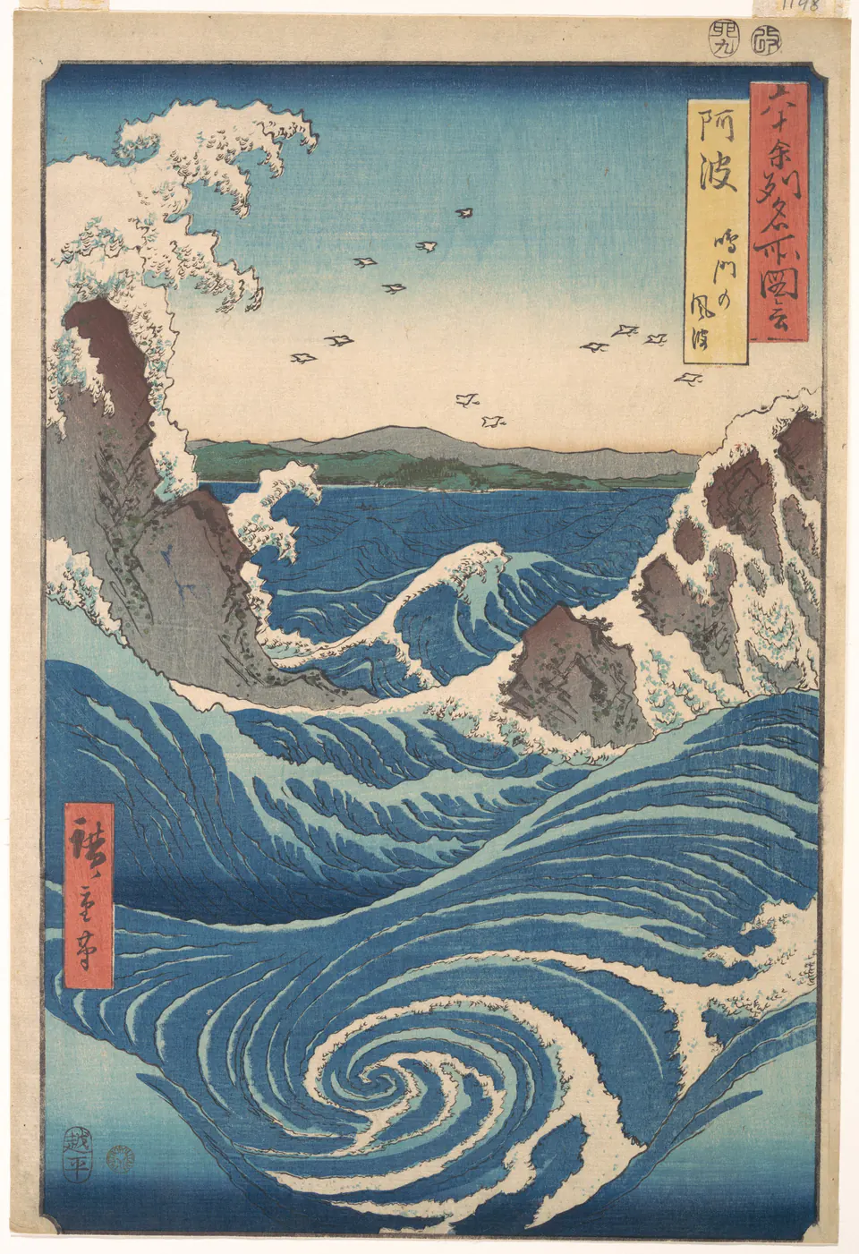
Hiroshige’s Naruto Whirlpool is hardly a retreat into mild weather. A foreground spiral draws the eye inward, while broken waves strike rocks above it. The tall sheet stacks several kinds of movement between near water and distant sky. Compare this with Hokusai’s horizontal wave: the shared subject does not produce the same route through the picture.
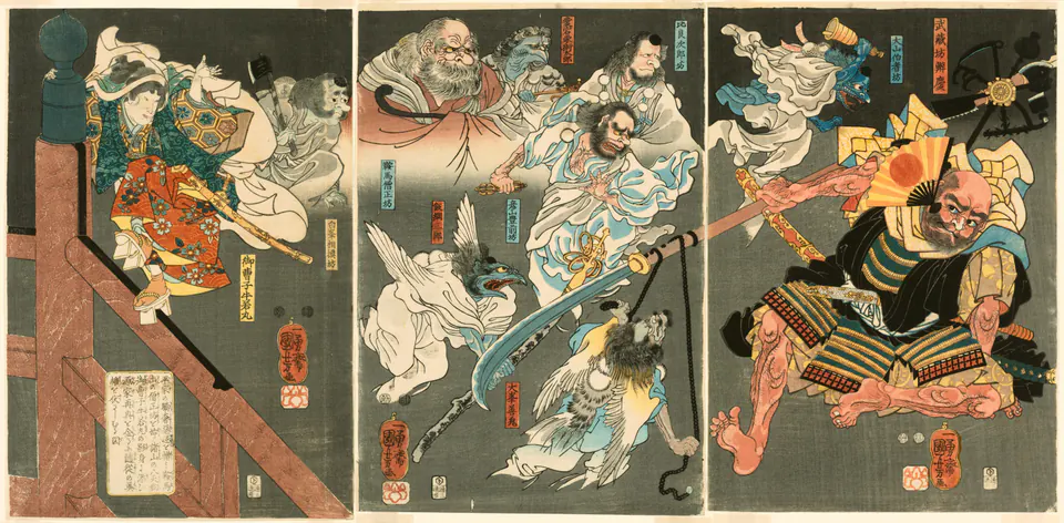
Kuniyoshi spreads the legendary encounter of Yoshitsune and Benkei across three sheets. The young figure is perched at the left; Benkei occupies the right; supernatural helpers crowd the intervening air. The museum’s account explains the tengu assistance rather than presenting the scene as a documentary record of a historical fight.
The wide format lets action travel between separated protagonists. That differs from the compressed body and tree in Lu Zhishen, and from the uninterrupted water in Ōmori. Even within one artist’s work, format changes the storytelling.
Three ways to build a picture
For these examples, Hokusai often makes a force legible through a sharply organised relationship: wave and boat, gust and traveller, ghost and net. Hiroshige makes the viewer’s position consequential: emerging through mist, looking from an interior, peering down at moving water. Kuniyoshi varies the scale of the human body from a commanding hero to a small worker, and uses expanded formats to stage relationships.
Those are observations about these nine works, not rules for authenticating an unsigned print. Try covering the caption and following the largest shapes first. Then restore the title and ask what information it adds. This keeps recognition connected to evidence rather than to a familiar name.
Keep looking beyond the most famous image
Our guides to Hokusai, Hiroshige and Kuniyoshi provide further works and object-specific source checks. For their wider reception, Japonisme follows Japanese designs into different Western works without treating resemblance alone as proof of influence.
The Hokusai and Hiroshige wallpaper collections are existing, separate selections for screen use; they do not contain every print discussed here. Whichever image first attracts you, look at one that challenges your initial idea of its maker. That second encounter often teaches you more than another glance at the famous one.
Editorial record
About this article
- Author
- Publisher
- GeMarkt
- Published
- Reviewed
- Internal source & rights check. Conducted by GeMarkt Research Review. This is an internal editorial check—not independent peer review.
- Source standard
- Art history source standardPrioritises object records and research sources, distinguishes evidence from interpretation, and states material uncertainty.
Found a claim that needs checking? Report a factual error.