GeMarkt Blog · Essay
Engravings and Etchings: Dürer, Piranesi and Doré
Explore eight prints through line, light and scale, from Dürer’s engravings and Piranesi’s architecture to Goya, Rembrandt and illustrations after Doré.

A black-and-white print can contain an extraordinary range of sensations: the smooth flank of a horse, a stone wall disappearing into shadow, a burst of light in a forest. Look close and those sensations resolve into marks. Step back and the marks become a world again.
Dürer, Piranesi and Doré offer three especially rewarding ways into that experience. Dürer asks for patient attention to small distinctions. Piranesi makes architecture feel physically overwhelming. Illustrations after Doré turn a book page into a dramatic stage. Rembrandt and Goya expand the comparison through light and darkness. The eight images below are particular museum impressions or book plates, not interchangeable versions of a famous design.
What to look for in a printed line
In metal engraving, a cutting tool called a burin makes grooves that hold ink. In etching, acid bites lines exposed through a protective coating. Both belong to intaglio printing, where ink in recessed marks transfers to paper. The Met’s introductions explain engraving and etching; individual prints can combine processes.
That is different from wood engraving, the relief process associated with many nineteenth-century illustrated books. The upper surface prints; cut-away marks remain light. The Met’s guide to prints describes the hard end-grain blocks used for fine wood engraving. The similar names do not make a Doré book illustration a copperplate engraving.
You need not identify a process from a thumbnail. Start with a simpler question: where do the marks change? A close mesh may model a cheek, loose strokes suggest smoke, and a pale opening make everything around it seem darker. Then check the catalogue’s medium rather than guessing from appearance alone.
Dürer: Saint Eustace and the patience of looking
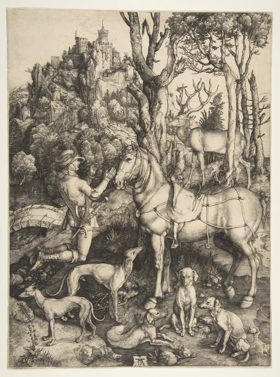
The hunting dogs are an easy place to begin. Some rest, one looks upward, and their overlapping bodies occupy much of the foreground. Follow them toward the horse, then to the kneeling man and the stag. The image rewards wandering before its central event becomes clear.
According to the legend identified by the Met, the hunter sees a crucifix between the stag’s antlers and converts to Christianity. Dürer gives that extraordinary encounter a world full of ordinary textures. Bark breaks into irregular ridges; the horse’s body looks smooth; distant buildings become tiny precise interruptions in the landscape. The variety matters as much as the quantity of detail. Try following one tree trunk upward: its marks stay legible even as branches and buildings compete around it.
Melencolia I: a room full of different surfaces
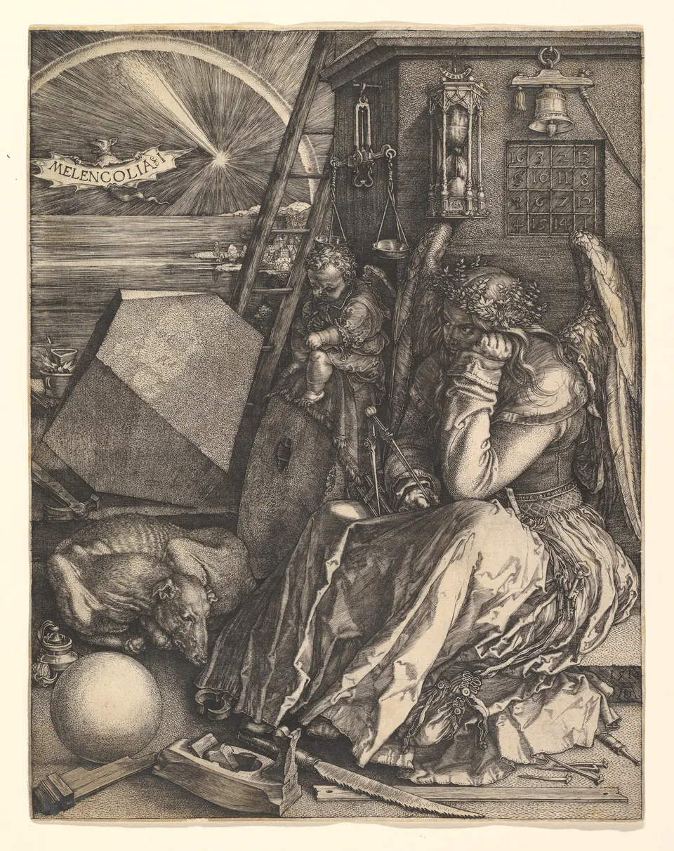
Begin with the sphere near the lower left. Its gradual shading makes it seem round. Move to the large angular solid above it: sharply divided planes replace that gentle transition. Then compare the dress, feathers and sleeping animal. One ink supplies several kinds of matter.
The winged figure holds a measuring instrument but does not appear to be working. Tools crowd the ground while the gaze travels beyond them. The Met connects this tension with Renaissance ideas about melancholy and creativity. That interpretation is useful without turning every object into a clue with one settled answer. You can experience the picture’s charged stillness before decoding its symbols: so much capacity for action, so little action taking place.
Rembrandt: light without a lamp
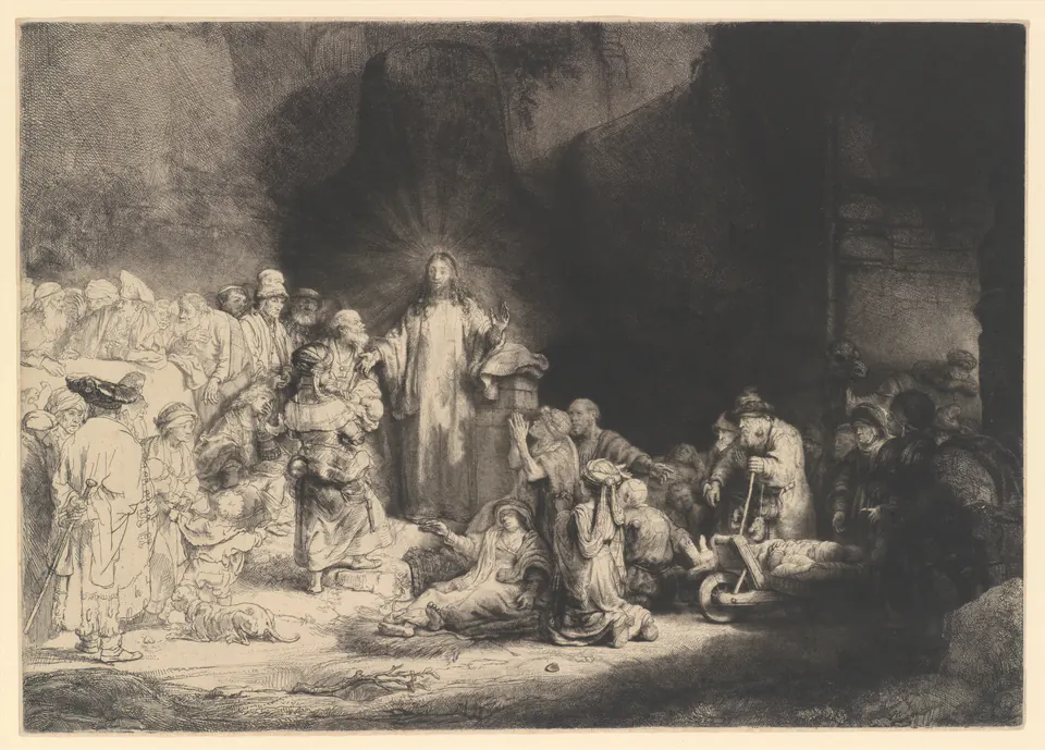
The crowd changes density as your eye crosses the sheet. At left, light lines leave the paper open. At right, people emerge from a much heavier darkness. Christ stands between those conditions, a relatively pale vertical form holding the composition together.
This is a useful corrective to the idea that a print must have one consistent kind of finish. The sparse and dense passages work together; neither is simply an incomplete version of the other. The Met records three processes in this impression. A screen image cannot reliably tell you which tool made each visible stroke, but it can show how different degrees of darkness guide attention through the gathering.
Piranesi: the Pantheon as an encounter
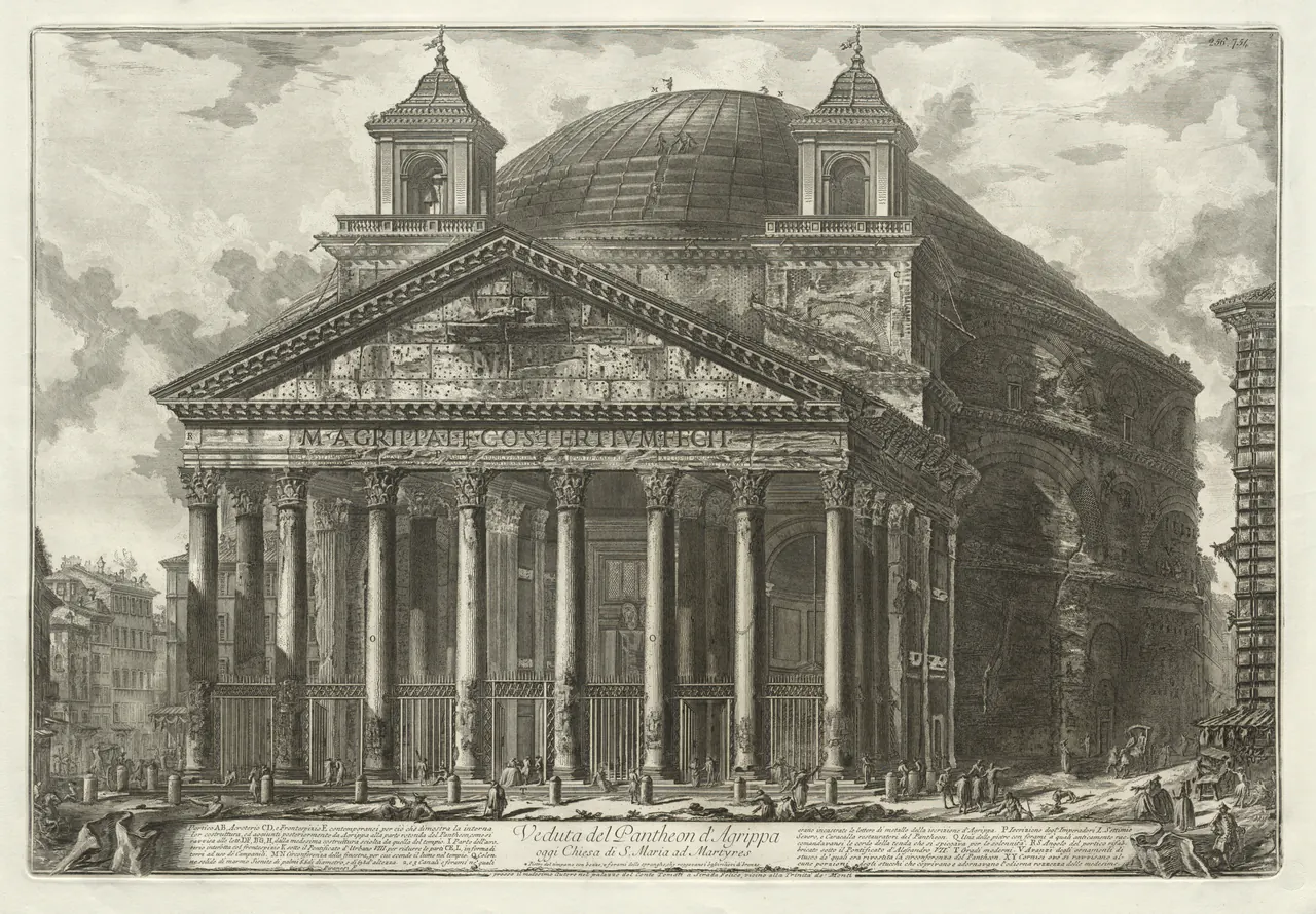
Here the small figures provide a way to feel the building’s size. Compare a person near the entrance with a column. Then follow the repeated columns into the portico’s darkness. The building becomes a sequence of surfaces and recesses rather than a flat architectural outline.
Notice the two towers above the portico and the text along the bottom. Keeping those features visible prevents the image from becoming a generic ancient-Rome illustration. It represents a historical view, and this particular sheet has a recorded print state. The date of the design should not automatically become the date when every surviving impression was pulled.
The Prisons: space that will not settle
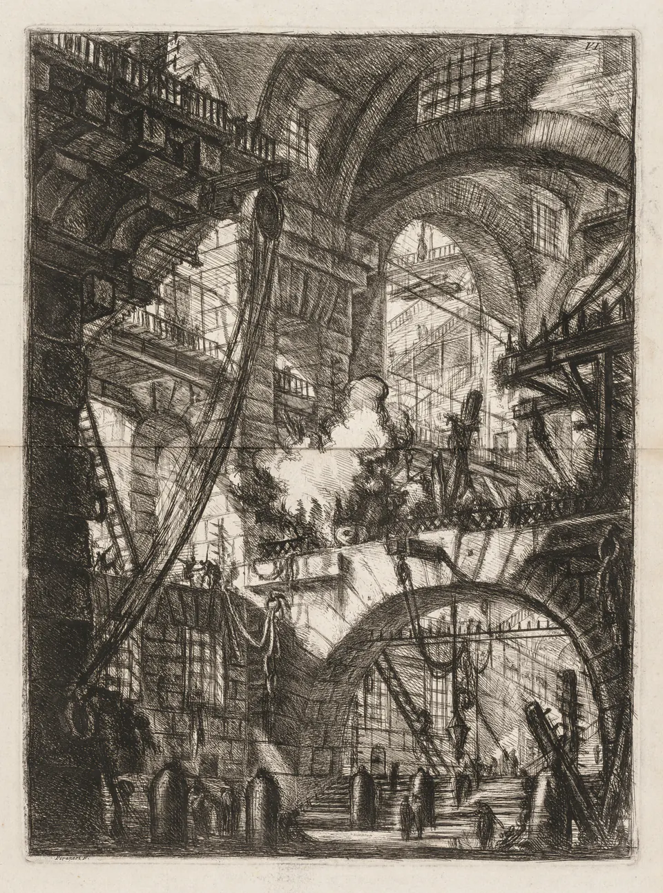
Try tracing a route through this interior. A staircase leads somewhere, but another arch interrupts the view. Walkways cross at different heights. Ropes and structural lines pull the eye in directions that never quite become a comfortable plan.
The pale smoke offers a temporary resting place amid the dense marks. Around it, masonry seems impossibly heavy while people become small strokes. Compare this sheet with the Pantheon: both use architecture and figures to establish scale, but the prison makes orientation itself uncertain. There is no need to identify it as a real building or a documented prison interior to feel its pressure.
Goya: a darkness without a horizon
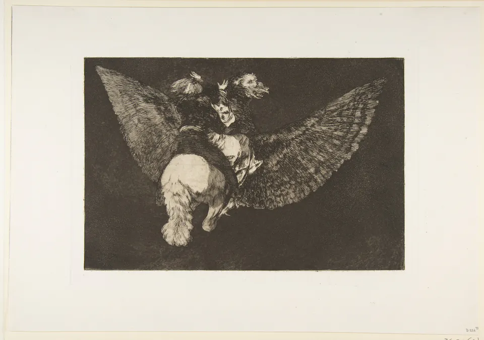
There is no reassuring patch of ground beneath the creature. Light catches its underside and the figures above it, while darkness fills the space around them. Without a horizon, even the direction of travel becomes difficult to settle.
Aquatint can establish areas of tone rather than relying entirely on separate drawn lines; the Met explains the process in its aquatint introduction. Here that tonal field helps make the scene unsettling. The impression also demonstrates why dates matter: the Met identifies a posthumous 1864 edition of a design made decades earlier. “By Goya” and “printed during Goya’s lifetime” are different statements.
After Doré: Creation of Eve
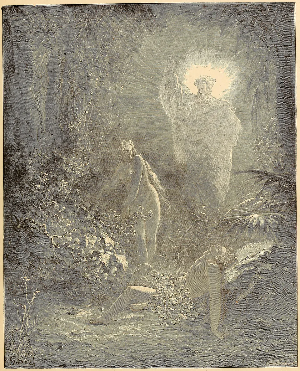
A bright opening appears inside a nearly continuous forest of marks. Adam’s reclining body anchors the lower part, Eve stands above him, and the raised hand and radiance draw the eye farther upward. The sequence makes a vertical page feel like an unfolding event.
This is an illustration after Doré, shown from a particular published book. It should not be captioned as an original pen drawing. At this scale, fine engraved textures blend into greys; closer inspection separates some of them again. The reproduction retains the aged appearance of its source rather than whitening the paper or inventing missing detail.
The Tower of Babel: a book page with monumental scale
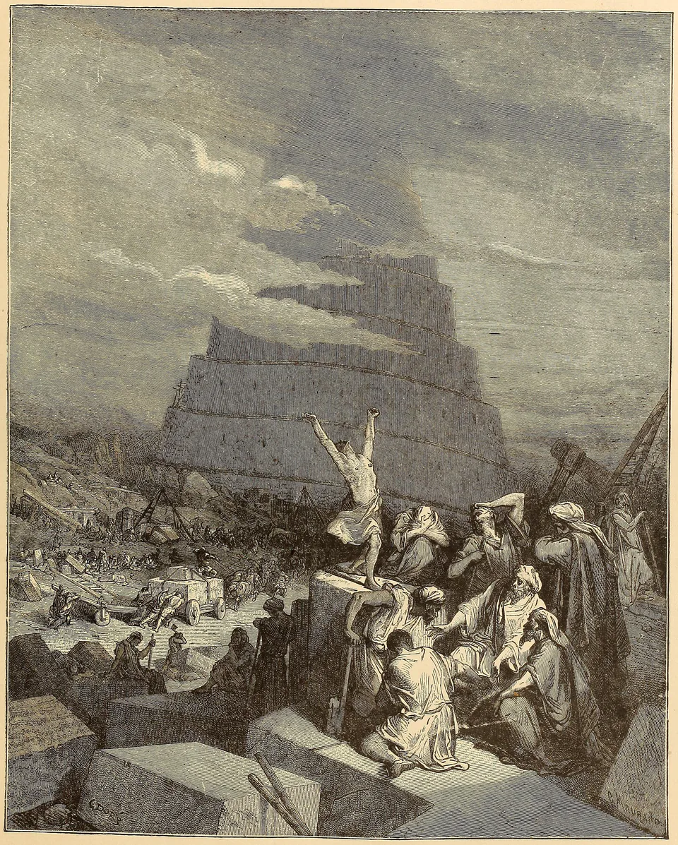
The nearest figures gesture upward while the tower passes behind bands of cloud. Its uppermost part is less certain than the stone blocks in the foreground. That contrast gives the architecture a size the page itself cannot possess.
Compare the people with Piranesi’s small figures. Both designs use bodies as measures, but this group also carries the story through conspicuous gestures. A raised arm sends you upward; the descending steps bring you back into the crowd. Doré’s design can be read quickly as drama and slowly as a network of directions.
Five names, and more than five makers
The linked guides to Dürer, Rembrandt, Piranesi, Goya and Doré offer further examples. These names identify important artistic contributions, but they do not erase publishers, specialist engravers or later printers. When a record says “after,” preserve it. If an individual block engraver has not been established for a book plate, do not silently give that work to its designer.
Read the sheet as well as the picture
On your next encounter with a print, look for three things: a change in the marks, a passage of light, and a piece of information outside the scene. An inscription, plate number or margin can locate the image in a series or edition. That habit lets technical knowledge serve looking. You begin to see both the imagined world and the object that carried it to another reader.
Editorial record
About this article
- Author
- Publisher
- GeMarkt
- Published
- Reviewed
- Internal source & rights check. Conducted by GeMarkt Research Review. This is an internal editorial check—not independent peer review.
- Source standard
- Art history source standardPrioritises object records and research sources, distinguishes evidence from interpretation, and states material uncertainty.
Found a claim that needs checking? Report a factual error.