GeMarkt Blog · Essay
Belle Époque Posters: Cappiello, Toulouse-Lautrec and Mucha
Read eight colourful posters by Chéret, Toulouse-Lautrec, Steinlen, Mucha and Cappiello through their lettering, silhouettes, performers and surprising mascots.

A woman on a red horse advertises chocolate. A black cat announces a company of performers. A dancer is cut off by an enormous musical instrument. Belle Époque posters make these unlikely combinations feel immediately convincing, even when the event or product is unfamiliar.
Their beauty is inseparable from the job they had to do. They name a place, announce a performer or make a brand memorable. Reading the lettering alongside the image changes what you see. These eight examples bring together five designers working in and around Paris: Jules Chéret, Henri de Toulouse-Lautrec, Théophile Alexandre Steinlen, Alphonse Mucha and Leonetto Cappiello. They share a public, promotional setting, but they do not all share one style.
A picture that has something to announce
Start by looking at a poster from a distance. Which shape arrives first? Then move closer and read the name, address, price or performance information. A good design can arrange those discoveries in a deliberate order. It may make you remember the image before you understand the offer.
Colour lithography was central to this visual world. It is a printing process based on the different behaviour of grease and water on a prepared surface, rather than cutting an image into a metal plate. The National Gallery’s print glossary explains the principle. Separate colour printings could build large flat shapes, textured passages and drawn lettering; each object’s record identifies its particular medium.
Belle Époque describes a historical setting, while Art Nouveau describes a family of design tendencies. Mucha’s curling ornament is one approach here. Lautrec’s abrupt silhouettes and Cappiello’s isolated mascot suggest others. Look at the differences before treating every old French advertising image as the same decorative style.
Chéret: Palais de Glace and the feeling of motion
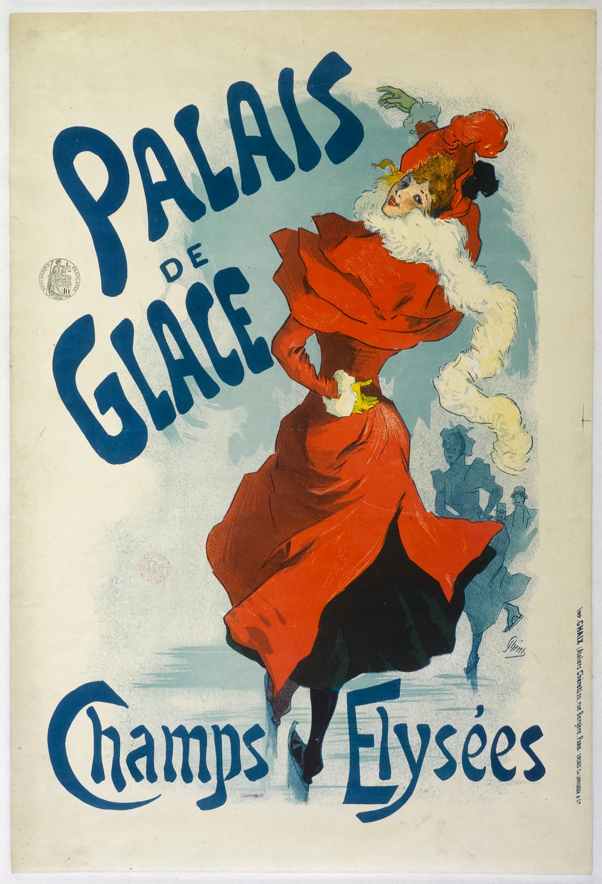
The coat opens into a broad red shape while the pale boa streams across the body. One skate carries the figure; the other lifts. Those diagonals make movement legible without a detailed account of the rink. The small blue skaters behind her provide enough setting to make the activity clear.
Chéret places the large blue words beside the figure rather than locking them into a separate heading box. Their changing sizes make them feel part of the same lively arrangement. Follow the arc from the raised hand through the boa to the coat’s hem: the advertised pleasure is visible before you have finished reading the venue’s name. It is a selective promise of elegant recreation, not a neutral record of everyone who used the rink.
Au Quartier Latin: joy in a crowd
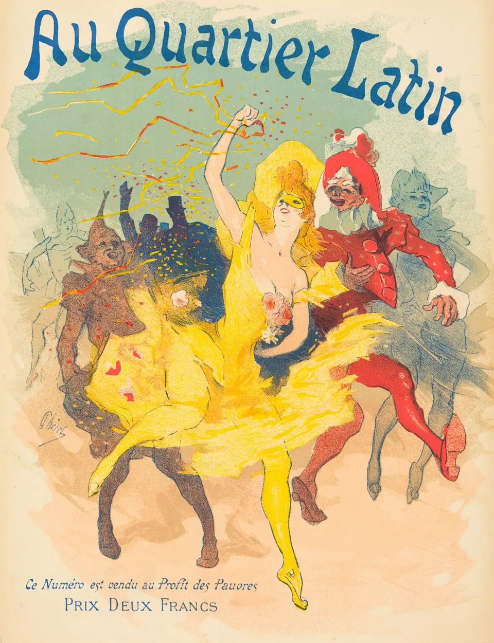
A yellow costume draws the eye forward, with a red figure beside it and paler dancers behind. Streamers carry the movement into the title. Unlike the relatively isolated skater, this central woman belongs to a crowded celebration. The image still gives her enough contrast to remain its visual anchor.
The small text at the bottom is worth reading: it names a price of two francs and says the issue is sold for the benefit of the poor. That printed information prevents us from treating “Au Quartier Latin” as merely an invented dance-hall name. Promotional graphics could attach pleasure to a publication or charitable purpose as well as a night out. Look down after enjoying the spectacle; the quieter line may explain what the picture was asking people to buy.
Moulin Rouge: the name you cannot miss
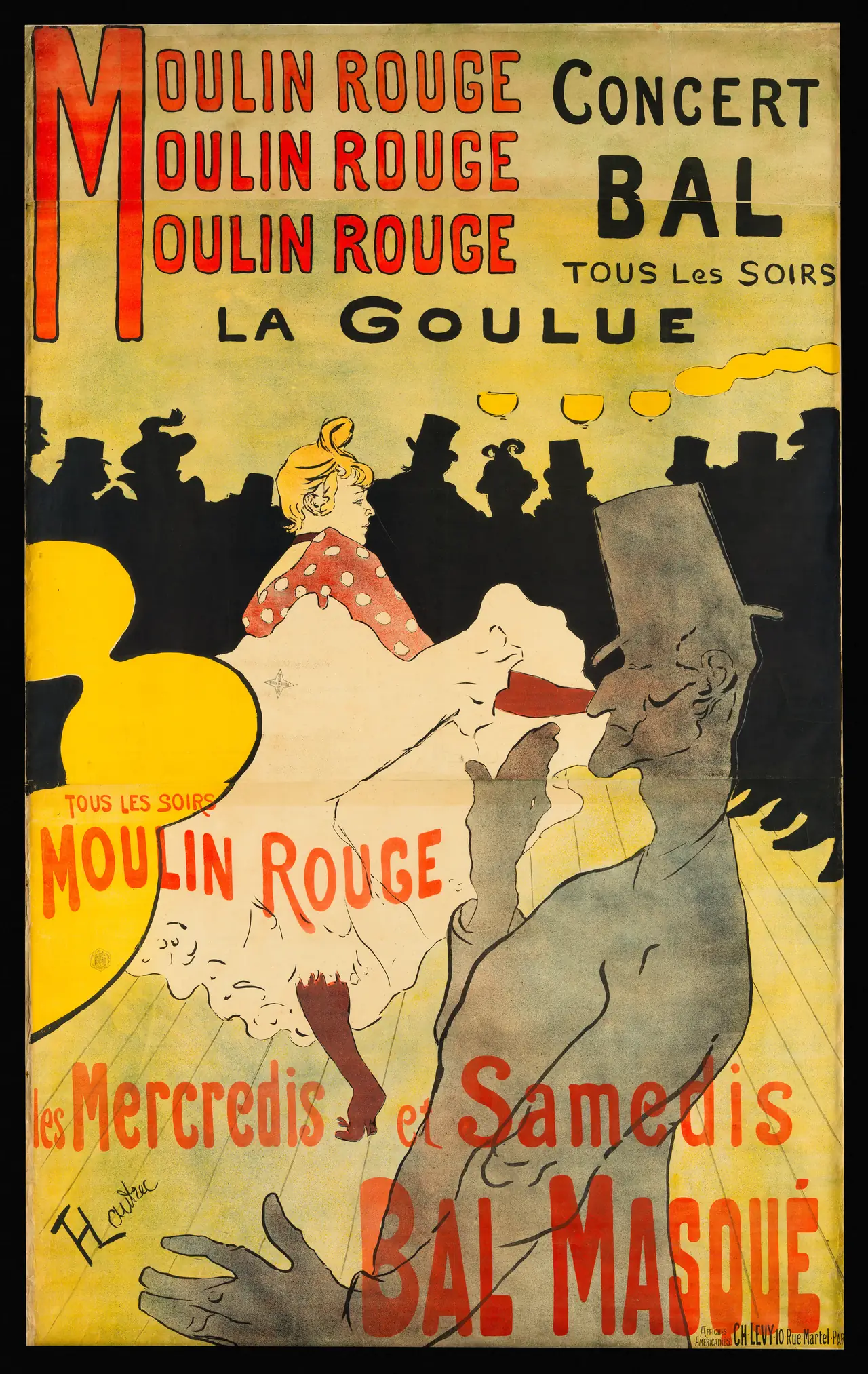
The repeated venue name does not politely wait above the picture. It dominates the upper field, while the lettering lower down crosses the performers. La Goulue’s pale skirt stands out against an almost continuous dark audience. The great grey figure in front makes the view feel partly obstructed, as if another person has entered our line of sight.
The Met identifies that foreground performer as Valentin le Désossé. It also records a sheet height of 190 centimetres: this was an imposing advertisement, not originally a small framed illustration. When looking at a reduced reproduction, imagine the lettering and silhouette enlarged to that scale. Their simplified shapes become easier to understand as choices made for public visibility.
Divan Japonais: recognition without a face
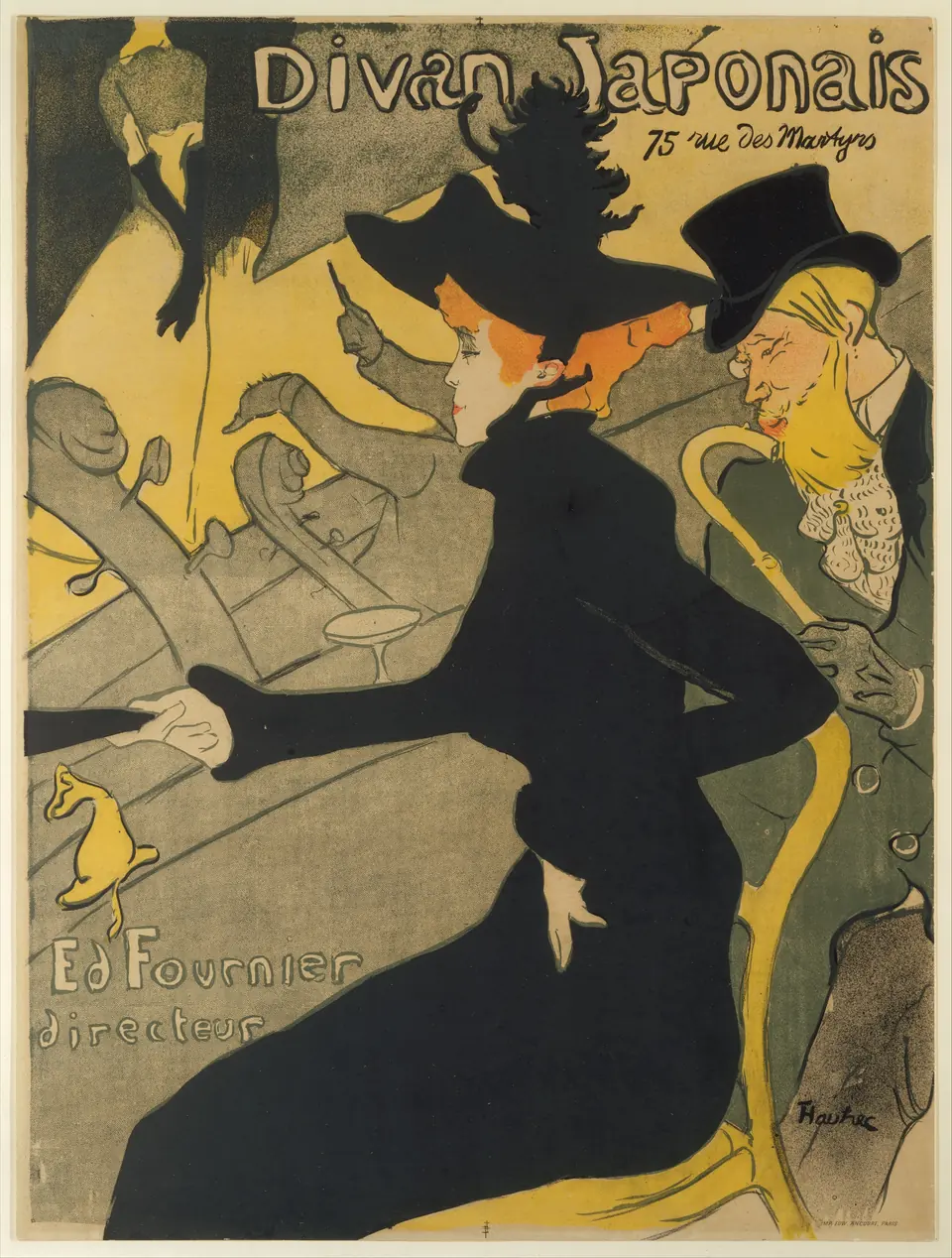
The largest dark shape belongs to Jane Avril, seated in the audience with the writer Édouard Dujardin. On the stage at upper left, the singer’s head has vanished beyond the composition. The Met identifies her as Yvette Guilbert through her characteristic long black gloves.
That is a striking way to advertise entertainment: a familiar gesture or costume can do the work of a full portrait. Notice, too, the orchestra’s instruments and the diagonal barrier between audience and stage. The poster assembles fragments from different distances. You understand the social space through those overlaps, without receiving a complete architectural view of the room.
Jane Avril: the orchestra enters the frame
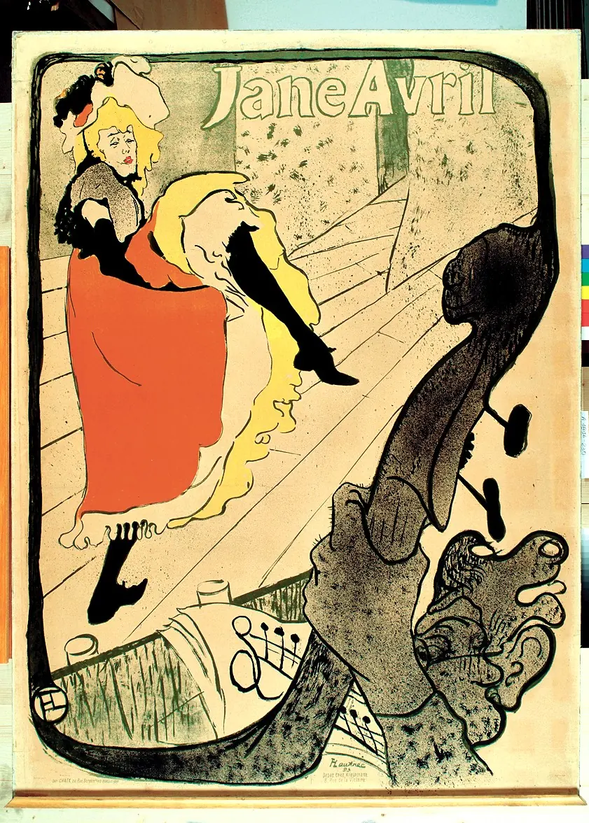
Here Avril is performing. The double-bass curves around the lower and right-hand edges, creating an irregular frame for her kick. A musician’s hand appears close to us while the dancer occupies the stage beyond. The oversized instrument makes the distance between those positions tangible.
The Met records that Avril commissioned the design for her Jardin de Paris appearance in 1893. Compared with Divan Japonais, the same named performer now has a different role and a different relationship with the viewer. Do not let recognition flatten that distinction. These are separate advertisements, built around different situations, rather than two decorative portraits with interchangeable titles.
Steinlen’s Chat Noir: an animal as an emblem
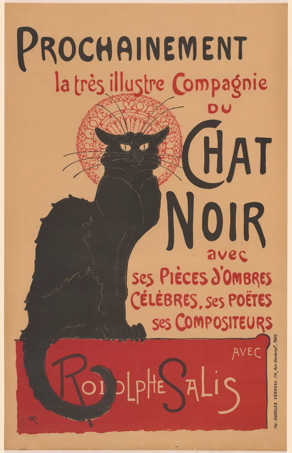
The cat looks out with narrow eyes and a prickly outline. Its body is a large dark mass, but the face remains sharply individual. A red ornamental circle gives the head an almost ceremonial presence; below, the tail curves through the lettering panel.
Read this exact version’s heading: it begins “Prochainement,” announcing something forthcoming. The wording promotes the Chat Noir company and names shadow plays, poets and composers with Rodolphe Salis. It is not the same text as every familiar Chat Noir poster reproduced today. The design shows how an animal can become an emblem for a whole entertainment identity, but the words still identify the particular announcement.
Mucha’s JOB: pattern does the selling
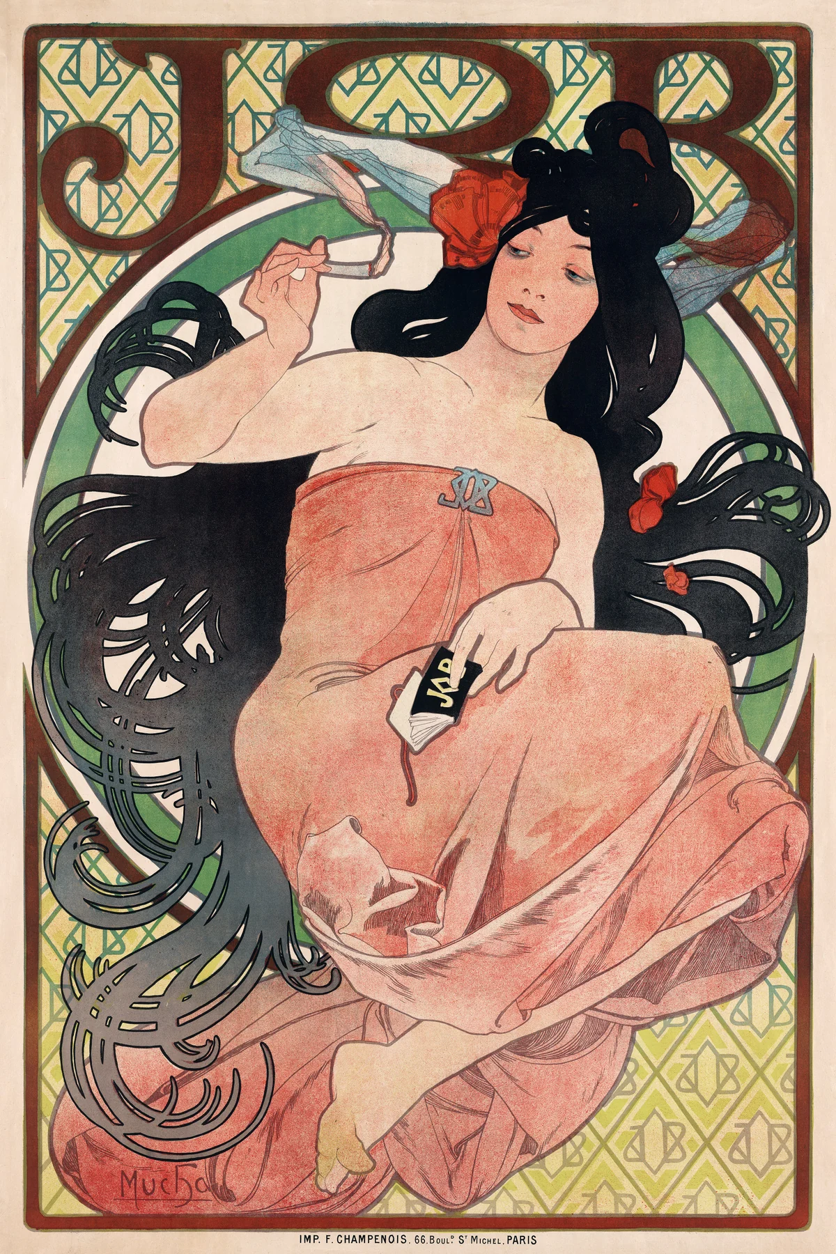
Hair becomes a network of loops around the figure, while smoke and fabric introduce lighter curves. The letters JOB recur in the background and on the packet in her hand. The brand is therefore present both as an object and as part of the decorative surface.
This is the seated 1898 design identified by the Library of Congress, not a date assigned to every JOB image by Mucha. It advertises cigarette papers. Reading that function does not require endorsing the product or treating its glamour as a trustworthy account of smoking. The useful historical question is how the composition links a commercial name with an atmosphere of leisure and pleasure.
Cappiello’s Chocolat Klaus: the unexpected mascot
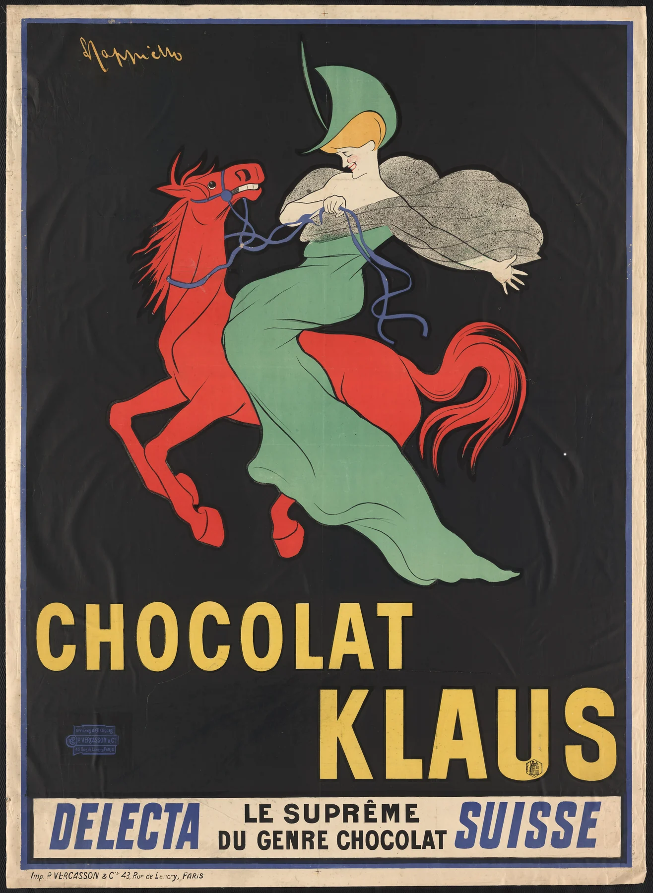
The red horse and green dress leap forward against black. There is no carefully described chocolate shop, dining table or manufacturing scene. The picture supplies a memorable, improbable pairing; the large yellow words tell you which name to attach to it.
Compare its empty dark field with Mucha’s repeated ornament. Cappiello gives the central silhouette room to stand alone. Even the lower text sits in a distinct band, separating the principal image from further claims. This is not a universal recipe for successful advertising, but it is an unusually clear demonstration of economy: a few high-contrast elements can give a poster a strong identity.
Five designers, five ways to catch the eye
Chéret’s figures invite you into movement. Lautrec builds striking views from interruptions and overlaps. Steinlen turns an animal into an emblem. Mucha spreads a brand through pattern, while Cappiello isolates a surprising mascot. These are useful comparisons, not rigid boxes: one example cannot describe everything an artist made.
For more context, explore our guides to Toulouse-Lautrec, Mucha and Cappiello. Their careers extend beyond these particular sheets. The printer credits matter too: Charles Lévy, Charles Verneau, F. Champenois and P. Vercasson belong to the history visible in the margins.
To browse the shop separately, visit the Toulouse-Lautrec, Mucha and Cappiello collections. These are related selections, not a promise that every historical poster illustrated here is available to buy.
Keep the words and the particular sheet
A crop that removes lettering may preserve an attractive figure while losing the poster’s purpose. Dates, printers’ imprints and changed wording can distinguish one version from another. Start with the whole sheet whenever possible, then look closely. Ask what first caught your eye, what you read next and which information you nearly missed. That small exercise restores the poster’s active voice: it had something specific to tell a passer-by.
Editorial record
About this article
- Author
- Publisher
- GeMarkt
- Published
- Reviewed
- Internal source & rights check. Conducted by GeMarkt Research Review. This is an internal editorial check—not independent peer review.
- Source standard
- Art history source standardPrioritises object records and research sources, distinguishes evidence from interpretation, and states material uncertainty.
Found a claim that needs checking? Report a factual error.