GeMarkt Blog · Practical guide
Art for Dark Walls: Green, Navy and Black
Choose pictures for dark green, navy and black walls by testing lightness, borders and evening visibility, with Turner's Whalers as a real example.

A picture for a dark wall does not have to be bright, gold-framed or unusually large. Decide first whether you want a clear light area against the wall or a quieter, darker pairing. Then make sure you can still enjoy the picture under the lighting you normally use.
Green, navy and black walls offer different colour relationships, but they share one practical question: where does the picture end and the wall begin? The image, a mat or the frame can provide that boundary. You do not need all three to compete for attention.
Choose how much separation you want
A mostly pale picture can give a dark wall an obvious focal point. A darker work may sit closer to the wall’s overall tone, revealing more detail as you approach. Both can be attractive. The right choice depends on whether you want to recognise the image immediately from across the room or enjoy it in a more intimate spot.
Avoid evaluating the picture only on a bright white product page. Hold a physical sample against the intended wall if one is available. Even a temporary paper outline can help answer the separate question of scale, though plain paper cannot show you the finished colours.
Keep the surrounding furniture in view. A pale sofa below the picture already introduces a large light shape. You might welcome a second pale area above it, or prefer a quieter work that does not create two competing rectangles. Neither arrangement is an error.
Compare three ways to find the picture
There are three useful starting points: choose a pale image, give a dark image a lighter surround, or accept a low-contrast pairing with a visible frame edge. Do not treat these as a ladder from dull to dramatic. They are different ways to organise attention.
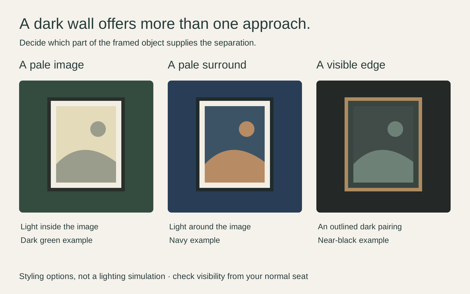
Try changing only one element at a time. If the image seems to disappear, add a temporary light surround before abandoning it. If a pale border feels too assertive, compare a narrower or warmer-toned one. A frame sample can reveal that the problem was at the boundary rather than in the artwork.
Work with green without adding more leaves
A green wall does not require a botanical picture. Look for something you want to spend time with: a portrait, a city view, an abstract work or an engraving can all be candidates. You can connect through a small green passage, through warm browns elsewhere in the room, or simply through an appealing contrast.
Against a hypothetical deep olive wall, I would compare a pale, warm-toned painting with a restrained dark frame. Turner’s Whalers is worth looking at for its broad cream and grey passages, interrupted by dark shapes near the lower edge. Those contrasts suggest a possibility for display without prescribing an exact paint match.
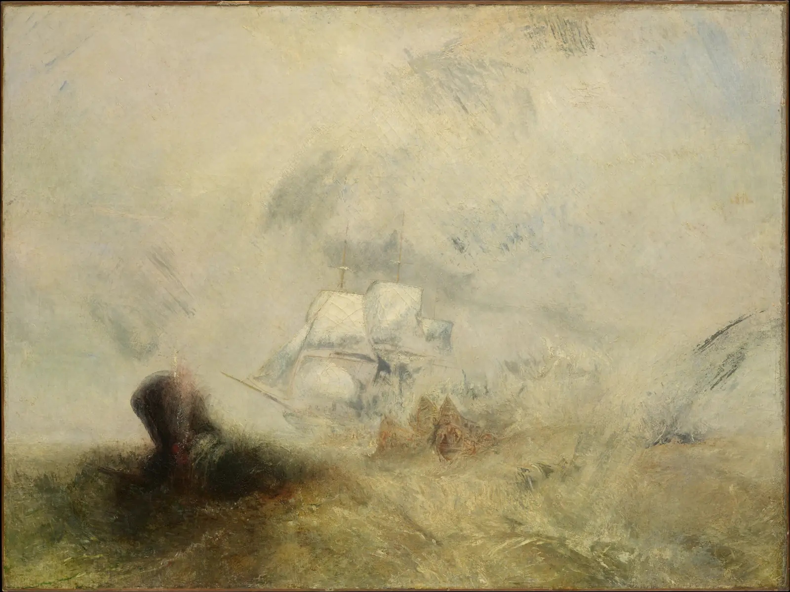
Its light palette does not make the subject gentle: there is a whale, small boats and maritime danger. Choose it because you like both what is depicted and how Turner paints it, not because the pale surface makes a convenient patch above the furniture. The Turner and Constable comparison helps unpack that distinction.
Give navy more than a nautical answer
Navy works with more than sea scenes. A warm-toned drawing, a photograph, a vivid abstract image or a mostly white composition may offer the separation you want. Ask how much blue occupies the picture, but also how much pale paper and how many dark outlines you can see.
If you prefer a blue image, do not reject it because it shares the wall’s colour family. Compare the actual blues and their lightness. A pale sky can remain distinct from navy; a dark blue rectangle may need a surround to keep its edge clear.
For an illustrative navy study with a tan chair, a cream mat and timber frame could connect the picture to the chair. A thin black frame might instead repeat the desk legs. These are different compositions using the same room, not evidence that navy must be paired with gold or brass.
Choose the boundary on black walls
On a near-black wall, start with the complete framed object rather than searching for the brightest possible image. A white mat can become a strong visible shape. A wood or metallic edge can supply a narrower outline. A black frame may look deliberately quiet, especially if its profile remains visible from your viewing position.
If you choose a very dark work, check which details you can actually recognise at the intended distance. A picture can be subtle without becoming unreadable. Moving it to a closer viewing position may be more satisfying than trying to brighten the whole wall.
Do not lighten a historic reproduction until it fits the decor. A different scan, an incorrectly adjusted file and a deliberately altered image can look similar in a shop thumbnail. Ask what you are buying and compare it with the identified museum record. Our guide to different reproductions of the same painting explains why this matters.
Check evening visibility without overlighting
Dark paint is not a reason to flood a print with a strong lamp. First check whether the problem is low visibility or a bright reflection masking the picture. View it from your normal seat and from a standing position. You may need a different location or glazing choice rather than more light.
The Library of Congress notes that light damage accumulates and can be irreversible. Its guidance concerns collection materials including art on paper; it is not a universal safe exposure allowance for every commercial print. Keep direct sun off vulnerable prints and avoid leaving display lights on simply to make an empty room look finished.
For a valuable original or sensitive historic sheet, ask a conservator about display conditions. For a modern reproduction, follow its supplier’s care information and accept that replacing a print does not make uncontrolled exposure harmless. See protecting prints from fading for the practical distinction.
Test the whole framed object
Before buying, compare the image, mat and frame together against the actual paint. Check the relationship in the part of the day when you use the room most. A bedroom viewed mainly under evening lamps deserves an evening test, not only a flattering midday photograph.
Use a full-size paper outline to check placement separately from colour. Measure the intended frame’s exterior; an image measurement alone leaves out the surround. Keep installation and wall-fixing decisions separate from the styling exercise.
Then ask one simple question: can you comfortably see what you like about the work? If the answer is yes, it does not matter whether your choice follows the familiar dark-wall formula. The aim is an enjoyable picture in a real room, not a demonstration of how many contrasting accessories can surround it.
Editorial record
About this article
- Author
- Publisher
- GeMarkt
- Published
- Reviewed
- Internal source & rights check. Conducted by GeMarkt Research Review. This is an internal editorial check—not independent peer review.
- Source standard
- Buying guide source standardSeparates measured or first-hand evidence from general guidance and keeps practical limits visible.
Found a claim that needs checking? Report a factual error.