GeMarkt Blog · Practical guide
Abstract Art in the Public Domain: Kandinsky, Klee, af Klint
Choose abstract art for your room through specific Kandinsky and Klee works, with practical advice on colour, scale and the separate af Klint rights question.

Choose a particular abstract picture, not an artist’s name followed by “public domain”. Kandinsky’s uneven circles, the broad movements of his Rowing, and Klee’s small theatrical figures offer quite different starting points for a room. The exact work, the country where it will be used and the source of its digital image still matter.
Three museum-supplied images below let you compare those choices directly. Hilma af Klint belongs in the conversation, but her inclusion in the title is not a clearance of her paintings or their photographs. No af Klint image is reproduced here. This is a practical guide to choosing art, not legal advice or a claim that every example is available as a GeMarkt product.
Start with a particular work
Separate three questions. Do you like the composition? Is the work available for your intended use in the relevant country? Does the particular file have an appropriate rights statement? A search result that answers only the first question is not enough for making your own reproduction.
The two Kandinsky images here carry Lenbachhaus CC0 designations; Cleveland supplies the Klee image through its open-access programme. These are attributed institutional assessments, not our independent reconstruction of each work’s United States publication history. CC0 also does not clear rights held by other people or imply museum endorsement. The Kandinsky and Klee guides explain the work-specific limits in more detail.
For the room itself, begin with one visual job. Do you want an organised block of colour, a broad sweep across a wall, or a smaller image to discover beside a chair? Answering that is more useful than deciding that an abstract print must look “modern”.
Circles for a room with several colours
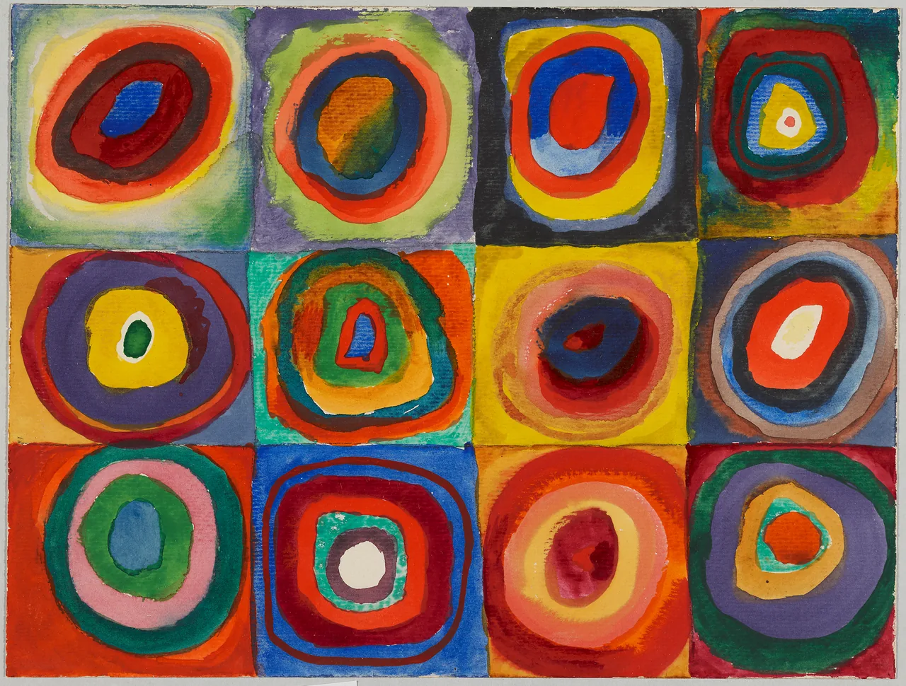
The Lenbachhaus record identifies this as a small work on paper, not an oil painting: 23.9 × 31.5 cm. Its twelve compartments hold repeated shapes without making them identical. The brushwork, stains and wandering edges are part of the image.
I would try this where a room already has two or three distinct colours. A blue chair and an ochre cushion can find echoes in the picture without requiring every ring to match a furnishing. Pick one connection, then leave the others alone. Replacing the room’s textiles to reproduce the whole painting would turn a useful relationship into a decorating assignment.
The grid can also sit comfortably beside shelving or rectangular cabinet doors because it offers another ordered arrangement. That is a styling option, not a scientific effect of circles. Keep enough plain wall around the picture to see its outer rectangle; a cluster of equally bright small prints immediately beside it may make the individual rings harder to enjoy.
Rowing for a more fluid arrangement
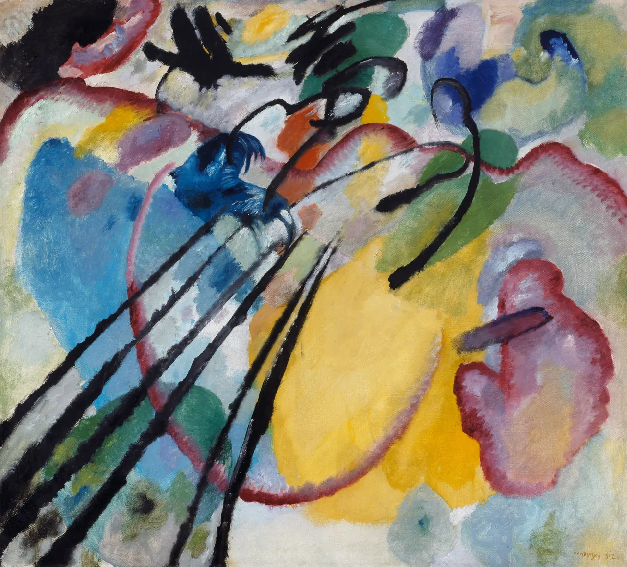
Improvisation 26 (Rowing) offers a different kind of movement. Lenbachhaus identifies traces of a boat, oars and bent figures. You need not resolve every mark into an object: the long dark diagonals are visible before you name what they describe.
Compared with the circles, this composition has fewer repeated divisions and larger passages of open colour. Try it as a single image over a low cabinet, particularly if the cabinet is already covered with books or ceramics. One larger picture may be easier to read than another row of small objects. It does not need an empty, all-white room.
Look at it from the actual approach to the wall. Does a tall plant obscure the strong diagonal at the left? Does the room’s doorway cut your first view into a narrow slice? Move the proposed picture outline before changing the furniture. Do not rotate or stretch the painting simply to make those lines follow the room.
Klee for a place you can approach
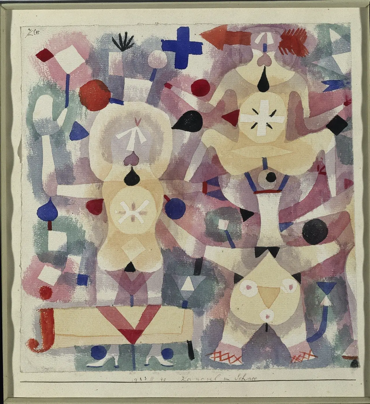
In Carnival in the Snow, geometric shapes become performers rather than eliminating the subject altogether. Cleveland describes acrobats and jugglers. The paper sheet measures only 24 × 23.5 cm, and the museum separately records its larger artist’s mount.
This is a good example to test near a reading chair, desk or short hallway stop. Small faces, feet and scattered signs give you reasons to come closer. From across a large room, the same image may read chiefly as a pale, mottled rectangle. Neither view is wrong, but choose the one you want to live with.
Notice that the displayed file includes a mount and outer frame. Those photographed features are not a promise that a physical frame comes with a print. They also occupy part of any printed sheet. A listing should make clear whether it reproduces this complete supplied view or a separately documented crop. Choose consciously rather than discovering a printed frame inside the real one after delivery.
Keep af Klint a separate decision
The Guggenheim Bilbao’s exhibition account dates the beginning of af Klint’s Paintings for the Temple to 1906 and describes their limited public presentation during her lifetime. Early creation is therefore not a substitute for checking how a particular work was later published.
For example, US law distinguishes certain works that were unpublished before 1978. A later publication history can matter even when an artist died many decades ago. We have not resolved that history and the exact file permissions for an af Klint image in this guide. The exhibition page is a viewing reference, not a free-download licence.
If one of her works is your favourite, ask a reproduction supplier to identify the exact work and its permission basis. Do not substitute an invented spiral image and label it as hers. If the evidence remains unclear, pause that reproduction decision rather than assuming another artist’s open-access status transfers to it.
Test the size without changing the picture
Use a paper rectangle to test the outer size, then compare that outline with the image area. A 40 × 30 cm image inside a 50 × 40 cm sheet leaves 5 cm of paper on each side when centred. The external frame will be larger again. Those are different measurements, not three names for the same size.
For the circles, preserving the museum image’s proportions matters more than filling a convenient rectangle. If an image were 40 cm wide at the original work’s 31.5:23.9 ratio, it would be about 30.3 cm high. A standard opening may therefore need a small adjustment or a border. This calculation is a planning example, not an available product size.
Stand and sit where you normally use the room. Compare one generous outline with a smaller alternative. If the smaller one already lets you enjoy the composition, enlargement is not an obligation. Our guide to famous paintings’ proportions and standard frames explains why stretching the image is not the solution.
Keep the file and the print in view
Before ordering, check whether the preview shows the whole composition, whether a border is printed, and whether the stated dimensions describe paper, image or outer frame. Ask about visible colour or cropping differences between the listing’s close view and its room mockup. A scene above an enormous sofa is not itself a measurement.
If you are arranging a digital file for printing, retain its object-page link and exact rights record. Use the original supplied proportions and inspect the file at a useful scale; a web preview does not establish a large print’s detail. An image’s CC0 label is a rights statement, not a resolution or print-quality guarantee.
The strongest choice is the picture that still interests you after the colour match is settled. Start with one, give it a place where its particular marks can be seen, and let the room remain a room rather than a complete reconstruction of an art movement.
Editorial record
About this article
- Author
- Publisher
- GeMarkt
- Published
- Reviewed
- Internal source & rights check. Conducted by GeMarkt Research Review. This is an internal editorial check—not independent peer review.
- Source standard
- Buying guide source standardSeparates measured or first-hand evidence from general guidance and keeps practical limits visible.
Found a claim that needs checking? Report a factual error.