GeMarkt Blog · Practical guide
Warm vs Cool Colours: How Art Changes a Room
Compare warm and cool art without relying on colour psychology slogans. Look at colour area, intensity, nearby materials and the light in your room.

Warm and cool colours are useful ways to describe a picture, not instructions for how a room must make you feel. A warm-coloured painting can look restrained; a blue picture can be full of tension. Look at the amount of each colour, its strength and its neighbours before choosing by a label.
You do not need to classify your whole home as warm or cool. A room can contain oak, blue upholstery, cream walls and a picture with both orange and green. The decision is where you want a connection and where you would welcome a difference.
Use warm and cool as descriptions
In the conventional artist’s colour vocabulary, reds, oranges and yellows are usually called warm, while blues and blue-greens are called cool. The National Gallery of Art’s colour lesson introduces these families as a way to look at art. The words describe visual associations, not the air temperature beside a print.
Use them comparatively. Instead of declaring a whole landscape warm, ask whether its yellow field seems warmer than its blue sky. That smaller observation is more helpful when deciding what the picture contributes to a room.
Avoid promises such as “blue will make you sleep” or “red will make guests lively.” Your response also involves the subject, the composition, the room and your own associations. A turbulent blue sea and a pale blue flower are not interchangeable merely because a shop has placed them in the same colour filter.
Compare how much colour you see
A tiny orange mark in a mostly blue picture is different from an orange field containing one blue mark. A list of colours would describe both, but it would miss how the image is organised. Start with the largest areas, then see what interrupts them.
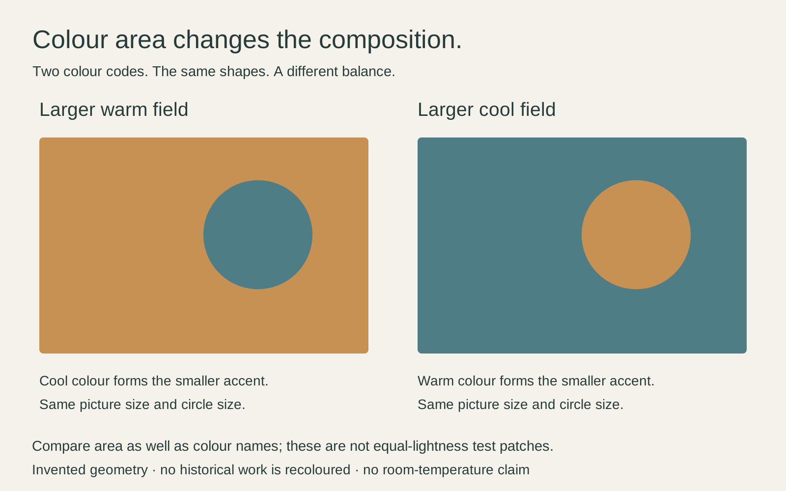
Imagine a grey room with a dark blue sofa. A picture containing a little blue within a much larger ochre area could repeat the sofa while introducing another emphasis. A mostly blue picture with a small ochre accent would make a different choice. Neither needs a perfectly matched cushion to justify it.
Do this comparison with the full image visible. A tiny cropped preview can make an accent seem dominant, particularly when a retailer has selected the most colourful corner. Check the complete composition before deciding what the print will add above a chair or cabinet.
Look at colours beside their neighbours
Kandinsky’s 1913 Color Study: Squares with Concentric Circles makes comparison easy. The sheet places uneven rings inside twelve roughly square spaces. Orange, blue, green, yellow and violet recur in different combinations, but the result is not a set of interchangeable colour badges.
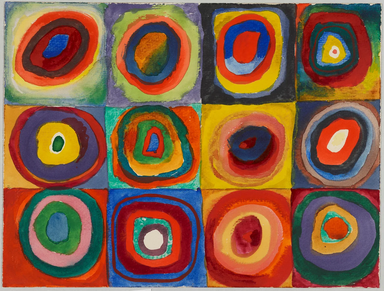
Look at the orange-heavy square near the bottom centre-right, then the green and violet square beside it. Notice which rings you find first and which boundaries seem clear. You do not need to attach an emotion to every hue to enjoy the comparison.
Lenbachhaus identifies the work as watercolour, gouache and crayon on a small sheet, not a digitally perfect chart. Its uneven marks belong to the work. Keep the whole composition when judging a reproduction, rather than smoothing or recolouring it to fit an interior scheme. The Kandinsky guide identifies the exact work and image source.
Keep intensity separate from temperature
A muted rust and a vivid orange can both be described as warm, yet offer different starting points for a room. Similarly, a pale blue-grey and an intense blue are not equivalent choices. Ask whether the colour is strong or softened, then ask whether it is light or dark.
This follows the Getty’s distinction between hue, value and intensity. Temperature language does not replace those other observations. A picture can contain cool colours and still have strong contrasts, dense detail and energetic diagonals.
For a room that already feels visually busy to you, compare an image with fewer competing accents rather than simply searching for “cool art.” For a room you find too uniform, try a clearer contrast or a more varied composition. These are ways to explore your preference, not prescriptions for producing a measured emotional effect.
Connect the art with materials in the room
Look beyond paint. A warm-looking timber floor, a metal lamp and a blue textile offer different possible connections. You might let a small brown passage in a picture relate to the floor and leave the larger blue area to contrast with it. Not everything needs to agree.
The frame can mediate the relationship. Try timber beside a picture dominated by cool colours, or a dark frame around an image with a pale warm background. Compare the actual samples: two woods described as oak may not share the same finish or appearance.
Avoid choosing a mat from a screen swatch alone. Hold it next to the physical print where possible. A cream surround that looks gentle in isolation may appear markedly yellow beside a cooler paper; a white surround might instead look too stark for your preference. Both are reasons to compare, not universal faults in the materials.
Distinguish paint colour from lamp colour
“Warm white” on a lamp package describes the light, not the palette of the painting. The U.S. Department of Energy distinguishes the appearance of a light source from its colour rendering: how the light itself looks and how objects look under it are related but different questions.
Do not assume two lamps with the same stated colour temperature will make every pigment look identical. If you are considering a lighting change, compare the actual artwork and room under the candidate lamp. A paint manufacturer’s lighting guidance likewise advises testing the colour in the room across changing conditions.
Keep preservation separate from preference. A pleasant-looking lamp is not proof that unlimited exposure is safe. For paper prints, our fading guide explains why display time and the material still matter.
Try one change before redecorating
Suppose your room feels too uniformly beige. Test one picture with a substantial cool area before replacing the rug, curtains and lamps. If that change gives you the difference you wanted, stop. If it does not, identify whether the issue is colour, scale or the subject itself.
Likewise, a grey room does not automatically need an orange print. You might prefer a pale drawing, a timber surround or a work with small warm details. Try a shortlist with genuinely different compositions instead of ten variations of the same colour swatch.
Keep the picture you enjoy looking at, not the one that best illustrates a rule. Warm and cool are useful comparisons when they help you notice the work. They become less useful when they prevent you from choosing something you like.
Editorial record
About this article
- Author
- Publisher
- GeMarkt
- Published
- Reviewed
- Internal source & rights check. Conducted by GeMarkt Research Review. This is an internal editorial check—not independent peer review.
- Source standard
- Buying guide source standardSeparates measured or first-hand evidence from general guidance and keeps practical limits visible.
Found a claim that needs checking? Report a factual error.