GeMarkt Blog · Practical guide
Spring Wall Art: Blossoms and Gardens
Compare Van Gogh’s almond branches, Hiroshige’s plum garden and Monet’s pond. Choose spring wall art by composition, colour and the room you already have.


For spring wall art, choose whether you want a close view of flowers or the feeling of looking into a garden. A branch against blue sky, a flowering tree beside visitors and a pond enclosed by green growth will have different relationships with your furniture and windows. The word “floral” is too broad to choose between them.
You also do not need a pink room or a complete seasonal makeover. A single reproduction can introduce blossom or greenery while the rest of the space stays as it is. These examples are suggestions for a spring display, not a claim that every garden painting shown was painted in spring.
Choose between a branch and a whole garden
Look at how much of the image is actually flower. A close arrangement of branches can fill the wall with repeated marks. A garden view may contain more paths, water, buildings and people than blossoms. A botanical plate would offer a third approach, with the plant set apart for study rather than placed in a landscape.
For a wall beside a patterned curtain, you might test a picture with broad areas of uninterrupted colour. In a plain room, a network of small leaves and flowers might provide the detail you want. Neither is a rule: put two very different previews beside a photograph of your room and see which one you keep noticing.
Decide whether the image should act like a close object or a view beyond the wall. This is especially useful in a small space, where a garden scene can compete with the real window. It does not physically enlarge the room; it simply offers another place for your attention to go.
Almond Blossom brings more blue than you might expect
Van Gogh’s Almond Blossom, 1890, belongs to the Van Gogh Museum’s collection. The white blossoms spread across a strong blue background, with substantial green and brown in the branches.
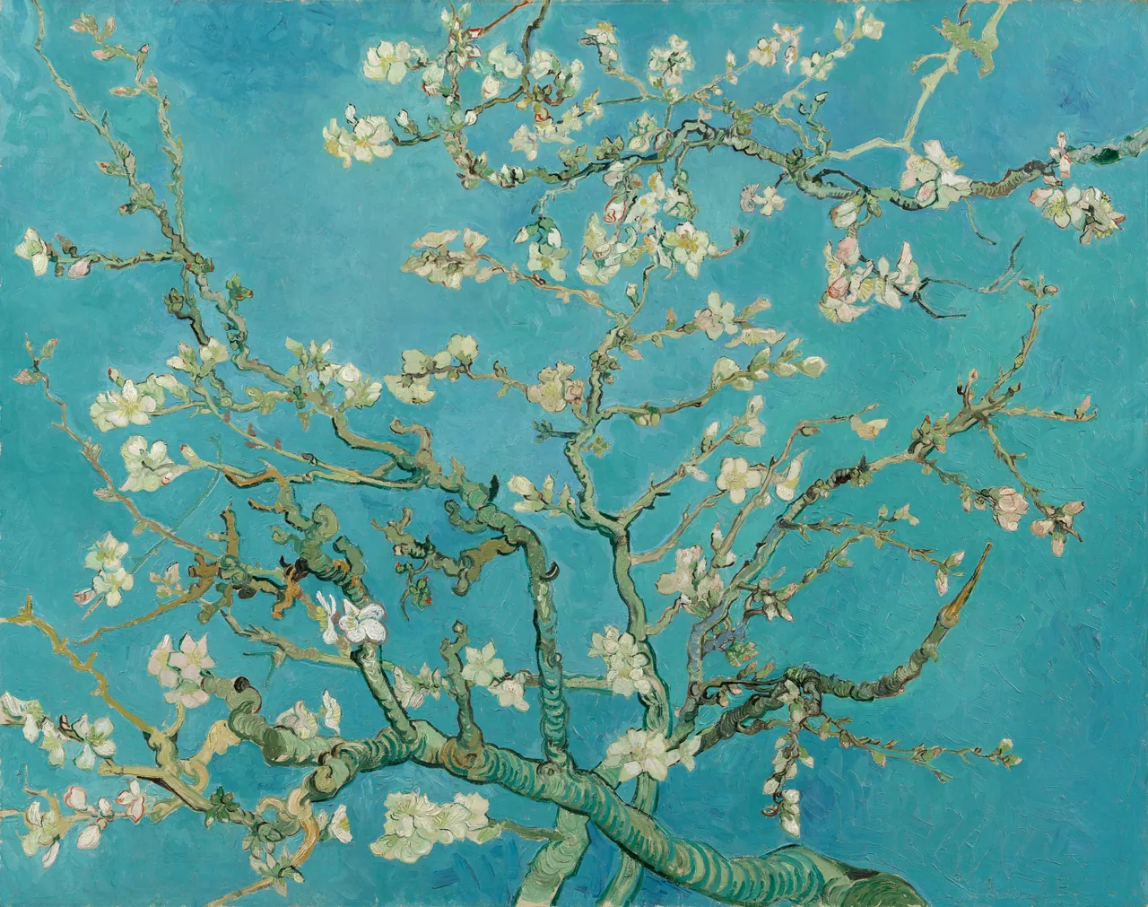
The branches divide the blue into unequal spaces. Some flowers cluster together; others sit near a thin twig. There is no horizon to line up with a sofa or shelf, so the picture works through this network rather than through a distant view.
I would test it as the main colour on an otherwise quiet wall. Repeating its blue in every nearby object could make the flowers harder to notice, while a small existing green object might connect with the stems without dominating the room. That is an option to compare, not an obligation to buy an accessory.
Keep the whole arrangement in view. A very narrow crop may preserve some flowers but remove the heavier branches that hold the composition together. If a detail is what you want, choose it knowingly and look for an accurate description of the crop.
Hiroshige’s plum garden keeps people in the picture
Hiroshige’s Plum Garden at Kamata, 1857, is a colour woodblock print from One Hundred Famous Views of Edo. These are plum blossoms, not cherry blossoms, and the distinction belongs in a description of the work.
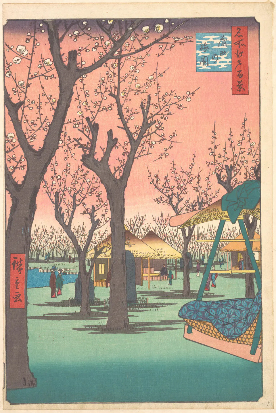
The dark trunks rise through a pink-orange sky. Lower down, visitors, roofs and the large object at the right make this a place being used, not a pattern of anonymous flowers. That combination is worth preserving when you choose the reproduction’s shape and size.
Its tall format could suit a wall between openings or beside a desk. Allow enough visible image area to notice the small people rather than using an oversized mount around a tiny print. If the lower part would sit behind a plant, reconsider the placement: the garden activity is an important part of the picture.
The pink sky can work beside natural wood without making the room predominantly pink. Compare its green lower area with your wall, too. Choosing it from a cropped preview of the blossom alone would miss much of the colour you will actually live with.
Monet’s pond offers a green alternative
Claude Monet’s The Japanese Footbridge, 1899, gives almost the entire rectangle to a bridge, pond and growth around the water. It is a useful garden choice if blossom branches are not what you want. Selecting it for a spring room does not establish the season depicted.
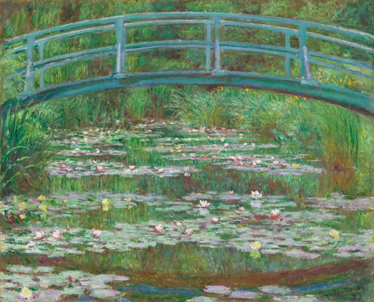
Unlike Almond Blossom, it has no large field of plain background. Short marks and reflections fill the pond, while the bridge provides a more definite curve across the top. If the room already contains leafy wallpaper, this density might be too much; on a simple wall, it might be exactly the attention you want.
Look at the bridge from your usual seat. If it disappears into glare, moving the picture or changing the viewing angle is more useful than brightening the digital file. You want to see the painting’s structure, not an edited version designed to compensate for one awkward spot.
Fit the image to the place without forcing it
The two paintings here are horizontal; Hiroshige’s print is vertical. That difference should influence the choice before you reach the frame menu. Do not stretch a horizontal flower picture into a tall rectangle to fill a narrow wall.
A useful first step is to mark the available area with paper templates. Include the finished frame, not just the printed image. If a proposed frame is 50 cm wide on a 70 cm-wide clear wall, centring it leaves 10 cm on each side. Whether that looks comfortable depends on the nearby door trim, switches and furniture; the calculation is not a universal spacing rule.
For a group, choose one relationship to test first: similar frames, a repeated colour, or the contrast between close branches and a distant garden. Trying to match every feature usually narrows the selection unnecessarily. The diptych and triptych guide can help when two works should be read together.
Work with the colours already in the room
Name the colours you cannot easily change: the floor, a large sofa, the main wall and perhaps a curtain. Then identify which part of the image sits beside them. A small pink flower is not equivalent to Hiroshige’s broad pink sky, and a tiny green accessory will not make a dense green garden disappear into the room.
Try a frame sample against the print rather than choosing from a finish name alone. A slim dark frame may repeat the plum trunks; a pale wood frame may make a different boundary around the blue of Almond Blossom. Keep the image unchanged while comparing those physical materials.
Our wall-colour guide explains how to make this comparison. Aim for a relationship you like, not a perfect colour match that only appears under one lamp.
Make one change and live with it
Put away a few competing objects before deciding you need a larger print. A branch picture may become clearer when it no longer shares the wall with a highly patterned hanging or a crowded shelf. Equally, you may find that the garden benefits from an existing plant nearby. See the arrangement before buying more pieces.
Choose a position out of direct sunlight; flowers painted in bright light do not make their paper reproduction resistant to fading. The print-light guide covers that practical difference.
Finally, leave the picture up long enough to see it during your normal routine. You do not need to remove blossom when spring ends. The best choice is one whose branches, people or reflections still interest you after the room’s seasonal refresh is no longer new.
Editorial record
About this article
- Author
- Publisher
- GeMarkt
- Published
- Reviewed
- Internal source & rights check. Conducted by GeMarkt Research Review. This is an internal editorial check—not independent peer review.
- Source standard
- Buying guide source standardSeparates measured or first-hand evidence from general guidance and keeps practical limits visible.
Found a claim that needs checking? Report a factual error.