GeMarkt Blog · Practical guide
How to Match Art to Your Wall Colour
Choose art for an existing wall by comparing colour, lightness and the frame. Use a real Hokusai example and a simple sample test before buying.

Art does not need to match your wall exactly. Start with a picture you want to live with, then decide whether it should blend into the room, gently echo one of its colours, or stand apart. The wall, picture and frame need to work together; they do not have to be the same colour.
This is especially useful when you cannot repaint. A rented room with cream walls, a navy bedroom or a green living room still gives you several sensible choices. You are choosing a relationship, not trying to solve a colour-code puzzle.
Start with the wall you have
Look at the intended wall with the furniture in place. Is it pale or dark? Does the paint seem greyed, yellowish, pinkish or fairly neutral beside the skirting and ceiling? Use those everyday descriptions before searching for a precise shade name. Your eye has to judge the actual room, not the attractive paint label.
Include the things that will stay. A large rust-coloured sofa may matter more than a small painted area around the picture. Timber flooring, curtains and a rug can also supply a useful connection. You do not need to repeat all of them inside the artwork.
If the room already contains many patterns, start by looking for a picture with a readable overall shape. If it is visually sparse, a more intricate work might be welcome. These are two possible directions, not a rule that patterned rooms can only contain simple art.
Choose a relationship not an exact match
Try three approaches to the same wall. An echo repeats a colour already present, perhaps the olive of a chair in the leaves of a landscape. A quiet pairing keeps wall and picture relatively close in lightness or mutedness. A contrast gives the image a clearly different background. None is inherently more sophisticated.
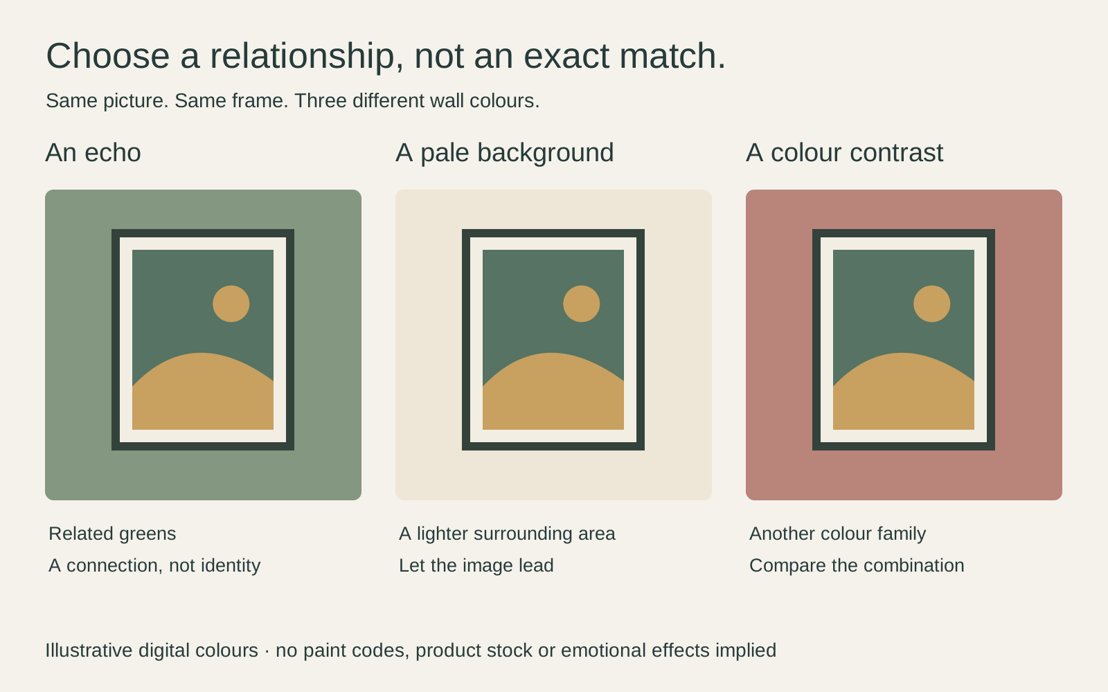
For a hypothetical sage wall and oak desk, you could choose a green landscape, an airy drawing on pale paper, or a picture with a substantial warm orange passage. Each produces a different emphasis. Start with the option whose image you actually like; matching is not a reason to buy an otherwise forgettable picture.
An exact match is also a fragile target. Change the lamp, frame or print paper and the relationship may no longer seem exact. A looser connection is often easier to live with: related greens rather than an attempted identity between one leaf and one paint chip.
Separate colour from lightness
Two pictures can both be blue and still behave very differently against the same wall. One might be mostly pale sky with a few blue marks; the other might be a dense block of dark sea. Colour names alone miss that difference.
The Getty’s guide to the elements of art distinguishes hue, value and intensity: the colour family, how light or dark it is, and how strong or muted it appears. For choosing a print, ask those three questions separately.
A dark blue image on a dark blue wall may need a visible boundary if you want it to stand apart. A mostly pale image can provide that difference itself. Neither requires you to remove every other blue object from the room. Look for the large masses first, then the small accents.
Look at the whole picture
Hokusai’s Great Wave is a useful example because “blue print” is an incomplete description. This impression has dark blue curves, pale foam, warm-toned paper and narrow peach-coloured boats. Those smaller warm areas can matter when considering a timber frame or a room with tan upholstery.

On a blue wall, I would compare a pale mount with a wood frame before searching for another blue frame. On a warm neutral wall, I would also try a slim dark frame that picks up the wave’s outlines. These are styling options for the displayed image, not colours Hokusai prescribed for a modern home.
Notice the subject as well. Boats under a breaking wave are not a peaceful scene simply because blue appears in it. If you like the work’s tension, that can be part of its appeal. Our Hokusai and Hiroshige comparison looks more closely at how weather and people shape their images.
Let the frame connect the two
Before rejecting a print against your wall, try changing the boundary. A mat is the board around a paper image, with an opening that reveals it. A printed border is part of the sheet; it is not automatically a separate mat. Both may provide visual breathing room, but their construction differs.
A light border can separate a dark picture from a dark wall. A narrow dark frame can outline a pale print against pale paint. Wood might connect the picture to furniture without repeating a colour in the image exactly. Avoid choosing a conspicuous frame merely to fix a pairing you otherwise dislike.
Keep the work intact while testing. Do not crop out a troublesome red figure or recolour the sky to match the sofa. Try another picture, another frame or another wall. The frame colour and material guide helps compare the surround without changing the artwork.
Compare physical samples in the room
A small screen preview helps make a shortlist, not a precise match. Benjamin Moore’s sampling guidance recommends viewing samples upright and in different positions and lighting. Apply that practical comparison to the intended wall, rather than judging a paint chip flat on a desk.
If a print sample is available, place it beside a frame or mat sample. Check once in daylight and again under your usual evening lamps. A home-printed thumbnail can test composition, but it does not establish the colour or surface of another supplier’s finished print.
Keep notes simple: “too little separation,” “frame looks heavy,” or “warm boat colours work with the chair.” That is more actionable than deciding the room is somehow wrong.
Make the final choice from your seat
Stand back to the doorway, then sit where you normally spend time. Can you read the main image? Does the frame dominate it? Do you still like the picture when you stop checking whether it matches?
If two candidates work equally well, choose the one you want to look at repeatedly. A small colour echo is enough to connect a room; it need not account for every shade. You can replace a cushion more easily than you can make yourself care about an artwork chosen only because it was beige.
Editorial record
About this article
- Author
- Publisher
- GeMarkt
- Published
- Reviewed
- Internal source & rights check. Conducted by GeMarkt Research Review. This is an internal editorial check—not independent peer review.
- Source standard
- Buying guide source standardSeparates measured or first-hand evidence from general guidance and keeps practical limits visible.
Found a claim that needs checking? Report a factual error.