GeMarkt Blog · Practical guide
Diptychs and Triptychs: Pairing Prints That Belong Together
Choose a convincing pair or trio without slicing up a painting: compare subject, sequence, scale, frame dimensions and the spaces between the pictures.

Choose two or three prints because they have a relationship you want to see: a shared subject, an interesting contrast, a sequence or a repeated visual shape. They do not need to be identical. Start with two; add a third only if it contributes something more than filling a space.
A successful set should still make sense when you cover the frames and look only at the images. Matching borders can connect pictures, but they cannot explain why those particular pictures belong together.
Distinguish a pair from a divided work
A diptych is a two-part work; a triptych has three parts. The National Gallery’s definitions describe historical diptychs and triptychs as related panel structures, commonly with hinged sections. That history is different from buying two independent images and putting them beside one another.
For your home, “pair” or “set of three” is often the clearer description. Two reproductions from different artists do not become an original historical diptych because their frames match. Equally, a new three-part composition can be designed to work across separate panels without copying a historical format literally.
Before ordering a set, establish what it contains: three complete images, three crops from one image, or three sections of a composition made for that purpose. Those choices look different once the wall gaps interrupt them.
Name the relationship before adding a picture
Try finishing one sentence: “These belong together because…” A pair of tree studies might compare branching forms. Two sea views might contrast still water with rough water. A detailed image beside a simpler one might give each a different role. These are starting ideas, not instructions to choose only the same subject.
A shared colour is another useful connection, but it need not dominate both images. A small rust-coloured shape in one picture can answer a larger warm area in the other. Check the actual reproduction colours; a tiny online thumbnail may hide the detail on which your pairing depends.
For a trio, ask what the third image changes. Does it complete a sequence, add a quieter interval or introduce a useful difference? If it repeats the same information less convincingly, keep the pair. Three is not automatically more balanced than two.
Be cautious about sets assembled only by a search keyword. Three files labelled “botanical” may have very different line weights, paper backgrounds and reproduction quality. Compare the images together before comparing their prices.
Compare the total framed width
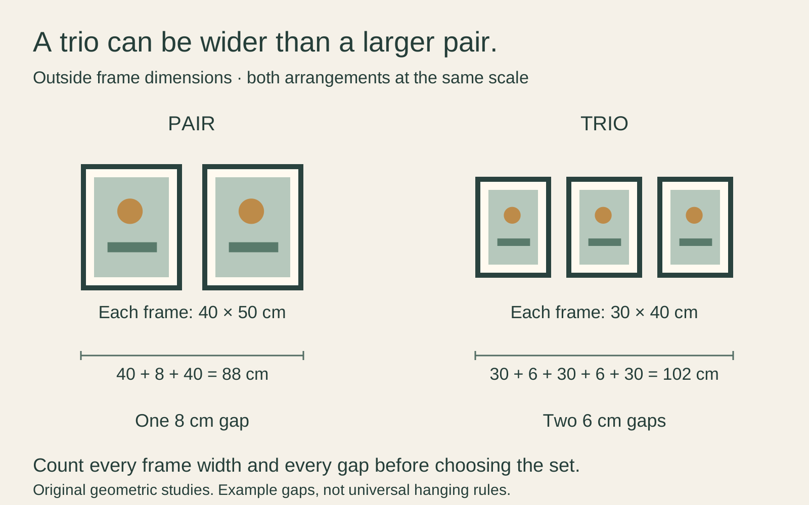
Measure the finished outside frames, not just the advertised image sizes. A pair of frames each 40 cm wide with an 8 cm gap spans 88 cm. A trio of frames each 30 cm wide, separated by two 6 cm gaps, spans 102 cm. The smaller individual frames make the wider group.
The diagram gives the pair a height of 50 cm and the trio a height of 40 cm. Both are drawn at the same scale, so you can compare their overall shapes. These are hypothetical outside dimensions, not available product sizes or recommended gaps for every room.
Test the gap with the actual imagery. A narrow separation may help a continuous composition read as one work, while two unrelated scenes may benefit from a clearer interval. The gap still has to allow the frames and their fittings to sit correctly. Ask the supplier how a purpose-made multi-panel set is intended to be displayed.
Decide whether order matters
Put both possible orders of a pair beside one another before deciding. A branch or figure directed toward the other image may connect the pair; directed outward, it may make the pictures feel more independent. Neither arrangement is a universal rule. Choose the one that suits what you want to notice.
For a sequence, preserve the meaningful order. If the three images show stages of a process, reversing them changes the story. If they are independent compositions, moving the quietest one to the centre might give the group a pause, or might make the middle seem empty. Try it at the intended size.
Do not mirror a historical image merely to make its subject face inward. Flipping it changes the composition, including writing and recognisable details. Change the order or choose another image instead.
Equal frame heights make a row easy to align, but they are not required. If the pictures have different proportions, decide whether they share a centre line or another deliberate reference. Avoid forcing them into equal image rectangles simply for convenience.
Keep the pictures complete
Three prints from one painting are a set of details or a divided reproduction, not three original paintings. If you want that treatment, preview the entire arrangement with its real gaps. Faces, lettering and important lines can disappear into the separations or be repeated where panel crops overlap.
For a continuous view, ask whether the seller has removed strips of the source to account for wall gaps, or simply placed complete adjacent image sections apart. Neither method is invisible. Do not assume that the subject will join perfectly from every viewing position.
Independent images avoid that particular problem. They can also accommodate different proportions through their own mats. Our guide to detail prints explains how a crop changes both the composition and the pixels available for printing.
Make the framing support the relationship
Try a common mat colour or frame finish if the pictures are visually different. If the images already form a strong sequence, you may want the frames to stay quiet. A matching frame is an option, not a requirement to discard an existing frame you like.
Matching outer sizes need not mean matching mat openings. A wider mat can surround a smaller image without enlarging or cropping it. Keep image size, paper size, visible mat opening and finished frame size separate when ordering.
Appearance is only one part of framing. The Canadian Conservation Institute’s framing guidance calls for adequate internal space and separation between suitable paper works and glazing. Do not flatten or cut an original just to complete a decorative set; consult a qualified framer for valuable or fragile pieces.
Test the set before hanging
Make paper templates for the finished frames and place small image previews on them. Stand where you normally enter and sit. Check that you can see why the images are together without having to explain the connection at length.
If one dominates unintentionally, try changing its position or scale before adding more pictures. If the set remains unconvincing, separate it. Art you enjoy individually does not have to occupy the same wall.
Once the arrangement works, check each frame’s actual weight, fittings and wall attachment separately. A measured row tells you where the pictures go; it does not establish what safely supports them.
Editorial record
About this article
- Author
- Publisher
- GeMarkt
- Published
- Reviewed
- Internal source & rights check. Conducted by GeMarkt Research Review. This is an internal editorial check—not independent peer review.
- Source standard
- Buying guide source standardSeparates measured or first-hand evidence from general guidance and keeps practical limits visible.
Found a claim that needs checking? Report a factual error.