GeMarkt Blog · Practical guide
Pink and Blush Art Prints
Use pink in art without matching the whole room. Compare Morisot’s pale brushwork with Cassatt’s striped print, then consider scale, framing and colour.

A pink print does not require a pink room. Choose a picture whose subject and composition you like, then decide whether its pink should be the room’s main colour connection or a small accent. Pale blush, rose and a stronger pink stripe can produce very different pictures; they are not one interchangeable decorating category.
The two examples below show that range without recolouring historical art. Berthe Morisot’s Woman at Her Toilette uses pale, broken passages around a figure. Mary Cassatt’s Woman Bathing puts pink into a patterned skirt beside other distinct colours. One is a painting; the other is a colour print. Their differences matter more than giving both the same colour tag.
Decide whether pink is the subject or an accent
When you save an image, look at where the pink actually appears. Is it a large background, a face, a garment, a flower or a few brushmarks? A small coloured area can be important without making the whole picture pink. This is especially useful when you want a modest connection with an existing cushion or rug rather than a room organised around one hue.
Also inspect the surrounding colours. A pale rose beside cream and brown presents a different combination from the same rose beside olive and dark blue. The diagram keeps the pink identical so you can compare those accompanying colours without involving a historical painting.
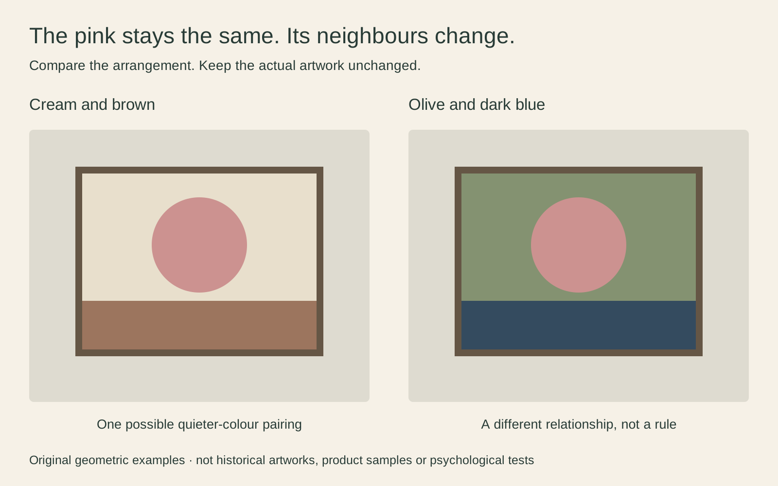
There is no universal winner. If your furniture is already mostly pale, the first combination may feel more continuous to you. If you want a sharper focal point, the second is worth testing. Those are styling options, not measured emotional effects.
Morisot makes pale colour part of the brushwork
The Art Institute of Chicago dates Morisot’s Woman at Her Toilette to 1875–80 and identifies it as oil on canvas, accession 1924.127. The palette includes pink, but much of the picture is made from pale greys, whites and other closely related passages. It is a more interesting choice than a promise of an evenly blush-coloured surface.
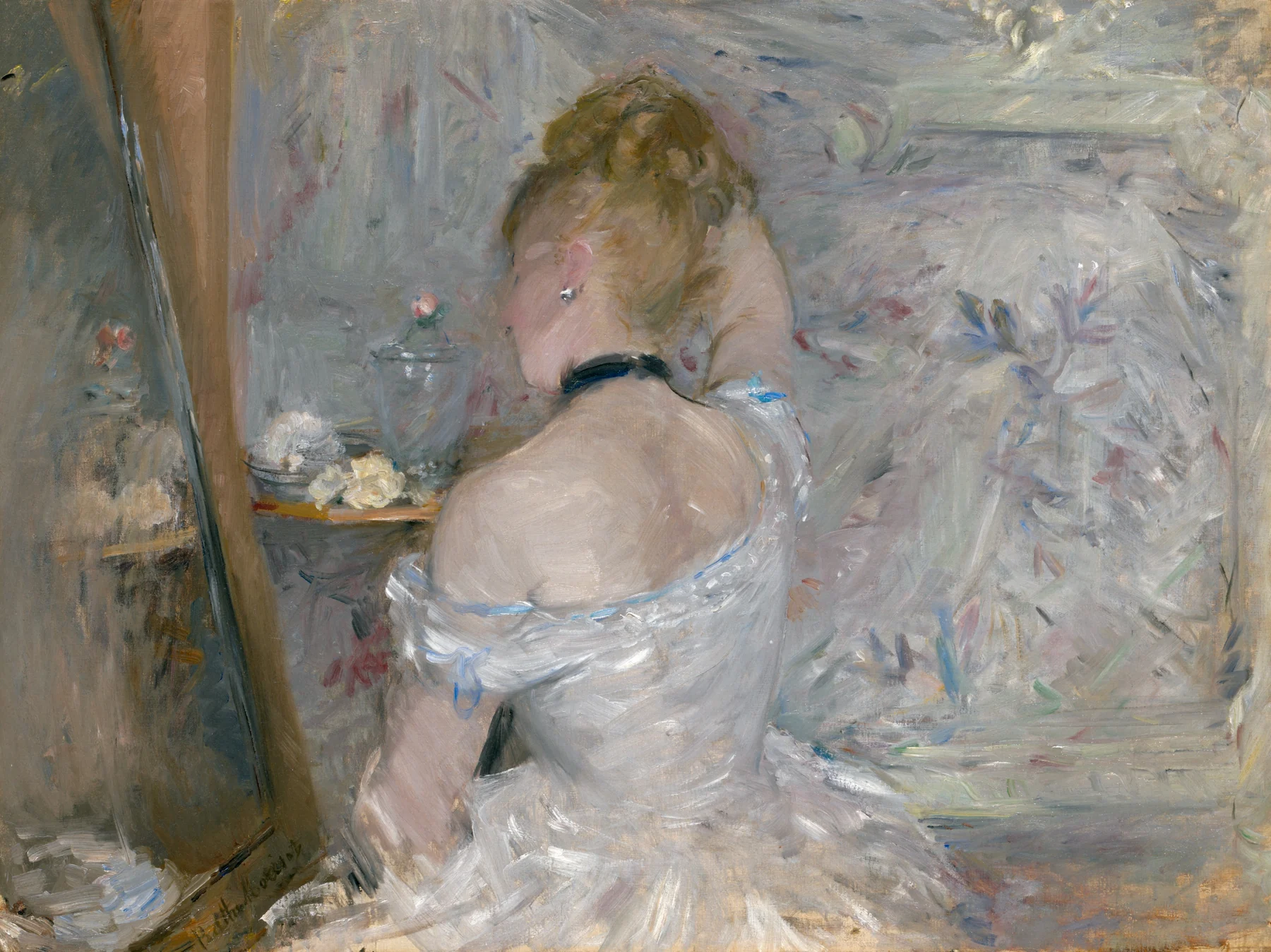
Look at the small dark ribbon against the woman’s neck, then the less definite boundaries around the furniture and flowers. That contrast gives the picture points of focus without making every edge equally emphatic. The painted surface remains visible as marks, not just a softly shaded photograph of a person.
I would try this near plain textiles where the brushwork can supply detail of its own. A broad white mat is not automatically necessary: on an already pale wall, compare a narrower surround as well. Give the actual image enough space to be read rather than allowing the border to become the largest feature.
Cassatt puts pink into a stronger pattern
Cassatt’s Woman Bathing is a colour aquatint and drypoint, dated 1890–91, in the Art Institute of Chicago, accession 1932.1281. The medium matters: this is an original historical print composition, not an oil painting reproduced in pastel tones.
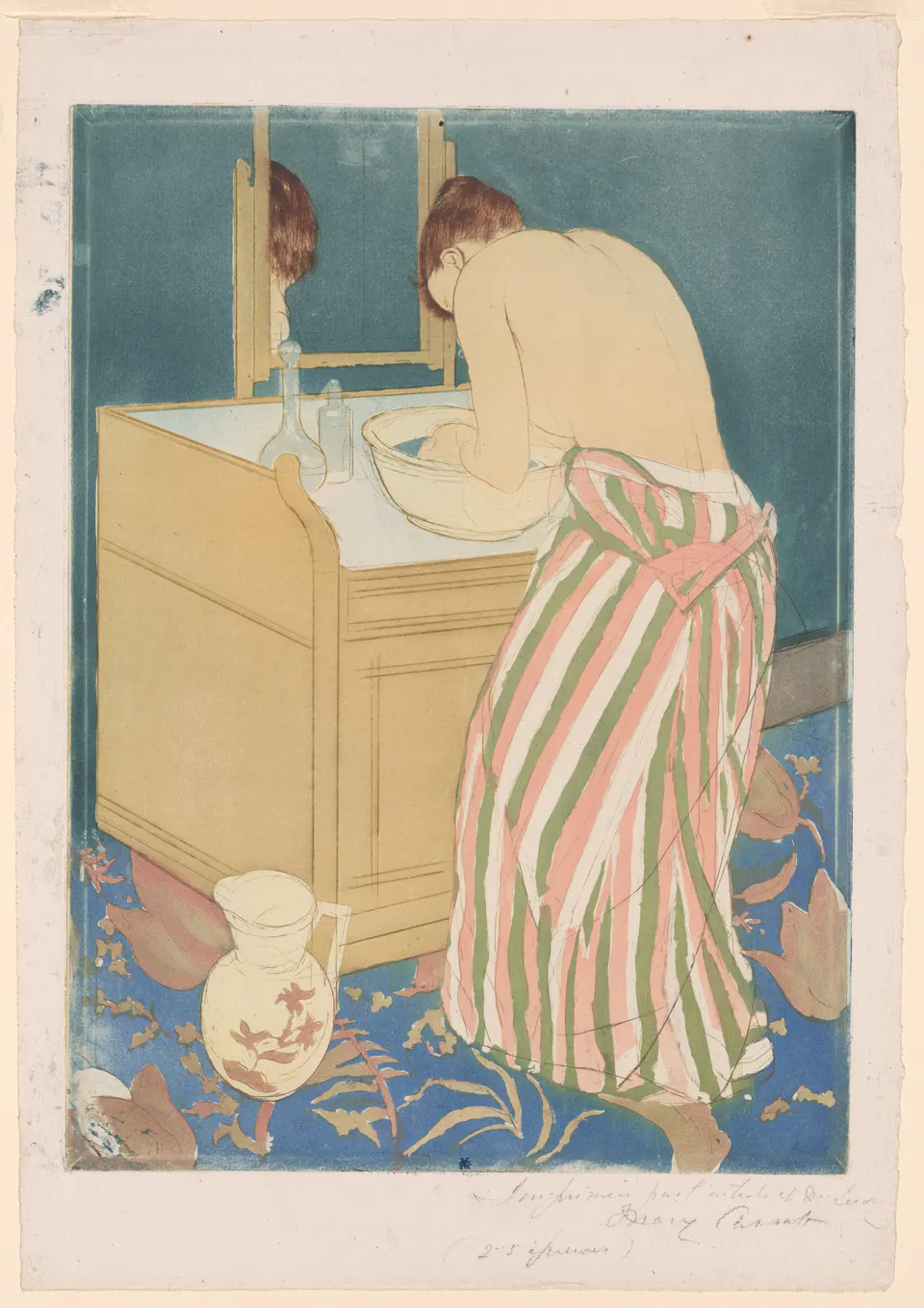
The pink is contained in stripes, with olive, pale paper, blue and ochre playing substantial roles around it. The curved back, basin and striped skirt give the scene a structure quite unlike Morisot’s more broken painted edges. You might choose it for that arrangement even if you own nothing pink.
Its vertical sheet could suit a wall beside a cabinet or chair, where you can approach the smaller details. Keeping the paper margins also preserves the object as photographed. A reproduction that removes those margins should not be confused with an unchanged view of the full sheet.
Use the other colours in the picture
An easy way to avoid an overly coordinated room is to connect furnishings to a secondary colour instead of the pink. With Cassatt, a muted olive object or a blue textile might be enough. With Morisot, a dark frame could make a loose connection with the small dark accents rather than with the palest brushwork.
Choose one relationship first, then stop and look at the room. You do not need matching pink curtains, a pink rug and pink accessories to justify the picture. If you already own those things and like them, the art can still belong; simply check whether its subject remains noticeable among them.
Pink against a coloured wall needs the same attention as any other combination. Hold proposed frame and mat samples near the wall, not against a white browser background alone. Our guide to matching art and wall colour offers a practical way to compare the whole framed object rather than trying to find a perfect digital match.
Choose a frame without adding another pink
A frame can separate the image from the room, connect it to furniture, or stay relatively unobtrusive. Those are more useful decisions than asking which frame colour is always correct for pink art. Pale wood, dark wood, black and a restrained metal finish are all possibilities; the actual finish and width matter.
For a delicate-looking image, do not assume the narrowest possible frame is the only option. A stronger outline can make a small work more distinct. Equally, an ornate frame can become distracting if the picture itself is small and lightly drawn. Compare examples at something close to their intended size.
Include the mat in your measurement. A visible image opening of 20 × 30 cm surrounded by 4 cm on each side occupies 28 × 38 cm before the frame moulding. That example illustrates the arithmetic, not a recommended mounting method or a size offered for either artwork. The paper sheet may extend behind the mat opening.
Make space for the subject not a stereotype
Neither pink nor blush belongs to a particular gender, age or room. Choose the scene as carefully as the palette. Morisot and Cassatt are showing people engaged in private activities; that content remains present even if a retailer groups the images under “soft pink decor”.
Think about where you want that subject. A quiet corner you use alone may feel different from a shared entrance or a video-call background. There is no need to invent a universal rule for everyone’s home. The useful question is whether you want to encounter this particular person and scene in that place every day.
Leave some unoccupied wall around a picture if nearby objects obscure its edges. This does not demand a minimalist room. Moving a tall lampshade or avoiding a row of ornaments directly underneath can let the subject read more clearly. For mixed collections, mixing old masters with modern prints explores connections beyond colour matching.
Check the print before building a room around it
Terms such as blush, dusty rose and pale pink are descriptions, not precise colour specifications. A thumbnail cannot tell you exactly how a printed sheet will look beside your wall. If the relationship is important, ask whether the seller offers a physical sample or proof and check what that sample actually represents.
Look for an unambiguous artwork title, artist, image version and description of any adaptation. A historical work made pink with a filter is different from a faithful reproduction that naturally contains pink. Neither the room nor a colour trend is a reason to hide that distinction.
Choose the artwork first, assess the surrounding colours second, and confirm the finished size and presentation before buying. You can enjoy a little pink on the wall without turning the picture into a colour-matching exercise or the entire room into a theme.
Editorial record
About this article
- Author
- Publisher
- GeMarkt
- Published
- Reviewed
- Internal source & rights check. Conducted by GeMarkt Research Review. This is an internal editorial check—not independent peer review.
- Source standard
- Buying guide source standardSeparates measured or first-hand evidence from general guidance and keeps practical limits visible.
Found a claim that needs checking? Report a factual error.