GeMarkt Blog · Practical guide
Mixing Old Masters with Modern Prints
Combine historical reproductions and contemporary images through colour, shape or subject while keeping each picture's identity, proportions and framing needs.

An Old Master reproduction can sit comfortably beside a contemporary print. Start with one visible connection, such as a colour, curve or subject, and let the other differences remain. You do not need to make the older image look modern or give the newer one an artificial antique finish.
The best test is simple: do you enjoy the pictures together, and can you still look at each one without the other becoming a distraction? A room need not behave like a chronological museum display, but it should give the art enough space to be seen.
Compare the images not the age labels
The National Gallery uses Old Master broadly for painters and works from the thirteenth through eighteenth centuries. In a print shop, however, an “Old Master print” may mean a newly made reproduction of a historical painting, not an old physical object.
“Modern” can be equally imprecise in shopping language. It may mean a contemporary design, a reproduction of a twentieth-century work or simply something that suits a recent interior. Before choosing by those labels, look at the actual image and read what is being sold.
A detailed historical scene and a spare abstract image offer one kind of contrast. Two densely worked pictures from different centuries offer another. A new line drawing may have more in common visually with an old engraving than with a recent colour-block design. Age does not tell you how busy, bright or quiet the picture will feel on your wall.
For this guide, the practical comparison is between images with different histories and visual character, usually displayed as reproductions. It is not a recommendation to treat valuable originals as ordinary decorative prints.
Choose one connection you can see
Begin with a feature visible from the distance at which you normally see the wall. A pale blue area, a strong diagonal or a rounded shape can link quite different subjects. If the connection exists only in a tiny detail visible on your phone, it may disappear across the room.
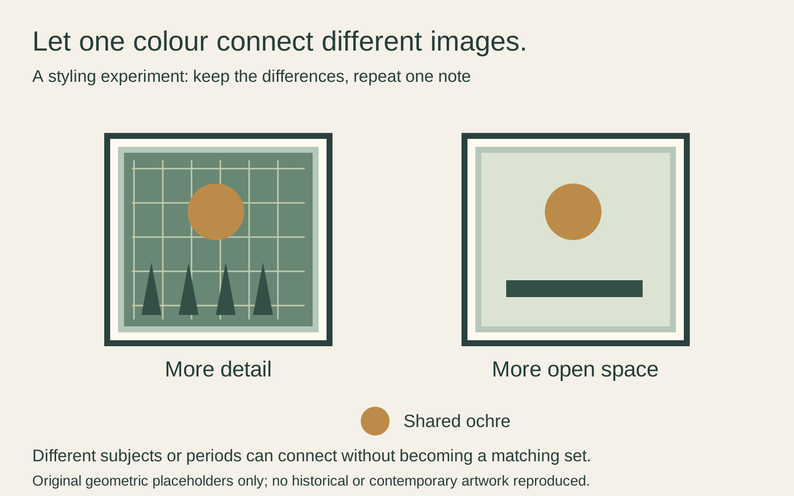
In the diagram, the left placeholder has many small lines and shapes; the right has fewer, larger ones. Both include an ochre circle. That repeated colour offers a way to connect the pair without making their backgrounds or amount of detail identical. It is a styling experiment, not a rule about how viewers must respond.
A connection can also be personal rather than purely visual: two images of places important to you, or pictures chosen by different members of the household. In that case, a common mat or consistent spacing may be enough to organise the display. You do not have to invent an art-historical relationship to justify liking both.
Give each picture a role
Choose the image you want to notice first. It might be larger, more detailed or simply the one with greater personal importance. Then ask what the companion contributes. It could introduce a broad area of colour, repeat a line or provide a calmer place to look after a complicated scene.
Suppose you have a dark, detailed interior reproduction and a pale graphic print. Putting them in identical sizes may still leave the darker image visually dominant. Rather than immediately enlarging the pale one, try a wider interval or a position where it receives an uninterrupted view. Compare the results instead of trying to make two very different pictures equally forceful.
The reverse can happen too: a small, saturated graphic may attract attention before a large, subdued image. Physical size is only part of the relationship. If both compete for the same first glance, they may work better on different walls.
Avoid adding a third picture merely to repair a difficult pair. First remove one and look again. A simpler display can reveal whether the problem was the images, their scale or their surroundings.
Keep the scale of the subject in mind
Equal outside frames do not guarantee equal-looking subjects. A face filling one image can feel much closer than figures occupying a small area of a broad scene. Judge the visible subject, not just the outline of the print.
Make a small preview using the intended image proportions and mat widths. For example, a 24 × 30 cm image and a 30 × 40 cm image could be presented within different openings of frames with the same outside dimensions. The smaller image does not need to be stretched to fill the larger opening.
If one reproduction requires a major crop to match its neighbour, consider separate frame proportions. A pair can share a colour or centre line without sharing a shape. Our guide to painting proportions and standard frames explains that difference.
Use frames as a connection not a disguise
Try one common treatment before replacing everything. A similar mat tone can connect a dark frame and a wood-toned frame. A repeated slim profile can link two different finishes. These approaches leave some variety instead of making the pictures look like a boxed set.
American Frame’s mixed-gallery guidance also suggests repeated finishes or mat treatments as ways to connect varied work. Treat that as a manufacturer’s styling advice, not a requirement or proof that one arrangement is better.
An ornate frame is not compulsory for a historical reproduction, and a plain frame is not compulsory for a contemporary image. Try the frame against the picture itself. Do not describe a new decorative frame as the work’s original historical frame just because its appearance seems appropriate.
If you already own a valuable original in an old frame, keep that question separate. The Canadian Conservation Institute’s framing guidance calls for checking old frames for damage before reuse. A qualified framer or conservator can help assess preservation needs rather than changing the frame solely to match a neighbour.
Try the pair with the room around it
Include the furniture, curtains and lamps in your test. Two images that look harmonious on a white screen may sit beside a strongly patterned curtain at home. A frame that seemed unobtrusive online may repeat every dark edge in a small room.
Make paper templates and attach image previews to them. Look from the doorway and your normal seat, not only straight on. Try one arrangement that groups the images closely and another that gives them more independence.
Check daylight and your usual evening light. A phone photograph can help compare arrangements, but its automatic brightness and colour adjustments are not a reliable record of exact print colour. If colour matching is central to the choice, examine actual samples or prints where possible.
Keep the history and the physical object straight
Keep the artist and title with each historical reproduction, even if that information sits on the back or in your order record. A decorative pairing does not make the two works a historical set, and a new print of an old painting is not itself an antique.
Protection depends on the physical object in front of you. A new paper reproduction still needs suitable framing and a sensible location; an original drawing may need specialist care. Neither becomes safe in direct sun because the other is replaceable.
Choose the combination that helps you enjoy both images. If the only way to make them match is to erase their differences, they may simply belong in different places.
Editorial record
About this article
- Author
- Publisher
- GeMarkt
- Published
- Reviewed
- Internal source & rights check. Conducted by GeMarkt Research Review. This is an internal editorial check—not independent peer review.
- Source standard
- Buying guide source standardSeparates measured or first-hand evidence from general guidance and keeps practical limits visible.
Found a claim that needs checking? Report a factual error.