GeMarkt Blog · Practical guide
Neutral and Beige Art for Quiet Rooms
Choose restrained art without losing the subject. Compare Hammershøi and Whistler, then test light and dark areas, framing and placement in your room.

Neutral art works best when there is still something worth looking at. Instead of searching only for beige, look for a subject you enjoy, a useful balance of light and dark, and a frame that suits the wall. A restrained palette can contain strong shapes, awkward spaces and an absorbing human presence.
“Quiet” here is a description of a room’s visual arrangement, not a medical or psychological promise. You may want less competition with a patterned rug, or a picture that does not introduce another strong colour. That does not require removing the artwork’s darker passages or turning an old painting brown with a filter.
Look for a range of light and dark
Before looking at a colour label, notice the palest and darkest areas of the image. A cream wall beside a black dress is not the same arrangement as a picture made entirely of similar pale patches. Both might appear in a neutral-art search, but they give the wall very different focal points.
Then ask what connects those areas. A doorway, a chair, a face or a patch of floor can make a restrained palette interesting. This is often a better basis for choosing a picture than a promise that it contains no “clashing” colour.
A room already full of pale fabric and wood may benefit from a defined dark area. Another room may need a picture with gentler boundaries to avoid adding more hard lines. These are choices to test, not universal design laws. If a thumbnail looks attractively subtle, enlarge it and check whether there is a subject or detail you want to see repeatedly rather than just a useful blankness.
Hammershoi is not just a beige room
Vilhelm Hammershøi’s Interior in Strandgade, Sunlight on the Floor is dated 1901 in the SMK collection, accession KMS3696. The room contains a woman, furniture, an opening towards the light and a doorway. It is not an empty interior invented to match current beige furnishings.
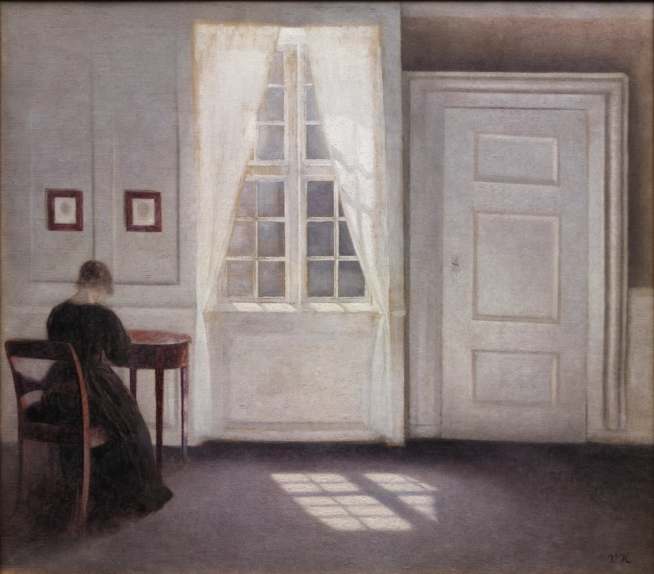
Look at the warm floor against the cooler-looking walls, then the woman’s dark dress. The colours are restrained without being identical. Bright rectangular patches on the floor give another kind of shape to compare with the doors and furniture.
I would try this where there is time to notice those relationships, perhaps beside a chair rather than at the far end of a narrow passage. Keep the whole room in the reproduction. Cropping it closely around the woman would remove the architecture and empty space that make the composition distinctive.
Whistler shows what a dark area can do
Whistler’s Arrangement in Grey and Black No. 1, usually called Whistler’s Mother, is an 1871 oil painting in the Musée d’Orsay, accession RF 699. Its formal title is a useful reminder to look at the arrangement around the sitter as well as her identity.
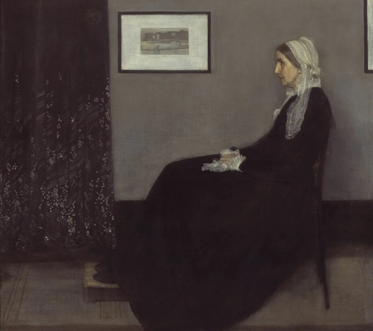

The black dress is substantial, not a tiny accent. Across the image, the curtain adds another dark area with a much more intricate pattern. Against these, the cap, face and hands become conspicuous. A restrained palette can therefore have a very clear focal point.
In a pale room, I would treat this as a deliberate dark presence rather than expecting it to disappear into the wall. It might connect with a dark table or chair while leaving the rest of the room relatively light. You do not need to imitate the nineteenth-century interior to give the portrait a place in your own.
Choose the relationship between picture and wall
A neutral picture can blend gently with the wall or sit apart from it. The frame and any mat help determine that relationship. Test the actual outer object: two frames around the same image can have quite different dimensions if one includes a wider mat.
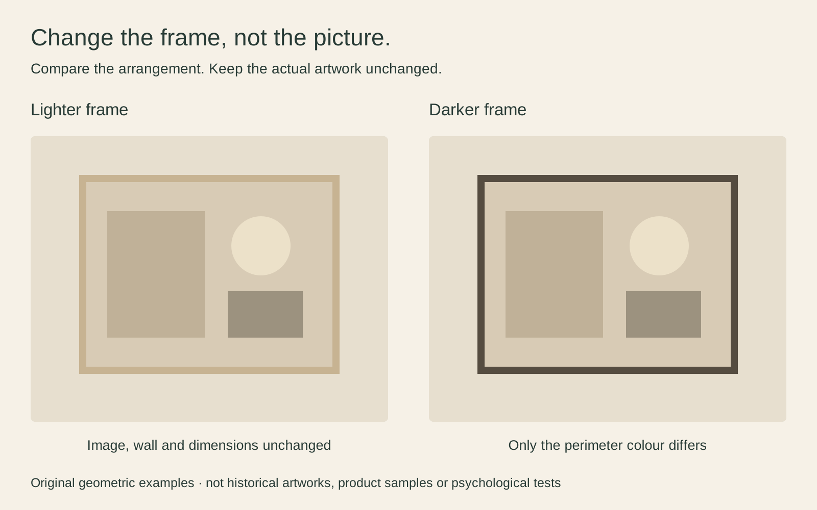
The diagram changes only the frame colour, so the choice is easy to isolate. In a real room you will also be choosing width, finish, glazing and perhaps a mat. Start with one of those decisions at a time rather than changing everything in each sample.
A darker perimeter may help a pale image remain distinct against a pale wall. A lighter one may be preferable if you want a less emphatic edge. Neither choice makes the artwork better; it changes how you present it. Mixing frame colours and styles explores how that decision works across more than one picture.
Give the subject enough space to register
Small, restrained pictures can become difficult to read across a room. That does not automatically mean ordering a much larger print. A closer viewing position may be the better answer, especially if the file cannot support the enlargement you had in mind.
Imagine a 150 cm cabinet with a framed picture 70 cm wide centred above it. That leaves 40 cm of cabinet width on either side of the frame. The calculation is simply a way to picture the arrangement, not a minimum or ideal proportion. A lamp may occupy one side, or an adjacent door may shift the most useful position.
Test the outer frame with paper before deciding. From the doorway, check whether it looks intentional rather than stranded. From the seat, ask whether the person or room inside the picture is readable. Do not judge only from directly in front of the wall, which may not be where you spend much time.
Check what neutral means in the actual file
A reproduction described as neutral might faithfully show a restrained painting, or it might have been desaturated and warmed to fit a decorating palette. These are different things. Look for a clear description of any recolouring rather than relying on the artwork’s familiar title.
Keep the subject’s darker areas as well as its pale ones. Lifting every shadow can make a preview look airy while reducing the distinctions that made the painting interesting. Adding a sepia cast is not the same as selecting a naturally warm-coloured artwork.
The examples here reuse the identified image files without a new colour treatment. That does not promise that every screen, paper or printer will show them identically. When a close match to wall paint matters, a physical sample or proof, if offered, is more useful than comparing tiny online swatches. Our guide to why prints look different from your screen explains the practical limits of that comparison.
Keep the room quiet without making it empty
A neutral room can still contain books, patterned fabric and personal objects. If the picture is hard to notice, first check for things that obscure it: a tall plant crossing the image, several ornaments immediately below it, or a bright reflection from a lamp. Moving one object may do more than replacing the art.
Avoid filling every remaining gap with another similar beige print simply because it coordinates. One image with a clear subject can offer more to look at than a set chosen only for identical colour. Alternatively, a small pair may make sense if the subjects relate and you have room to see both.
The useful question is not whether the room contains the correct amount of beige. It is whether the picture adds something you enjoy while allowing the room to work as you want. Keep the art’s distinctions intact, choose its position deliberately, and let quietness come from the arrangement rather than from erasing everything distinctive.
Editorial record
About this article
- Author
- Publisher
- GeMarkt
- Published
- Reviewed
- Internal source & rights check. Conducted by GeMarkt Research Review. This is an internal editorial check—not independent peer review.
- Source standard
- Buying guide source standardSeparates measured or first-hand evidence from general guidance and keeps practical limits visible.
Found a claim that needs checking? Report a factual error.