GeMarkt Blog · Practical guide
Why Prints Look Different from Your Screen
Understand dark prints, changed colours, paper and screen brightness, then use a practical checking sequence before editing or reordering your artwork.

A print can look darker or less vivid than its screen preview without the file being corrupt. A display sends light towards you; paper reflects the light falling on it. Screen settings, image profiles, printing materials and viewing conditions all affect the comparison. Start by checking those conditions before changing the artwork or assuming that either version is automatically correct.
Compare light with light
Place the print where it is evenly lit and free of glare. A dim corner is not a fair place to compare paper with a bright display. Equally, direct sunlight is not a sensible permanent way to make a print appear brighter. Compare the image first under stable room lighting, then consider the conditions in its intended position.
The International Color Consortium’s introduction to colour reproduction explains that reflection prints and luminous displays operate under different brightness and viewing conditions. Paper cannot reproduce the light of a glowing display simply by receiving more ink. A white area in an ordinary paper print largely depends on the paper and the illumination, rather than a miniature light source behind it.
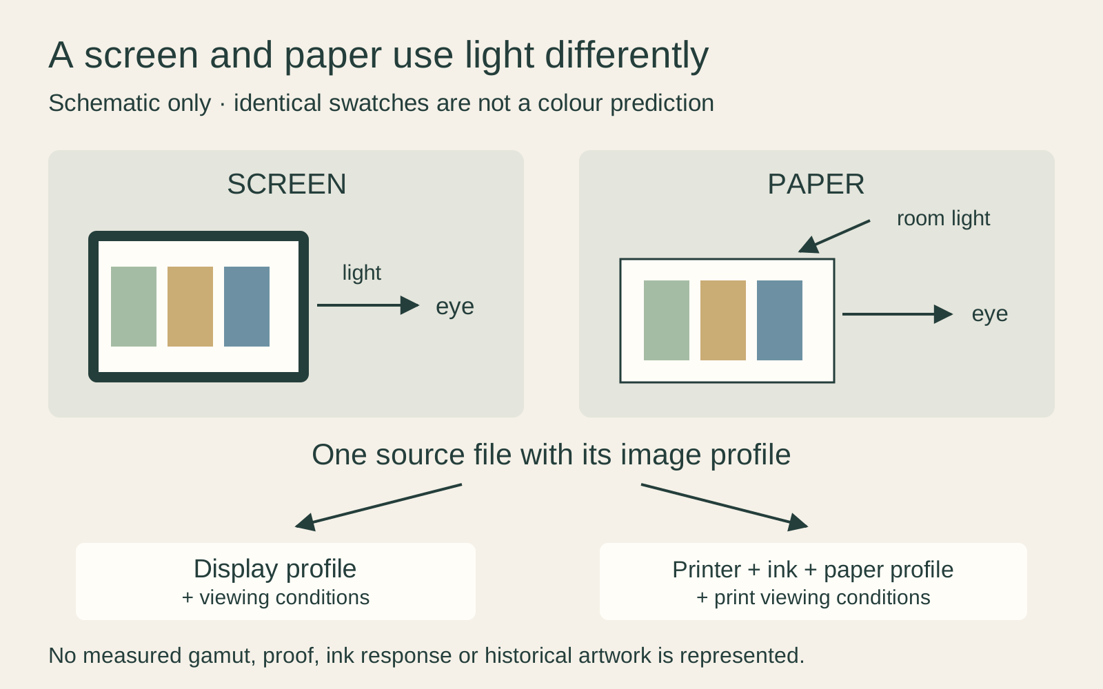
This does not excuse a severe colour error. It explains why a useful comparison starts with the surroundings. A print that changes character between a warm bedside lamp and a brighter room needs to be assessed in the setting where you actually want to enjoy it.
Remove screen settings that change the comparison
Before judging colour, note whether the device is using a night mode, warm colour filter, vivid display mode or automatic brightness adjustment. These settings may be comfortable for ordinary use but make a moving target for a print comparison. Temporarily choose a stable setting and avoid judging the picture at extreme screen brightness.
Changing a brightness slider is not full calibration. Calibration sets a display to a chosen behaviour; profiling describes that behaviour for colour-managed software. The ICC’s display guidance treats them as related but different processes, with the viewing environment also affecting accuracy.
For occasional buyers, a controlled comparison and a physical sample may be more useful than trying to build a professional proofing setup. For repeated print preparation, a suitable measurement-based calibration and profile are worth discussing with the printer. Do not copy a stranger’s numerical monitor settings and assume they characterise your own device.
Understand what a profile does
An RGB value describes amounts of red, green and blue in a defined colour space. An ICC profile gives software information needed to interpret those numbers. Without the right interpretation, identical numbers are not a dependable promise of identical colour across devices.
The input file’s profile and the printer’s output profile have different jobs. The latter needs to describe the relevant printing conditions. Adobe’s guide to print-output profiles explains that the printer, ink and paper combination affects what can be reproduced. A profile for a different material is not automatically an improvement over the correct standard setting.
Keep the supplied profile unless the printer asks for a defined conversion. If a file has no profile or an application reports a mismatch, ask the source or printer how to interpret it. Guessing and then saving over the original makes the problem harder to trace.
Account for the paper and ink
A matte surface and a glossy surface can give the same image a different appearance. Paper colour, surface texture and the printing system influence how the tones read. Choosing a surface is therefore more than deciding whether you like reflections.
Inspect the lightest areas of a sample as well as the darkest ones. Is the apparent white part of the picture, unprinted paper or a surrounding mat? Are shadows still separate, or do they merge into one dark shape? Look at transitions rather than choosing whichever sample has the most dramatic contrast.
“More saturated” and “more faithful” are different judgements. A historical painting does not become more accurate when every green becomes stronger. If fidelity is important, ask which source image the print follows and whether any colour changes were made, rather than using punchiness as the only test.
Use a soft proof for a specific output
A soft proof is an on-screen simulation using an output profile. It can help reveal colours that a particular printing combination cannot reproduce in the same way, and show an estimate of paper white or darker tones. It is not a generic filter that makes every screen behave like paper.
Adobe’s proofing guidance notes that reliability depends on the display, the profiles and the surrounding light. Its paper-colour and black-ink simulations also depend on support from the chosen profile. If a service supplies a proofing profile, use it with that service’s instructions; do not assume it is also the profile you should embed in the uploaded file.
A physical sample remains useful when material and appearance are central to the purchase. Soft proofing cannot let your hand feel a surface or show glare from the exact lamp beside your sofa.
Diagnose the symptom before changing the picture
Describe what is wrong as precisely as possible. “It looks different” leaves too many possible causes. These are starting checks, not diagnoses made from a distance:
| What you notice | What to check first |
|---|---|
| Everything looks darker on paper | Print illumination, display brightness and the supplied proof |
| Most neutrals have a colour cast | Viewing light, screen filter, embedded profile and printing settings |
| One vivid colour has changed most | The output profile, printable colour range and any automatic correction |
| Fine detail looks soft but colour is plausible | Source pixels, enlargement and print size rather than only colour settings |
| A different crop or object detail appears | Whether the printed file matches the ordered version |
Make one controlled test
Keep the original file and change one controllable factor at a time. If you alter brightness, saturation, paper and printer settings together, a better result will not tell you which change helped. Ask the printer to reproduce a small demanding area with the intended final settings before commissioning another large print.
Do not brighten a museum image simply until it matches an over-bright phone. That may compensate for one viewing situation while misrepresenting the work elsewhere. Correct a demonstrated workflow problem first; any deliberate reinterpretation of the image should remain a separate, clearly identified version.
Decide what to ask the seller
Send the order details and a specific description: for example, “the pale grey area has a strong green cast under neutral room light.” Include the file or proof name and whether the whole image or only one region is affected. A photograph can help show a problem, but its own camera processing means it is not a precise colour measurement.
Ask whether the source, crop, paper and printing settings match the approved order, and what remedy applies if they do not. Normal differences between media are not a reason to dismiss banding, an obviously wrong file or a badly clipped image. The goal is a credible physical print, not an impossible promise that paper and every screen will look identical.
Editorial record
About this article
- Author
- Publisher
- GeMarkt
- Published
- Reviewed
- Internal source & rights check. Conducted by GeMarkt Research Review. This is an internal editorial check—not independent peer review.
- Source standard
- Buying guide source standardSeparates measured or first-hand evidence from general guidance and keeps practical limits visible.
Found a claim that needs checking? Report a factual error.