GeMarkt Blog · Practical guide
Mixing Frame Colours and Styles
Make different frames work as a group by comparing finish, width, mat tone and placement, without replacing every frame or treating colour as a quality claim.

You can mix black, wood-toned, gold-toned and other frames on the same wall. Choose one feature that repeats, such as a mat colour or frame profile, and let some other features vary. Start with the frames you already like; an intentional group does not require buying an identical set.
The aim is not to make every frame disappear. It is to let each support its picture while giving the group enough connection to feel considered. Sometimes that connection is obvious; sometimes a single unusual frame is exactly the contrast you want.
Sort the frames before buying more
Lay the framed pictures out where you can compare them safely, or use straight-on photographs. Make a quick record of outside size, visible frame width, finish and mat colour. Include the image: a dark frame around a pale drawing does not read the same way as that frame around a nearly black photograph.
Separate the finish from the material. Gold-toned does not tell you whether a frame is gilded wood, coated metal or a wrapped composite. A wood effect does not establish solid timber. Our frame colour and material guide covers those buying distinctions; here the question is how the visible finishes work together.
Notice which frame you would keep even if the group did not exist. That is a useful starting point. A frame with sentimental or historical value should not be treated as the problem simply because it is harder to match to an online set.
Choose what will repeat
Try one shared feature first. If the frames have different profiles and finishes, a common mat tone may provide a connection. If every mat is different, repeating a dark finish in several positions may be enough. You do not need to match both.
The diagram uses six frames: two dark, two wood-toned and two gold-toned. Their mat colour stays consistent while the finishes move through the group. It is an example to compare with your own pictures, not a rule requiring exactly three finishes or two of each.
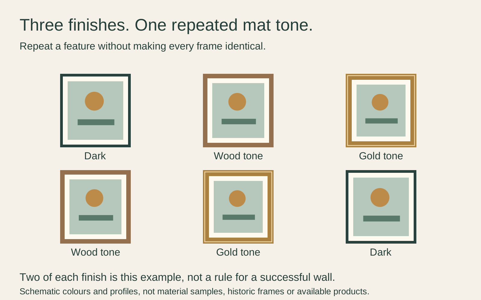
American Frame discusses repeated finishes and mats in its mixed-gallery-wall advice. Repetition is a useful option, but a single different frame is not automatically a mistake. It can deliberately emphasise the picture inside it.
Before changing a mat, test a loose colour sample beside the framed image without putting it against the artwork. You may find that a nearly matching white looks less convincing than a clearly different warm tone. Judge that in the room’s light rather than by the name “white” on a screen.
Compare width and sheen as well as colour
Two black frames can look less alike than a black frame and a dark wood frame. A broad glossy surround reflects light and occupies more of the view than a narrow matte edge. Look at the whole profile, not just its colour swatch.
Try describing the difference you dislike. Is the frame too shiny, too wide, too warm in tone, too decorated, or simply too close to another strong frame? Each calls for a different response. Replacing black with white will not necessarily solve an oversized border.
A useful test is to hold corner samples beside the same print. Keep the mat and image unchanged while you compare profiles. Then keep the preferred profile and compare finishes. Changing everything at once makes it harder to identify what helped.
The wall is part of this comparison. A pale frame against a pale wall may have a quiet edge, while the same frame against a dark wall becomes more distinct. These are visual relationships to test, not reasons to assume one finish always suits one kind of art.
Use mats without forcing identical openings
A common mat colour can connect pictures while preserving their proportions. The openings do not have to be equal. A square image and a narrow portrait can sit in different openings even if the outer frames share a size.
Ask for four measurements when needed: the image, the paper sheet, the visible mat opening and the outside frame. Those are not interchangeable. The opening usually overlaps some paper edge, while the sheet continues behind it; decide which part of the image should remain visible before ordering.
Do not trim an original or enlarge a reproduction disproportionately to make the openings match. For a small print, a wider mat may be the more straightforward choice. For an image that needs to remain complete, confirm the visible area with the framer rather than relying on the advertised fitting size.
Mat colour is not a conservation specification. The Canadian Conservation Institute’s paper-care guidance distinguishes protective materials from potentially damaging materials in contact with paper. Ask what the mat and backing are made from, especially for an original or irreplaceable work.
Place the strongest frames deliberately
Look for frames that draw attention through size, shine, contrast or decoration. You can group them to create a deliberate emphasis, or distribute them so one end of the wall does not carry all that activity. There is no requirement to spread every finish evenly.
In a six-frame group, try moving one strong frame from an outer corner to a position nearer the centre. Then compare the group with the images visible. A frame-only diagram is useful for planning, but the content may change which side attracts attention.
If two decorative frames seem to compete, give them more separation or place a quieter treatment between them. If one special frame is meant to stand out, do not buy a second merely to justify the first. The picture’s importance can supply the reason.
Use the finished outside dimensions when you transfer the arrangement to a paper plan. Matching print sizes do not ensure equal frame edges or gaps.
Check old frames and new contents
An old frame can be worth keeping, but inspect it before reuse. The Canadian Conservation Institute’s framing guidance identifies issues such as loose joints, warping and damaged glazing. A frame that looks attractive from the front may need attention before it can safely hold a new package.
Ask a qualified framer to check the internal depth, contents and fittings rather than forcing a thicker mat or backing into an unsuitable recess. Do not paint, strip or dismantle a potentially valuable historical frame just to match a new purchase; seek advice first.
The final hanging method must suit each assembled frame and wall. Matching frames may have different weights because their glazing and contents differ. Colour coordination tells you nothing about the capacity of the attachment.
Make one change at a time
Start by rearranging what you own. Next, test a mat sample or one different profile. Buy replacements only after identifying a particular problem you cannot solve through placement.
Photograph the preferred arrangement with labels so you know which frame belongs where. If the group grows, use that record to decide whether the new picture needs a repeated treatment or a deliberate contrast.
A mixed wall can look finished without looking uniform. Keep the frames that help you enjoy their pictures, and let the repeated features do only as much organising as the group needs.
Editorial record
About this article
- Author
- Publisher
- GeMarkt
- Published
- Reviewed
- Internal source & rights check. Conducted by GeMarkt Research Review. This is an internal editorial check—not independent peer review.
- Source standard
- Buying guide source standardSeparates measured or first-hand evidence from general guidance and keeps practical limits visible.
Found a claim that needs checking? Report a factual error.