GeMarkt Blog · Practical guide
Mythology in Art for the Home
Choose mythological and literary art for your home by looking at the story, figures, colour and room, with three paintings that reward a closer look.


Choose mythological art for both the image you want to see every day and the story you are willing to live with. A painting can suit a room’s colours while carrying a subject that changes its atmosphere for the people using it. Neither consideration cancels the other.
You do not need a classical interior or a collection of antiques. A single narrative painting can work beside plain furniture, books or contemporary objects. Start with the picture itself, then consider its size and surroundings. The examples below include ancient mythology and a later literary legend; they suggest different ways of bringing stories into a home, rather than one approved decorative style.
Choose the story as well as the colour
Before ordering, enlarge the complete image and identify who is doing what. Does a gesture show affection, resistance or a threat? Is a figure resting, departing or dying? Paintings sometimes make those distinctions difficult to see at first, especially when a small preview emphasises colour over action.
That is not a reason to avoid challenging subjects. A dramatic or unsettling work may be precisely what you want in a study. It is a reason to choose knowingly. A bedroom shared with someone else, a family living room and a private reading corner can call for different conversations about the same picture.
Nudity and distress are separate questions. Someone may be comfortable with an unclothed figure but not with visible violence, or the reverse. Ask the people who will regularly see the picture rather than assuming that a famous title makes everyone comfortable. For a child’s room, discuss the actual image with the household instead of using “classical” as a suitability label.
Our myth and literature guide explores the narratives more fully. For decorating, the first task is simply to understand what you are bringing into view.
Venus can bring pattern into a simple room
François Boucher’s The Toilette of Venus, 1751, surrounds its central figure with folds, pearls, birds and small winged attendants. Blue fabric spreads through much of the picture, while pale skin and scattered pinks interrupt it. There is very little empty space.
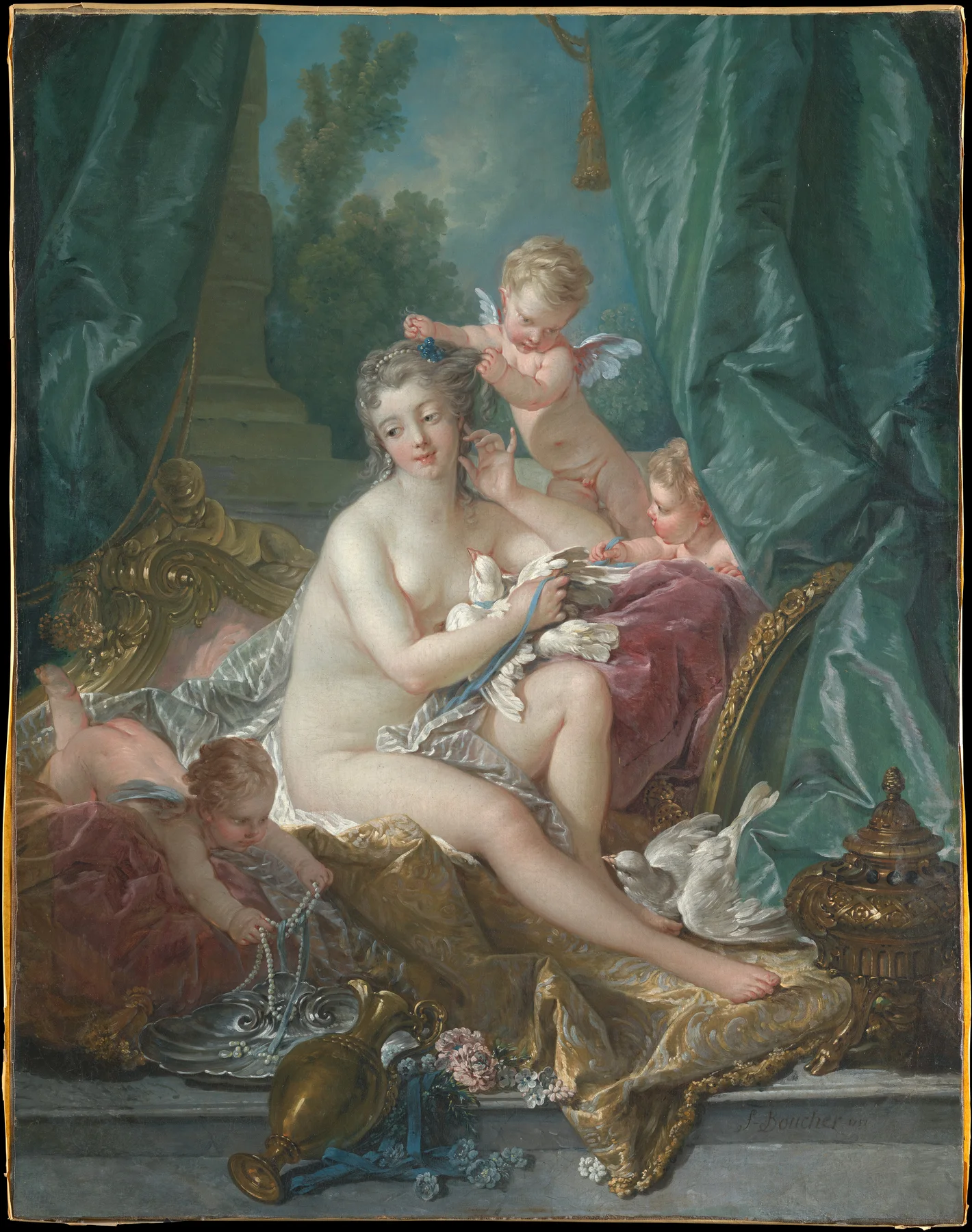
The Met records that it was made for Madame de Pompadour’s Château de Bellevue, where it sat within wood-panelled walls. That historical setting explains why the painting seems so closely involved with furnishings. It does not oblige a modern owner of a reproduction to copy the room around it.
Try the picture beside a simple cabinet or plain wall before adding more ornament. A narrow, restrained frame could let the painted fabrics supply the movement. An elaborate frame might instead extend the picture’s abundance; both are options to compare, not requirements of the subject.
Pick up one secondary colour if you want a connection with the room. A small pink detail elsewhere may be enough. Repeating the blue, pink, gold and every curved shape at once can make the space feel more themed than you intended. The painting can provide complexity without recruiting all the furniture to support it.
A dramatic encounter needs a deliberate place
Gustave Moreau’s Oedipus and the Sphinx, 1864, is tall, dense and confrontational. Two faces meet at close range, while wings, claws, rocks and ornament crowd the narrow field. The dark greens and browns might appeal immediately, but the subject deserves equal attention.
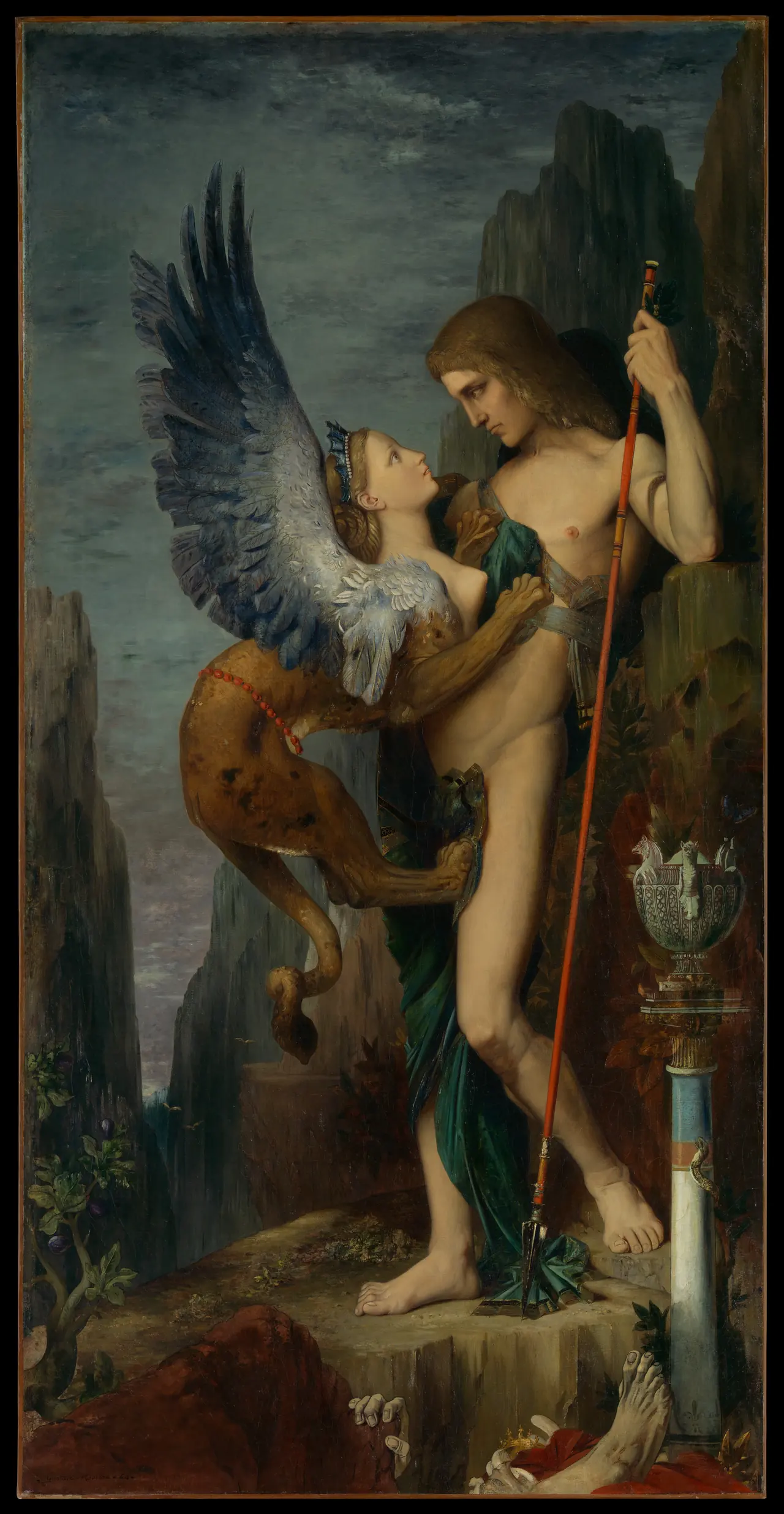
In the museum’s account of the myth, the Sphinx kills travellers who cannot solve her riddle. The remains in the foreground are part of the painting, not damage to a scan. This is not simply an intimate embrace with an exotic creature.
A study or reading area may give an interested viewer room to examine those details. Test a reproduction at the distance from which you would usually see it. At a very small size, the exchange of looks can disappear into a dark strip; an enormous version could become more confrontational than you want.
There is no obligation to turn that reaction into a verdict on the painting’s quality. You may admire it in a museum and prefer something else at home. Alternatively, its unresolved tension may be the reason you keep returning to it. Choose a location because you want the encounter there, not merely because the narrow shape fits an unused gap.
A literary landscape is not just a pretty river
John William Waterhouse’s The Lady of Shalott, 1888, can first register as a white dress, dark water and lush greenery. A patterned textile spills over the boat, making it especially tempting to connect the image with fabrics in a room.
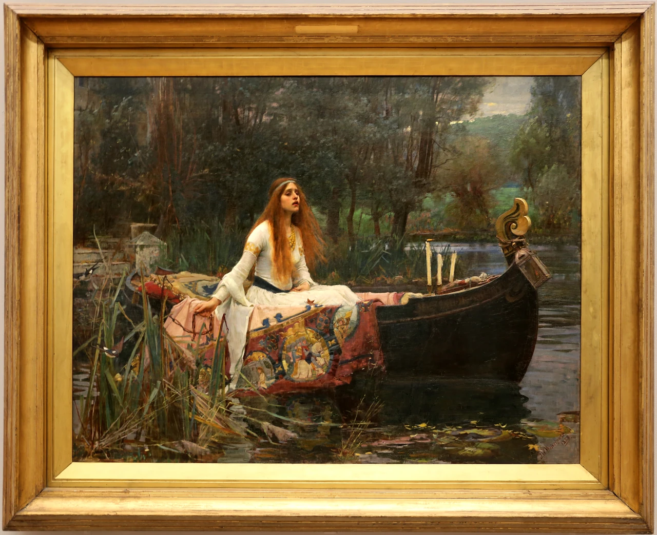
The figure belongs to Tennyson’s poetry and its Arthurian world, not to ancient Greek mythology. In the 1842 poem, her departure becomes a fatal journey. Knowing that can change the picture from a quiet boating scene into something more moving or more troubling.
For a reading room, that connection between landscape, textile and literature might be welcome. You could pair the reproduction with books you genuinely read, without adding props to manufacture a Victorian setting. In a shared room, explain the story before making the purchase rather than after someone asks why the figure looks distressed.
Notice that this reference photograph includes the historical frame. A print listing may reproduce it, remove it or use a different photograph of the painting. Decide which version you want before choosing another physical frame around the reproduction. Otherwise, a frame-within-a-frame effect may arrive as a surprise.
Test the format without cutting away the story
Narrative pictures often depend on apparently secondary details. Moreau’s foreground remains explain the danger; Waterhouse’s boat and textile give the figure somewhere to be. A tight crop that keeps only the faces can remove information you valued in the first place.
Compare the full composition with the seller’s actual preview. A white margin can help accommodate a different frame shape without cutting into the image, but it changes the balance of image and surrounding paper. Ask which part of the advertised dimensions describes the sheet, visible image and finished frame. Our proportions guide separates those questions.
For a simple room test, make paper outlines of two possible outer frames, such as 50 × 70 and 70 × 100 centimetres. Those are hypothetical finished-frame sizes, not promises that these artworks are sold in them. Try one outline at a time and look from your usual seat and the doorway. Check nearby shelves and the door’s movement, then assess the actual installation separately.
Pair pictures through one clear connection
You do not need another mythological work beside the first. A landscape, an abstract print or a family photograph might offer a more interesting contrast. Look for one connection you can name: a repeated blue, a similar dark-to-light balance or two figures looking in different directions.
Keep the stories independent. Two paintings containing Venus do not necessarily describe the same event, and two embracing figures do not automatically make a romantic pair. If you want a narrative relationship, learn enough about both works to know what you are joining.
Try placing the images side by side on a screen before buying frames. If one makes the other hard to notice, change their relative size or give them separate positions. Matching frames can unify different pictures, but cannot fix a pairing you do not enjoy. Our pairing guide offers ways to test the relationship without treating every pair as an original diptych.
Make room for a changing response
Living with a story means noticing it repeatedly, not completing an interpretation once. A small gesture may become more important over time; a subject you once liked may become something you would rather see less often. Moving a reproduction to another room or putting it away is a legitimate choice.
Keep a brief record of the artist, title and exact version with the purchase or download. An old painting’s copyright status does not automatically settle the licence of a particular modern photograph. Use the actual source or seller’s terms, especially when commissioning a print from a downloaded file.
The strongest choice is not necessarily the grandest or most recognisable scene. It is a picture whose shapes hold your attention and whose story you are comfortable encountering in that particular place. Let both parts of the decision remain visible.
Editorial record
About this article
- Author
- Publisher
- GeMarkt
- Published
- Reviewed
- Internal source & rights check. Conducted by GeMarkt Research Review. This is an internal editorial check—not independent peer review.
- Source standard
- Buying guide source standardSeparates measured or first-hand evidence from general guidance and keeps practical limits visible.
Found a claim that needs checking? Report a factual error.