GeMarkt Blog · Practical guide
Mid-Century Modern Wall Art
Choose art for mid-century-inspired furniture without turning the room into a period set. Compare geometry, colour, picture size and framing.

For a mid-century-inspired room, choose art that works with the furniture’s shape and the way you use the space. A clear geometric composition can sit comfortably above a long sideboard; a smaller, more intricate picture can reward looking beside a chair. The picture does not have to have been made in the 1950s.
That distinction gives you much more freedom. You can enjoy a 1920s abstraction with later furniture without mislabelling either object. You can also choose a portrait or landscape instead of filling the room with matching rectangles. Start with one picture you genuinely want to see, then decide how it belongs on the wall.
Start with your furniture not a date
Mid-century modern is not one fixed palette. The V&A’s post-war design collection brings together furniture, textiles, graphics and other objects made amid changing materials and ways of living after the Second World War. Its examples are more varied than a compulsory combination of brown wood, mustard cushions and an abstract print.
Look at what is already dominant in your room. A long cabinet provides a strong horizontal line. A chair with curved arms may be the most noticeable shape. A patterned rug may already supply the small-scale detail. The wall picture can repeat one of those qualities or provide a useful difference.
For instance, above a cabinet with several narrow drawers, I would first test one broad image rather than another dense grid. Near a generous curved chair, a square picture with clear divisions could introduce a pleasing contrast. Neither pairing depends on every object sharing a period or manufacturer.
Try Mondrian for clear structure
Mondrian’s Composition with Red, Yellow, and Blue is a useful example of strong structure with unequal parts. Cleveland dates this particular painting to 1927, well before the post-war furniture commonly associated with the decorating label. The museum also identifies the narrow painted wooden strip as his original frame.
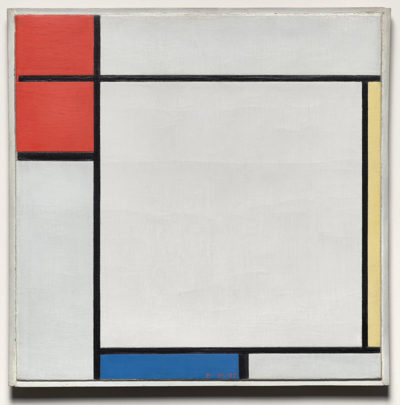
The large white area holds the middle while smaller coloured areas gather around it. Notice how little blue is needed to matter. That is more interesting than reading the image as a recipe to buy equal quantities of red, yellow and blue furnishings.
You could place a reproduction near plain timber furniture and let one existing blue object make a loose connection. Keep the complete composition: cutting off a narrow coloured band to fit a different frame would remove something important. The museum frame visible in a photograph is also not a promise about the frame supplied with a reproduction.
Try Klee for colour with smaller surprises
Klee’s Carnival in the Snow, a 1923 watercolour, offers a less severe arrangement. Cleveland identifies acrobats and jugglers emerging from its patterned shapes. Around them are arrows, circles, crosses and small patches of strong colour. It is not simply a set of fashionable pastel blocks.
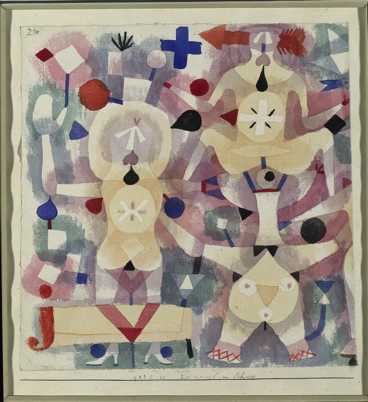
I would try this where you can approach it: beside a reading chair or on the wall you pass near a desk. From farther away, the broad colours register first; closer up, the small signs and figures become part of the experience. That makes viewing distance worth considering before simply ordering the largest size.
Its softer passages could sit beside strong furniture outlines without repeating every line. Leave a little clear wall around it if nearby shelves are busy. You do not need to remove your books; moving one tall ornament out of the sightline may be enough.
Give a low cabinet a deliberate arrangement
A low sideboard often leaves a large rectangle of wall above it. That does not mean the whole rectangle must be filled. Test the picture against the furniture, not against the ceiling height alone.
Consider a hypothetical 160 cm cabinet. A single frame 88 cm wide and two frames each 40 cm wide with an 8 cm gap have the same overall width: 40 + 8 + 40 = 88 cm. Centred above that cabinet, either arrangement leaves 36 cm to each side. These are planning measurements, not a recommended product size or a universal proportion.
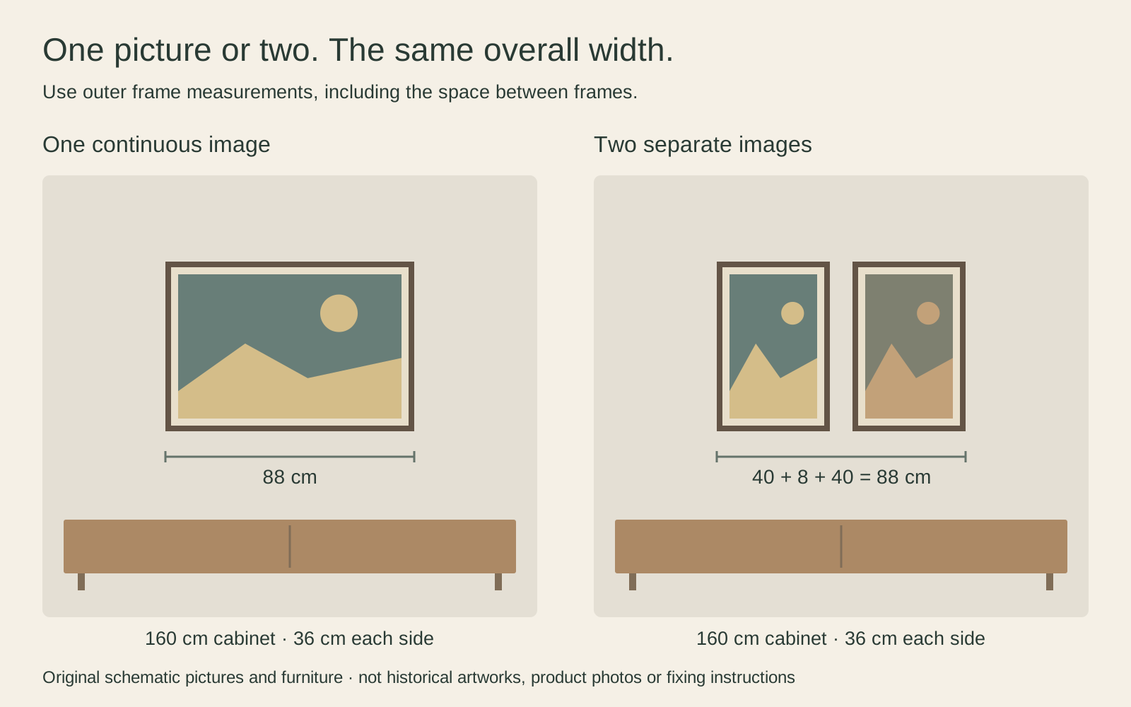
The single picture offers one continuous composition. The pair asks you to look between two separate images. If a lamp stands at one end, centring on the cabinet may no longer feel right. Make paper outlines of the outer frames and look from your usual seat before fixing anything in place.
Repeat one colour without matching everything
An accent can be small. The blue in a picture might relate to a book jacket or a ceramic bowl, while the rest of the room stays different. Exact matches are not necessary, and a screen is a poor place to decide whether two subtle colours match physically.
Try your shortlisted print beside the furniture in daylight and under the lamps you normally use. A bright phone screen can make a muted reproduction look more luminous than it will on paper. If colour is central to the purchase, ask what physical samples or print previews are available rather than treating a room mockup as a colour guarantee.
A picture with no obvious colour match can still belong through scale, subject or shape. For more ways to test that relationship, see how to match art to your wall colour.
Choose a frame that does not compete
A simple dark frame may echo furniture legs; a timber frame may relate to the sideboard. You do not have to identify a perfectly matching wood species. Compare the frame’s visible width and darkness as well as its colour, because a heavy border can dominate a delicate image.
For paper reproductions, distinguish the image, any printed border, the mat opening and the frame’s outer dimensions. A large white surround can make the object on the wall substantially bigger without making the artwork itself bigger. Check which measurement the listing actually gives.
Use mixing frame colours and styles if the room already contains several kinds. Consistency can come from similar spacing or restrained frame widths rather than buying a complete matching set.
Make the room yours rather than a period set
Finish by checking ordinary use. Does the lamp hide an important part of the picture? Can a cabinet door still open freely? Is a favourite small image being made too remote simply to fill a big wall? Those questions are more useful than asking whether every detail looks sufficiently retro.
Keep the furniture you enjoy and add art gradually. A family photograph, a contemporary drawing and an older abstraction can share a room without pretending to share a date. The strongest result is usually a setting in which the objects have room to be understood, not a display that passes a style checklist.
Editorial record
About this article
- Author
- Publisher
- GeMarkt
- Published
- Reviewed
- Internal source & rights check. Conducted by GeMarkt Research Review. This is an internal editorial check—not independent peer review.
- Source standard
- Buying guide source standardSeparates measured or first-hand evidence from general guidance and keeps practical limits visible.
Found a claim that needs checking? Report a factual error.