GeMarkt Blog · Practical guide
Maximalist and Eclectic Walls
Build a varied art wall around things you love. Use anchors, changing scale and repeated connections without hiding individual pictures in a crowded arrangement.

A maximalist wall can be full of pictures and still make each one worth looking at. The trick is to give the collection some order: a work that leads, smaller groups that belong together and enough separation to see where one picture ends and another begins.
Eclectic describes the mixture more than the quantity. You can combine different periods, subjects and frame styles with only a few works. You can also fill a large wall with closely related prints. Decide whether you want variety, abundance or both before treating every empty patch as a problem.
Start with a collection not a shopping target
Lay out the pictures you already care about. Include the modest things: a photograph, an exhibition card, a drawing from a friend. Their value to the arrangement does not depend on sharing an art-historical period or looking equally expensive.
Choose one or two that you would keep even if you changed everything else. Those are better starting points than a target such as “twelve frames above the sofa”. A numerical target encourages purchases that fill spaces rather than add something you enjoy.
Now consider the wall’s daily use. A narrow passage calls for frames that do not catch shoulders; a wall behind a desk must coexist with lamps, shelves and screens. A busy family room may need some pictures placed where they can be seen while seated, not all pushed into the highest available strip.
Take a quick photograph of the empty wall with the furniture in place. Use it to remember obstacles and compare arrangements, not to judge exact colours. Keep switches, vents, door swings and access to useful surfaces out of your intended picture area.
Choose an anchor and smaller groups
The anchor is the work you place first. It might be the largest frame, the darkest image or simply the picture you most want to see. It does not have to sit in the mathematical centre. Put it where it can be enjoyed, then test neighbouring works around it.
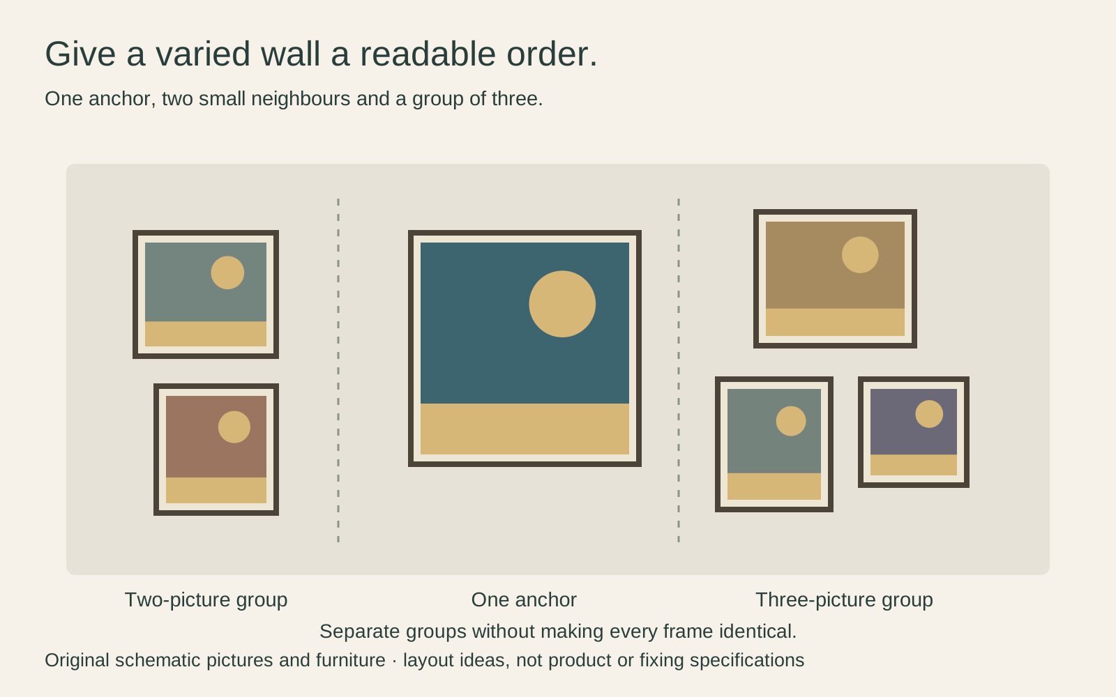
A pair of small drawings can behave as one little group beside a larger painting. Aligning one edge or repeating a mat colour can make the connection visible without making every frame identical. Leave a slightly larger break between groups if that helps you read them separately.
For a simple paper plan, two outer frames each 30 cm wide with a 6 cm gap make a group 66 cm wide. That group width, not just either frame, is what you need to fit beside the anchor. The numbers are an example, not a recommended spacing for every wall.
Borrow repetition from Morris not an entire room
William Morris’s Strawberry Thief shows how a richly filled surface can contain repeated relationships. Birds, berries, leaves and flowers recur within an organised design. There is plenty to see, but you can also recognise larger units.
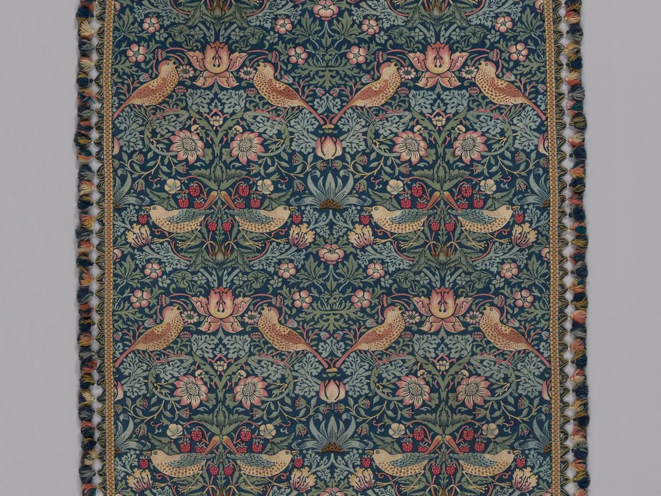
You can borrow that idea of recurrence without covering the room in the same pattern. Repeat a dark blue in two pictures, a curved outline in a frame and an image, or a pale mat across otherwise different works. One connection is often enough to begin testing a group.
If the wall itself already carries a dense pattern, try the pictures against it before committing. A broader plain mat may separate fine image detail from wallpaper; a strong dark image might need less help. This is a visual test, not a rule that patterned walls always require white mats.
The photograph above is a detail of a historical textile. It is not a specification for a current fabric, wallpaper or GeMarkt product, and its colours should not be treated as guaranteed matches for something sold under the same design name.
Let one colourful picture have its own voice
Kandinsky’s Color Study: Squares with Concentric Circles contains a wide range of colours within one image. The repeated square areas give them a structure while the rings remain noticeably irregular. You can look at a single part or follow differences across the whole sheet.
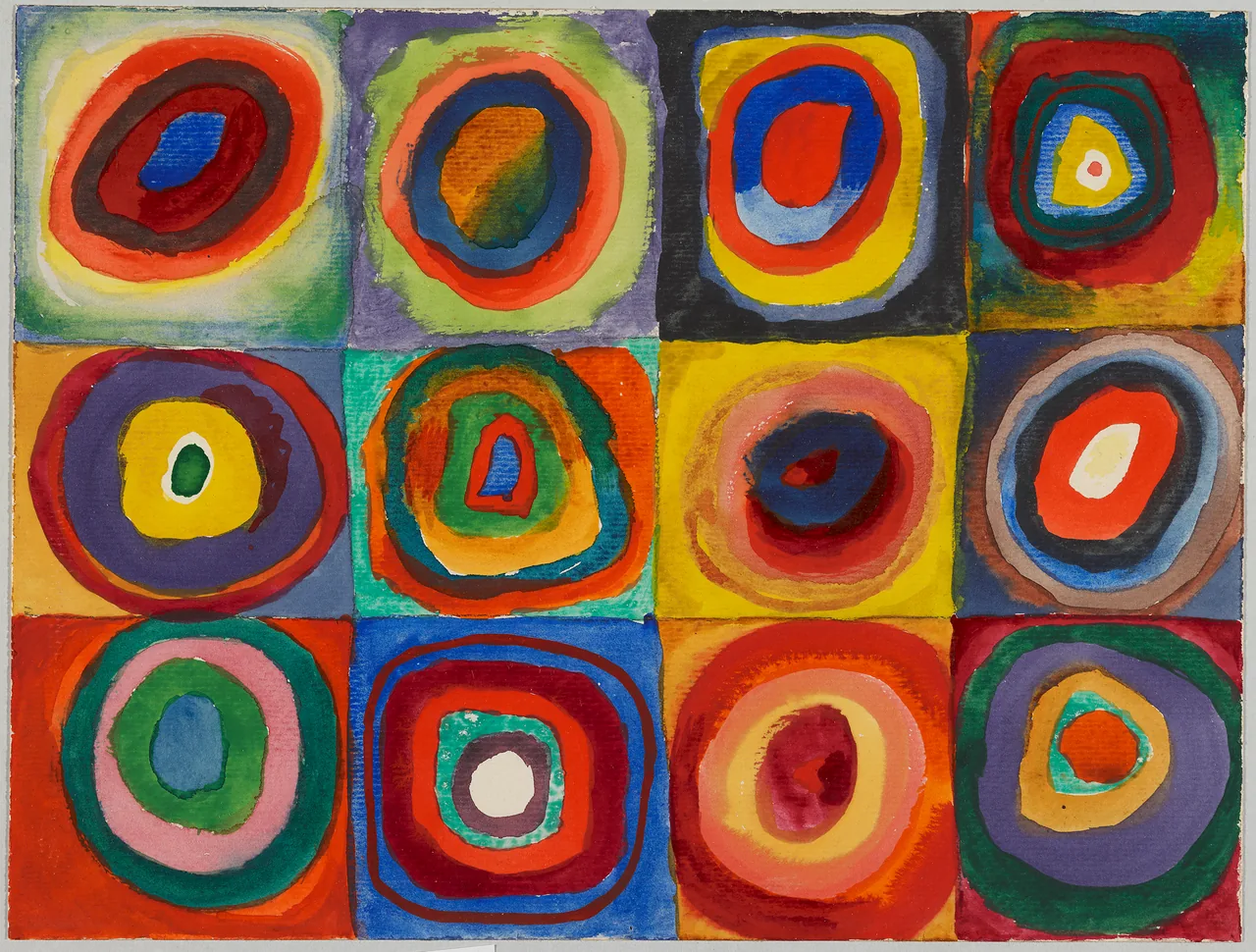
A reproduction could be the most colourful object on your wall without requiring every neighbouring picture to compete. I would first try it beside a drawing or a more limited palette, then add another strongly coloured work only if I liked the conversation between them.
That does not mean colour must be rationed. You might prefer several intense pictures together. The useful question is whether their particular shapes and colour areas remain enjoyable, not whether a decorating formula permits the combination. Never recolour a historical image merely to make the set coordinate.
Vary scale without making everything compete
Look for differences at more than one level. A large frame may hold a quiet image; a small frame may contain a very dark or bright one. Judging only external size can therefore miss which picture actually draws your eye.
Try placing the visually strongest works first, then adding quieter companions. If every image is dense with tiny detail, consider leaving a larger interval around the work you especially want to read. If everything is pale, a single dark frame may change the balance more than another large print.
Scale also means the size of marks within an image. A broad band of colour and a fine engraving can offer different experiences even when their frames are the same size. Put delicate work where you can approach it, rather than using it as a filler high above a doorway.
Make room for the frames and the room
Measure external frame dimensions, including projecting ornament. Frames that appear separated in a plan can collide if you measured only the glass. A curved or ornate edge also needs a different visual allowance from a straight narrow strip.
You need not replace varied frames as a set. Our guide to mixing frame colours and styles explores smaller connections. A repeated timber tone or mat treatment may be enough, while a distinctive inherited frame can remain distinctive.
Protect the objects as well as the arrangement. A dense wall is not a reason to push paper prints into a sunny strip or lean unsecured frames above a seat. Light exposure accumulates, as the Library of Congress explains. Follow appropriate frame, wall and fixing instructions, and give valuable originals professional conservation advice rather than a decorating shortcut.
Edit the wall without making it less yours
Photograph a trial arrangement and remove one picture at a time. Does the gap make its neighbours more enjoyable, or does the group lose something important? This is a useful way to identify an awkward filler without deciding that abundance itself was a mistake.
Do the same test with the furniture and objects beneath. A crowded console may be competing with the lowest row of pictures. Moving a tall vase can sometimes clarify the wall more effectively than rearranging six frames.
Keep pieces that do not currently fit in suitable storage and rotate them later. You are not obliged to display every meaningful object at once. The paper gallery-wall planning guide helps you test the next arrangement before making more holes.
A successful eclectic wall can show differences rather than hide them. The aim is for a visitor—and you—to find several reasons to look closer, not simply to register that the wall is full.
Editorial record
About this article
- Author
- Publisher
- GeMarkt
- Published
- Reviewed
- Internal source & rights check. Conducted by GeMarkt Research Review. This is an internal editorial check—not independent peer review.
- Source standard
- Buying guide source standardSeparates measured or first-hand evidence from general guidance and keeps practical limits visible.
Found a claim that needs checking? Report a factual error.