GeMarkt Blog · Practical guide
Matte, Satin or Fine-Art Paper? Choosing a Print Surface
Separate sheen, texture and paper composition before choosing an art print. Compare real paper examples, samples and the effect of your intended frame.

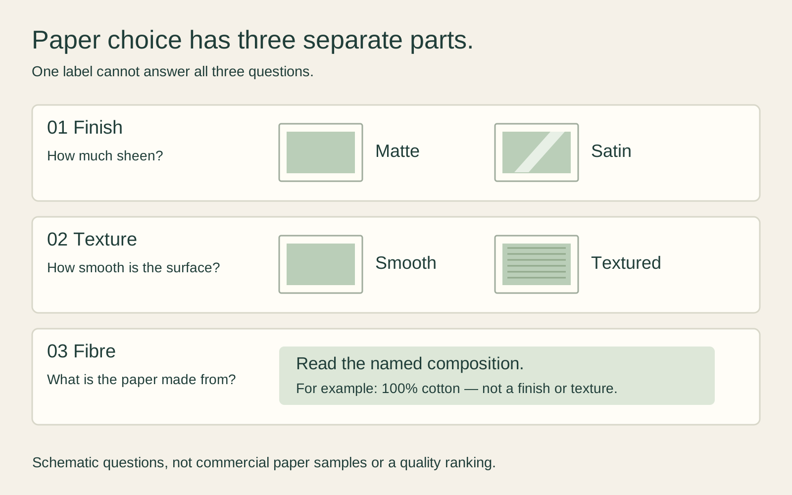
Matte and satin describe a surface finish; “fine-art paper” does not tell you that finish on its own. Before choosing, ask three separate questions: how much sheen does the surface have, how textured is it, and what is the paper made from? Then compare a printed sample in the room where you will see it.
There is no need to choose the most expensive sheet to prove that you care about art. Choose a print you enjoy looking at, with a clear material description and a suitable way to display it.
Start with three separate questions
An online menu might offer “matte,” “satin” and “fine art” as though they were three mutually exclusive materials. That is not a reliable way to understand the choice. A fine-art inkjet paper can itself have a matte or satin coating, and either a smooth or noticeably textured surface.
For a concrete example, Canson Rag Photographique is a smooth, matte, 100% cotton paper, offered in 210 and 310 gsm weights. Hahnemühle Photo Rag Satin is also 100% cotton, but has a delicately textured surface and a satin-gloss inkjet coating. Cotton does not automatically mean rough, and fine-art paper does not automatically mean matte.
Those are named manufacturer examples, not a description of every print sold here. For an actual purchase, use the specification attached to the selected product and size. If a listing only says “premium paper,” ask for the missing information rather than guessing from the price.
What matte and satin tell you
Matte is the place to begin if you dislike a visible sheen on the paper itself. Satin is worth comparing if you enjoy some surface sheen but do not want to choose a strongly glossy paper without seeing it. Treat these as starting preferences, not grades on a quality ladder.
The precise result belongs to the paper and its coating. Hahnemühle’s description of Photo Rag Satin is especially useful: its printed areas have a soft sheen, while unprinted areas remain matte. A blank swatch alone would not show that whole effect. Another paper carrying “satin” in its name need not behave identically.
Do not infer reflection performance from a photograph of a product. The photograph has its own lighting and viewpoint, and your display may include glazing. A pleasing online image cannot tell you whether you will see a bright lamp reflected from the completed frame beside your sofa.
Decide how much texture you want
Try to describe your preference without the word “better.” Would you like the sheet to be visually quiet, letting small lines and lettering hold your attention? Or do you enjoy noticing a paper surface as part of the object? Neither answer commits you to a particular artist or period.
For a reproduction with fine engraved lines, inspect a small area where several lines nearly meet. For a painting with broad pale areas, look at both the image and the unprinted border. Ask yourself whether the surface interests you or competes with what you want to see. These are looking exercises, not claims that a particular texture always preserves or destroys detail.
A textured sheet also does not recreate the original artist’s brushwork. The depicted marks belong to the photographed artwork; the texture you can see or feel belongs to the new print support. Enjoy that combination if you like it, but do not confuse it with a physically accurate copy of the original paint surface.
Read the paper name not just the weight
Gsm means grams per square metre: it is mass per area, not a direct measurement of thickness, texture or lifespan. Canson lists both weight and thickness for Rag Photographique: 210 gsm at 323 micrometres and 310 gsm at 466 micrometres. Those paired figures describe those papers, not a formula for converting every paper’s weight into thickness.
An illustrative 30 × 40 cm sheet has an area of 0.12 square metres. At 300 gsm, the nominal paper mass is 36 grams. That arithmetic says nothing about the weight of its frame, backing or glazing, and it does not tell you how smooth the image will look.
Look for a named paper or sufficiently specific description, finish, fibre composition and weight. Thickness may matter when fitting a frame or checking a printer’s media limits. “Heavier” by itself is not a reason to reject a lighter paper that suits the print and the framing method.
Compare a print not an empty sheet
If samples are available, compare the same image, at the same scale, on the candidate papers. Otherwise you may be choosing between two different edits or two different pictures while believing you are comparing surfaces.
Include a dark area, a pale area and a detail that matters to you. Examine the samples close up, then at your normal viewing distance. Move your viewpoint a little rather than keeping both flat on a desk throughout the comparison. Check them in daylight and under the light you normally use in the evening.
Write down a useful observation: “I prefer the quieter surface from the armchair” or “the fine text is easier for me to read on this sample.” That is more helpful than deciding one paper looks vaguely more professional. Do not rub, wet or scratch a sample to invent your own durability test.
Include the frame in your decision
If the finished print will sit behind glass or acrylic, include a representative glazing sample when discussing the order with a framer. You are choosing the appearance of an assembled object, not paper in isolation. The framing specification should also keep the print appropriately separated from its glazing; see our mat-board guide for the distinction between a printed border and a separate mount.
Keep frame dimensions separate from sheet dimensions. A border printed on a 30 × 40 cm sheet does not make that sheet larger. Adding a mat around it does change the framing arrangement. Resolve those measurements before choosing a paper merely because it comes in a convenient size.
Choose for the image you actually want
For a first purchase, a clear specification and a useful sample are more valuable than a vocabulary of impressive adjectives. If you like a smooth matte result, you need not upgrade to a textured sheet. If you prefer a satin print, you need not apologise for enjoying its surface.
Finally, surface choice cannot repair a poor source image or an unwanted crop. Our guide to why reproductions of the same painting look different covers that separate problem. Choose the image, check the complete size and crop, then choose the paper that makes you want to keep looking at it.
Editorial record
About this article
- Author
- Publisher
- GeMarkt
- Published
- Reviewed
- Internal source & rights check. Conducted by GeMarkt Research Review. This is an internal editorial check—not independent peer review.
- Source standard
- Buying guide source standardSeparates measured or first-hand evidence from general guidance and keeps practical limits visible.
Found a claim that needs checking? Report a factual error.