GeMarkt Blog · Practical guide
Japandi Wall Art: Why Hokusai and Hiroshige Fit
Choose Japanese prints for a restrained contemporary room by looking at shape, space and proportion, with Hokusai and Hiroshige examples and a clear layout plan.

Hokusai and Hiroshige can work beautifully in a Japandi room, but choose the particular print, not just the artist’s name. A strong curve, a broad stretch of sky or a narrow vertical composition can sit comfortably beside simple furniture. That does not make every Japanese print quiet, beige or interchangeable.
For wall-art shopping, use Japandi as a loose description of a contemporary room combining Japanese and Scandinavian references. It is not an instruction to strip a Japanese image of its colour or story. Start with a print you want to look at, then give it an appropriate place among the things you already use.
Start with the room not a style checklist
There is a substantial history behind the connection, beyond today’s decorating label. Designmuseum Danmark’s Learning from Japan exhibition traced Japanese influence on Danish crafts and design, including the decades around 1900 and later furniture and objects. That relationship is broader than pale wood and empty walls.
In your room, identify what actually needs organising. Perhaps a low cabinet has an empty wall above it, while a nearby shelf is already full. Perhaps a patterned rug supplies plenty of detail and you want one clear picture rather than another patterned surface. Those are useful starting points. “Make it more Japanese” is too vague to help you choose.
A room can include dark timber, books, colour and everyday mess without failing a style test. Decide which wall should draw attention and which objects should remain easy to use. You do not need a matching vase, lamp and cushion for every colour in the print.
Use Hokusai when you want a strong shape
In The Great Wave, the curling water dominates the left of the image while the small peak of Fuji sits beyond the boats. The wide shape and contrast between pale foam and dark blue make the composition easy to recognise from a distance. Closer up, the people and fine lines offer more to see.
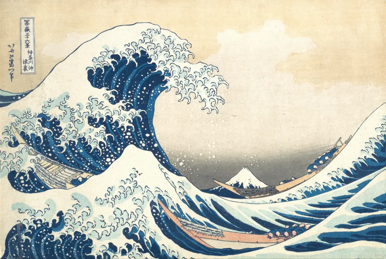
I would try this above a low cabinet or on a wall seen across a room. The broad composition gives you a clear first impression without requiring a cluster of little pictures around it. Its pale sky can also provide some relief beside busy shelving.
It is a dramatic image, however, not a guarantee of a peaceful atmosphere. If the wave feels too forceful beside your reading chair, believe that reaction. Another composition may suit you better than buying the most famous print simply because a mood board recommends it.
Use Hiroshige when the wall calls for height
Hiroshige’s Sudden Shower over Shin-Ōhashi Bridge and Atake has a different structure. The bridge cuts across the lower part of a tall sheet; rain lines cross the river, and a dark band of sky closes the top above the distant shore. The travellers make the weather personal rather than merely decorative.
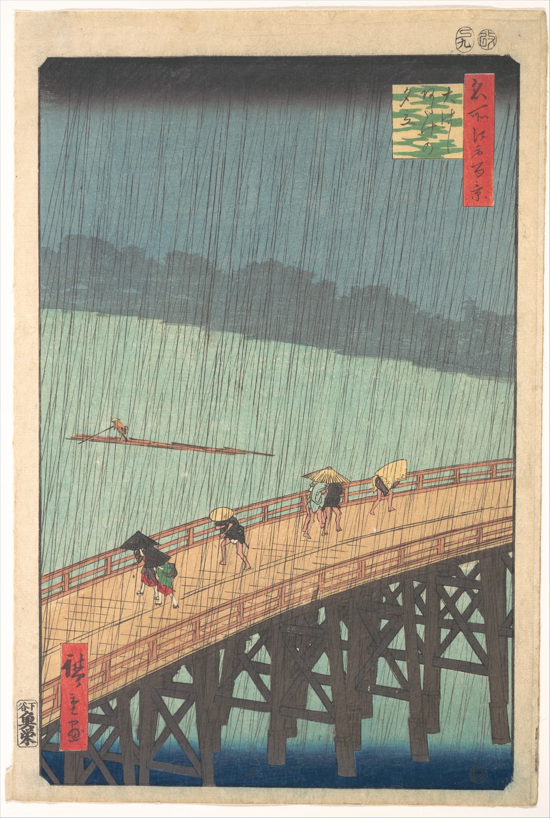
Try a vertical print like this beside a chair or above a narrow chest, where its full shape can remain intact. Do not turn it into a horizontal image by cutting away the sky and river. Those areas are part of how the scene works, even though they contain fewer objects than the bridge.
The print can connect with grey, green or timber surfaces without matching them exactly. Its fine rain lines are worth seeing at close range, so a distant high wall may waste something you particularly enjoy about it.
Let the composition choose its place
Think of orientation as a useful constraint. A wide image and a tall image can both belong in the same room; they need not be forced into identical outer rectangles to look related. Try their actual proportions before choosing frames.
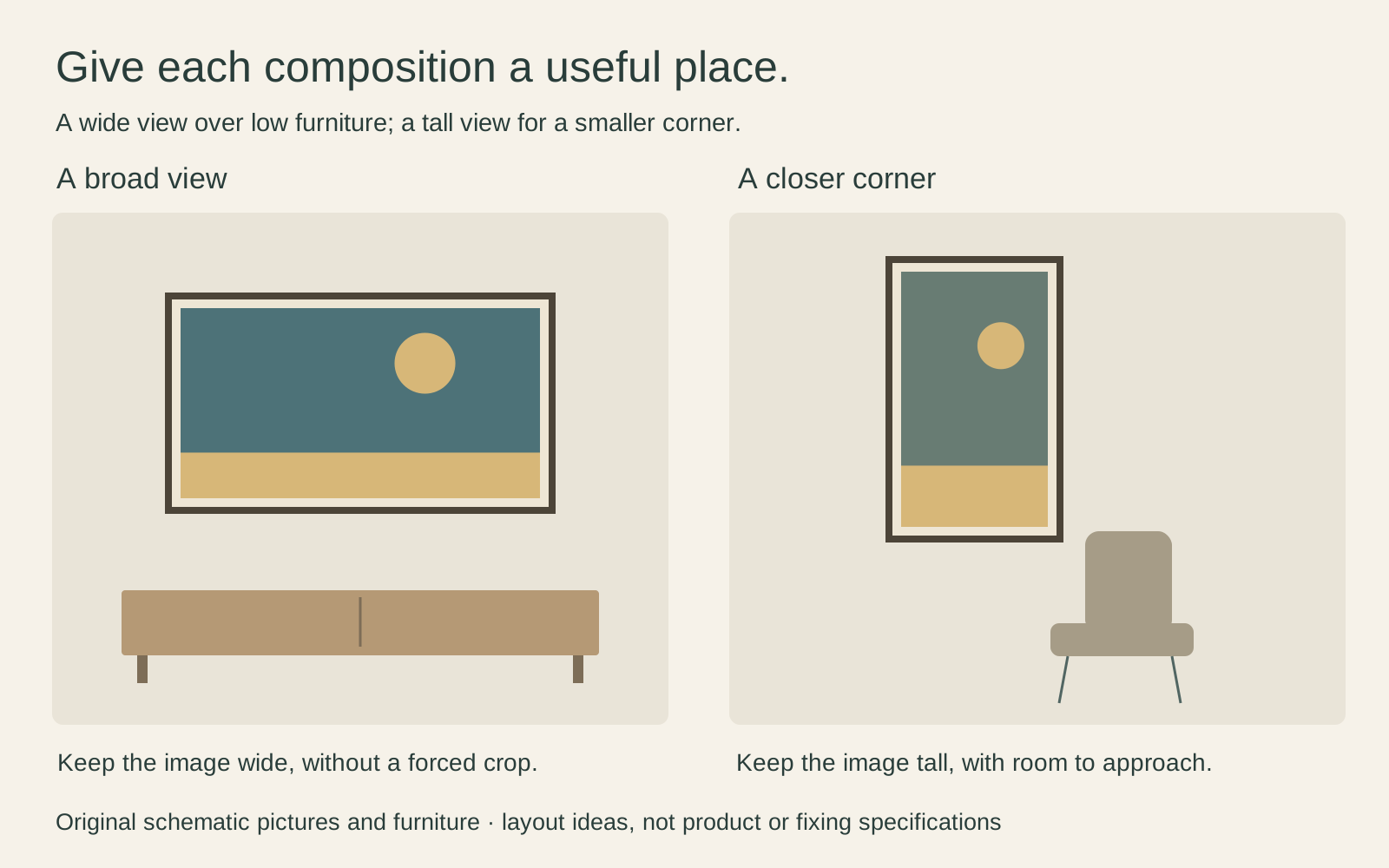
Space around the frame can separate the picture from a lamp or neighbouring shelf. It does not have to be equal on all sides. A low cabinet with a lamp at one end may leave a more useful picture position slightly away from the lamp, rather than exactly centred on the entire wall.
If you want both artists, try one in the main seating area and one in a smaller corner. Giving each a distinct place can be more satisfying than squeezing them together as a compulsory pair. The Hokusai and Hiroshige comparison helps you look beyond their shared reputation.
Choose a frame without repainting the print
A simple timber or dark frame is a sensible first sample, not a requirement. Compare its colour beside the actual reproduction. A heavily orange timber finish may call more attention to itself than you expect; a black frame may repeat the print’s dark lines very clearly.
Keep the image’s existing colour. Turning everything brown or adding a false aged-paper effect to suit the furniture changes the work you selected. Equally, do not expect different surviving impressions or digital reproductions to have identical colours. Check the particular image offered, including its margins and inscriptions.
If a mat is included, ask what part of the print remains visible through the opening. A generous pale surround should not conceal a title panel or signature. Our guide to paintings and standard frame proportions explains why frame size alone cannot answer that question.
Connect the picture to what you already own
Choose one modest connection. The blue in Hokusai might speak to an existing bowl, or Hiroshige’s bridge might sit comfortably with the room’s timber furniture. You can stop there. Repeating every motif would make the room feel like a themed display rather than somewhere you live.
Also look for useful differences. A crisp print can sit against a rough woven surface; a curved shape can interrupt a room of straight-edged cabinets. These are styling choices, not historical claims that the artists designed their images for contemporary interiors.
Keep meaningful details visible. The boat crews, travellers and written panels are part of these works. Treating them only as anonymous “Zen patterns” would lose much of what makes them interesting. A restrained room can still contain an image with a complicated story.
Make a small test before you buy
Mark out the proposed frame’s external dimensions with a paper template. Look from the doorway, then from the chair or sofa. Check that the print can be enjoyed without leaning around a lamp or craning over furniture. Follow the frame and fixing manufacturer’s requirements when installing it.
Compare a sample in daylight and under your normal evening lamps. Avoid placing a vulnerable print in direct sunlight merely because the wall photographs well; the Library of Congress explains that light damage accumulates. A treasured original needs more careful display advice than a replaceable modern reproduction.
The final test is simple: would you still choose this picture without the Japandi label? If so, the style has helped you find a useful arrangement rather than made the decision for you.
Editorial record
About this article
- Author
- Publisher
- GeMarkt
- Published
- Reviewed
- Internal source & rights check. Conducted by GeMarkt Research Review. This is an internal editorial check—not independent peer review.
- Source standard
- Buying guide source standardSeparates measured or first-hand evidence from general guidance and keeps practical limits visible.
Found a claim that needs checking? Report a factual error.