GeMarkt Blog · Practical guide
Green Paintings for Calm Rooms
Choose green art by its composition, subject and relationship to your furniture. Compare Monet’s Japanese Footbridge with Rousseau’s stormy jungle.

For a calmer-looking room, choose a green picture whose composition you enjoy at your normal viewing distance. Colour alone is not enough. A pond, a tangled jungle and a neatly arranged botanical sheet can all be green, yet ask very different things of your attention.
Here, “calm” describes a decorating intention: fewer competing features, a comfortable place to look, and a picture that belongs with the rest of the room. It is not a promise that green art reduces stress or improves sleep. Start with what you find restful rather than allowing a colour label to make the decision for you.
Decide what calm means in your room
Perhaps the room already has a patterned rug, open shelves and a busy view through the window. In that case, the aim may be to give one wall a simpler arrangement. In a nearly empty room, however, an intricate landscape could be exactly the detail you want. Calm does not have to mean blank.
Look for broad shapes before inspecting every leaf. Is there a clear arch, horizon or open patch? Do many diagonal lines compete across the surface? Are the darkest marks scattered everywhere or gathered into a few areas? These observations help explain why one green image feels more manageable to you than another.
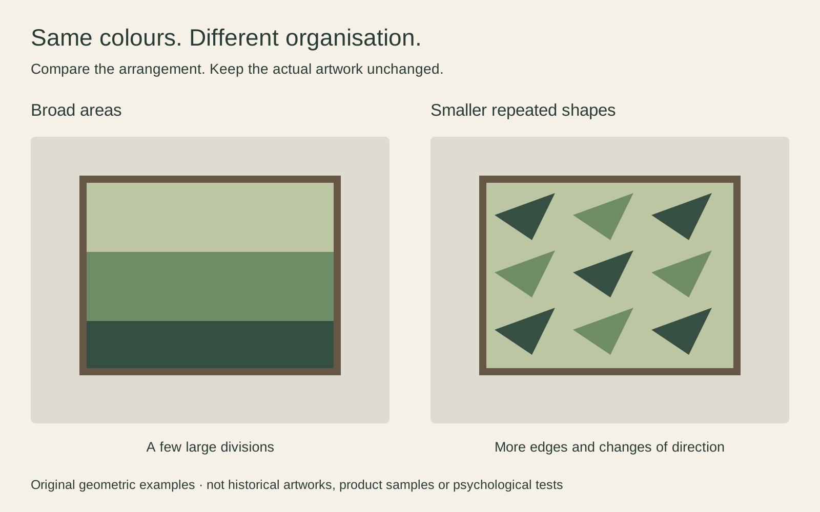
The diagram is intentionally simple. Real paintings combine broad organisation and fine detail. Use it as a prompt to describe what you see, not a rule that diagonal lines or detailed pictures are unsuitable for a home.
Monet gives dense greenery a clear structure
Claude Monet’s 1899 The Japanese Footbridge offers green in many forms: foliage, reflections, the bridge itself and small touches among the flowers. The National Gallery of Art identifies this canvas as one of the works he made of his garden at Giverny, accession 1992.9.1. It is a particular bridge painting, not a generic image representing every Water Lilies canvas.
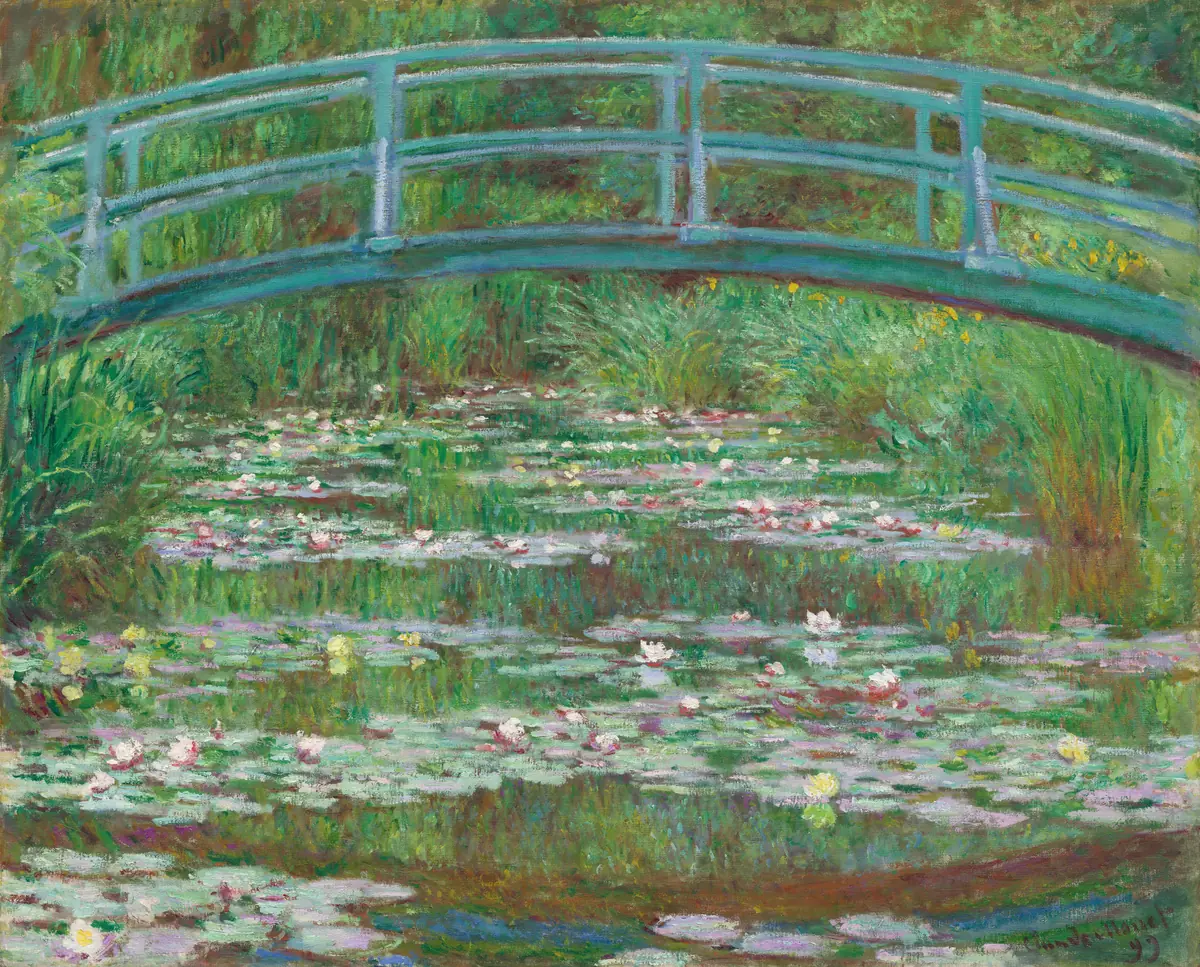
The arch gives the upper part a continuous line. Below it, lighter lily patches interrupt the pond. There is plenty to see, but the bridge gives you something easy to recognise before you explore the painted surface.
I would try this above plain furniture rather than immediately pairing it with another equally dense plant pattern. The small pink and pale yellow notes also give you options beyond matching the room to green. A light cushion or a small ceramic object could make a subtler connection than adding another large leafy surface.
Rousseau shows why green does not mean quiet
Henri Rousseau’s Surprised! is full of leaves, but it is not simply a peaceful plant picture. The National Gallery dates it to 1891 and describes a tiger in a stormy jungle. The diagonal streaks and leaning vegetation belong to that drama. The museum’s accession number is NG6421.
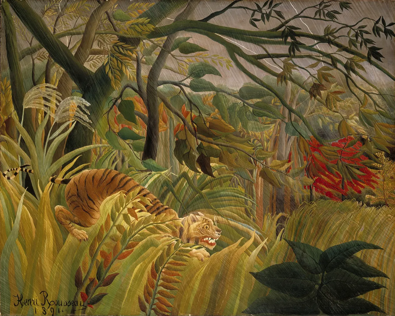

The tiger’s striped body makes another pattern inside the foliage. Look at its eye and teeth before treating the painting as a set of olive swatches. You might love its suspense and want it as the room’s most animated feature. That is a good reason to choose it, but a different reason from wanting an unobtrusive background.
A plain surrounding wall would let the shapes remain distinct. I would avoid surrounding it with several competing jungle pictures simply to extend the theme. One complex image can do more for a room than a wall full of near-matches.
Compare the patterns already in the room
Take a photograph from the seat you use most, then look at it without zooming. It can help you notice a patterned blind, a row of plant pots or a bookcase you have stopped consciously seeing. This is a composition check, not a dependable colour measurement from a phone camera.
If the room already has small repeated patterns, try one image with a strong broad structure. If the furniture and textiles are mostly plain, a leaf-filled painting may supply welcome variety. You do not have to remove every other pattern; giving the picture a clear area around its frame may be enough.
Think about real plants too. A large leaf crossing the frame can obscure a detail you chose the painting for. Move the pot slightly before concluding that you need a different artwork. Conversely, an irregular plant beside a formal arrangement may be a contrast you like. The aim is deliberate placement, not a ban on mixing nature with pictures of nature.
Choose one connection with the furniture
A green picture does not require green walls or upholstery. Start with the surfaces you are keeping. Near pale wood and cream fabric, the darker greens in either example could provide a distinct focal point. Near a dark green sofa, a pale mat or the lighter areas within the picture might matter more.
Avoid judging a reproduction by a single sampled green square. Monet’s blue-green bridge and Rousseau’s yellow-green leaves are not interchangeable, and each painting includes several colours. Look at the whole image beside the room’s materials.
If you want one small echo, use something already there: a grey-green throw, a brown wooden table, a pale lampshade. It is fine if the relationship is approximate. A room can look considered without every object being bought to match the art. For a wider approach, see warm and cool colours in a room, which treats these labels as comparisons rather than fixed personalities.
Preserve the picture and size the surround
The empty-looking or dark areas of a landscape are not automatically disposable margins. In Monet’s painting, cutting closely around the bridge would reduce the pond that balances it. In Rousseau’s, removing dense foliage can change the sense of the tiger being enclosed. Choose a complete reproduction unless a clearly labelled detail is specifically what you want.
If the preferred frame has a different proportion, a mat can accommodate a smaller image opening rather than forcing a crop. For example, a visible opening of 30 × 24 cm with an even 5 cm border occupies 40 × 34 cm before the frame moulding is added. These are illustrative dimensions, not an available product size or a prescription for mounting an original.
When laying out several pictures, count the outer frames and gaps rather than adding their image widths alone. The gallery-wall planning guide explains how to test that arrangement before choosing hardware or making holes.
Test the view you will actually use
An artwork does not spend its life as an enlarged browser image. Look at a proposed placement from the sofa, the doorway and any nearby chair. Does the main subject remain readable? Is the picture competing with a television? Do reflections cover the area you want to see when the usual lamps are on?
A paper outline of the frame helps with scale. A small reference image nearby can remind you of the composition, but neither substitutes for a print sample when colour accuracy matters. If you need a less reflective presentation, ask about the actual glazing and surface offered rather than assuming every matte-labelled product behaves identically.
Finally, choose the green painting you want to spend time with. If you enjoy the tiger’s drama, it need not become a poor choice because a decorating guide says the room should be calm. Describe the effect you want, inspect the whole picture, and let the room support that decision.
Editorial record
About this article
- Author
- Publisher
- GeMarkt
- Published
- Reviewed
- Internal source & rights check. Conducted by GeMarkt Research Review. This is an internal editorial check—not independent peer review.
- Source standard
- Buying guide source standardSeparates measured or first-hand evidence from general guidance and keeps practical limits visible.
Found a claim that needs checking? Report a factual error.