GeMarkt Blog · Practical guide
Gallery Wall Layouts: 6 Arrangements That Work
Compare six gallery wall arrangements, from an even grid to a rising stair layout, and choose a structure that suits your pictures and usable wall.

For matching frames, begin with a grid or a row. For pictures of different sizes, try a shared centre line or a group built around one larger piece. A narrow wall may need a vertical stack; a staircase may suit a rising arrangement. These six layouts are starting points, not rules about what a particular room must look like.
The useful question is not which layout is most fashionable. It is which one lets you show the pictures you want without squeezing them into the wrong frames or filling a wall that already feels busy.
Start with the frames you have
Lay out the pictures you genuinely want to display. Include their finished frames and mats in your measurements: a small print in a broad mat may occupy more wall than a larger image in a slim frame. If you are still choosing between one picture and a group, start with one large print or several small ones.
Treat each diagram below as a relationship between shapes. It does not prescribe the number of centimetres between them. A successful small arrangement cannot simply be enlarged until it fills the room; doors, furniture and the distance from which you see it still matter.
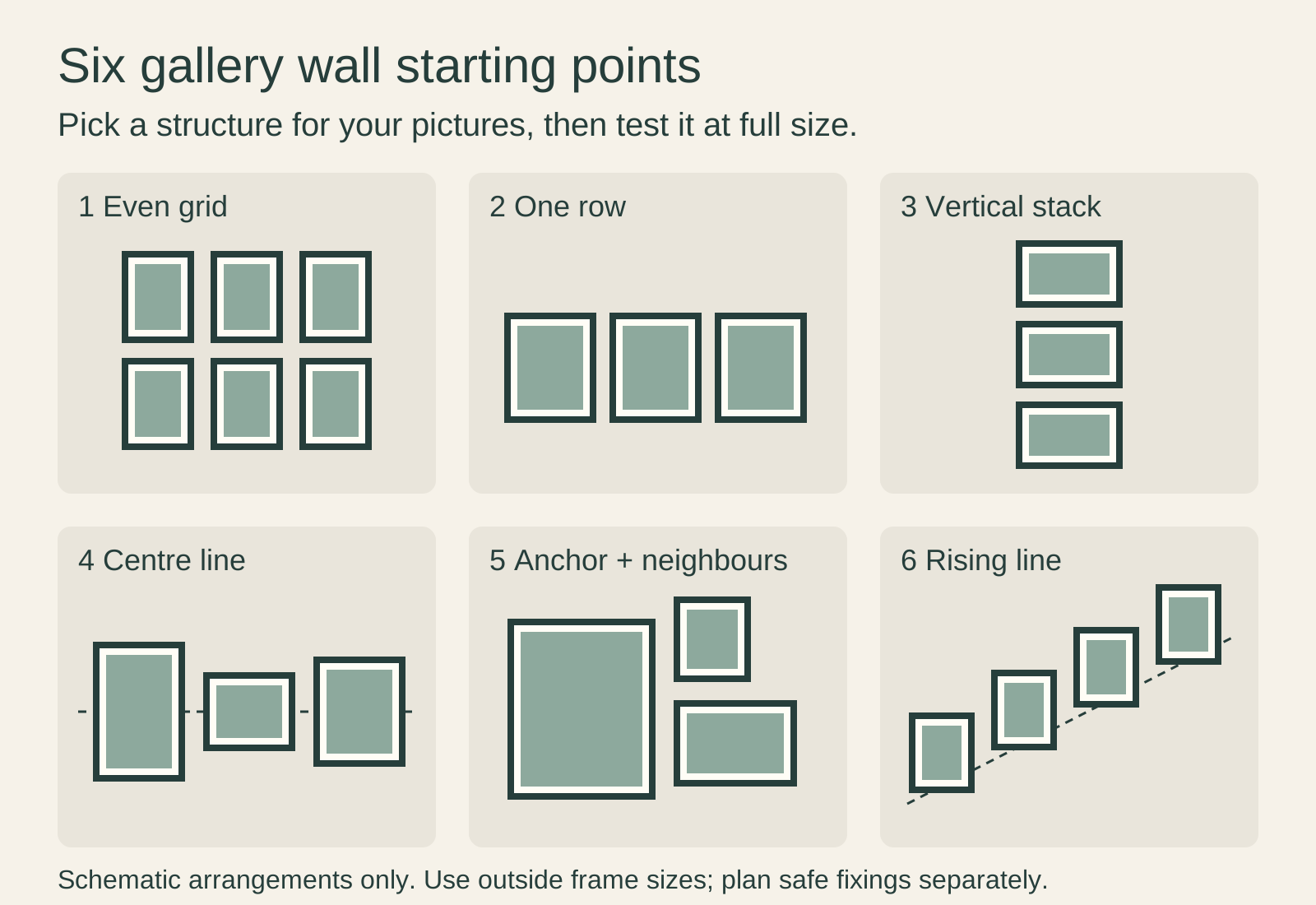
An even grid for a related series
A grid repeats both the frame size and the gaps. It is a useful first choice for a series of botanical illustrations, photographs or similarly sized prints because the arrangement gives each picture an equivalent place.
Matching outside dimensions do not require identical image dimensions. Different mat openings can accommodate different pictures inside the same frame size. Do not crop a composition merely to make a grid possible.
The main commitment is precision: a tilted frame or an inconsistent gap interrupts a repeated pattern. A grid also needs a growth plan. Adding one picture to a six-frame rectangle changes its outline; adding a complete row preserves it. Framebridge describes that row-or-column approach for expanding its own grid arrangements. Leave the required space now if expansion matters to you.
One row for a horizontal space
A single row is worth trying above a sideboard or along a wall with limited usable height. It also lets you read pictures as a sequence, from left to right, without switching between rows.
With equal frames, align the tops and bottoms. With different heights, decide whether you want a shared top, bottom or centre line; an accidental mixture of all three is harder to organise. The centre-line option has its own diagram below.
Watch the group’s total width rather than each frame in isolation. Three modest pictures plus two generous gaps can become a surprisingly long arrangement. If the row runs into a lamp or door, reduce the number of pictures before resorting to tiny gaps.
A vertical stack for a narrow wall
A stack uses height where there is little width: a slender wall between openings, for example, or a short return beside furniture. Two or three horizontal pictures can form a vertical group without changing the orientation of the art.
Try a common vertical centre line first. Equal outside widths make the edges easy to align; unequal widths can still share the same centre. Keep enough separation for each frame to read as a distinct object.
The limit is viewing, not just fitting. A top picture may technically fit below the ceiling but be difficult to enjoy. Check the bottom picture too: furniture should not hide it from the position where you usually stand or sit.
A shared centre line for mixed heights
Imagine a horizontal line passing through the middle of every frame. Tall and short pictures can hang along that line while their upper and lower edges vary. This arrangement is useful when you want a row but do not want to force portraits and landscapes into identical frames.
The line refers to the centre of the finished frame, not the horizon painted inside the picture. You do not need to align every depicted landscape or face.
Place the tallest frame where it has room above and below the line. Then judge the gaps between the frame edges. Equal centre-to-centre distances are not equal gaps when widths differ, so measure the empty spaces you actually see.
An anchor with smaller neighbours
Start with the picture you most want to notice, then arrange smaller works around it. In the diagram, one large portrait provides the anchor and two smaller frames sit beside it. The anchor need not be the most expensive picture or the centre of the whole wall.
Avoid treating every remaining opening as a space that needs filling. A small neighbour should have a reason to join the group: subject, colour, personal association or a useful difference in shape.
When the frames vary, repeat something deliberately. American Frame suggests a shared finish or mat treatment as ways to connect a mixed gallery wall. That is an option, not a requirement to replace frames you already like.
A rising line beside stairs
A rising arrangement follows the direction of a staircase. The example steps four frames upwards rather than making a horizontal group that happens to sit beside stairs.
Check the view from both landings and while approaching the stairs. The useful hanging area must avoid the handrail, switches and places where frames could obstruct movement. Do not copy the slope of a photograph without checking your own staircase.
This layout is not an installation guide. Reaching a tall stairwell wall can require specialist access equipment, and neither a stretched arm nor a ladder balanced across steps is a substitute for safe access. If you cannot reach the proposed position safely, choose a different location or use an installer.
Choose the pattern before the fixings
Try two plausible layouts with the same pictures. Photograph each straight on, then compare them from your normal viewing position. Use a measured paper plan when one is worth testing at full size.
Only then decide how to hang it. The Canadian Conservation Institute’s display guidance makes the important distinction: the attachment must suit the wall, the frame and the total weight. A pleasing arrangement cannot establish the capacity of a hook. Keep those as two separate decisions.
Editorial record
About this article
- Author
- Publisher
- GeMarkt
- Published
- Reviewed
- Internal source & rights check. Conducted by GeMarkt Research Review. This is an internal editorial check—not independent peer review.
- Source standard
- Buying guide source standardSeparates measured or first-hand evidence from general guidance and keeps practical limits visible.
Found a claim that needs checking? Report a factual error.