GeMarkt Blog · Practical guide
Dining Room Art: Still Lifes and Conversation Pieces
Choose dining room art that works from the table as well as the doorway. Compare subjects, framed width, lighting and the way you use the room.

Dining room art should be worth looking at while you sit down, not only while you walk into the room. Start with a wall visible from the table, then compare the picture with the chairs, sideboard and lighting already there. A still life is a natural option, but food is not a requirement: a landscape, figure scene or graphic print may suit your meals and your room better.
Choose something you enjoy noticing repeatedly. A conversation piece need not shock visitors or require a prepared lecture. It can simply contain an intriguing detail that someone sees after a few minutes at the table.
Look from the seats before choosing a wall
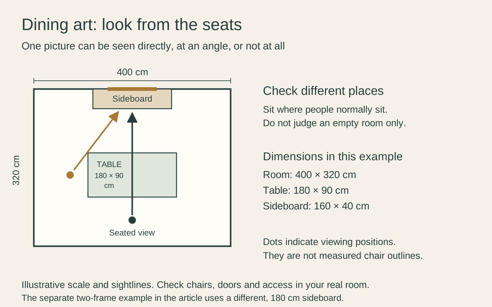
Sit in each place at the table. One person may face a long wall directly, while another sees it at a sharp angle and a third has their back to it. Those differences matter more than finding the mathematical centre of the room.
Choose a primary view, but do not expect one picture to face everyone equally. If a side wall gives most seats an oblique view, a clear silhouette or broad composition may be easier to enjoy than a densely lettered print. Test that with a preview rather than relying on the subject label.
In the plan, a 400 × 320 cm room contains a 180 × 90 cm table and a 160 × 40 cm sideboard. Two seated viewing directions point towards the proposed art wall. The dimensions give the example scale; they are not recommendations for chair access or a complete furnished room.
Choose more than a food theme
A still life brings familiar things into focus: a bowl, flowers, a folded cloth or a group of objects. It can connect with the room without matching your tableware. A picture of a spare arrangement may be particularly appealing if the real table becomes busy during meals.
But a still life is not automatically cheerful or domestic. Some works carry reminders of mortality, wealth or passing time. Read the description and look at the actual objects before treating the image as simple decoration. Our still life and vanitas comparison explains that distinction.
Other subjects can work just as well. A place connected with family travels gives guests something to ask about. A landscape may provide an open view in a room facing another building. A figure scene can invite closer looking, provided you are comfortable with its subject in a shared eating space.
Find a detail worth talking about
Look for an image that rewards a second glance. It might contain an unexpected object, an unusual viewpoint or a relationship between figures. The detail should actually be visible at the size you intend to print; a feature you can find only by zooming in on a phone may disappear across the table.
You do not need a plaque beside the frame. Keep the artist, title and a short reliable explanation in your order record or on the back. If somebody asks, you can share what interested you without inventing a story.
For a room used by several people, invite each person to suggest a picture and compare the actual images together. A choice with a personal connection can be more satisfying than a generic dining-room theme. If opinions differ, try a small pair rather than immediately filling a whole wall.
Size the group to the actual wall
Measure the usable wall and the furniture beneath it. A sideboard provides a different reference from the table: the table may be centred in the room while the sideboard sits between a door and a window. Centre the proposed group where it belongs visually, not automatically on whichever object is largest.
Suppose a sideboard is 180 cm wide. Two outside frames, each 45 cm wide, with a 10 cm gap make a 100 cm group. Centred over that sideboard, they leave 40 cm on each side. That is one arrangement to test, not an ideal proportion. A larger image or a narrower pair may suit your wall better.
Include mouldings and mats in those measurements. The picture’s advertised print size is not the finished frame width. Compare a single image with the pair using paper templates before ordering either.
Test the room with the table in use
Set out the objects normally on the table. A vase or pendant may interrupt the view of a small central picture. Instead of moving art higher without checking, try shifting it to a different wall or choosing a composition whose important area remains visible.
Pull the chairs out and open the sideboard doors. If the room doubles as a workspace, include the laptop, task lamp and papers you regularly use. You are arranging a lived-in room, not preserving an empty surface for a photograph.
Think about everyday contact as well. A frame beside the route from the kitchen may be brushed by bags or serving trays. A picture just above a sideboard can be knocked by a tall object placed there. Move the template while those actions are easy to test.
Separate lighting from protecting the print
View the proposed position with your normal dinner lighting. Reflections in glazing can hide an image from one seat while leaving it clear from another. Check all the seats before choosing a lighting change or a different glazing option.
Avoid direct sun and nearby heat for paper art, following the Canadian Conservation Institute’s paper-care guidance. Keep candles, splashes and cleaning products away from the frame. A location that photographs brightly is not necessarily a sensible place to keep a print.
If you want a dedicated picture light, discuss the object, fixture and installation with suitable professionals. Do not assume that any small lamp is harmless simply because it is sold for decoration.
Choose framing for the object
Compare the frame with the table and chairs, but do not require every wood tone or metal finish to match. A repeated dark line or similar mat colour may be enough. Test corner samples with the image rather than choosing from the furniture alone.
The inside of the frame matters separately. CCI’s framing guidance calls for enough depth for the contents and appropriate separation from glazing. Ask a framer about suitable materials for a valuable or fragile work instead of treating an attractive surround as the whole solution.
Make the final choice at home
Compare the shortlist from the doorway and from the table in both daytime and evening use. Change one thing at a time so you can tell whether the subject, position or size caused the problem.
Keep the choice that you still enjoy after the table is set and the room is occupied. A dining room picture does not need to explain your entire taste. One well-placed work can be enough to give people something worth looking at between conversations.
Editorial record
About this article
- Author
- Publisher
- GeMarkt
- Published
- Reviewed
- Internal source & rights check. Conducted by GeMarkt Research Review. This is an internal editorial check—not independent peer review.
- Source standard
- Buying guide source standardSeparates measured or first-hand evidence from general guidance and keeps practical limits visible.
Found a claim that needs checking? Report a factual error.