GeMarkt Blog · Practical guide
Dance and Music in Art: Degas, Toulouse-Lautrec, Renoir
Choose dance and music art through three real works: Degas’s rehearsal room, Renoir’s single dancer and Toulouse-Lautrec’s concert audience.

Music and dance pictures do not all show a performance. Some concentrate on rehearsal, some on a figure in costume, and others on the people watching. Choosing between those experiences is a better starting point than searching for a generic “music-room print.”
You might play an instrument, attend concerts, dance yourself or simply enjoy the shapes of a particular image. None requires your wall to become a literal illustration of your hobby. These three works offer distinct ways in: Degas’s crowded class, Renoir’s single dancer and Toulouse-Lautrec’s café-concert poster. The practical question is which picture will remain interesting at the size and distance your room allows.
Start with your connection to music or dance
Think about what attracts you to the activity. Is it the repeated work before a performance, the presence of one person, or the pleasure of being among an audience? A rehearsal scene can speak to someone who enjoys practice; a poster may appeal to someone who remembers particular venues. These are possible personal connections, not fixed meanings assigned by the artist.
Look at the picture without its title for a moment. Decide whether the visible arrangement still appeals: the open floor, the upright figure, the large dark shape. If a subject interests you but the composition does not, there is no obligation to live with it.
Nor does a ballet picture belong only in a child’s bedroom, or a concert poster only beside a record player. Judge the image and the room together. An unexpected position can let you see a familiar subject afresh without making claims about motivation, relaxation or musical ability.
Degas: a room full of practice
The Dance Class shown here is the Met’s 1874 painting, 1987.47.1. It is not the similarly titled painting in the Musée d’Orsay. The Met’s account identifies the teacher Jules Perrot and describes an imagined scene in the old Paris Opéra: it should not be treated as a photograph of one recorded lesson.
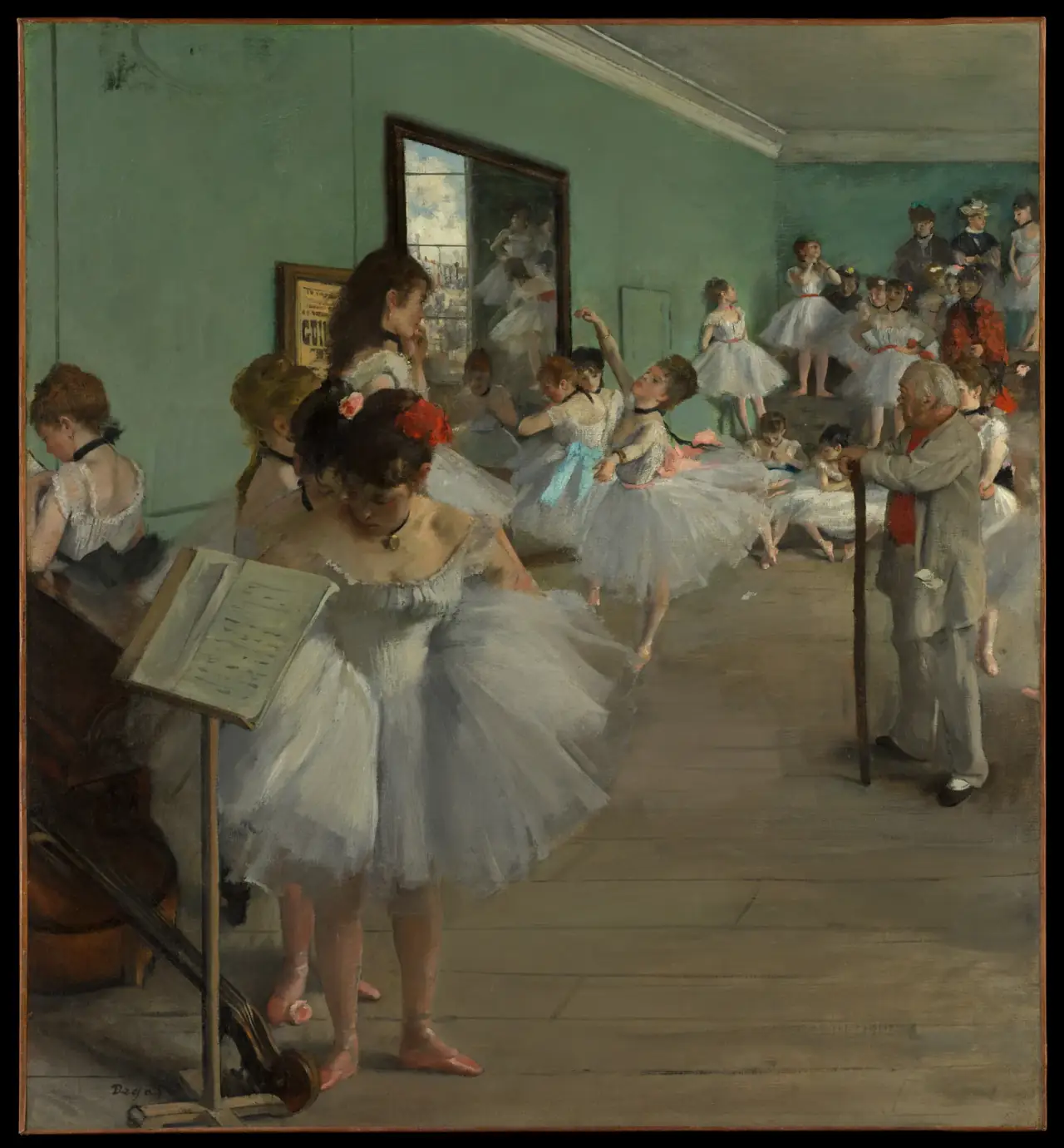
Notice how much floor remains visible. The figures do not fill the canvas evenly; their pale skirts collect at different depths around the room. That open foreground is part of the composition, not wasted space to trim away when fitting a frame.
For a place where you can approach the print, the smaller gestures and scattered groups offer plenty to inspect. Across a larger room, you may see mainly pale clothing against the green-grey interior. Try both views on a screen before deciding what size would suit you.
Check a reproduction for separation between the white skirts, the walls and the floor. If every pale passage merges, the room loses some of its depth. Preserve the lower foreground when looking at crop previews, even if removing it would make the dancers seem larger.
Renoir: one figure and a clear silhouette
Renoir’s The Dancer, also 1874, provides a much simpler arrangement. The National Gallery of Art’s painting, 1942.9.72, shows a single full-length figure against a loosely painted background. It is an oil painting of a dancer in costume, not a photograph documenting a named performance.
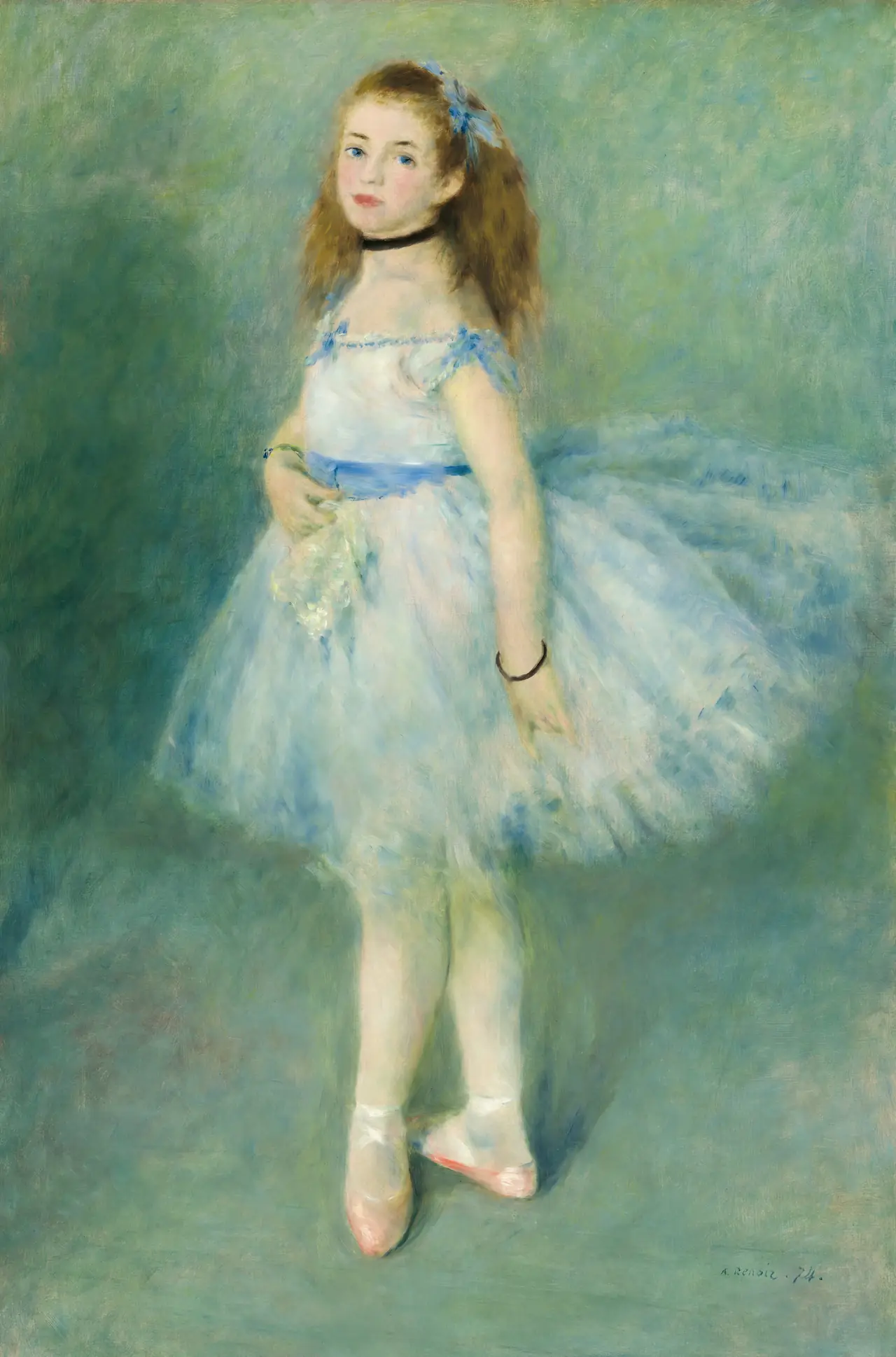
Its long vertical shape makes it worth considering for a narrow space, but measure the frame as well as the picture. A tall image can become surprisingly wide once a mount and substantial frame are added.
Keep the feet. They help complete the pose, and cropping them would turn a full-length figure into something different. Look at the space above the head too: enlarging until the image fills an unsuitable frame can compress the figure at both ends.
The background is comparatively open, so the silhouette is easier to take in at a glance than Degas’s many figures. That does not make it the “calmer” or “better” painting. It simply offers a different amount of visual information. For the artists’ approaches rather than decorating choices, read Degas vs Renoir.
Toulouse-Lautrec: being in the audience
Divan Japonais, 1892–93, makes music visible through a venue and its audience. In the Met’s colour lithograph, Jane Avril sits in the foreground with Édouard Dujardin. The performer at the upper left is Yvette Guilbert, whose head is cut off by the original composition. That is not damage to this digital file.
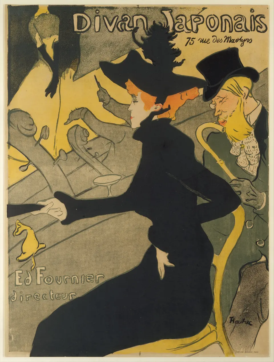
The large black silhouette and venue lettering read differently from the painted textures of the two canvases. It can be a useful choice when you want a strong graphic image rather than a small scene requiring close inspection.
Do not describe the foreground spectator as the singer or dancer on stage. That changes the picture’s story. The raised arms and instrument necks beyond her help place us among people attending a concert, rather than looking directly at a solo performer.
Keep the lettering when comparing reproductions. It is part of a poster designed for a particular venue, not an accidental label around an otherwise independent painting. Check that the outer marks and text survive the offered crop and that the black shapes remain distinct from adjacent dark areas.
Make a group through more than the theme
You do not have to hang these three together. Sharing a subject is a reason to compare images, not proof that they form the best group for a wall. A single work may be easier to enjoy beside shelves, instruments or other objects that already attract attention.
For a pair, choose one visible connection: a repeated dark shape, a pale costume, or a similar outer frame. Leave room for difference inside that relationship. Renoir’s isolated figure beside Lautrec’s poster will read differently from two busy rehearsal scenes.
Lay paper templates out first. If two outer frames are each 40 centimetres wide and you allow an 8-centimetre gap, the total span is 88 centimetres. Those are example dimensions, not a universal spacing rule. Our paper-first gallery-wall guide helps test the arrangement before buying.
Choose the size from the details you want to see
Stand where you will normally encounter the picture. From a sofa, you may mainly see a figure’s outline; from a chair beside the frame, you can inspect small gestures and lettering. Choose the size for the experience you want, rather than automatically buying the largest available option.
Make sure a nearby monitor, music stand or tall object will not hide the feature you bought it for. Consider the view from a seated position as well as from the doorway. Check reflections at the intended spot before committing to a glazed presentation.
The three images also have different proportions. Identical paper sizes can contain different image sizes or borders. Compare the complete compositions, not three automatically filled mockup frames.
Buy the object described, not the historical process
An inkjet reproduction of Divan Japonais is not an original nineteenth-century lithograph. A reproduction of Degas’s canvas is not an oil painting just because the historical work used oil paint. The listing should state the process and material of the item you will receive.
Check the source image, complete crop preview, printed area, paper or canvas, and whether a frame is included. A digital download needs a separate printing decision. The art-listing checklist explains those distinctions without relying on promotional labels.
Return finally to your first choice: practice, individual presence or the shared experience of a venue. Let that connection guide you, then confirm that the reproduction preserves the parts of the picture that make it visible.
Editorial record
About this article
- Author
- Publisher
- GeMarkt
- Published
- Reviewed
- Internal source & rights check. Conducted by GeMarkt Research Review. This is an internal editorial check—not independent peer review.
- Source standard
- Buying guide source standardSeparates measured or first-hand evidence from general guidance and keeps practical limits visible.
Found a claim that needs checking? Report a factual error.