GeMarkt Blog · Practical guide
Boho Wall Art: Botanicals, Textiles and Warm Tones
Build a personal, layered wall with botanical prints, textile patterns and warm colour, without making every surface compete or losing the works' identities.

For a boho wall, begin with pictures and objects you care about, then give that mixture a little order. Botanical prints, textile patterns and warm colours can work together without turning every available surface into a pattern. You do not need a prescribed bundle of pampas grass, rust-coloured shapes and anonymous “ethnic” decoration.
Here, boho is a loose decorating description, not an art-historical category that makes unrelated objects interchangeable. A French botanical engraving and an English textile design have different purposes and histories. Keeping those identities visible makes the room more interesting than choosing them only because they share a beige background.
Begin with what you actually collect
Put the things you already like together before buying more: a flower print, a family photograph, a small drawing, perhaps a textile you know something about. Look for connections that are already there. Two pictures might share a line quality, or an old photograph might pick up the dark wood of a frame.
You need not find a connection between every object. Choose one larger or more noticeable piece as a starting point, then ask whether the others improve the group. If a picture disappears between much louder neighbours, give it another place instead of trying to rescue it with a larger decorative frame.
Avoid using a broad culture or continent as a shopping adjective. Where an object has a maker, community, place or purpose, name it accurately. Something with a specific meaning deserves more attention than a generic promise that it will make a room feel well travelled.
Give botanical detail some clear space
Redouté’s rose below is a colour stipple engraving from Les Roses, not a watercolour painted on the paper of a modern reproduction. The Met identifies the sheet as Rosa turbinata, Empress Josephine or Frankfort Rose, from the publication of 1817–24.
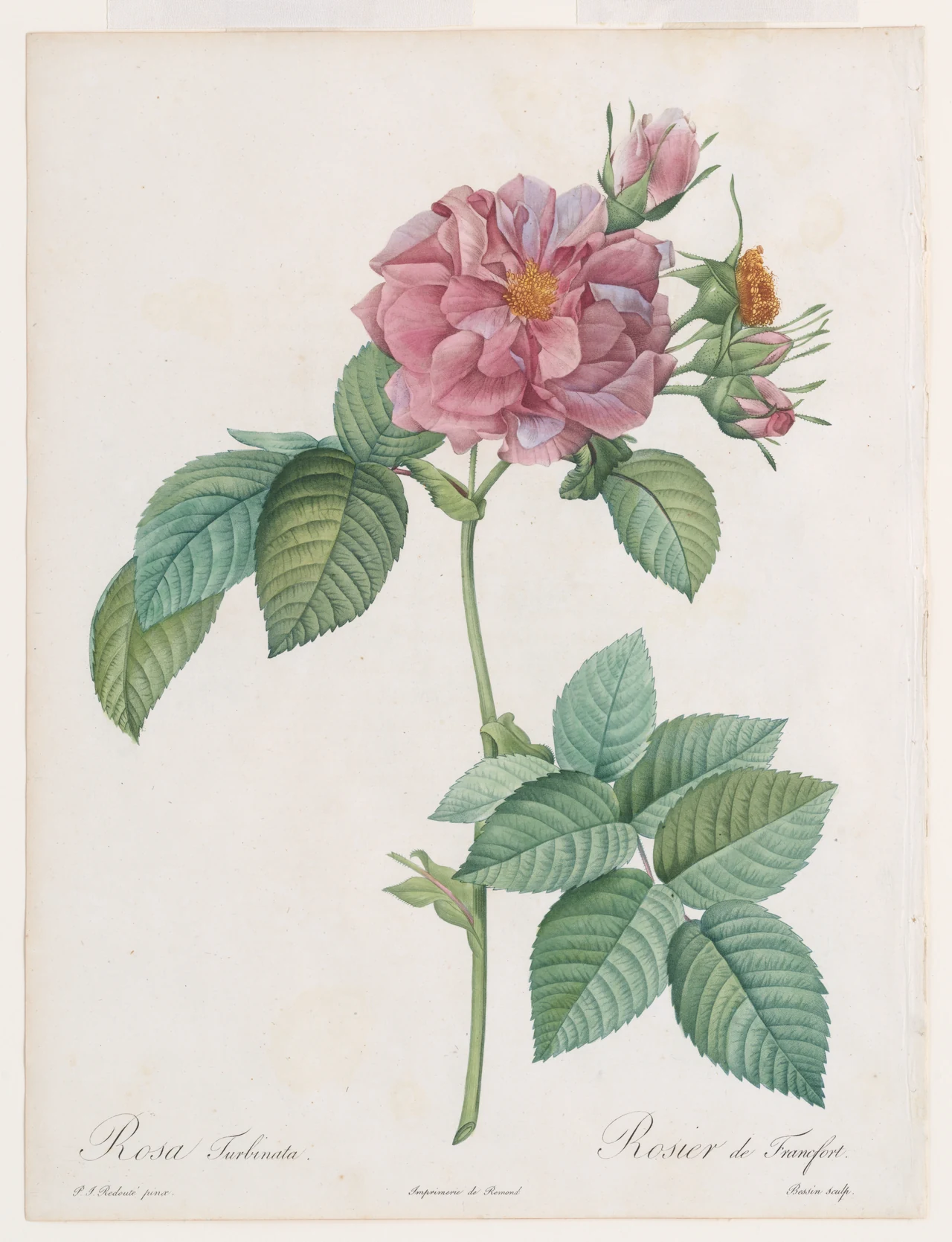
The unprinted area is useful: it separates the stem, leaves and lettering from the edge. Keep it if those parts are what drew you to the image. Enlarging only the pink flower until it fills a rectangle creates a detail print with a different effect; it is not simply the same botanical plate at a larger size.
I would place a print like this somewhere you can approach it, such as beside a reading chair or above a small chest. Across a large room, the fine lettering may become irrelevant. That is not a flaw, but it is worth deciding whether you want to see the whole sheet as a shape or examine its small marks.
Treat a textile pattern as a specific design
Morris’s Strawberry Thief supplies a different kind of interest: birds, berries and curved stems repeat across the surface. The Art Institute of Chicago record distinguishes the design date, 1883, from the making date of its textile, 1883–1917. The illustration here is an existing detail of that textile, not a newly drawn seamless pattern.
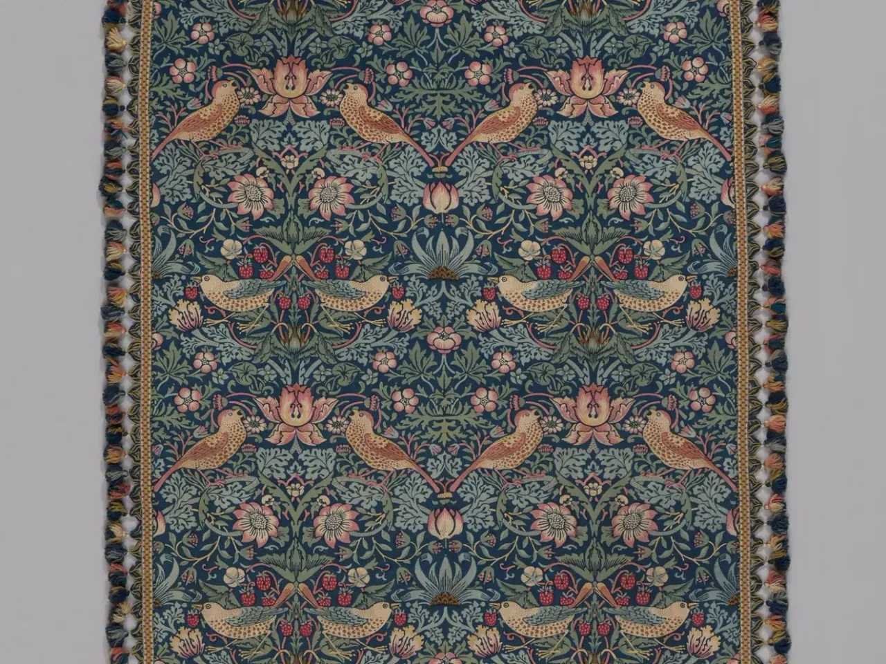
This is an Arts and Crafts design, not an example of a historical boho school. Its repetition can still be useful in a layered contemporary room. Let it provide the dense pattern while a nearby botanical print or photograph offers a less crowded surface.
A photograph of fabric printed on paper remains a paper print. It will not have the weave, drape or handling qualities of the historical object. Choose it because you enjoy the design rather than because the word “textile” suggests a material you will receive.
Decide where the detail should gather
The diagram compares two workable arrangements. One puts most of the small repeated shapes in the wall picture; the other gives that role to a rug and leaves the picture simpler. These are alternatives, not a rule that you may have only one pattern in a room.
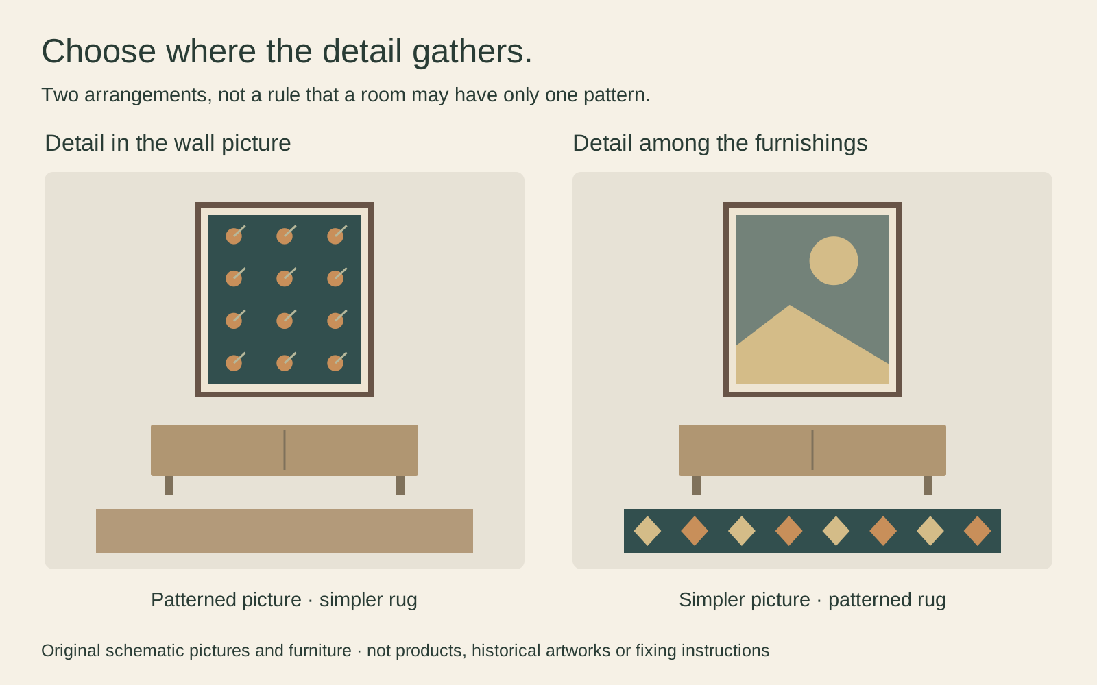
If your sofa already has patterned cushions and a throw, try a print with a readable outline before adding another intricate pattern above it. If the furniture is mostly plain, a detailed picture may carry the grouping by itself. Take an ordinary photograph from the doorway: it can help you see what dominates, even though it cannot judge print colour reliably.
Leave useful surfaces useful. A wall arrangement should not force a reading lamp behind a frame or crowd a shelf that holds everyday things. If the arrangement becomes awkward to live with, reducing it is a design improvement, not a failure to be eclectic.
Build a small group before a whole wall
Three small pictures can make a more manageable starting point than a room-sized collection. For example, three outer frames each 24 cm wide, separated by two 6 cm gaps, occupy 84 cm. Centred within the width of a 120 cm console, that leaves 18 cm on either side. These are hypothetical measurements, not a required furniture ratio or available product sizes.
Make templates at those outer dimensions and inspect the group from your normal seat. Check the door swing and any nearby switch. If the central picture is much darker, equal dimensions may still look unequal in emphasis; that can be appealing, or a reason to change the order.
Our paper-first gallery-wall method helps you try that arrangement before committing to fixings. For installation, follow the actual frame, wall and fixing requirements; a pleasing layout does not establish that a fixing is suitable.
Use warm colour without recolouring the art
Warm tones can come from furniture, frame or mat as well as the image. A brown timber frame may connect a rose print to a chair without altering the original green leaves. A muted red elsewhere in the room can acknowledge Morris’s fruit without matching every patch of colour.
Do not assume a warm screen image predicts a warm-looking print in your room. Compare a physical sample where available and look under the light you normally use. Our warm and cool colour guide treats these relationships as choices to test, not guaranteed emotional effects.
Keep the material and the story clear
Distinguish a replaceable reproduction from an original drawing or an old textile. Valuable or fragile objects need appropriate care and mounting, not improvised attachment chosen only for its appearance. The Library of Congress paper-care guidance cautions against self-adhesive tapes and unsuitable display environments for paper collections.
For the ordinary decorative prints in your room, keep the source and artist information somewhere you can find it. A varied wall becomes more personal when you can explain what each image is, not just where you bought its frame. Add gradually, keep the parts you enjoy and let the arrangement remain changeable.
Editorial record
About this article
- Author
- Publisher
- GeMarkt
- Published
- Reviewed
- Internal source & rights check. Conducted by GeMarkt Research Review. This is an internal editorial check—not independent peer review.
- Source standard
- Buying guide source standardSeparates measured or first-hand evidence from general guidance and keeps practical limits visible.
Found a claim that needs checking? Report a factual error.