GeMarkt Blog · Practical guide
Blue Paintings: Famous Works by Colour
Compare the blue in Van Gogh’s Almond Blossom and Hokusai’s Great Wave, then choose a picture by its composition, scale and place in your room.

Choose a blue artwork for its shapes and subject as well as its colour. Van Gogh’s Almond Blossom opens into a broad turquoise-blue sky; Hokusai’s Great Wave sets dark blue lines against pale foam and paper. They can connect with similar furnishings while bringing very different pictures into the room.
This is a close look at two familiar examples, not a ranking of every famous blue painting. One is an oil painting and the other a woodblock print. Both are worth considering when you want blue on the wall, but neither should be reduced to a swatch that happens to match the sofa.
Choose what the blue is doing
Start by asking whether blue fills the background, describes one object, or appears in small accents. A picture with a large blue field gives that colour a very different presence from a mostly pale image with a few blue marks. Also notice the darkest and lightest parts. A deep outline can remain conspicuous even when it occupies little space.
The diagram uses invented shapes to make that distinction easy to see. It does not recolour an artist’s work or claim that one arrangement will make everyone feel a particular way.
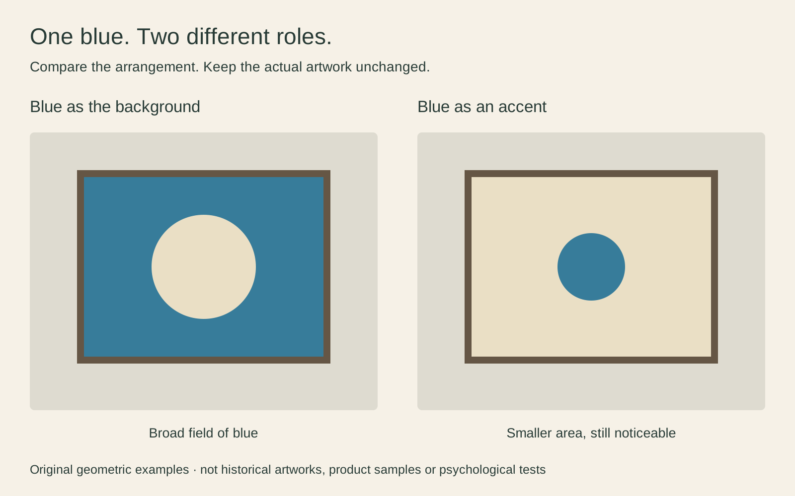
For a room with plain furnishings, either approach may work. If the curtains, rug and cushions are already patterned, I would compare a picture with broad open areas against a more intricate one before committing. The goal is to see what you enjoy looking at from your usual seat, not to obey a rule about how many blue objects a room may contain.
Almond Blossom gives blue room to spread
Van Gogh’s Almond Blossom, dated 1890 in the Van Gogh Museum’s collection, sets pale flowers and branching stems against blue. Here the background is not a distant strip above a landscape. It reaches between the branches throughout the picture.
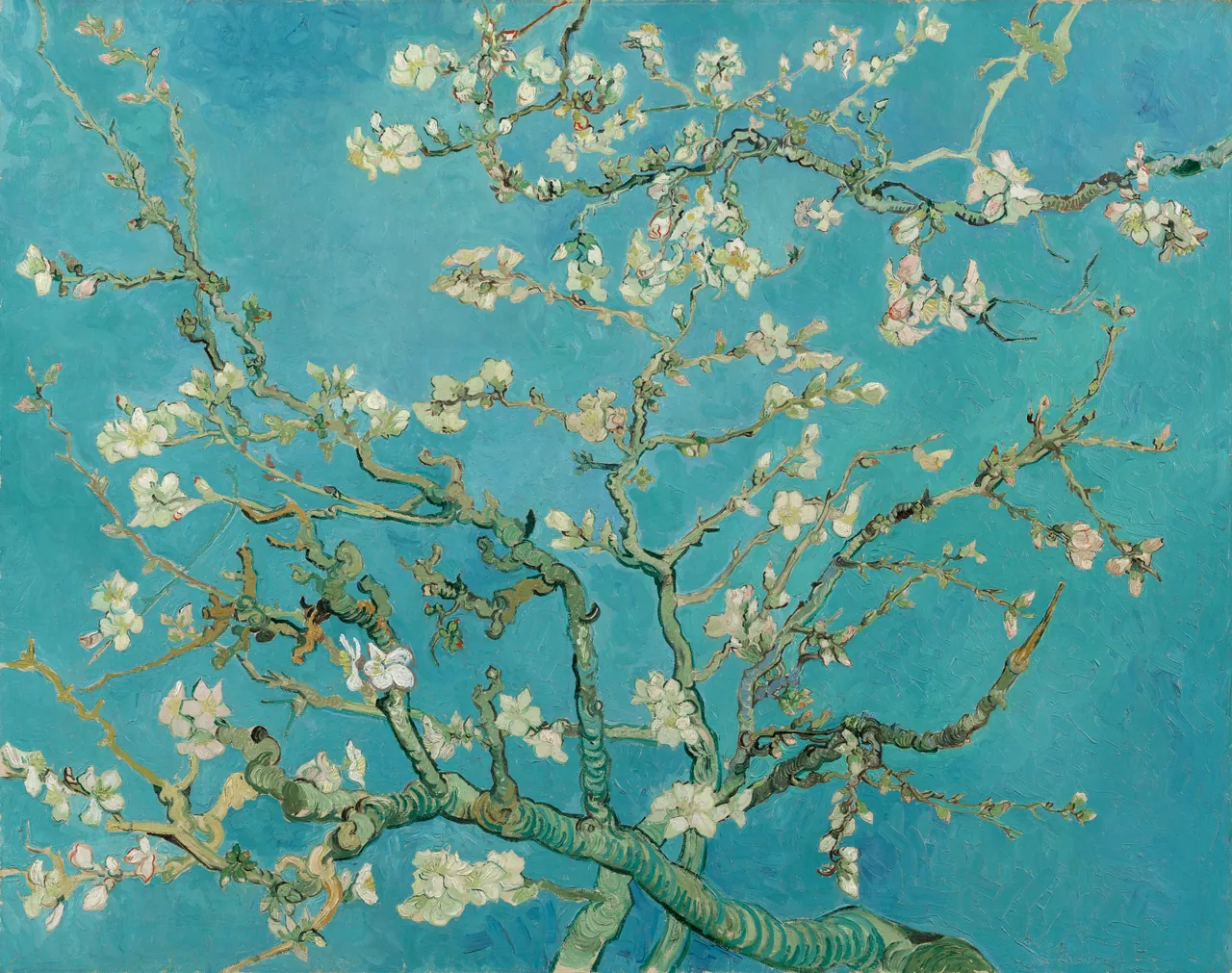

Look at the heavier branch entering from below and the thinner branches extending outwards. They prevent the flowers from becoming an evenly scattered pattern. The image has a direction and weight even though there is no horizon or central figure.
I would try it where you want a noticeable area of colour without a large block of near-black: over a plain sideboard, for instance, or opposite light curtains. That is a styling suggestion, not a claim about its effect on sleep or stress. Choose it because you like the particular flowers, brushwork and branching structure, not only because the listing calls it blue.
The Great Wave uses blue for force and detail
Hokusai’s Under the Wave off Kanagawa, commonly called The Great Wave, is a woodblock print, not a painting. The Met dates its impression to about 1830–32 and identifies the artist’s use of indigo and imported Prussian blue in his landscapes. The example shown here is the Met’s JP1847 impression.
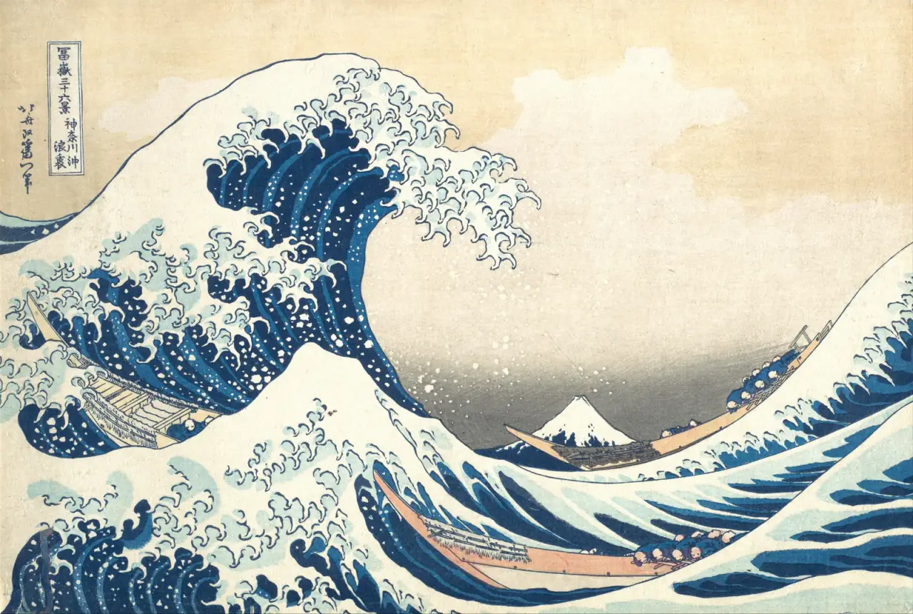
The darker curves remain strong when the image is viewed small. Move closer and the boats, people and little mountain become easier to distinguish. Unlike Almond Blossom, the image has areas of pale paper that separate forceful dark shapes. It may suit someone who wants blue alongside a more graphic contrast.
Do not assume that a sea subject is a quiet one. The wave towers over working people. That tension is part of what makes it compelling. Keep the whole composition if that is the picture you want: a narrow crop centred only on foam tells a different story.
Connect the picture to something you already own
You do not need a precisely matching blue wall. Begin with a small existing connection: a blue-grey woven chair, a dark navy book spine, or a ceramic bowl. The picture can repeat that colour loosely while supplying other colours the room does not yet have.
For Almond Blossom, I would compare the pale flowers with the curtains or a light rug before trying to match every blue passage. With The Great Wave, a cream mat can relate to the paper while a darker frame relates to the outlines. Those are alternative approaches, not instructions to buy an entire matching set.
If the sofa is already large and blue, consider whether another broad blue field is what you actually want. A lighter picture with smaller dark-blue areas may create a more distinct wall. Equally, a room built around repeated blue surfaces can be a deliberate choice. Our guide to matching art to wall colour helps you test the relationship without changing the artwork itself.
Let the surround help rather than match
Test the full framed object, not just the image rectangle. A pale mat places a visible interval between picture and wall. A narrow dark frame gives a sharper perimeter. A timber frame introduces its own colour and pattern, which deserves a place in the decision too.
For example, on a blue-painted wall, a pale surround can make the edge of the artwork easier to distinguish. On a cream wall, you may prefer a closer, less separated presentation. Neither is automatically more sophisticated; compare them with the furniture still in view.
A blue frame is possible, but it is not required because the picture is blue. A near-match can be more distracting than a clear difference. If you are choosing a new frame, look at a physical finish sample where possible rather than judging a tiny online colour chip. Remember that the mat opening, paper size and outer frame size are separate measurements.
Choose a size that keeps the picture readable
Ask how near you will usually be. At the end of a long room, the broad blue field in Almond Blossom may register before the individual blossoms. Beside an armchair, those small flowers and broken brushstrokes have more opportunity to hold attention. With The Great Wave, check whether the boats remain legible at the size you are considering.
Use paper templates for the outer frame dimensions and stand in the doorway as well as sitting down. The templates test placement, not the quality of a proposed print file. A large frame cannot recover detail that is missing from a low-resolution reproduction.
Both examples shown here are horizontal, but that does not make them interchangeable with every landscape-shaped frame. The image proportions differ. Preserve the composition with a suitable size or border rather than stretching it to fit. See famous paintings’ proportions and standard frames before choosing a size by its label alone.
Make a shortlist without recolouring the art
Save the exact image version you are considering, not just the artwork’s title. Different reproductions can look different, and a bright turquoise preview is not a reliable promise about a printed surface. Request a sample or proof when a close colour relationship is important and the seller offers one.
Compare your shortlist in the room during the times you use it. Does the picture still interest you when the lamps are on? Can you see the details you liked? Is it the subject you want to live with, or only the right shade?
Keep the artwork’s colours intact. If a reproduction has been deliberately recoloured, it should be described as an adaptation rather than passed off as an unchanged painting or print. Choosing between existing works gives you plenty of freedom without turning their colours into adjustable furniture finishes.
Editorial record
About this article
- Author
- Publisher
- GeMarkt
- Published
- Reviewed
- Internal source & rights check. Conducted by GeMarkt Research Review. This is an internal editorial check—not independent peer review.
- Source standard
- Buying guide source standardSeparates measured or first-hand evidence from general guidance and keeps practical limits visible.
Found a claim that needs checking? Report a factual error.