GeMarkt Blog · Practical guide
Bedroom Wall Art: Calm Paintings for Sleep Spaces
Choose bedroom art from the views you actually see: compare subject, detail, colour and frame size, then test it with your bedding and evening light.

Choose bedroom art for the view you will live with, not only the photograph taken from the door. Start with a picture you enjoy looking at, place a paper template on the proposed wall, and check it from the bed and while getting dressed. The best position may be opposite the bed or beside it rather than above the headboard.
Here, a calm picture means one that feels visually comfortable to you. A misty landscape, a dense flower study and a spare line drawing can suit different people. No subject or colour is a promise of better sleep.
Start with the view from the bed
Sit or recline where you normally read or look around the room. Which wall is actually visible? An impressive picture above the headboard may greet you when you enter but disappear from view once you are in bed. A smaller print opposite you can become the picture you notice most.
Also look from the doorway. You are choosing between different views, not discovering one correct wall. In a shared bedroom, check both sides of the bed: a wardrobe, lamp or open door may interrupt one person’s view more than the other’s.
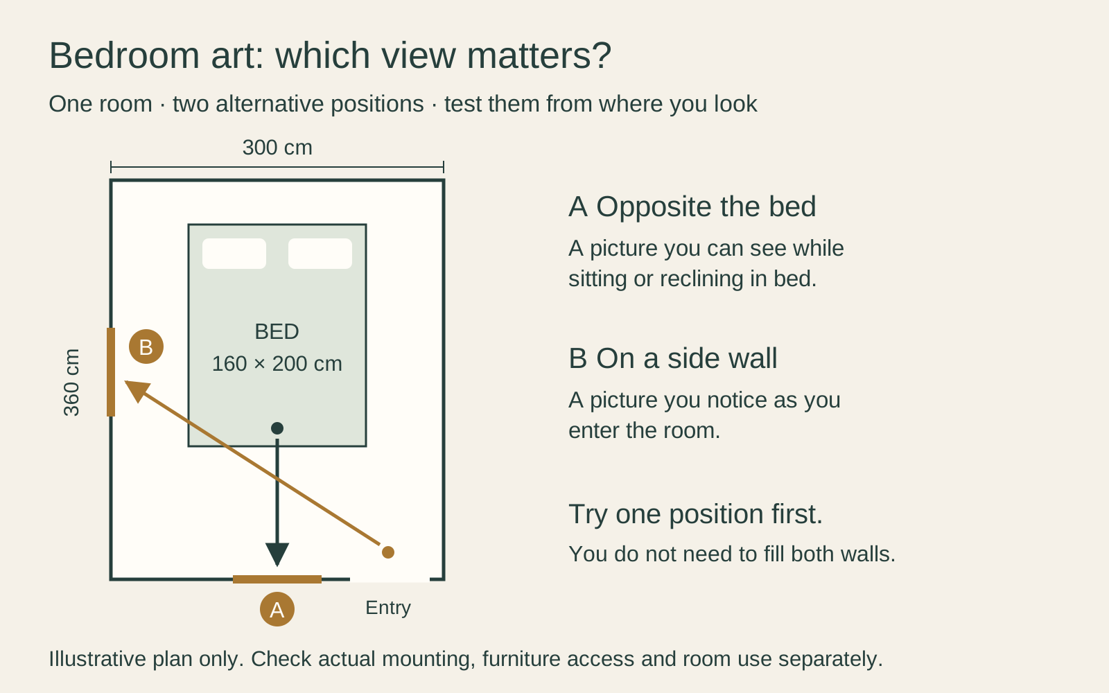
The plan below uses a 300 × 360 cm room and a 160 × 200 cm bed. Position A is opposite the bed; position B is on a side wall, seen from the entrance. The arrows show possible viewing directions, not walking routes. Try either position before deciding that both walls need pictures.
Decide what calm means to you
Compare how much is happening in the image. Broad areas of similar colour give you a different experience from small figures, strong diagonals or closely packed lettering. Neither is inherently unsuitable for a bedroom. The question is whether you want a picture to examine closely or something you can enjoy as a whole from across the room.
Try covering the title while comparing two options. Does the image itself appeal, or are you mainly responding to a description such as “serene” or “dreamlike”? A dark seascape can be quiet to one person and unsettling to another. A familiar crowded scene may be more welcome than a fashionable neutral abstraction.
If the room already contains patterned bedding, books and several objects on display, start with one picture. You can add a companion later without having to solve the whole room in one purchase.
Choose a subject you want to see often
A landscape can offer a view beyond the room, while a botanical print lets you enjoy the shape of a plant without making the whole wall a scenic statement. A still life might connect with a vase or treasured object nearby. These are ways to choose, not fixed bedroom categories.
Look closely at the actual composition. A landscape described as peaceful may include a dramatic sky or a small event you dislike once you notice it. A flower image may have sharp contrasts and dense detail. Open the full image and inspect the parts a cropped shop thumbnail leaves out.
Personal associations matter too. A place you have visited or an image you have known for years can be a better starting point than a list of supposedly relaxing colours. If two people share the room, choose something both are comfortable seeing daily rather than assuming matching décor means matching preferences.
Compare the picture with your bedding
Bring the image into the room as a modest preview. Compare it with the wall, bedding, headboard and curtains together. Matching every colour is unnecessary. One repeated tone may be enough, or you may prefer a clear contrast.
Keep temporary textiles in perspective. If you regularly change duvet covers, a picture chosen to match one specific pattern may feel less flexible. Test it with a plain cover as well as your favourite patterned one. The wall art should not require you to preserve an entire set of bedding indefinitely.
A screen cannot confirm the final printed colour. If a near match is essential, ask about a physical sample or proof. Our guide to why prints differ from your screen explains why the display, paper and viewing light all matter.
Test the finished frame size
Cut the template to the outside frame dimensions, including the mat and moulding, rather than the image alone. Draw the visible image area inside it. This prevents a broad mat from surprising you after delivery and helps you see whether the actual picture will be large enough.
For example, a 30 × 40 cm image with a wide mat can occupy a substantially larger frame. Conversely, a large outside frame does not guarantee that a small, detailed subject inside it will be readable from the pillows. Compare the image area at the distance you intend to use it.
For a pair, include the gap in the template. Two narrow pictures may suit a wall between wardrobes; a single horizontal picture may work better on an uninterrupted wall. Keep the source proportions rather than stretching a painting to fill an opening. The portrait and landscape guide helps compare those shapes.
Check the evening view
Test the position with the lights you actually use. A bedside lamp can reflect in glazing from one side of the bed even when the picture looks clear from the door. Try a different position before buying specialist glazing or adding another light.
Avoid using a bright patch of direct sun as the reason to choose a wall. The Canadian Conservation Institute’s paper-care guidance warns that light damage is irreversible and advises avoiding sunlight and heat sources. A decorative frame does not remove those risks.
Choose a secure position
Treat an over-bed position as a mounting decision, not just a styling opportunity. The complete frame, its fittings and the wall need a suitable attachment. If you cannot establish a secure solution, choose a different wall; do not improvise with a leaning frame above pillows.
Check ordinary movement too. Open wardrobes fully, raise any adjustable bed backrest, and use the bedside lamps and curtains. A frame should not be struck while someone reaches for a switch or changes the bedding. Keep heavy or fragile pieces away from a position where they could be knocked during those routines.
Live with a preview before ordering
Leave the paper outline in place while you use the room. Look in the morning, with the evening lights, and from both sides of the bed. If it feels wrong, change one thing: position, outside size or image choice.
Once the view works, record the image size, visible opening, outside frame and chosen location. You can then order a specific arrangement instead of hoping that a picture labelled “bedroom art” will solve the room for you.
Editorial record
About this article
- Author
- Publisher
- GeMarkt
- Published
- Reviewed
- Internal source & rights check. Conducted by GeMarkt Research Review. This is an internal editorial check—not independent peer review.
- Source standard
- Buying guide source standardSeparates measured or first-hand evidence from general guidance and keeps practical limits visible.
Found a claim that needs checking? Report a factual error.