GeMarkt Blog · Practical guide
Art Nouveau Posters: A Buyer’s Guide
Choose Art Nouveau and related vintage poster reproductions by the complete design, exact version, readable lettering, paper, borders and honest product details.

A poster is an arrangement of words and images, not just a picture with spare lettering around it. That matters when buying an Art Nouveau reproduction. An appealing face in a thumbnail may come with an ornate border, a brand name and a long, narrow shape that disappear in a standard-frame crop.
Start with the complete design. Mucha’s curling lines are an obvious choice, but shops also group Toulouse-Lautrec and Steinlen under broad “vintage Paris” labels. Those neighbours can be worth considering without pretending that every late nineteenth-century poster has the same style. The three examples below help you evaluate a reproduction, not authenticate a collectible or identify current stock.
Choose the advertisement as well as the picture
Read the words before deciding where the poster will hang. Are you happy living with a tobacco advertisement, a cabaret promotion or an unfamiliar brand? You need not endorse the original business to enjoy its poster, but the message should be a conscious choice, especially in a shared room or workplace.
Also look beyond the broad search label. If what attracts you is flowing hair, curving ornament and an elaborate surround, use those visible features to compare designs. If you prefer a strong silhouette and large lettering, a related Belle Époque poster may suit you better than an intricately patterned Mucha.
You can mix them, but choose the connection: warm paper tones, red lettering, performance subjects or similarly tall formats. Buying everything tagged “Art Nouveau” will not automatically produce a coherent group. Our Mucha and Toulouse-Lautrec comparison explores the visual differences.
Mucha’s JOB asks you to keep the border
This is Mucha’s 1898 JOB poster, with a seated woman and a cigarette-paper packet, not his different 1896 design for the same brand. The Library of Congress record identifies the Paris publication by F. Champenois. A useful listing should name the version rather than say only “Mucha JOB”.
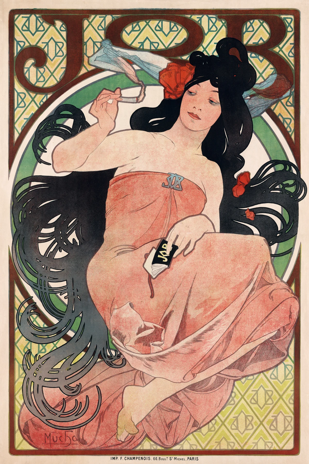

The woman’s hair spreads into loops that almost become a second border. The large letters above her and the repeated smaller motifs behind her make this a dense image. Look at its full rectangle when judging size: enlarging the face until it fills a frame would remove much of what makes the poster distinctive.
A reproduction should show those thin lines clearly without turning every dark passage into a heavy outline. Ask for a close photograph around the hair and printed lettering. Cream and yellow areas in an image do not mean the finished item uses metallic ink or gold leaf; those materials would need an explicit product specification.
Lautrec shows why lettering needs space
Toulouse-Lautrec’s 1891 Moulin Rouge: La Goulue makes a useful comparison. The Met’s original object is a colour lithograph printed on three sheets, measuring about 190 × 116.5 cm. Those are the museum object’s dimensions, not a suggested size or a promise that a modern reproduction arrives in three pieces.
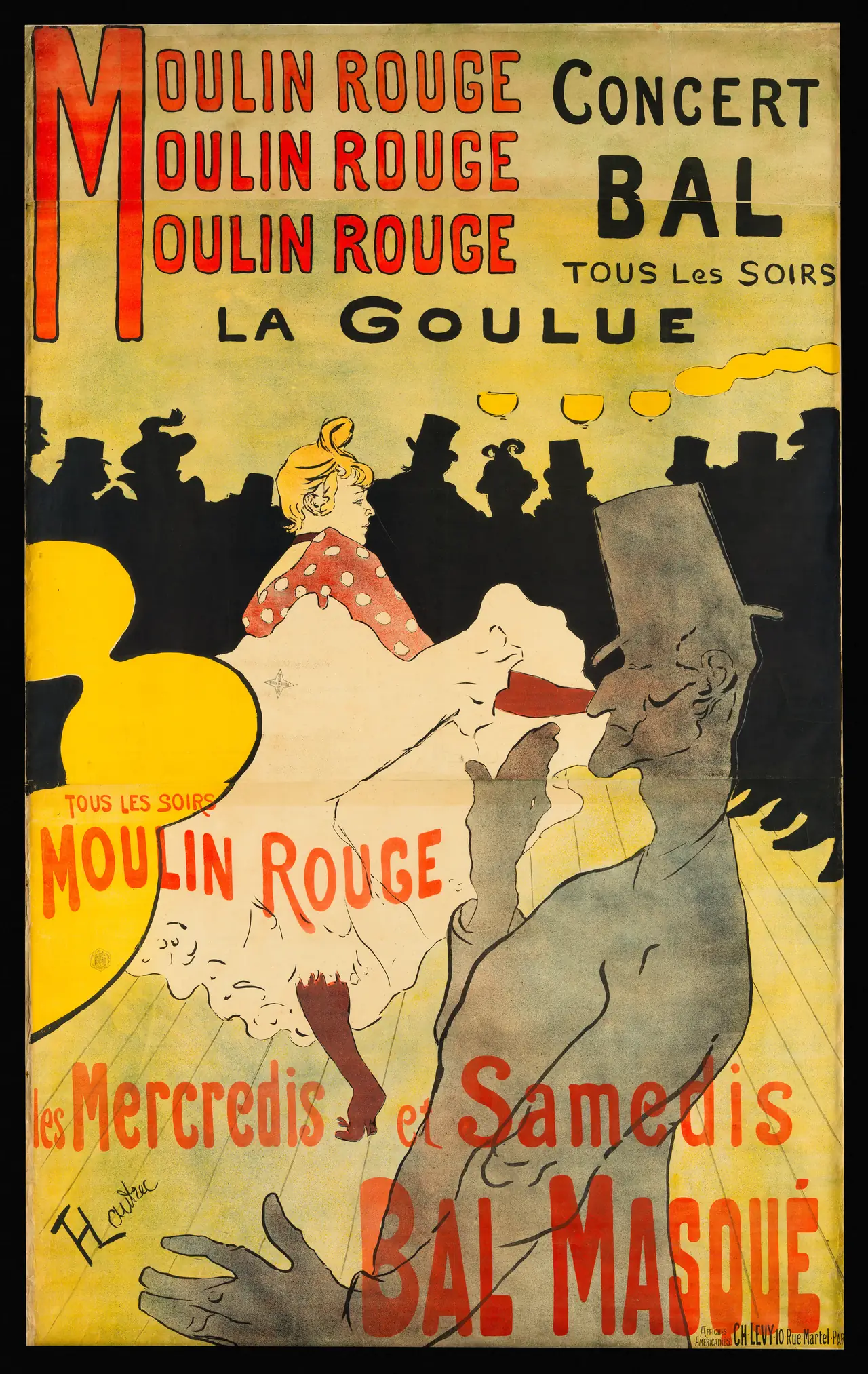
Here the words occupy a great deal of the surface. At a reduced size, the main red heading remains bold while the finer information near the edges becomes harder to read. Decide which experience you want: a graphic presence across the room, or a poster whose small details you can inspect nearby.
The lower lettering crosses the foreground figure. It is not disposable catalogue text outside the artwork. Check the bottom edge in the offered preview, and ask whether a visible join or worn patch comes from the photographed historical sheet. A reproduction of that surface does not itself become an antique.
Check which black cat you are buying
Steinlen’s black cat is familiar enough to make version checking easy to forget. The example here is 1896 Prochainement la très illustre Compagnie du Chat Noir, in the National Gallery of Art’s collection. It is a colour lithograph printed by Charles Verneau, with the cat beside a substantial announcement.
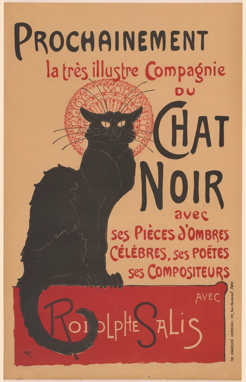
The cat is a strong shape, but its tail, the red panel and the uneven lettering are part of the balance. An isolated cat on a newly coloured background is an adaptation, not this complete poster. Either might appeal to you; the listing should make clear which you are getting.
Notice the source image’s warm ground and worn marks. Compare the actual product image with the version you prefer, rather than assuming all black-cat posters use one identical file. For more context, see our Belle Époque poster guide.
Know whether the sheet is old or new
“Vintage poster” may mean a period sheet, a later reprint or a newly made reproduction of a vintage design. Ask for an unambiguous description. For a modern print, the important details are the source image, current printing process, paper and included finishing. A download should be labelled as a file, with no physical delivery implied.
For a historical sheet, condition, repairs, backing and provenance become different questions. Do not assess those from a staged room image. Ask for photographs of the actual object and qualified advice when the purchase depends on authenticity. Printed signatures and publisher lines can appear in reproductions too.
A current inkjet reproduction of a lithograph is still an inkjet reproduction. That is a perfectly reasonable way to enjoy the design; it should not be sold as though the nineteenth-century printer produced it. Our original versus reproduction guide unpacks these terms.
Measure the printed design and its surround
Keep three dimensions separate: the image, the paper and the frame’s outside edge. For an invented example, a 27 × 45 cm image with a 3 cm paper border on all sides needs a 33 × 51 cm sheet. A frame’s outer dimensions will be larger still, depending on its construction.
If the shop offers a familiar paper size, check how the chosen poster fits it. Different designs have different proportions. The options are usually some combination of surrounding space, a different print size or cropping; stretching the image is not a substitute for resolving that choice.
Make a paper template of the complete framed size, then look from the doorway. A long poster may work beside a bookcase yet leave too much empty width above a broad sofa. Two compatible posters can answer that differently from one heavily enlarged image.
Inspect the surface before choosing the frame
Ask for the paper’s actual name and finish rather than treating “museum quality” as a full description. If fine lettering is central to your choice, compare a close print photograph on the offered surface. A coarse texture may be attractive in itself, but decide whether you like its effect on those small lines.
Choose a frame that leaves the printed border visible. A mat can separate an intricate design from an equally busy frame; a quieter frame can let the existing ornament do the work. The scan’s apparent paper colour is not necessarily the colour of any unprinted border added by the seller.
Avoid direct intense sunlight and positions vulnerable to leaks or heating vents. The Library of Congress’s guidance on paper care supports those precautions. An expensive frame cannot make exposure harmless, and an old sheet with condition problems belongs with a conservator, not a home restoration experiment.
Buy the version you actually want to see
Before ordering, confirm the named design and date, the complete crop, the printed dimensions and what arrives in the package. Read the text as well as looking at the central figure. None of those checks requires collecting expertise; they prevent ordinary mismatches between a lovely thumbnail and the object you expected.
Finally, do not use an Art Nouveau label as a copyright or image-permission test. A modern adaptation or particular photograph needs its own identification. Choose a clearly sourced reproduction whose lettering, margins and surface you genuinely like, then let the poster’s original design do the decorating.
Editorial record
About this article
- Author
- Publisher
- GeMarkt
- Published
- Reviewed
- Internal source & rights check. Conducted by GeMarkt Research Review. This is an internal editorial check—not independent peer review.
- Source standard
- Buying guide source standardSeparates measured or first-hand evidence from general guidance and keeps practical limits visible.
Found a claim that needs checking? Report a factual error.