GeMarkt Blog · Essay
Mucha vs Toulouse-Lautrec: Two Kinds of Poster
Put Mucha's JOB beside Toulouse-Lautrec's Moulin Rouge poster to compare lettering, colour, theatrical glamour and a crowded Paris dance floor.

One poster surrounds a woman with curling hair, repeated initials and a carefully bounded decorative world. The other puts a dancer beyond a grey foreground figure, as if you have arrived at a crowded venue and someone is standing in your way. Both need you to notice a name. They arrange that encounter very differently.
Alphonse Mucha’s 1898 JOB advertisement turns a product into an ornamental image of pleasure. Henri de Toulouse-Lautrec’s 1891 Moulin Rouge: La Goulue sells a place and its performers through bold silhouettes and interrupted views. These are two particular solutions to advertising, not complete definitions of either artist.
Two advertisements with different jobs
Start with what was being sold. JOB was cigarette paper. The object is not just a decorative woman with lettering added later: the initials belong to the product, and the smoking figure gives the design a commercial purpose. We are looking at historical tobacco advertising, not advice to use the product.
The Library of Congress’s account of Mucha places this poster around 1898, after the success of his work for the actress Sarah Bernhardt brought further advertising commissions. The different JOB designs are easy to confuse; the image below is the seated figure of 1898, not his other widely reproduced version of 1896.
Lautrec’s commission was for a dance hall. The Met’s record of Moulin Rouge: La Goulue identifies the featured performers as La Goulue and Valentin le Désossé. Their recognisable appearance mattered: the poster promised a particular attraction, not an anonymous evening of entertainment.
Put the posters side by side
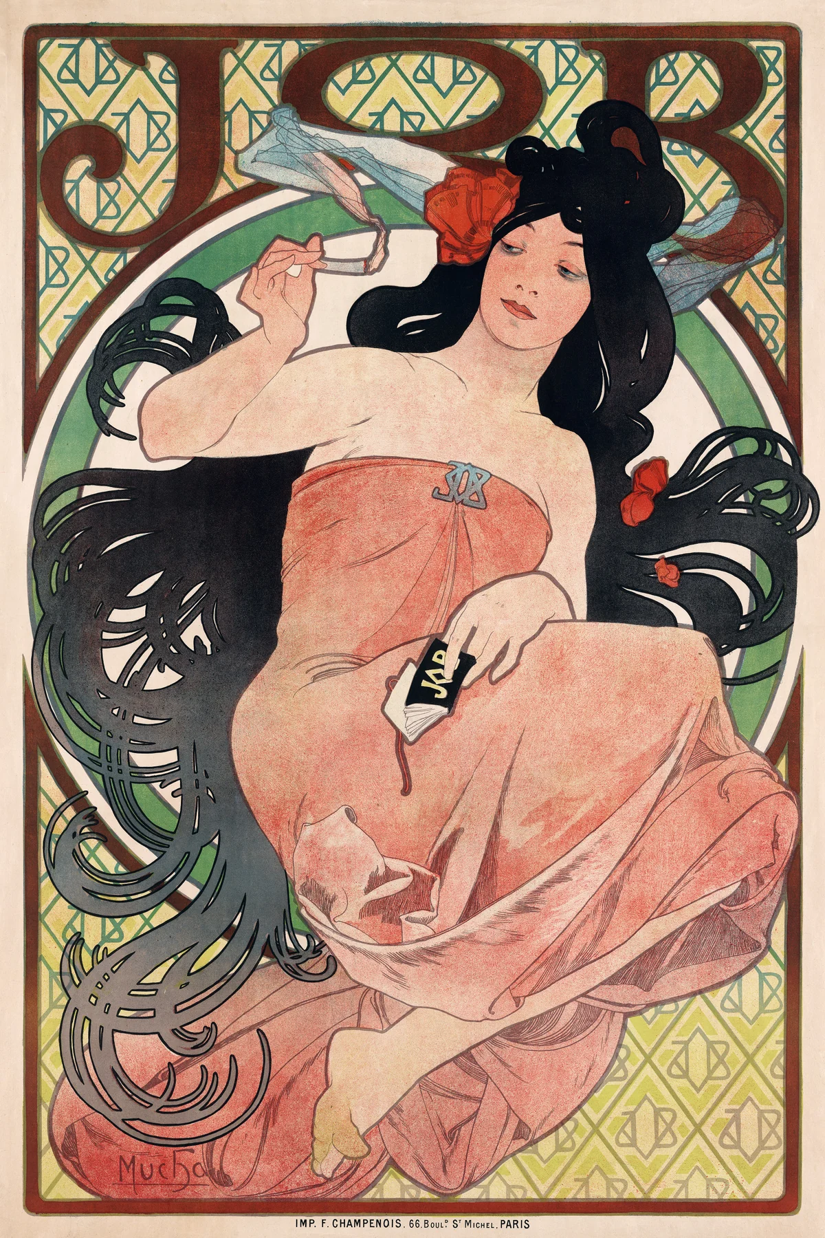

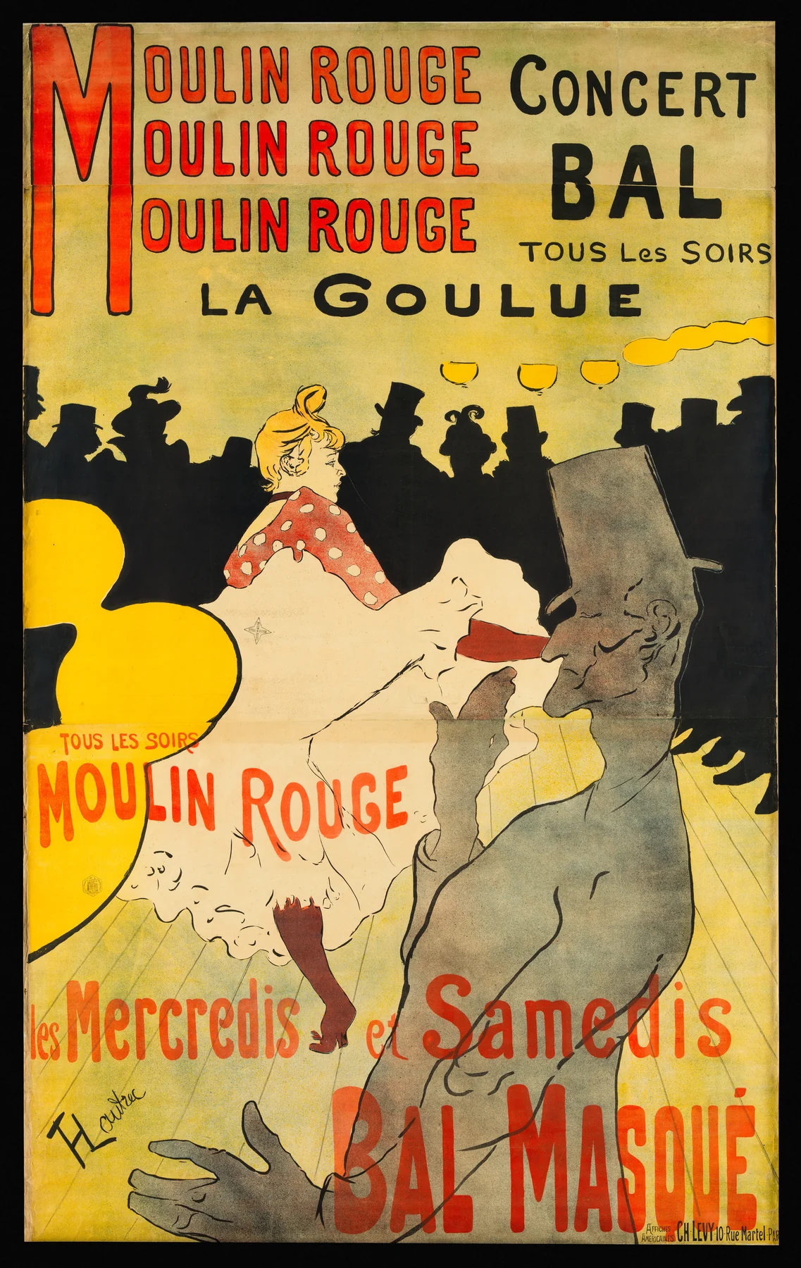
Before reading further, reduce the pair to the things you notice from a distance. Mucha gives you a large, enclosed figure. Lautrec gives you a band of red words, a black crowd and an exceptionally bright skirt. The small details develop impressions that are already legible in the large shapes.
Mucha makes the brand a world
Follow the hair in JOB. It does not behave like a neutral description of strands. Dark loops spread around the head, turn back on themselves and connect the figure with the surrounding ornament. The smoke contributes another curling movement near the raised hand. These lines keep the eye circulating rather than directing it straight to a vanishing point.
The large initials are not the brand’s only appearance. Smaller monograms repeat through the background, and the product packet remains part of the figure’s immediate surroundings. Instead of separating picture and sales message, Mucha distributes recognition across the sheet.
Notice, too, the contrast between the figure’s pale skin, warm dress and the darker hair. There is modelling, but the broad areas remain readable as shapes. The border helps contain them. You are invited to look at a designed surface as much as to imagine a person occupying deep space.
That creates a peculiar balance: the pose feels relaxed, while almost everything around it is tightly organised. The advertisement presents ease through considerable visual control. Calling it merely pretty misses how actively it holds and redirects attention.
Lautrec makes you part of a crowd
In Moulin Rouge, start at the bottom right. The grey foreground figure is large enough to interrupt the view, yet flat enough to read almost as a cut-out. The body is cropped by the edge of the sheet. That truncation makes the space feel as though it continues beyond the printed boundary.
Behind him, La Goulue’s white petticoat supplies a brilliant break in a much darker scene. Her lifted leg and spreading skirt announce movement with very few forms. Across the back, hats and profiles combine into a continuous strip of spectators. Individual outlines survive, but the crowd also works as a single black shape.
Compare that interruption with Mucha’s enclosure. JOB’s decorative border stabilises the image. Lautrec’s looming foreground figure makes looking feel more contingent: we see the performance from a position within a busy room. This is a constructed viewpoint, not evidence of an instantaneous photograph.
Neither approach is inherently more honest. Mucha idealises an advertised experience; Lautrec selects and exaggerates what makes a performance memorable. Both leave out enormous amounts of ordinary information to make an image register quickly.
Lettering is part of the picture
The repeated Moulin Rouge at the top functions as both information and rhythm. Red words create a strong horizontal zone before the eye reaches the dance floor. Lower inscriptions supply further details, but they do not have equal visual weight. A poster can give its main message immediately and reward a closer approach afterwards.
In Mucha, the large JOB letters sit within the same ornamental system as the hair and frame. The brand becomes something to recognise by shape as well as something to read. Try covering the smallest writing in each poster: the dominant commercial identity remains available.
This is why a crop that removes the lettering changes more than the proportions. It can turn an advertisement into a decorative figure study and hide what the designer was solving. The text is not packaging around the art; it is part of the work.
Colour printing is a collaboration
Both images are lithographic posters, not unique oil paintings. Lithography is a printing process that allows drawn marks and broad tonal areas to be transferred from a prepared surface to paper. Our lithograph and screen-print comparison explains the difference between those processes.
These ambitious sheets depended on printers as well as designers. The Met credits Charles Lévy’s workshop for the Moulin Rouge impression. At 190 centimetres high and assembled from three sheets, it was an imposing public advertisement, not originally the small rectangle you see on a phone.
MoMA’s account of Lautrec’s printmaking stresses the expertise of specialist printing workshops and the expansion of colour printing in this period. That context matters more than imagining a poster emerging fully formed from an artist working alone.
Art Nouveau is not a box for every poster
The V&A’s explanation of the whiplash line connects Art Nouveau with curling, organic ornament. Mucha’s hair and borders make that connection easy to see. The term describes a wider design culture, however, not every image printed in Paris in the 1890s.
Mucha also made theatrical publicity. His Gismonda poster presented Bernhardt in a tall, narrow format suited to her stage presence. Lautrec, meanwhile, advertised a literary magazine in La Revue blanche. Product versus performance is a useful distinction for our pair, but not a division of their entire careers.
Look at the whole sheet
To remember the difference, follow the route each poster offers. In JOB, look from the brand into the figure and around the repeating ornament. In Moulin Rouge, move from the venue’s name past the obstructing foreground to the star performer and the watching crowd.
Then return to the edges, lettering and surviving paper. They show why a poster is more than its most attractive figure. Mucha and Lautrec both made commercial images worth looking at after their immediate message had expired; their different ways of directing attention are still visible in the complete sheets.
Editorial record
About this article
- Author
- Publisher
- GeMarkt
- Published
- Reviewed
- Internal source & rights check. Conducted by GeMarkt Research Review. This is an internal editorial check—not independent peer review.
- Source standard
- Art history source standardPrioritises object records and research sources, distinguishes evidence from interpretation, and states material uncertainty.
Found a claim that needs checking? Report a factual error.