GeMarkt Blog · Practical guide
Art Nouveau Interiors: Mucha and Morris at Home
Use Mucha posters and Morris patterns in a modern home while preserving borders, distinguishing their histories and deciding where ornament should stop.

You can enjoy a Mucha poster or a Morris pattern without furnishing an entire period room. Let the picture supply a strong line, a repeated shape or a particular colour relationship. Then decide how much ornament the frame and surrounding furniture need to add.
Start by keeping the histories distinct. Mucha is closely associated with Art Nouveau; Morris belongs to the earlier Arts and Crafts story and helped influence what followed. They can look good together in a present-day home without becoming the same movement or a compulsory matching collection.
Know which history you are borrowing
The V&A’s introduction to Art Nouveau describes an international late-nineteenth-century development with several local forms. Flowing lines, natural references and the relationship between structure and decoration matter, but not every work is a curving plant in gold and green.
The museum’s separate Arts and Crafts introduction places Morris within concerns about design, making and everyday life. That gives us a reason to look at his textiles as designed objects, not simply a convenient background pattern for anything labelled vintage.
For your room, the practical question is narrower: what do you like in this particular image? A tall figure? A dark blue ground? The way stems repeat? Answering that makes it easier to connect the picture with existing furniture than shopping for an entire room under one historical label.
Give Mucha’s poster its full height
The JOB poster shown here is Mucha’s 1898 seated-figure design, not his different 1896 poster for the same brand. The Library of Congress discusses the 1898 design as an advertisement for cigarette papers. Its commercial purpose is part of the image, not something to hide beneath a description of pretty hair and flowers.
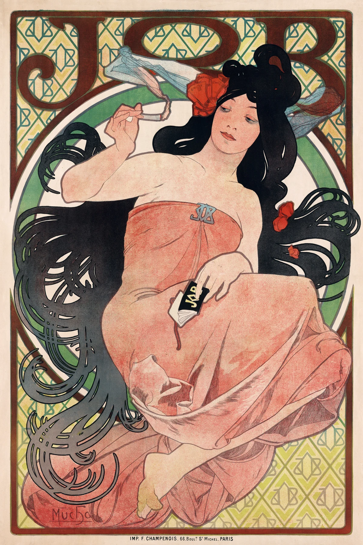

The lettering, figure and lower border form one tall composition. A crop that turns it into a short rectangle may cut away part of the advertisement as well as the decorative edge. If the full poster is what you want, choose a location and framing arrangement that accommodate it.
Try a narrower wall beside a cabinet or a place you pass at close range. The large silhouette reads from farther away; the lettering and small repeated marks reward a closer look. Decide whether the tobacco-related subject belongs in your particular room, rather than treating any famous poster as automatically suitable everywhere.
Let Morris’s repetition do a different job
Morris’s Strawberry Thief is not organised around one dominant person. Birds, berries, flowers and stems recur across a dark ground. The Art Institute of Chicago’s object record dates the design to 1883 and its textile to 1883–1917. The image below shows a detail of that particular fabric.
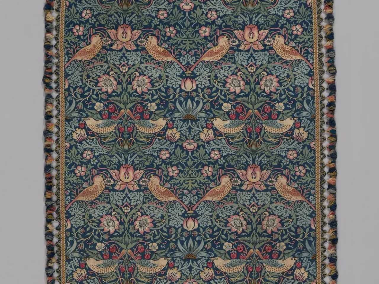
A framed reproduction can let you enjoy that repetition as an image. It does not turn the paper into fabric, or tell you how a newly manufactured textile would feel. Equally, a photographed piece of historical fabric is not necessarily a seamless pattern ready to repeat across wallpaper.
In a room with plain upholstered furniture, one dense patterned picture may be enough. If you already have patterned curtains and a rug, place it where there is a visible stretch of wall around it. That interval can help you see the design as a particular object rather than another patch in an uninterrupted pattern.
Choose where the ornament stops
Treat image, frame and wall as separate layers. An intricate picture in a simple frame makes one kind of statement. The same picture in a decorative frame makes another. Neither is inherently more authentic or more expensive-looking; the useful test is whether the combined object remains readable in your room.
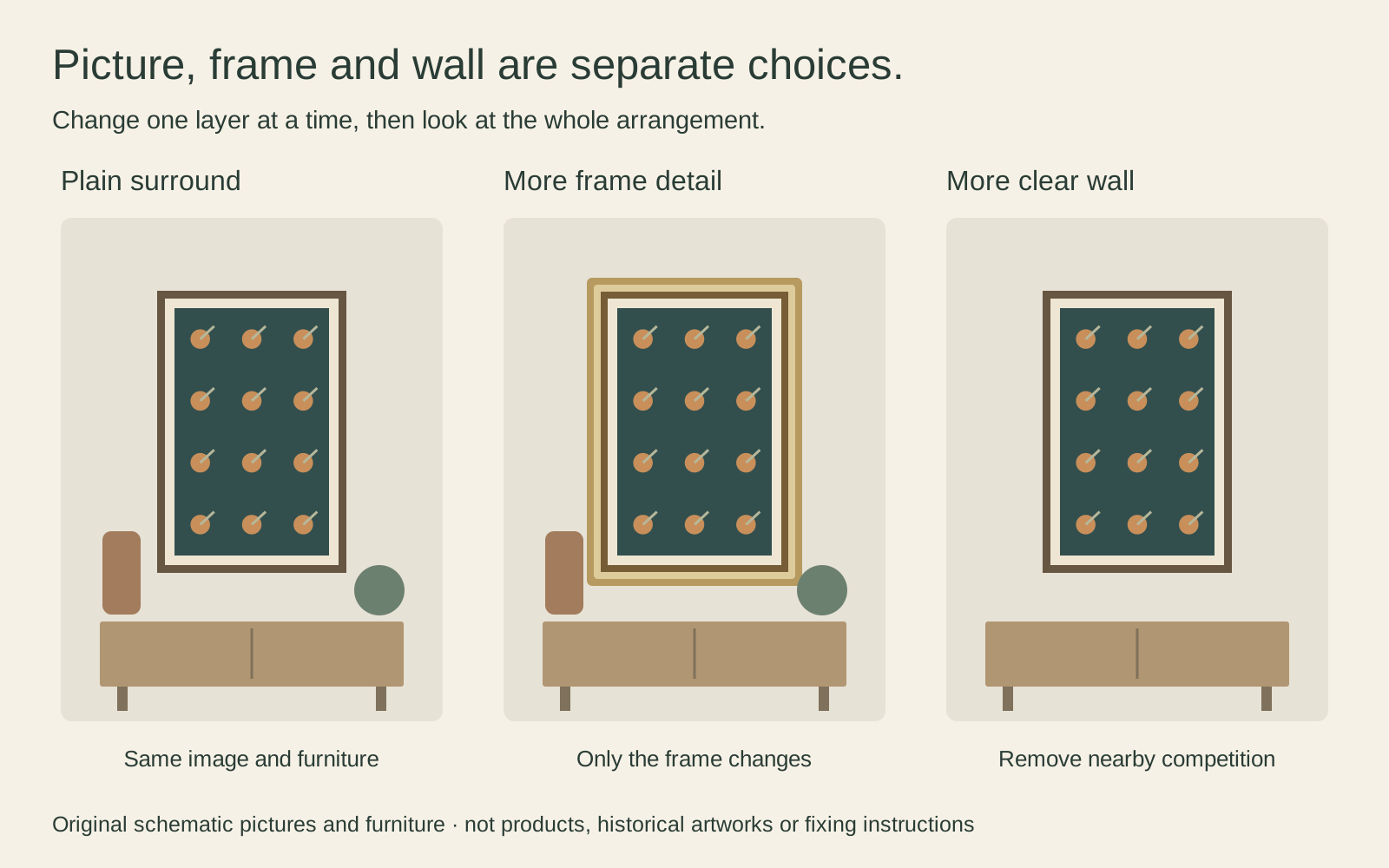
I would start with a simple surround and then try the decorative alternative, rather than assuming every Art Nouveau picture needs a scrolling gold frame. Photograph both samples with the actual image if possible. Small corner samples viewed alone can make a frame look less dominant than it will around the whole sheet.
If you enjoy an ornate combination, give it somewhere to be noticed. Moving a competing shelf ornament can be more effective than changing the print. You do not have to remove all other detail from the room; just decide which object should lead in that particular view.
Protect the border and the proportions
Measure the full image you intend to show, including decorative borders and lettering. Then distinguish that from the sheet, the mat opening and the outside of the frame. A listing that says only “50 × 70 cm” has not yet told you which of those measurements it means.
As an invented example, a full image measuring 30 × 45 cm has a 2:3 ratio. Enlarging it without distortion to 40 cm wide makes it 60 cm high, not 50 cm. A 40 × 50 cm image area therefore needs a crop or a different, smaller image with surrounding space. Those numbers demonstrate the geometry; they are not dimensions or offered sizes of the poster above.
Our custom print-size guide explains when a different mat or frame can preserve the full composition. Do not stretch a face or compress a decorative border to make an unsuitable rectangle fit.
Connect the design to modern furniture
A curved lamp, a plain dark cabinet or one muted colour from the image may be enough of a connection. You do not need to replace straight-edged furniture because the poster contains curves. The contrast between a detailed image and a simple object can make both easier to see.
Try separating Mucha and Morris across different parts of the room rather than hanging them together as a pair by default. A tall poster might suit the entrance; a smaller patterned print might belong beside a chair. Our guide to mixing frame colours and styles helps connect different images without forcing identical framing.
Check the reproduction not just the name
Look closely at lettering, fine repeated lines and any photographed fabric edge. A beautiful small thumbnail cannot tell you whether the source holds up at the size you want. Ask to see a useful detail or sample when one is available, especially if the small pattern is the main attraction.
Gold-coloured areas in an image are not a promise of metallic ink or leaf. Visible fabric texture in a photograph is not a promise of woven material. Check the actual print description rather than allowing the historical object’s name to supply missing specifications.
Keep the source, title and version with your purchase record. The room can be thoroughly contemporary while the works remain correctly identified. That combination is more useful than a period look built from attractive but anonymous fragments.
Editorial record
About this article
- Author
- Publisher
- GeMarkt
- Published
- Reviewed
- Internal source & rights check. Conducted by GeMarkt Research Review. This is an internal editorial check—not independent peer review.
- Source standard
- Buying guide source standardSeparates measured or first-hand evidence from general guidance and keeps practical limits visible.
Found a claim that needs checking? Report a factual error.