GeMarkt Blog · Practical guide
Art for White Walls
Make a white wall work with colourful, dark or pale art. Compare the image edge, frame and room before assuming that a blank wall needs a bold picture.

White walls can work with vivid colour, dark images or very pale art. The useful question is not “what colour goes with white?” but “how clearly should this picture stand apart from the room?” You can answer that with the image, its frame, or both.
Do not assume you need a huge colourful print to rescue an empty wall. You might prefer a restrained drawing beside a desk, one striking painting over a cabinet, or a small group with space between the frames. White gives you choices; it does not decide the composition for you.
Decide what the white wall should do
Begin by choosing the role of the wall. Is it the first thing you see on entering, a backdrop behind a busy dining table, or a quiet corner for reading? A picture that needs close attention may suit the corner better than a distant spot across the room.
Look at how much else is already visible. A patterned rug, bookshelves and colourful upholstery may give the room plenty to look at. In that setting, a pale work is a choice, not an absence. In a sparse room, a vivid picture can become the main event without needing matching accessories everywhere.
White walls are not visually identical. Compare your wall with the ceiling, door trim and a piece of plain white paper. You may notice a creamy, greyish or pinkish cast. Treat that observation as a reason to test the actual print and frame, not an instruction to buy a new paint colour.
Compare the image and its edge
Separate two decisions: what happens inside the picture, and what happens at the boundary. An image with strong dark lines may be legible against a white wall even in a light frame. A pale image may benefit from a clearer frame edge, though it can also look attractive with a deliberately soft boundary.
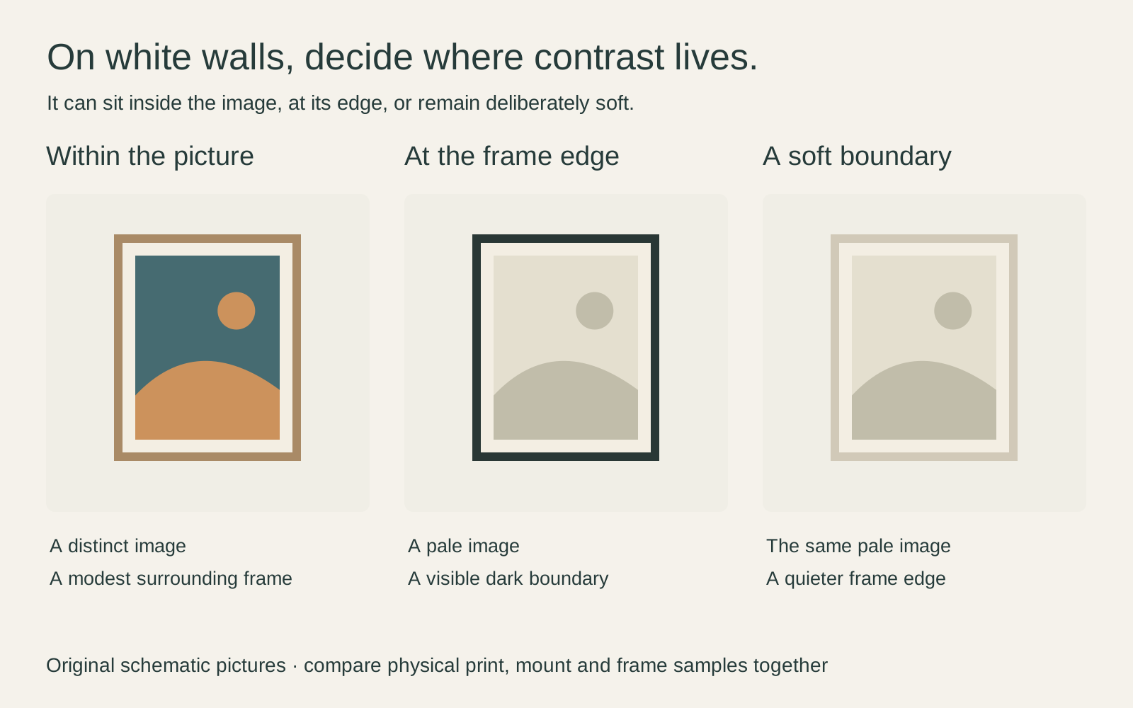
Imagine a white hallway with a black door handle and oak flooring. A dark frame can echo the handle; a wood frame can connect with the floor; a light frame can keep the outline less prominent. Try those alternatives before adding a bright image you do not particularly like.
Make the comparison at the intended size. A thin line on a small thumbnail can disappear when viewed across a room, while a broad dark frame may become more prominent than expected. The sample should help you judge the whole object rather than just its centre.
Look at white inside the artwork
Piet Mondrian’s Composition with Red, Yellow, and Blue is not simply a collection of bright rectangles. In Cleveland’s 1927 painting, a large pale area occupies much of the centre and right. Black divisions, red at the left, a thin yellow strip and blue near the bottom give that open area its structure.
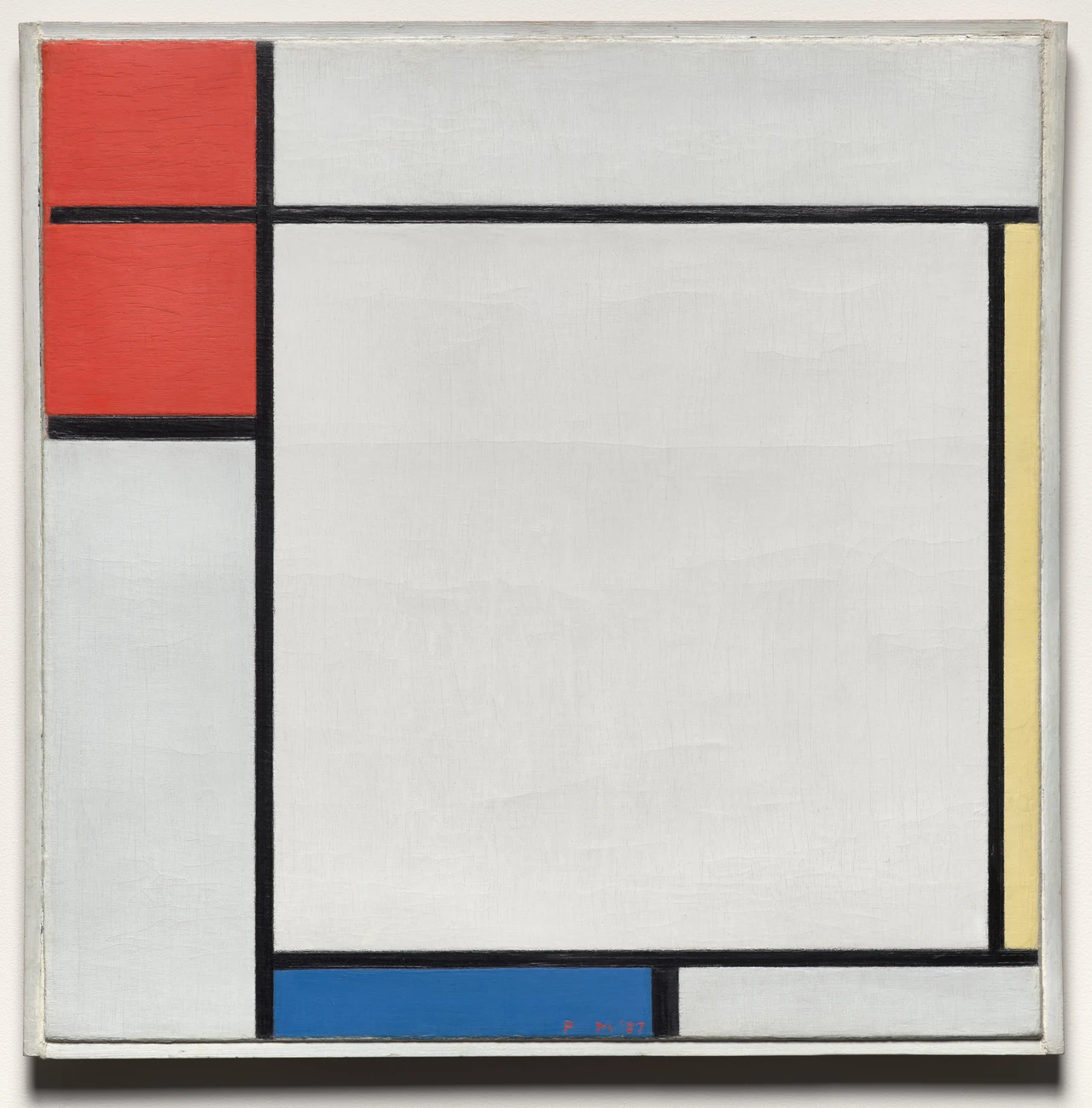
On a white wall, I would first try a simple surround and let the internal black lines do much of the organising. A second broad black border might be appealing, but it should be a deliberate addition rather than an automatic response to every modern-looking image.
Notice that the museum photograph includes the painting’s existing frame. A reproduction may retain that photographed surround. Check the seller’s image so you understand whether you are seeing a printed frame within the picture, an actual supplied frame, or both. Those are very different purchases.
Give pale art a deliberate place
A low-contrast landscape or drawing can be rewarding on a white wall when you can get close enough to enjoy it. Place it where the subtle detail is useful: beside a chair, over a small cabinet or along a route where you naturally pause. A remote high position may make a fine image feel blank.
If you want stronger separation, compare an off-white mat and a modest dark or timber frame. The mat need not match the wall exactly. Choose its colour beside the print, because a starkly different white may make the paper seem unexpectedly creamy by comparison.
The Albers Foundation’s account of colour in context emphasises learning through relationships between neighbouring colours. That is a useful reason to compare wall, paper and mat together. It is not evidence that there is one universally correct white for every print.
Use the frame without overpowering the picture
Think about the frame as another visible shape. A wide, dark frame around a quiet work may be exactly the bold outline you want, or it may drown out the image. Narrower is not always better; compare proportions instead of following a fixed frame-width rule.
For example, an illustrative 30 × 40 cm image with a 5 cm visible mat on each side makes a 40 × 50 cm rectangle before the frame moulding is added. That extra pale area can substantially change the wall arrangement. It is not the same as ordering a 30 × 40 cm outer frame.
Check the frame’s actual external dimensions and opening rather than treating that example as a fitting specification. The mat board guide explains the difference between the image, opening and surround.
Arrange a group with one clear connection
If several pictures share a white wall, they do not all need to share one colour palette. A repeated frame material, aligned upper edge, consistent mat treatment or related subject can give the group a connection. Choose the one that suits the works instead of forcing every connection at once.
For a small group, put the strongest dark or colourful image in position first. Then test its quieter neighbours. If one work attracts all the attention, decide whether you like that hierarchy before trying to make all three equally conspicuous.
Leave room for the wall itself. Empty space around a picture is part of an arrangement, not proof that you need another purchase. Our guide to mixing frame colours and styles offers more ways to make varied frames feel intentional.
Check the room before adding more colour
View the arrangement from the doorway and from where you sit. Is it the artwork that feels too quiet, or is it too small for the distance? Is the problem a faint image, a distracting reflection, or a frame that barely separates from the paint? Those problems call for different changes.
Try a paper outline for scale and a physical frame or print sample for appearance. Check under the lamps you normally use, as well as during the day. Keep a screen mockup as a layout aid, not a promise of identical print colours.
Only add more colour if that is what you actually want to see. A white room can support a single red passage, a dark engraving or a near-white landscape. A successful choice makes the work enjoyable to live with; it does not have to fill every visual silence.
Editorial record
About this article
- Author
- Publisher
- GeMarkt
- Published
- Reviewed
- Internal source & rights check. Conducted by GeMarkt Research Review. This is an internal editorial check—not independent peer review.
- Source standard
- Buying guide source standardSeparates measured or first-hand evidence from general guidance and keeps practical limits visible.
Found a claim that needs checking? Report a factual error.