GeMarkt Blog · Practical guide
Istanbul in Paintings and Old Prints
Choose historical Istanbul art for a home: a wide painted view, an intricate procession print or a quiet sketch, with practical scale and source checks.

Choose the kind of Istanbul picture you want to live with before choosing a landmark. A broad harbour view gives a room an expanse of sky and water. A closely worked old print asks you to notice people and buildings. A spare drawing can hold a memory of the city without dominating the wall.
The three works below offer those different possibilities. None is a substitute for a current map, and they do not show the same moment in the city’s history. Their makers also made choices: where to stand, which features to emphasise, and sometimes which earlier image to adapt. Knowing that makes the pictures more interesting, not less suitable for a home.
Read the title as part of the image
Historic catalogues and inscriptions often use Constantinople, while contemporary English normally uses Istanbul. Keep an artwork’s recorded title when naming it, then explain the modern place. The older word in a print title is historical information, not a reason to relabel today’s city throughout the room or article.
Museum catalogues can help connect the names without guessing. The Rijksmuseum’s record for Vanmour’s view uses Istanbul in its English title and Constantinopel in its subject indexing. It also identifies Pera with present-day Beyoğlu. These are useful search terms when looking for the same object in different catalogues.
Be specific about the view you want. “Istanbul” might mean a distant skyline, a waterway, a procession or an interior. If the connection is personal, a recognisable stretch of water may matter more than the most famous building. Write down that preference before browsing, so a dramatic but unrelated image does not win simply because its thumbnail is brighter.
A wide painted view for the main wall
Jean Baptiste Vanmour’s View of Istanbul from the Dutch Embassy at Pera, dated about 1720–1737, is an oil painting in the Rijksmuseum. The museum identifies the Golden Horn in the foreground, the Bosporus at left and the palace area on the right-hand hill. Its recorded original dimensions are 142 × 214 centimetres.
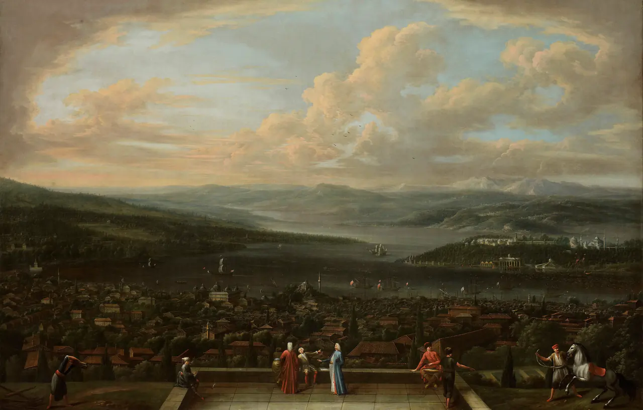

The sky occupies a large part of the image. The city is darker and more densely worked below it; the small foreground figures give the expanse a human scale. From across a room, you are likely to notice that broad division before individual roofs or boats.
That makes it worth trying above a long piece of furniture, where a horizontal composition can be seen as a whole. It does not need to be enormous. Test whether you enjoy the light sky and dark foreground at your usual seated distance, rather than buying a larger print only to make every tiny building readable.
A plain frame could leave the distant city as the main point of attention. If you prefer an ornamented frame, compare the complete framed outline with nearby shelves and lamps. More ornament is not automatically more historically appropriate for a reproduction in a modern room.
A procession print for looking closely
William Hogarth’s Procession through the Hippodrome, Constantinople, 1723–24, was made for Aubry de La Mottraye’s travel book. The Met identifies it as an etching and engraving after Jean Baptiste Vanmour. It also explains a significant alteration: Hogarth reversed an earlier marriage procession and moved it from a country setting into the city.
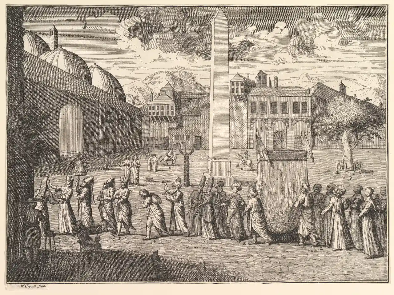
The historical subject does not make this a neutral record of one witnessed event. Its adaptation is part of what you are looking at. Keep that information with the print rather than describing it as a precise photograph-like view of the old city.
At home, the procession offers a different experience from the broad painted panorama. Repeated hats, folds and architectural lines create a dense surface. Near a desk or on an approachable hallway wall, someone can stop and explore it. Across a large room, those same lines may merge into an overall dark pattern.
Consider a mount that separates the printed sheet from a busy wall colour. Keep the edges and inscription visible where possible. A sharply cropped enlargement may make the people larger, but it also removes evidence that this image was a printed page with a maker and a publication history.
A small sketch for a quieter corner
The Met records Leaving Constantinople (from Sketchbook) as a 1904 graphite drawing by Mary Newbold Sargent. It is not by John Singer Sargent. The sheet measures 13.3 × 21 centimetres, a scale very different from Vanmour’s large canvas.
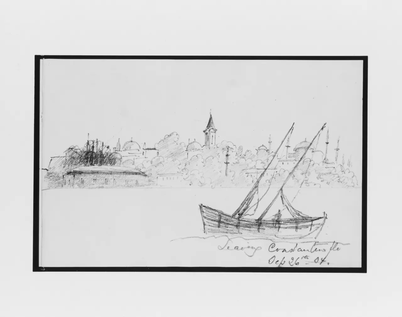
The boat’s diagonal masts cross the low skyline. Much of the page remains lightly marked or empty, and the handwritten title gives it the feeling of a particular moment recorded on paper. Those are qualities to preserve, not flaws to fill with added colour.
Try this kind of drawing in a small frame where you can approach it: beside a reading chair, near a personal photograph or within a compact group. It need not compete with the strongest painting in the room. A reproduction can retain a modest scale even when the digital file would permit something larger.
Notice that this supplied photograph includes a dark rectangular surround. It is part of the digital reproduction shown here, not a promise that a physical black frame comes with a print. Check the exact file and product preview rather than assuming those borders will match.
Choose the viewing distance before the frame
Put a temporary paper outline on the intended wall and look at it from where you normally sit or pass. Include the outer frame dimensions, not merely the printed image. A wide skyline and a small drawing can occupy the same nominal paper size while using very different amounts of that sheet.
As a simple arrangement example, two outer frames each 50 centimetres wide with an 8-centimetre gap require 108 centimetres of wall width. Centred over a 160-centimetre cabinet, that would leave 26 centimetres on each side. These are planning numbers, not a universal furniture-to-art ratio or an installation specification.
Check reflections in the actual location before committing to glazing. A beautifully detailed print can be difficult to see if the main viewing angle catches a window. Our glass and acrylic guide explains the material choices without assuming that every picture needs the same solution.
Build a pair around one real connection
The Vanmour panorama and Hogarth procession share more than a place name: the print’s source relationship is documented. Yet one offers painted colour and distance while the other offers tightly worked lines and a staged crowd. A pair can make that difference visible instead of pretending they belong to a matching historical set.
Alternatively, combine a city view with a contemporary photograph of your own. Keep the dates and viewpoints separate. A similar curve of water or arrangement of roofs can connect them without claiming the older image proves exactly how a neighbourhood looked.
Matching outer frames can help relate images of unequal shapes. Do not stretch either composition to make their horizons align. Our pairing guide covers ways to arrange companions without turning independent works into an invented diptych.
Check the whole file before printing
All three examples have specific source records: the Rijksmuseum image through Commons carries public-domain/CC0 information, and the two Met images are identified as public domain under the museum’s Open Access policy. Those records apply to the selected files, not every image returned by an Istanbul search.
Keep the title, artist, date, collection and file link together. Inspect the complete image for existing borders, inscriptions and trimmed edges. A web illustration is also not automatically the file you should send to a printer: check the original download’s pixel dimensions and the proposed physical output.
Choose the view you can return to with pleasure, whether it is crowded, expansive or spare. Historical accuracy does not require a room full of labels, but knowing what the picture is makes it a more lasting choice than a generic souvenir skyline.
Editorial record
About this article
- Author
- Publisher
- GeMarkt
- Published
- Reviewed
- Internal source & rights check. Conducted by GeMarkt Research Review. This is an internal editorial check—not independent peer review.
- Source standard
- Buying guide source standardSeparates measured or first-hand evidence from general guidance and keeps practical limits visible.
Found a claim that needs checking? Report a factual error.