GeMarkt Blog · Practical guide
Winter Wall Art: Snow Scenes from Bruegel to Hiroshige
Choose winter art by the kind of scene you enjoy: Bruegel’s busy valley, Hiroshige’s village or a snowy shrine. Compare detail, colour, framing and placement.


Choose winter wall art by its scene and contrast, not just by the presence of snow. A crowded valley, three travellers on a village road and a shrine beside blue water offer very different things to look at. Decide whether you want human activity, a spare arrangement of roofs and hills, or a carefully structured view across water.
Winter art also need not be Christmas decoration. These three historical works can remain interesting after the holiday objects are packed away. The aim is to find a reproduction you like living with, at a size and in a position where its particular details remain visible.
Decide how much winter you want to see
Start by looking beyond the thumbnail’s pale colour. Are people walking, working, skating or struggling? Does the scene contain a hunt? Are buildings the main attraction, or do you prefer an almost empty landscape? These questions help avoid a picture that fits the room’s palette but not the household’s interests.
For a large shared living room, you might enjoy a scene that keeps revealing incidents. For a small reading area, one clear foreground shape may be enough. That is a choice about viewing, not a universal claim that detailed pictures are exciting or snowy pictures are calming.
Think about when you use the room. A fine branch against a dark sky may look good close up in daylight but nearly vanish from your usual chair at night. Before choosing a very small reproduction, inspect the image at a comparable apparent size on screen, then use a paper outline to judge the finished frame’s footprint.
Bruegel’s valley rewards a closer view
Pieter Bruegel the Elder painted Hunters in the Snow (Winter) in 1565. The Kunsthistorisches Museum’s account places it in a seasonal series. It combines hunters returning with dogs, people on the ice and a landscape that joins mountain forms with village buildings.
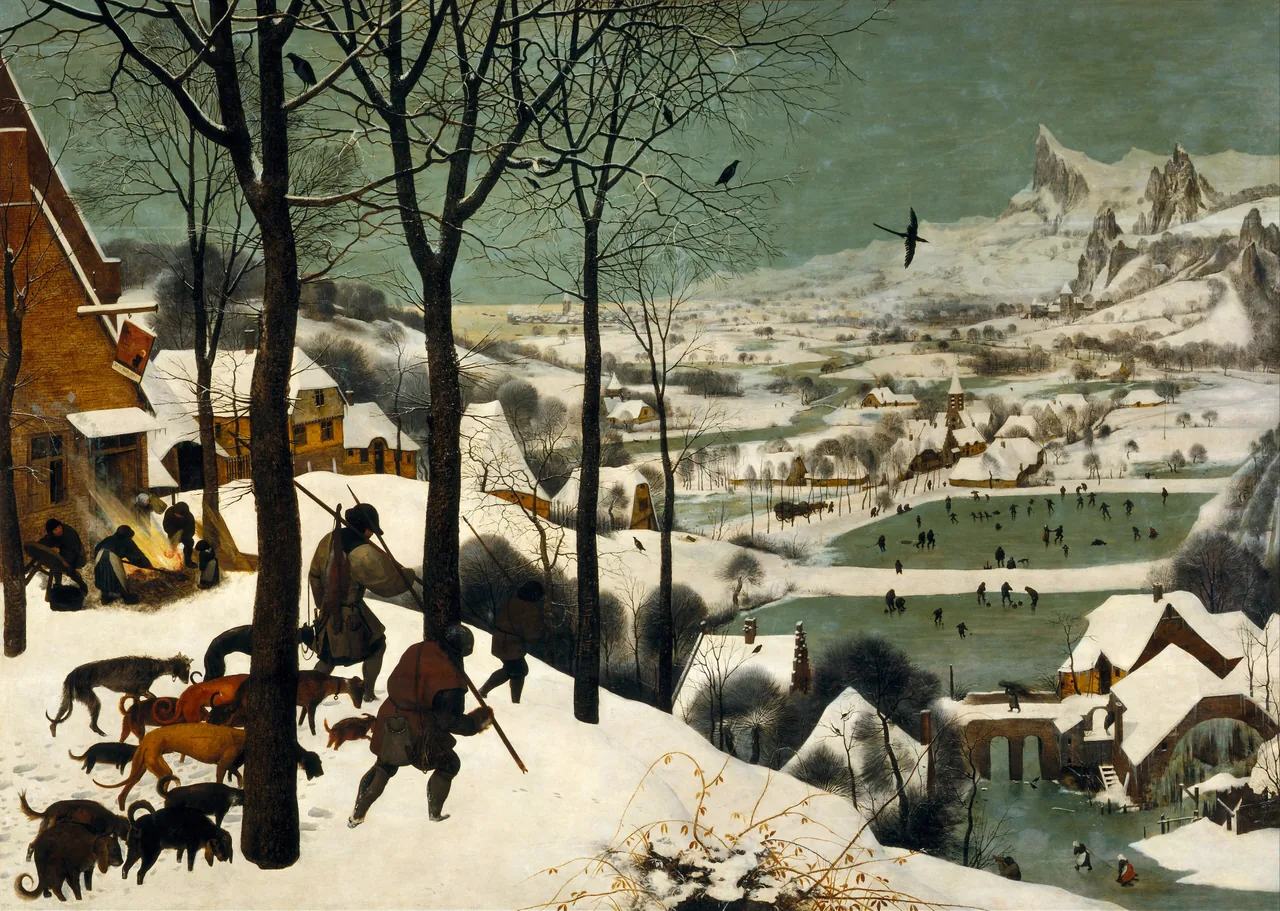
From across the room, the dark trees and descending slope do much of the work. Closer to the picture, the small people on the ponds and the buildings become important. I would choose it for a wall you can approach, rather than a high space where the lower half is permanently hidden behind furniture.
Do not crop it down to the hunters simply because a narrower frame is available. That removes much of the connection between their return and the village below. A clearly labelled detail print is a different choice; it should not replace the full view without your noticing.
The hunting subject deserves attention, too. This is not an anonymous snowy village. If that part of the scene is unwelcome in your room, choose another winter picture rather than relying on the small scale to conceal it.
Kanbara makes the pale areas count
Hiroshige’s Kanbara: Evening Snow, about 1833–34, is a colour woodblock print from his Fifty-three Stations of the Tokaido series. The Art Institute of Chicago holds this impression.
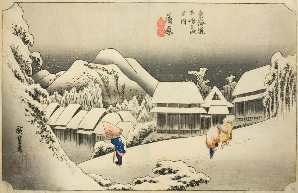
The roofs, road and hills make a connected pale structure. Dark walls and trees interrupt it, while the three figures supply small areas of stronger colour. You do not need to turn the print into black and white to use it in a restrained room; its existing touches of colour are part of the interest.
Against a dark wall, the pale image will make a distinct rectangle. Against a light wall, a narrow dark frame might help define its boundary. Compare both before deciding that Japanese prints require either natural wood or a black frame.
Keep the inscription and the paper edges visible when evaluating a reproduction. Removing them to make a cleaner-looking crop changes what you are buying. A broad mat may give the image room around it, but it should not swallow so much of the available wall that the actual print becomes too small to enjoy.
The shrine offers a different kind of order
Hiroshige’s Snow at Benzaiten Shrine in Inokashira Pond, about 1844–45, provides a useful comparison with the village road. It belongs to Snow, Moon, and Flowers at Famous Places.
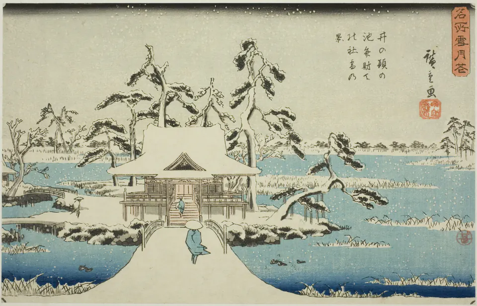
The approach leads almost straight towards the building, while the twisting trees stop the composition from becoming a rigid diagram. Blue water occupies substantial space. Choose it if that combination appeals to you, rather than assuming all of Hiroshige’s snow scenes have the same grey palette as Kanbara.
A low cabinet with few objects above it would let the approach remain easy to see. A tall vase placed directly in front of the centre would block the route into the picture. If you want objects on the cabinet, try grouping them to one side and check from the place you normally enter the room.
Compare the snow with your wall and mat
Snow in a reproduction is not necessarily the same white as your paint, curtain or mounting board. In these images, pale areas sit beside greens, greys, blues and the colour of the reproduced paper. A very bright white mat may emphasise that difference; a softer white may make the transition less abrupt.
Neither approach is inherently more faithful. The print should retain the source image’s colours, while the physical mat is a separate decorating choice. Do not ask for the image to be bleached to match a new mat, or assume that every cream area is dirt that should have been removed.
View a sample or your existing print beside the actual framing materials when possible. Screen brightness can make a pale image appear far more luminous than printed paper. Our guide to why prints differ from screens explains that distinction without promising an exact screen match.
Give the whole scene enough room
All three examples are horizontal, but their shapes are not identical. Check the actual image size, sheet size and finished framed size. The outside dimensions determine the space on your wall; the image dimensions tell you how much room the snow scene itself receives.
For a pair, test paper rectangles first. Two hypothetical frames 45 cm wide, separated by 8 cm, occupy 98 cm across. That measurement excludes any additional space you want around the group. It is a layout example, not a prescribed gap or a statement that these works are sold in that format.
A single winter work can also sit among pictures with no seasonal connection. Repeating a dark frame or a pale mat may be enough to make the group readable. You need not replace every neighbouring image with a snow scene.
Choose a picture that outlasts the holiday
Before ordering, ask whether you would still want the image without candles, greenery or a seasonal table arrangement. If so, it is probably serving as a picture rather than merely filling a decorating slot. That gives you the freedom to leave it up or bring it back in another year.
Keep the work clear of candle flames, heat sources and decorating arrangements that could touch it. Use the room-location guide if the intended spot is above a heater or fireplace; the winter subject does not make the physical print resistant to heat.
Choose Bruegel for a wide, inhabited landscape you want to explore, Kanbara for the relationship of pale snow and dark village forms, or the shrine for its approach through blue water. The strongest choice is the scene you keep returning to after its seasonal label stops mattering.
Editorial record
About this article
- Author
- Publisher
- GeMarkt
- Published
- Reviewed
- Internal source & rights check. Conducted by GeMarkt Research Review. This is an internal editorial check—not independent peer review.
- Source standard
- Buying guide source standardSeparates measured or first-hand evidence from general guidance and keeps practical limits visible.
Found a claim that needs checking? Report a factual error.