GeMarkt Blog · Essay
Vienna Secession vs Art Nouveau: How They Overlap
Compare Mucha, Moser, Gallé and Olbrich to see why the Vienna Secession was an association within a wider Art Nouveau world, not its opposite.


The Vienna Secession and Art Nouveau overlap; they are not opposing styles. The Secession was a particular artists’ association founded in Vienna in 1897. Art Nouveau is the broader name used for an international movement in art and design around the turn of the twentieth century. One describes an organisation and its history; the other helps describe a family of approaches to making things.
That difference explains why a museum can discuss a Secession designer under Art Nouveau without contradicting itself. It also explains why two members of the association need not make similar pictures. Four objects, arranged in two pairs below, make the distinction more useful than a contest between “Viennese geometry” and “French curves.”
Two labels answering different questions
According to the Leopold Museum’s account of Vienna around 1900, the Secession broke from the conservative Künstlerhaus cooperative to create a platform for contemporary and international art. Gustav Klimt was its first president; founders included Koloman Moser, Carl Moll, Josef Hoffmann and Joseph Maria Olbrich. Membership and exhibitions give the term a specific historical meaning.
Art Nouveau does not have an equivalent single membership list. The V&A describes an international movement whose regional forms combined natural motifs, fluid or geometric lines and an interest in how decoration relates to structure. It crossed buildings, furniture and printed sheets rather than belonging exclusively to painting.
So ask two separate questions: was this maker connected with the Vienna association, and what visual or design ideas does this object share with Art Nouveau? The answers may overlap, but neither question makes the other unnecessary.
Mucha and Moser: what is the line doing?
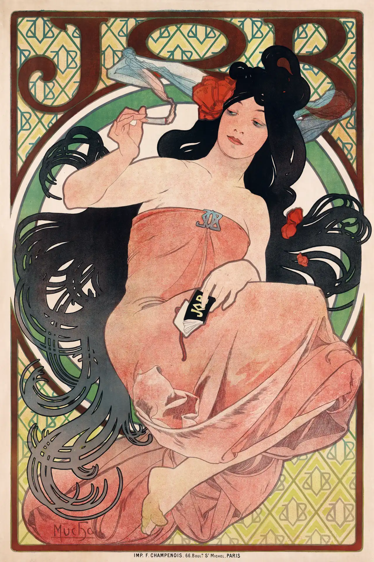
Mucha’s poster tries to hold attention across the entire sheet. The large lettering establishes a name; the small repeated monograms keep that name present behind the figure. Hair supplies an elaborate dark border within the printed border. Even the hand holding the packet returns the eye to the advertised product. The Library of Congress identifies this as the 1898 cigarette-paper advertisement, not the different JOB design of 1896.
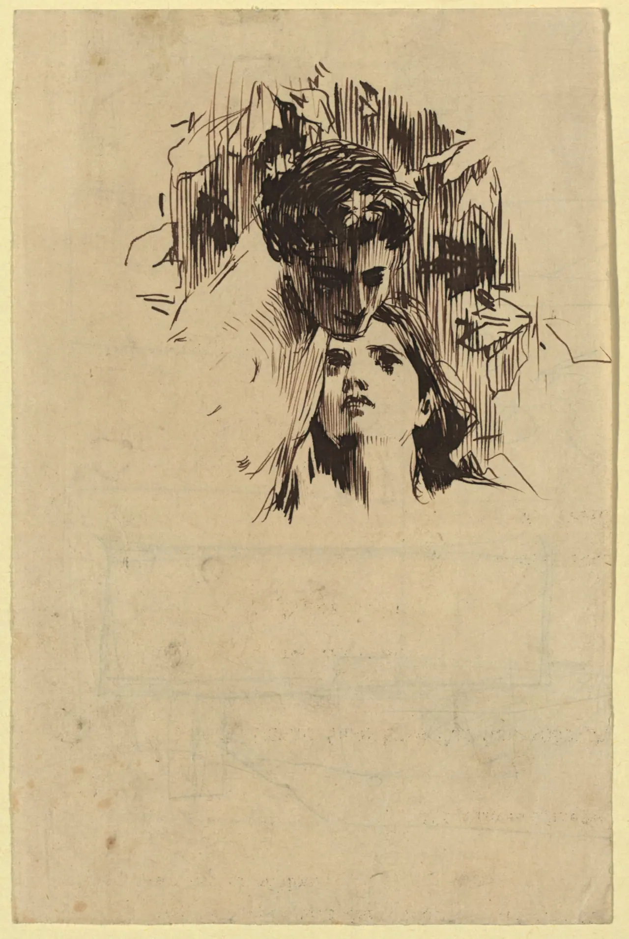
Moser’s drawing concentrates attention instead. The two heads meet near the upper centre, while most of the lower paper remains empty. The tight strokes behind the darkened face provide a background without describing a furnished room. Follow one long curve around a shoulder, then compare the abruptly ending marks beside it: a contour can suggest a body without enclosing everything.
The Wien Museum dates this sheet to about 1900 and records its height as only 17.1 centimetres. It is a small pen drawing, not a mass-produced poster. Our equal display widths do not mean equal original sizes.
Both images use emphatic outlines and selective areas of detail. Their purposes differ, however: branding organises Mucha’s sheet, while an encounter between two people organises Moser’s. Calling the first “curved” and the second “geometric” would miss what is actually visible. This pairing tests how line works, not whether every Mucha picture or Moser drawing follows one formula.
Gallé and Olbrich: where does the ornament stop?
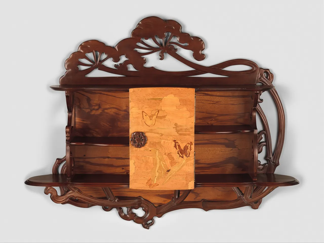


A cabinet and an exhibition building are not interchangeable objects. Putting them together is useful precisely because the comparison crosses scale and function. In each, ask whether the plant motif changes the outline, occupies a flat surface or appears to hold something up.
Gallé’s flower heads rise above the cabinet like a second, irregular roof. Curving stems reach along its sides, while the pale central door stays rectangular. Butterfly imagery sits within that door rather than reshaping its edges. The Met identifies a stained beech case with several kinds of veneer: different woods help organise the surface as well as the carved outline.
In the Olbrich photograph, flowers spread across upright strips of wall beside the windows. Their stems do not hide the rectangular openings or pretend to be structural columns. White space separates the decorated areas. A piece of the gilded leaf dome appears above the roof, concentrating colour rather than distributing it everywhere.
The NGV dates the building to 1898 and describes the relationship between its simple forms and gilded foliage. This modern side view is not a photograph of the complete façade on opening day. Still, it demonstrates why geometry is not the absence of nature: one design can contain both. Gallé’s cabinet, equally, has plenty of straight lines.
Jugendstil and Secession style are not passports
Names travelled through journals, exhibitions and design markets. The Met’s Art Nouveau essay explains regional terms including Jugendstil in Germany and Sezessionstil in Austria and Hungary. These names help locate a discussion; they are not rules that prevent ideas crossing a border.
“Viennese” can describe where an object was made or the context of its maker. “Secessionist” can point towards an association, an exhibition or a visual connection. Those are not identical statements. A later object influenced by Vienna does not become an item from an 1897 exhibition, and an ornate object made in France does not automatically belong to Art Nouveau.
Keep the catalogue’s exact description beside your visual impression. If one source calls a design Jugendstil and another places it in Art Nouveau, there may be no disagreement to resolve. They may simply be working at different geographical levels.
The workshop and the later paintings need their own dates
Another name often appears in this story: Wiener Werkstätte. The Leopold Museum identifies its founders in 1903 as Hoffmann, Moser and Fritz Waerndorfer. It was a workshop organisation, not an alternative name for the Secession. Shared people and ambitions explain the connection without erasing the distinction.
Nor did a founding member’s career remain tied to the association forever. The NGV records Klimt, Hoffmann and Moser leaving in 1905. Consequently, describing every later Klimt painting as “a Secession work” needs more care than recognising its Viennese context. Gold alone cannot settle the question.
This is where chronology improves looking. A date can show that two objects were contemporary, or that a resemblance crosses several decades. It cannot by itself prove who influenced whom. The broader Vienna Secession guide follows the founding group and its later artistic surroundings without treating them as one membership list.
Compare the object before choosing the label
Start with one visible relationship. Is the figure separate from its background, as Moser’s pale face seems to be, or locked into a repeated pattern like Mucha’s advertisement? Does ornament project beyond an edge, as on Gallé’s cabinet, or remain within a wall surface, as in the Olbrich detail?
Then identify the object’s job. A printed advertisement, a drawing, a storage cabinet and a public exhibition building solve different problems. Their decoration cannot be judged only by how much of the image it fills. What looks quiet on a screen might be physically large; what looks monumental may be a small sheet.
Finally, bring back the maker, date and institutional connection. That sequence gives the label something concrete to describe. Our Art Nouveau guide offers more objects for testing the comparison rather than a stricter set of boxes.
What the images can and cannot tell you
These reproductions make close comparison possible, but they do not reproduce the sheen of wood, the depth of carving or the experience of walking around a building. The photographs also have their own framing and dates. Keep those differences visible when comparing materials or scale.
The captions identify each particular file and its terms. A CC0 museum image, a public-domain assessment of a historical poster and a photographer’s Creative Commons licence are different kinds of evidence—not permission automatically attached to an entire movement. Above all, the two labels need not compete: the Secession tells us who organised a particular artistic break; Art Nouveau helps us see the wider design conversation around it.
Editorial record
About this article
- Author
- Publisher
- GeMarkt
- Published
- Reviewed
- Internal source & rights check. Conducted by GeMarkt Research Review. This is an internal editorial check—not independent peer review.
- Source standard
- Art history source standardPrioritises object records and research sources, distinguishes evidence from interpretation, and states material uncertainty.
Found a claim that needs checking? Report a factual error.