GeMarkt Blog · Practical guide
Teen Room Art: Posters with a Story
Build a teen room around pictures they actually want: connect interests to art, compare wall positions and leave room for the collection to change.

A teen room does not need a special category of “teen art.” It needs pictures the person using the room wants to live with. Begin with one image they can explain in their own words: a place they want to visit, a scene that feels like a story, a striking shape or a subject they already enjoy.
If you are choosing together, offer a small selection and leave room for a genuine no. The aim is not to disguise an adult’s decorating scheme as a gift. A poster becomes more personal when its owner has a reason to keep looking at it, whether or not that reason matches yours.
Let the person using the room choose
Start with the room as it is used today. Where do they read, listen to music, work, make things or talk with friends? Which wall do they see from the bed or desk? A blank wall above the headboard may be prominent in a photograph but invisible to someone lying in bed.
Ask for three images they like before asking for a colour scheme. Notice what connects them: perhaps dramatic skies, intricate drawings, a city, an animal or a particular kind of lettering. Those connections can guide a selection without turning the room into a theme park.
Agree what is fixed and what is open to choice. A shared room, rental agreement or existing frame may set real limits. Explain those limits directly. Within them, let the teenager choose the image, rather than only allowing a choice between two frames around a picture already selected for them.
Start with an interest, not an age label
An interest gives you a better starting point than an assumption about what all teenagers like. Someone interested in the sea might prefer a turbulent wave to a quiet beach. Someone who draws may want a work with marks they can study closely. A person interested in buildings may enjoy a city view without wanting an entire travel-themed bedroom.
The connection can be loose. A poster need not illustrate a school subject or communicate a useful lesson. It can simply be funny, strange, beautiful or full of questions. Avoid turning every choice into homework by attaching a long explanation to it.
If they cannot decide, keep a small shortlist somewhere they can revisit. Which image do they return to after a few days? That is more useful than buying several coordinated posters in one sitting because they happen to share a palette.
Look for the story inside the picture
Hokusai’s Great Wave is a useful example of an image that offers more than a recognisable silhouette. The Met identifies this impression as a woodblock print from about 1830–32, belonging to Thirty-six Views of Mount Fuji. Its account explains the perspective that makes the distant mountain appear small inside the curl of the wave. See the museum’s exact object record.

Look together for the people in the boats before talking about style. From a distance the wave dominates; closer up, the small figures make the scene feel different. A useful question is “What did you miss the first time?” rather than “Do you understand this famous artwork?”
If the image becomes a favourite, our Great Wave story offers a longer look. The room itself need not carry a museum label: a title and source saved with the order may be enough to keep the story available.
Separate a favourite picture from changing notes
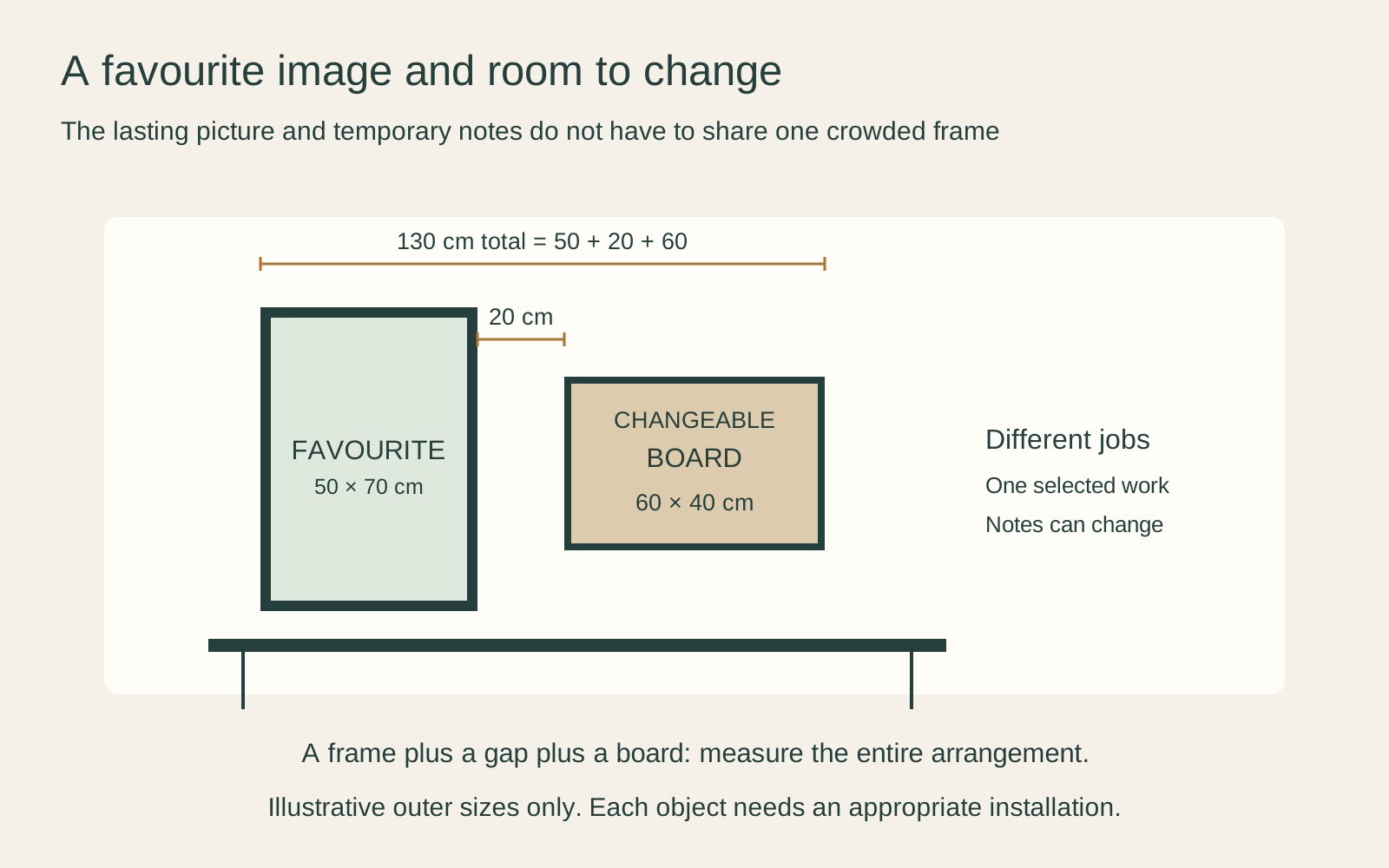
Give the favourite image a stable place and let the more temporary material change around it. A framed print and a separate board for postcards, schedules or sketches do different jobs. Combining everything in one crowded cluster can make the chosen artwork hard to see.
The diagram uses a 50 × 70 cm outer frame and a 60 × 40 cm board, with an illustrative 20 cm gap. Together they span 130 cm: 50 + 20 + 60. This is an invented composition, not a required gap or a mounting plan. Check the real furniture, fixtures and wall before adopting it.
Choose a size for the way it will be seen
A small, detailed picture can work beside a desk if it is easy to approach. An image intended to be read from the doorway or across the room may need a different size. Test the chosen image as well as a blank frame outline: a large mat can make a small picture appear physically substantial without making its details any easier to see.
For a shared room, try the template from both beds and workspaces. It is possible to create a personal area without drawing a strict line down the room or forcing both sides into matching sets.
Check how much of the image a proposed size preserves. Do not stretch a famous work to fill a frame or assume a crop is harmless. The boats and mountain in the Great Wave, for example, are part of the reason to choose it, not spare edges to discard automatically.
Make change affordable without making everything disposable
Decide how much of the arrangement is likely to stay. A well-chosen existing frame might serve several images over time, provided the next work fits appropriately. Keep its usable opening, glazing and outside measurements; a nominal frame size alone may not tell you what a particular print will show.
For an inexpensive current poster, a simpler display may suit the owner better than a costly permanent treatment. For a drawing, signed print or sentimental object, discuss appropriate mounting with a framer rather than assuming that every sheet can be pinned or taped.
The Library of Congress advises against ordinary self-adhesive tape, glue and damaging fasteners on works on paper; see its handling guidance. If a picture is worth keeping, choose a display method with that in mind instead of expecting it to survive whatever held last month’s timetable.
Check the file and the physical object
When printing a download, check the permission for the exact file, its pixel dimensions and the proposed output size. “Found online” does not mean available for unrestricted printing. The Met’s Open Access policy covers the public-domain image shown here; it is not a licence for every poster, photograph or character image on the internet.
For a physical purchase, check whether the listing supplies a print, a frame, both or a digital file only. Show the teenager the actual product choice rather than just a room mockup: the frame in the photograph may be illustrative.
Save the artist, title and source with the purchase details. That small record makes it easier to find the work again, choose a related image later or explain why this particular version was selected.
Agree the practical details before hanging
Confirm permission to fix items to the wall and use a method appropriate to the wall, full assembly and manufacturer’s instructions. A removable product is not automatically suitable for every painted surface, object or location. Do not let a preferred composition overrule a practical installation problem.
Also check the room’s camera view if it is used for calls. Personal timetables, addresses and photographs may be visible behind the desk even when the chosen art is not. Move private information out of that view rather than asking the whole room to become a blank background.
Finish with one picture they want, in a position they can enjoy, and enough flexibility for the room to change. The story can begin with a wave, a place or a favourite sketch. It does not have to predict who they will be in five years.
Editorial record
About this article
- Author
- Publisher
- GeMarkt
- Published
- Reviewed
- Internal source & rights check. Conducted by GeMarkt Research Review. This is an internal editorial check—not independent peer review.
- Source standard
- Buying guide source standardSeparates measured or first-hand evidence from general guidance and keeps practical limits visible.
Found a claim that needs checking? Report a factual error.