GeMarkt Blog · Practical guide
Symmetrical vs Asymmetrical Layouts
Compare symmetrical and asymmetrical gallery walls using the same five frames, with practical ways to choose an axis, distribute pictures and test balance.

A symmetrical arrangement repeats frame positions around an axis, usually a vertical line. An asymmetrical arrangement does not mirror those positions. Either can feel settled or awkward, depending on the pictures, the gaps and the wall around them.
If you like precise repetition, start with symmetry. If your pictures differ greatly in size or you want one work to lead, try an asymmetrical group. You do not need to assign your whole home to one camp, and neither approach belongs exclusively to traditional or modern interiors.
What changes and what stays the same
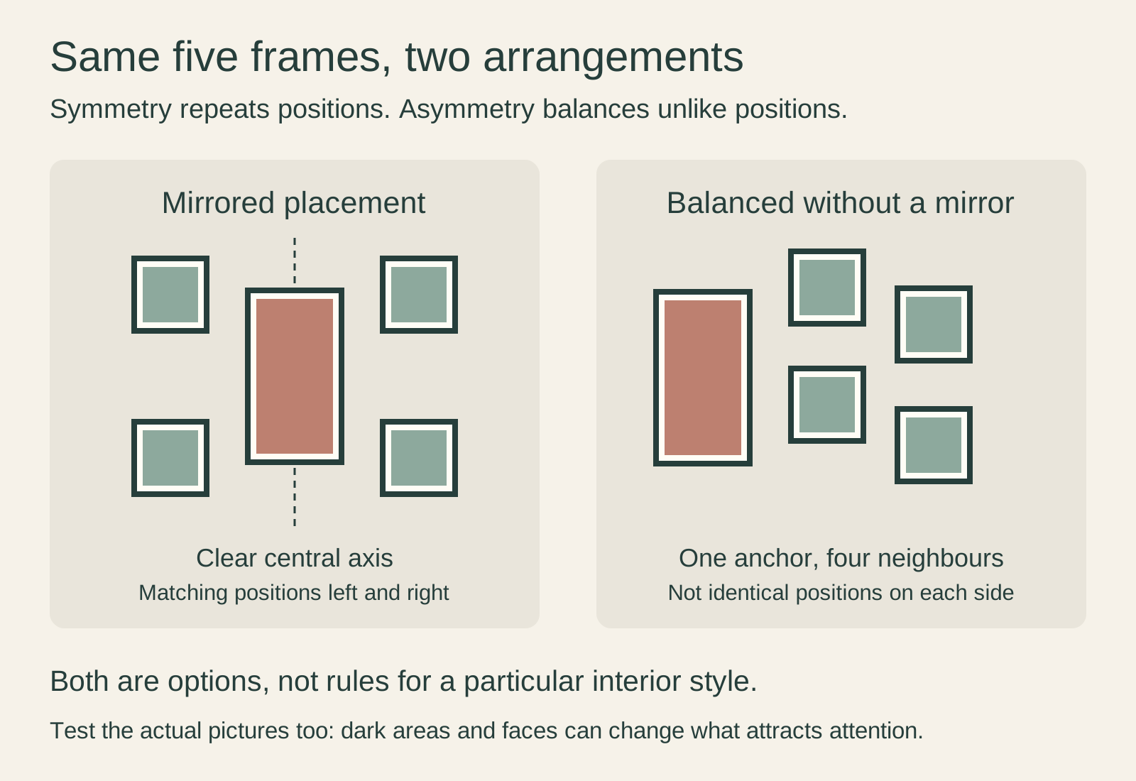
The diagram uses exactly the same inventory twice: one tall frame and four small square frames. On the left, the tall frame sits on the centre line, with matching positions on either side. On the right, it moves to the left and the small frames occupy different positions beside it.
The first arrangement makes the repeated positions obvious. The second asks you to judge a group of unequal shapes without a mirrored plan. In both, the pictures remain upright, the large frame remains large, and there is space between neighbouring frames. The change is in their relationship, not in a special type of art.
Choose an axis you can explain
For a symmetrical group, decide what the central line belongs to. It might be the middle of a sofa, a sideboard or the usable section of wall between two doors. Those centres may not coincide.
Suppose a sofa sits off-centre because the room needs a clear walking route. Centring the pictures on the entire wall may leave them looking detached from the sofa. Try the furniture centre first, then compare the alternative. This is our practical design starting point, not a rule that overrides the room’s use.
A nearby floor lamp does not necessarily require a matching lamp on the other side. The frame group can be symmetrical while the room is not. Decide how much of the scene you are trying to mirror before buying more objects to complete a pattern.
Symmetry does not require identical pictures
Matching outside frame sizes can hold different subjects. Two landscapes can occupy mirrored positions without depicting the same place, and a portrait can stand at the centre between smaller still lifes.
Look at the mat as part of that outer shape. A wide mat around a small picture can give it an outside frame size that pairs with a larger image. That is often more useful than enlarging or cropping the art solely to make the frame dimensions match.
The pictures themselves can still pull attention in different directions. A pair of equal frames containing a mostly pale landscape and a dark close-up portrait is geometrically symmetrical, but it may not seem visually equal to you. That is not a mistake the ruler can diagnose. Swap their positions and judge the actual images.
Build asymmetry around one clear decision
For a first asymmetrical group, choose one anchor: usually the largest frame or the picture you want to see first. Set its position, then arrange the other works in relation to it. Moving every picture at once makes it difficult to understand what improved.
Keep one useful connection while you experiment. You might repeat a frame finish, use similar gaps in a cluster, or align two neighbouring edges. American Frame’s mixed-wall guidance offers common frame colours and mat treatments as ways of connecting different pieces. Use whichever connection suits your pictures; you do not need all of them.
Asymmetry is not a licence to leave accidental slivers of space between frames. If a narrow gap attracts more attention than either picture beside it, open the gap or move the pair. The empty areas are part of what you are arranging.
Test the pictures as well as the frames
Paper rectangles are good for testing the group’s footprint. They cannot show you the effect of a bright patch of red, a dark background or a face. Once the frame positions seem plausible, compare them with small reproductions of the actual images or a digital sketch that includes them.
Try a simple diagnostic: name the picture you notice first, then the second. If the first is meant to be the large landscape but your eye repeatedly goes to a small, high-contrast portrait at the edge, decide whether you like that. You might move the portrait closer to the landscape or let it become the anchor instead.
This is a personal viewing test, not a formula for measuring visual weight. There is no need to assign every colour a score or assume an odd number of frames is automatically better. Four pictures you want to see are a better starting set than five chosen to satisfy a slogan.
Think about the next picture
A symmetrical arrangement is easiest to extend when the addition preserves its pattern. An extra pair can maintain left-right repetition; a complete row can extend a grid. Framebridge demonstrates that distinction in its guidance on expanding gallery walls.
An asymmetrical group may accept one new picture without requiring a partner, but it still needs enough wall space. Before treating it as permanently expandable, sketch where the next frame could go. If every edge already reaches furniture or a doorway, the group is full regardless of its style.
You can also keep the arrangement and exchange pictures inside suitable frames. A collection does not have to grow physically every time your interests change.
Compare two versions before you commit
Make one mirrored version and one varied version with the same works. Keep the overall size reasonably similar so that you are comparing arrangement rather than a tiny group with a sprawling one. View both above the actual furniture, not only on a blank screen.
Choose the version that shows your favourite pictures clearly and feels intentional from the places where you use the room. Then test the final positions with measured templates and select appropriate hanging hardware separately. A symmetrical plan does not require extra holes, and an asymmetrical one does not excuse uncertain fixings.
Editorial record
About this article
- Author
- Publisher
- GeMarkt
- Published
- Reviewed
- Internal source & rights check. Conducted by GeMarkt Research Review. This is an internal editorial check—not independent peer review.
- Source standard
- Buying guide source standardSeparates measured or first-hand evidence from general guidance and keeps practical limits visible.
Found a claim that needs checking? Report a factual error.