GeMarkt Blog · Practical guide
Summer Wall Art: Beaches, Light and Long Days
Look beyond a blue horizon when choosing summer art. Compare Sorolla, Cassatt and a Constable mezzotint, then judge the subject, size and light in your room.

Choose summer wall art for the experience in the picture, not just its blue water or bright sky. You might want a busy beach, children absorbed in play, or an inland morning with no saturated colour at all. Those choices can bring summer into an ordinary room without turning it into a coastal-themed interior.
Start with a scene you would enjoy in November as well as July. Then consider how much space its people, light and details need. The best print for your wall may be a vertical figure scene rather than the wide horizon that appears first in a search for summer art.
Choose an activity rather than a holiday label
Think about what summer means to you: a swim, a garden, open fields, crowded streets or quiet time indoors. You do not have to share the painter’s climate or holiday habits. A personal connection gives you a better starting point than a collection assembled only because its images are bright.
Look closely at the people. A beach scene may show work, injury, exhaustion or care as well as leisure. Check expressions and gestures before deciding it belongs in a shared bedroom or sitting room. A difficult subject is not necessarily unsuitable, but it should be a choice rather than a surprise after delivery.
Also decide how much activity you want on the wall. Small figures moving across a long beach invite a different kind of attention from two large figures filling the frame. Open water is only one possibility; a picture can suggest a season through clothing, tools or the direction of light.
Sorolla’s light illuminates a human moment
Joaquín Sorolla y Bastida’s The Wounded Foot, 1909, was painted at Valencia. The Getty describes late-afternoon light directing attention towards the injured foot while bathers play behind the children.
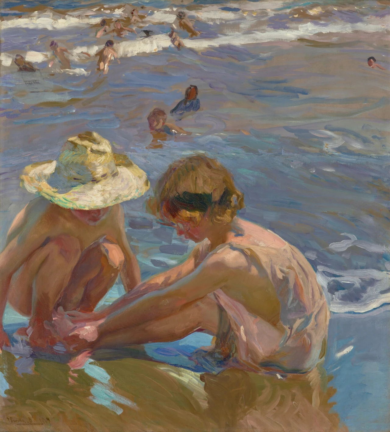
This is not simply a picture of carefree swimming. The hands, hat and bent bodies make the encounter at the front the main subject. Behind them, violet and blue strokes keep the water active. If what attracts you is only the sea, compare another work rather than cropping away the children.
Its relatively tall shape could work beside a chair or on a wall between openings. I would avoid hiding its lower section behind a high object: the foot is the reason for the title. The original composition already cuts into a figure at the left; an additional crop in a reproduction needs particular care.
For colour, compare a small existing ochre or wood tone with the straw hat before adding more blue. You may find that the warm foreground gives the room a useful connection without matching its largest area of colour.
Cassatt’s beach begins with the children
Mary Cassatt’s Children Playing on the Beach, 1884, offers another vertical beach scene. Two children occupy most of the foreground, while the boats and water remain much smaller in the distance.
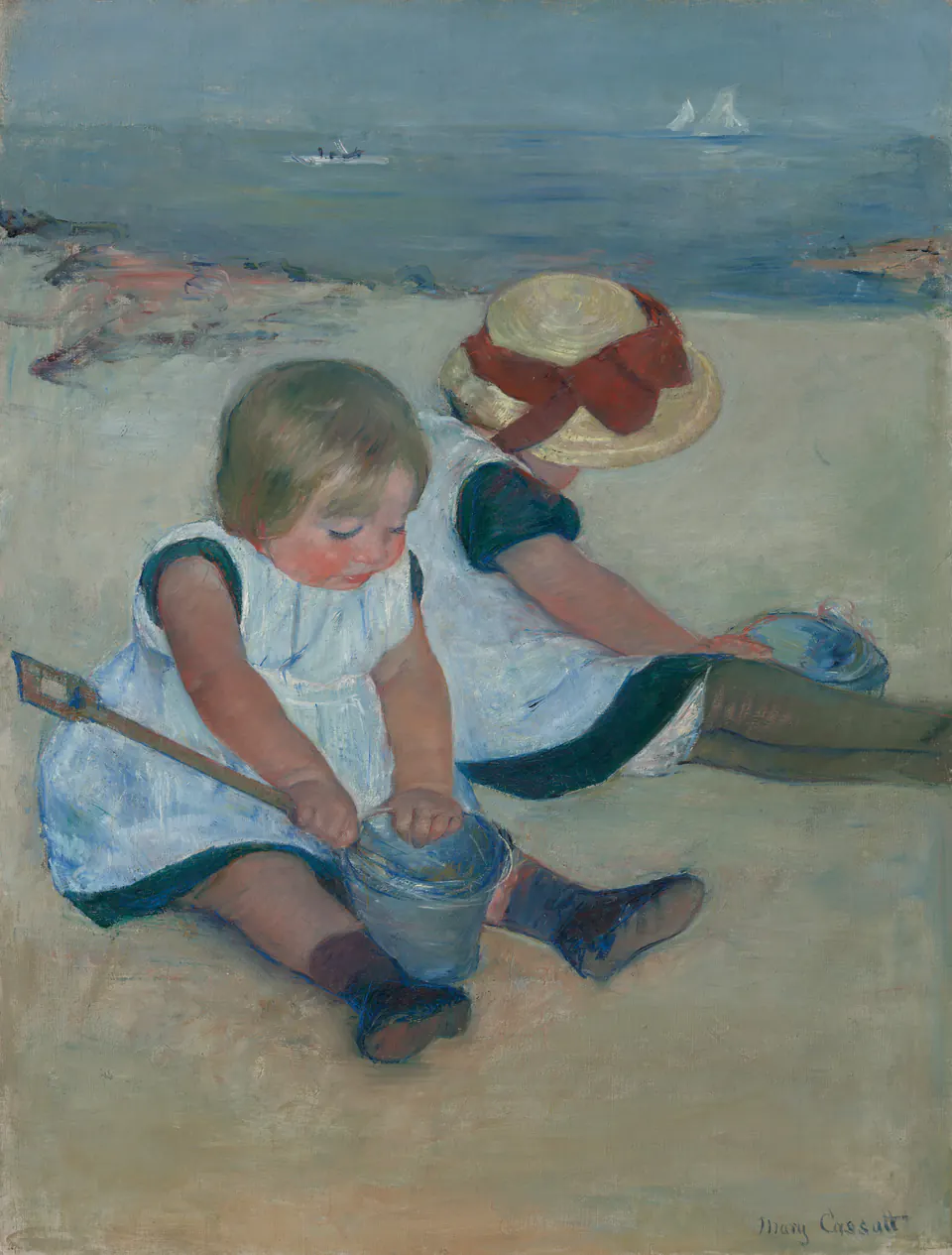
The nearest child concentrates on the pail rather than looking out at us. The companion turns away beneath a hat. That makes the painting feel like an activity continuing independently of the viewer, a useful contrast with pictures in which everyone poses for attention.
As a reproduction, it could belong in a family sitting room without becoming a nursery decoration. Choose it because you enjoy the children and the painting, not because a room used by children supposedly requires a child subject. In a shared space, ask whether everyone likes having such prominent figures on the wall.
The large pale garments and dark shoes matter from a distance. The tiny boats will be less obvious, so do not judge the required size only by the empty-looking water in a thumbnail. Move back from the preview and see which parts of the composition still read clearly.
A summer morning without blue paint
Summer Morning, 1831, is a mezzotint by David Lucas after John Constable. Naming Lucas matters: this is a print made from another artist’s design, not a black-and-white photograph of a Constable oil painting.
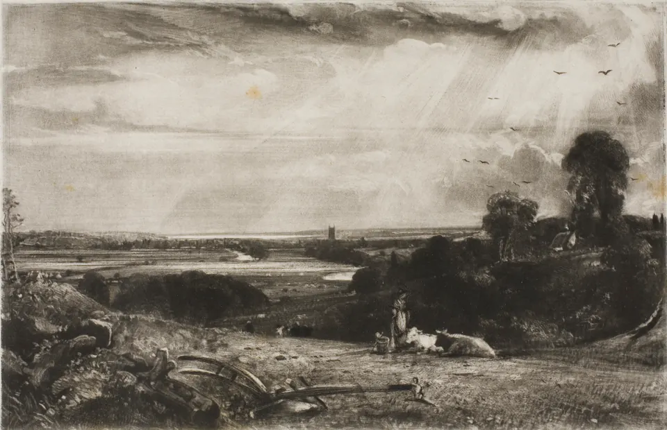
The pale sky occupies much of the rectangle, with stronger darks gathering in the foreground and trees. Cattle, a figure and agricultural equipment place summer in a worked landscape. It offers a route away from beach imagery without requiring a new palette of bright greens.
Try this kind of image where the room already has substantial colour. Its range of tones can sit beside patterned fabric without introducing another large coloured field. That does not mean monochrome automatically matches everything: a heavy dark frame may make the group feel more emphatic than you wanted.
Look at the actual source file before choosing a larger print. This impression includes the paper’s surface and small marks. They are not evidence that a modern reproduction is damaged, but they should be visible in an accurate preview rather than appearing unexpectedly when enlarged.
Give the subject the right kind of space
The two beach paintings put people close to you; the mezzotint spreads a landscape across the wall. Choose between those forms before choosing a standard paper size. A tall figure scene does not need to fill the entire width above a sofa to deserve its place.
If you want two pictures, compare their visible image sizes as well as their frames. Two equal outside frames can contain noticeably different amounts of artwork when their mats and proportions differ. A small reproduction inside a broad mount is not equivalent to a larger image that nearly fills the same frame.
Use paper outlines for the arrangement. As an example, two 40 cm-wide frames and a 7 cm gap need 87 cm of horizontal space. Leave additional room around the group according to the furniture and wall. This is a measuring example, not a frame size offered for these particular works.
For more options, our seascape guide compares open water, waves and maritime danger. The black-and-white print guide is useful if Lucas’s tonal landscape is closer to what you want.
Check the wall throughout the day
A picture chosen for its painted light should still be visible when you actually use the room. Look for reflected windows in the glazing from your chair, not only while standing directly in front of it. In the evening, check whether a lamp blocks the view or leaves the faces too difficult to see.
Keep the physical print out of direct sun. The Library of Congress notes that light damage is cumulative and irreversible; a bright subject does not require a sunlit display position. If light moves across the proposed wall, choose another location or manage the incoming light rather than relying on the season being short.
Do not put a summer picture outdoors unless the actual product is specified for that use. A painting of water is not evidence that its paper, frame or canvas reproduction tolerates rain or damp conditions.
Keep the picture after the holiday
Remove the word “summer” from your shortlist and look again. Would you still choose the children’s gestures, the shape of the surf or the light across the fields? If so, the picture has a reason to remain after a seasonal refresh.
You can make its surroundings lighter or simpler without changing the print itself. Moving one busy object from the shelf may reveal more of a composition than adding a new collection of beach accessories. Equally, you may want the same picture to stay among darker fabrics through winter.
Choose Sorolla for the close encounter in moving water, Cassatt for absorbed play, or Lucas after Constable for a luminous inland landscape. None needs to stand for everyone’s perfect summer. It only needs to be a scene you want to return to in your own room.
Editorial record
About this article
- Author
- Publisher
- GeMarkt
- Published
- Reviewed
- Internal source & rights check. Conducted by GeMarkt Research Review. This is an internal editorial check—not independent peer review.
- Source standard
- Buying guide source standardSeparates measured or first-hand evidence from general guidance and keeps practical limits visible.
Found a claim that needs checking? Report a factual error.